by Calculated Risk on 11/29/2007 02:34:00 PM
Thursday, November 29, 2007
House Prices and Foreclosures
OFHEO provides a discussion of foreclosures and house prices in the Q3 House Price Index report.
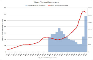
The causal relationship between home prices and foreclosures is two-directional: high foreclosure activity can both cause and be caused by home price declines. Home price declines can cause foreclosures by decreasing the equity homeowners have in their properties. Mortgagors are much more likely to default on their loans if the current value of their property falls below the outstanding loan balance (i.e., their equity is zero or less). Declines in home prices will increase the frequency with which homeowners find themselves with no equity and thus may be motivated to “walk away” from the property and the mortgage.Historically foreclosure activity peaks when prices bottom. The following graph shows this relationship for California.
Home foreclosures contribute to weakening prices by introducing additional supply to the inventory of unsold homes. Compounding this influence is the fact that the sellers of foreclosed homes, frequently creditors, may be strongly averse to holding onto the property for an extended period of time. As a result, they may be willing to sell for lower prices than resident homeowners.
 Click on graph for larger image.
In the '90s, as prices fell in California, foreclosure activity (using Notice of Defaults NODs) increased. Prices bottomed in 1996, as foreclosure activity peaked.
Now imagine what will happen over the next few years as house prices fall. Foreclosure activity is already at record levels (2007 estimated on graph). Yet, as prices fall, foreclosure activity will probably continue to increase - the activity will be literally off the chart!
Back to OFHEO:
The upshot of the interrelatedness of foreclosures and house price changes is that the empirical evidence should reveal sharp differences in measured appreciation for states and cities with higher foreclosure rates. ...

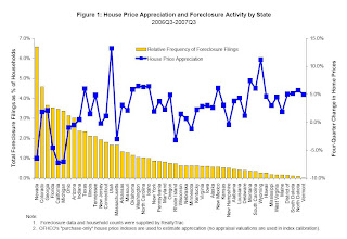
Figure 1 plots recent appreciation rates and foreclosure filings by state since the third quarter of 2006. The bars reflect the relative intensity of foreclosure activity for states, where intensity is defined as the ratio of statewide foreclosure filings to the number of households. The blue squares show house price appreciation between the third quarters of 2006 and 2007. OFHEO’s “purchase-only” price index, which is constructed exclusively with sales price data, is used to estimate price changes.OFEHO's conclusion on house prices and foreclosure:
The graph clearly depicts the negative correlation over the latest year. With few exceptions, states with the lowest appreciation (i.e., greatest depreciation) tended to have the most foreclosure filings. For instance, Nevada had by far the greatest relative foreclosure activity and, at the same time, showed the third largest price decline. By contrast, states with relatively few foreclosure filings, including the Dakotas and Vermont, had relatively strong price growth of between 5 and 6 percent.
In conclusion, it should be recognized that house prices are very hard to track in housing market downturns. Empirical evidence has consistently shown that homeowners are hesitant to sell their homes for losses, often leaving their homes on the market for long periods awaiting the “right” price. Price declines may appear muted, as inventories of for-sale properties grow sharply and the properties that do sell may not fully reflect price declines that have occurred. In this environment, if the inventory of unsold properties is relatively large in high-foreclosure areas, then it may take some time for the association between foreclosures and price trends to reveal itself within cities. The best empirical estimates will only become available after the market normalizes and excess inventory has been sold.Translation: There are large price declines coming.
MGIC Tightens Alt-A
by Tanta on 11/29/2007 12:45:00 PM
AP, via our Clyde:
MILWAUKEE (AP) -- The nation's leading mortgage insurer, MGIC Investment Corp., says it will raise prices and limit its coverage of loans made without proof of income to try to rein in growing losses. . . .You know, I actually believe that MGIC always thought stated income for wage earners was silly.
One of the bigger changes proposed announced Wednesday will limit the insurance MGIC offers people who have Alt-A loans, which generally require only limited verification of income.
MGIC will insure these loans only for people who are self-employed, the original market for them, Culver said. They have been used more recently by people who wanted to borrow more than they could really afford, resulting in losses for MGIC and other mortgage insurers, he said.
"We always thought it was silly, a wage earner who could show you a paycheck would pay a higher interest rate not to show you their paycheck," he said.
The company will raise prices on Alt-A loans, other loans worth 95 percent of a home's value and certain loans for people with low credit scores or small down payments. More specifics will be announced next week, Culver said.
What is missing here is the explanation for why they went ahead and insured something this "silly."
ETrade Sells Portfolio for 27 cents on the Dollar
by Calculated Risk on 11/29/2007 12:43:00 PM
From MarketWatch: CEO leaves as E-Trade gets $2.55 billion from Citadel
The subprime crisis claimed a new scalp Thursday, as E-Trade's CEO Mitch Caplan said he was stepping down as part of a deal that has private equity firm Citadel injecting $2.55 billion into the troubled firm.That is about 27 cents on the dollar for the ABS portfolio.
Under the deal, Citadel will end up with about a 20% stake in E-Trade after acquiring its $3 billion asset backed securities portfolio for $800 million and making other investments.
More on New Home Sales
by Calculated Risk on 11/29/2007 11:45:00 AM
First, three key points to consider on housing.
Note: For more graphs, please see my earlier post: October New Home Sales
Let's start with revisions. In August, I wrote:
The new homes sales number today [August] will probably be revised down too. Applying the median cumulative revision (4.8%) during this downtrend suggests a final revised Seasonally Adjusted Annual Rate (SAAR) sales number of 757 thousand for August (was reported as 795 thousand SAAR by the Census Bureau). Just something to remember when looking at the data.Sure enough, sales for August have been revised down to 717 thousand! The same is true for September (initially reported at 770 thousand, now revised down to 716 thousand).
The same will probably be true for the just reported October sales number of 728 thousand. It is likely the final number will be below 700K.
I believe the Census Bureau is doing a good job, but the users of the data need to understand what is happening (during down trends, the Census Bureau initially overestimates sales).
For an analysis on Census Bureau revisions, see the bottom of this post.
Next up, inventory. The Census Bureau reported that inventory was 516 thousand units. But this excludes the impact of cancellations. Currently the inventory of new homes is understated by about 100K (See this post for an analysis of the impact of cancellations on inventory).
This also means that the months of supply is understated. The Census Bureau reported the months of supply as 8.5 months. Assuming a typical downward revision, and adjusting for the impact of cancellations, the actual months of supply is probably closer to 10.5 months.
The impact of OFHEO reported falling prices on household assets. Also this morning, OFHEO reported that house prices fell in Q3. This will impact the Fed's calculation of household real estate assets. I expect household real estate assets to decline around $60 Billion in Q3. (0.3% price decline times $21 Trillion in assets).
Since Mortgage Equity Withdrawal appears to have still been strong in Q3, the percent equity will decline sharply! I believe this will start to impact the ability of homeowners to use the Home ATM in the near future.
 Click on graph for larger image.
This graph shows New Home Sales vs. Recession for the last 35 years. New Home sales were falling prior to every recession, with the exception of the business investment led recession of 2001.
This is what we call Cliff Diving!
And this shows why so many economists are concerned about a possible consumer led recession - possibly starting right now!
The second graph compares annual New Home Sales vs. Not Seasonally Adjusted (NSA) New Home Sales through October.

Typically, for an average year, about 86% of all new home sales happen before the end of October. Therefore the scale on the right is set to 86% of the left scale.
It now looks like New Home sales will be around 800 thousand - the lowest level since 1996 (758K in '96). My forecast was for 830 to 850 thousand units in 2007 and that now appears a little too high.
OFHEO: House Prices Fall in Q3
by Calculated Risk on 11/29/2007 10:38:00 AM
From OFHEO: House Prices Weaken Further in Most Recent Quarter
For the first time in nearly thirteen years, U.S. home prices experienced a quarterly decline. The OFHEO House Price Index (HPI), which is based on data from sales and refinance transactions, was 0.4 percent lower in the third quarter than in the second quarter of 2007. This is similar to the quarterly decline of 0.3 percent (seasonally-adjusted) shown in the purchase-only index. The annual price change, comparing the third quarter of 2007 to the same period last year showed an increase of 1.8 percent , the lowest four-quarter increase since 1995. OFHEO’s purchase-only index, which is based solely on purchase price data, indicates the same rate of appreciation over the last year.Finally OFHEO shows prices falling.
October New Home Sales
by Calculated Risk on 11/29/2007 10:10:00 AM
According to the Census Bureau report, New Home Sales in October were at a seasonally adjusted annual rate of 728 thousand. Sales for September were revised down substantially to 716 thousand, from 770 thousand. Numbers for July and August were also revised down.
This is another VERY weak report for New Home sales. The stunning - but not surprising - downward revision to the August and September sales numbers was extremely ugly. This is the third report after the start of the credit turmoil, and, as expected, the sales numbers are very poor.
I expect these numbers to be revised down too - perhaps below 700K. More later today on New Home Sales.
Fitch Opens Loan Files: Results Not Pretty
by Tanta on 11/29/2007 09:53:00 AM
Regular readers of this site will remember more or less constant outbursts of complaining about the lack of full-file due diligence in the securitization process. People look at data tapes and write contract warranties; people don't actually open up loan files and assess the accuracy of those data tapes, let alone go beyond the tape elements (quantifiable information like LTV and DTI and FICO) to qualitative aspects and conformity with "soft guidelines" (the rules of processing or evaluating documents or information that generates the quantities).
Well, glory be. Some analysts at Fitch rolled up their sleeves and sat down with a pile of loan files (45 of them, to be precise). What they discovered are the parameters of the the most innovative product the industry has ever offered, the NUNA (No Underwriting, No Accountability).
While we realize this was a very limited sample, Fitch believes that the findings are indicative of the types and magnitude of issues, such as poor underwriting and fraud, which are prevalent in the high delinquencies of recent subprime vintages. In addition, although the sample was adversely selected based on payment patterns and high risk factors, the files indicated that fraud was not only present, but, in most cases, could have been identified with adequate underwriting, quality control and fraud prevention tools prior to the loan funding.I suggest reading the whole thing, if you've got a few minutes to blow on mortgage credit risk assessment arcana. What is happening here, although Fitch doesn't state it in these terms, is that someone went through a pile of loan files that were originally processed and underwritten in the "innovative" (cheap) way, and subjected them to processing and underwriting in the traditional (less cheap) way. As far as I can tell, the results here did not come from "extraordinary" levels of investigation or even much in the way of hindsight data (that is, by working back from events that took place after the loan was closed).
What this little exercise of Fitch's shows is that doing things like working through a credit report, looking carefully at the ownership of accounts (sole, joint, authorized user) and the relationship of tradelines to the information listed on the application (matching mortgage tradelines to real estate owned and matching general debt usage and spending patterns to income claimed) provides you with vital information that leads you to reject a mere FICO score as either a sole determinant of credit quality or as a "magic offset" that can let you ignore other weaknesses in the deal. No, really. All that is what we used to do before we started relying on FICOs and AUS.
But don't think this is just an anti-technology rant: 22% of the files Fitch looked at had a "HAWK Alert" right there on the original credit report, visible to anyone who reads English. What's that? It's a warning message that the credit repositories print on a report when some combination of facts or transactions trigger one of its potential fraud algorithms. It does not prove fraud, but it is designed to make your average human underwriter sit up straight and start poring over documents at a much greater level of detail and skepticism than might be usual.
Computers are great for this kind of thing: they help you put your work into "buckets" right off the bat. Any loan with a HAWK Alert should be immediately routed out of the "automation" pipeline and onto the desk of a senior underwriter. The technology helps you direct your human expertise where it really pays off.
Yeah, right, except that as Fitch notes, there is no indication in any of these files that anyone even noticed the HAWK Alert. And the problems that caused that Alert were, apparently, quite visible in the original file documents, if you looked past the FICO score to the details of the tradelines or the relationship of the tradelines to the loan application. (Loan app says borrower is a first-time homebuyer, credit report says there are existing mortgage tradelines. Duh.)
And of course the ridiculousness of the whole stated income thing is here on display, but Fitch never quite gets to asking the question raised by it all: if stated income is such high risk that you need to develop all sorts of processes and practices for testing it, contextualizing it, and subjecting the rest of the file to a fine-toothed review to compensate for it, what, exactly, is the benefit, in cost and speed, of doing it in the first place? At some level Fitch's analysis reads like a medical school textbook on using expensive fifth-generation antibiotics to treat staph infections caused by failure of doctors and nurses to wash their hands between patients. It's nice to know that can be treated, but it would be even nicer--not to mention cheaper--if hand-washing became more popular in the first place.
The fact is that many mortgage shops did, actually, put all kinds of practices and processes and "risk management control points" in place over the last several years to compensate for the risk created by their reliance on AUS, stated income, FICO scores, AVMs, and so on. For a lot of these shops, all that compensating was at least as expensive as just doing it the old way from the beginning. Certainly it remains to be demonstrated what kind of originator the files Fitch found came from: newbies who never learned the old ways and hence never saw the risk? Thinly-capitalized budget operations who just couldn't afford to produce anything except NUNA loans? Cynical players who knew the stuff was junk but who also knew that neither the security issuers nor the rating agencies would notice, and who also knew that the game of representations and warranties, properly played, would insulate them from having to take it back?
The whole thing really begins to take on an amazing Rube Goldberg quality once you refuse to accept the beginning premise--that these "innovative" ways of underwriting loans are a given, it's the compensation mechanisms that are the question. You do not have to believe that traditional human underwriting is perfect to wonder whether the cure is worse than the disease when it comes to compensating for automation.
(Hat tip to some awesomely cool dood)
Wednesday, November 28, 2007
SEC: Wall Street Sold "Too many Lottery Tickets"
by Calculated Risk on 11/28/2007 10:19:00 PM
From Bloomberg: Wall Street Failed in CDO `Lottery,' SEC's Sirri Says
Securities firms and banks sold ``too many lottery tickets'' tied to U.S. mortgages and failed to look closely enough at their growing risks, the head of the Securities and Exchange Commission's market regulation division said today.Here is Sirri's speech:
Financial companies had ``a significant risk management failure'' on so-called super senior classes of collateralized debt obligations made up of asset-backed bonds, Erik R. Sirri said at a conference in New York ...
``There is a spectrum of lottery tickets that can be written,'' offering little upside for the seller and potentially large, sudden losses in a worst-case scenario, Sirri said.
If a firm were to have a concentrated position in a risk that suddenly became illiquid, that would clearly be bad. However, much worse would be a concentrated position with negative convexity that suddenly became illiquid. That trifecta is a risk manager's nightmare, as there is little to do once the markets start moving adversely and liquidity goes away, other than to hope. And as one head trader wisely said recently, "Hope is a crappy hedge." Combine this unhappy situation with risk that has begun to morph into less obvious forms and one starts to understand what occurred with super senior ABS CDO over the past nine months.
WSJ: Incorrect Home Price Graph
by Calculated Risk on 11/28/2007 05:39:00 PM
 The WSJ included this graph in a story on consumers: Consumer Gloom Adds to Recession Risk
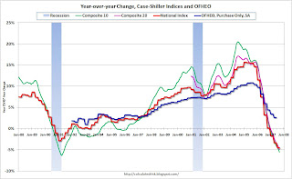
The problem with this graph is that this isn't the Case-Shiller U.S. Home price index; this is the year over year graph for the Case-Shiller Composite 10 price index.
This minor mistake does help understand the differences between the various price indices. Case-Shiller has indices for 20 cities, plus two composites: one for 10 cities, one for all 20 cities. They also offer a quarterly U.S. National home price index.
The following cities are included in the Composite 10 and includes many of the more bubbly areas: Boston, Chicago, Denver, Las Vegas, Los Angeles, Miami, New York, San Diego, San Francisco, Washington DC. This is what the WSJ presented. Click on graph for larger image.
This graph compares the Composite 10 index to the Case-Shiller U.S. home price index. Note that the National price index is stair stepped because it is only available quarterly (and plotted monthly).
That extra few percent per year in the Composite 10 doesn't look like much, but it definitely added up!
Now to complicate the graph, lets add the Composite 20 (started in 2000) and the OFHEO Purchase Only home price indices. The larger the geographical coverage, the less the appreciation.
The OFHEO index lags the Case-Shiller index because it covers the entire nation (Case-Shiller is not really national), and OFHEO is probably also impacted by the use of conforming loans only.
The Q3 OFHEO index will be released tomorrow.
More on October Existing Home Sales
by Calculated Risk on 11/28/2007 12:28:00 PM
For more existing home sales graphs, please see the earlier post: October Existing Home Sales
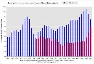
To put the NAR numbers into perspective, here are the year-end sales, inventory and months of supply numbers, since 1969. Click on graph for larger image.
This graph shows the actual annual sales, year end inventory and months of supply, since 1982 (sales since 1969). For 2007, the October inventory and Seasonally Adjusted Annual Rate (SAAR) for sales were used.
The current inventory of 4.453 million is just below the all time record set in July and well above the record year end inventory for any other year. The "months of supply" metric is 10.8 months. The "months of supply" is now above the level of the previous housing slump in the early '90s, and closing in on the worst levels of the housing bust in the early '80s (inventory was 11.5 months at the end of 1982).
Both the numerator and the denominator are moving in the wrong direction. Not only is inventory at record levels, but sales - though falling - are still somewhat above the normal range as a percent of owner occupied units. For the second graph, sales and inventory are normalized by the number of owner occupied units. This shows the annual variability in the turnover of existing homes, with a median of 6% of owner occupied units selling per year.
Currently 6% of owner occupied units would be about 4.6 million existing home sales per year. This indicates that the turnover of existing homes - October sales were at a 4.97 million Seasonally Adjusted Annual Rate (SAAR) - is still above the historical median.
The third graph is an update to my mid-year forecast adding the actual results for July, August, September and October in 2007. Update: Labels fixed.
My forecast was for sales to be between 5.6 and 5.8 million units.
At mid-year I updated my forecast to the lower end of the previous range (5.6 million units). Through October there have been 4.9 million units sold, and it looks like the total for 2007 will be just over 5.6 million units.


