by Calculated Risk on 2/23/2011 11:30:00 AM
Wednesday, February 23, 2011
Existing Home Inventory increases 3.1% Year over Year
Earlier the NAR released the existing home sales data for January; here are a couple more graphs ...
The first graph shows the year-over-year (YoY) change in reported existing home inventory and months-of-supply. Inventory is not seasonally adjusted, so it really helps to look at the YoY change.
IMPORTANT: On a seasonal basis, inventory usually bottoms in December and January, and then will start increasing again in February and March. Since the NAR "months-of-supply" metric uses Seasonally Adjusted (SA) sales, but Not Seasonally Adjusted (NSA) inventory, this seasonal decline in inventory leads to a lower "months-of-supply" in December and January.
The key is to recognize the seasonal pattern, and watch the YoY change in inventory.
 Click on graph for larger image in graph gallery.
Although inventory decreased from December to January, inventory increased 3.1% YoY in January. This is the sixth consecutive month of year-over-year increases in inventory, although the increase in January was lower than the previous months. But any increase is bad news with the high level of inventory.
Inventory should increase in February and March, and this is something to watch closely over the next few months.
 By request - the second graph shows existing home sales Not Seasonally Adjusted (NSA).
The red column in January is for 2011.
Sales NSA were about the same level as the last three years. January is usually the weakest month of the year for existing home sales (followed by February). The real key is what happens in the spring and summer.
The bottom line: Sales increased slightly in January (using the old method to estimate sales), apparently due to an increase in investor purchases of distressed properties at the low end. The NAR noted "Investors accounted for 23 percent of purchases in January, up from 20 percent in December and 17 percent in January 2010 ... Distressed homes edged up to a 37 percent market share in January from 36 percent in December"
Inventory remains very high, and the year-over-year increase in inventory is very concerning.
January Existing Home Sales: 5.36 million SAAR, 7.6 months of supply
by Calculated Risk on 2/23/2011 10:00:00 AM
The NAR reports: January Existing-Home Sales
Existing-home sales, which are completed transactions that include single-family, townhomes, condominiums and co-ops, increased 2.7 percent to a seasonally adjusted annual rate of 5.36 million in January from a downwardly revised 5.22 million in December, and are 5.3 percent above the 5.09 million level in January 2010.
...
Total housing inventory at the end of January fell 5.1 percent to 3.38 million existing homes available for sale, which represents a 7.6-month supply at the current sales pace, down from an 8.2-month supply in December. The inventory supply is at the lowest level since December 2009 when there was a 7.3-month supply.
 Click on graph for larger image in new window.
This graph shows existing home sales, on a Seasonally Adjusted Annual Rate (SAAR) basis since 1993.
Sales in January 2010 (5.36 million SAAR) were 2.7% higher than last month, and were 5.3% higher than January 2010.
 The second graph shows nationwide inventory for existing homes.
According to the NAR, inventory decreased to 3.38 million in January from 3.56 million in December.
Inventory is not seasonally adjusted and there is a clear seasonal pattern with inventory peaking in the summer and declining in the fall - and then really declining during the holidays. So this decline was expected. Inventory should start to increase again in February.
 The last graph shows the 'months of supply' metric.
Months of supply decreased to 7.6 months in January from 8.2 months in December. The months of supply will probably increase over the next few months as sales slow a little, and inventory increases. This is still higher than normal.
These sales numbers were above the consensus of 5.2 million SAAR, and are above what I expected (Lawler's forecast was 5.17 million). I'll have more later.
Special Note: Back in January, I noted that it appeared the NAR had overestimated sales by 5% or so in 2007, and that the errors had increased since then (perhaps 10% or 15% or more in 2009 and 2010). I reported in January that the NAR was working on benchmarking existing home sales for earlier years with other industry data, and I expected "this effort will lead to significant downward revisions to previously reported sales". The numbers reported today were estimated using the old method and will probably be revised down significantly, but they are still useful on a month-to-month basis.
MBA: Mortgage Purchase Application activity increases
by Calculated Risk on 2/23/2011 07:50:00 AM
The MBA reports: Mortgage Applications Increase in Latest MBA Weekly Survey
The Refinance Index increased 17.8 percent from the previous week. The seasonally adjusted Purchase Index increased 5.1 percent from one week earlier.
...
“Ongoing turmoil in the Middle East brought interest rates lower last week. Borrowers took advantage of these lower rates, bringing application activity back near levels from two weeks ago, following sharp declines last week,” said Michael Fratantoni, MBA’s Vice President of Research and Economics.
...
The average contract interest rate for 30-year fixed-rate mortgages decreased to 5.00 percent from 5.12 percent, with points increasing to 0.97 from 0.85 (including the origination fee) for 80 percent loan-to-value (LTV) ratio loans.
 Click on graph for larger image in graph gallery.
This graph shows the MBA Purchase Index and four week moving average since 1990.
Even with the slight increase in activity last week, the four-week moving average of the purchase index is still at 1997 levels - suggesting weak home sales through the first few months of 2011.
AIA: Architecture Billings Index shows no change in January
by Calculated Risk on 2/23/2011 12:01:00 AM
Note: This index is a leading indicator for new Commercial Real Estate (CRE) investment.
From the American Institute of Architects: Billings at Architecture Firms Hold Steady in January
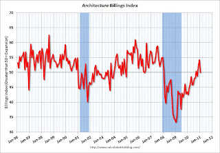
Following a healthy upturn in the fourth quarter, design billings at U.S. architecture firms remained flat in January. The national reading for the AIA’s Architecture Billings Index (ABI) was 50.0, meaning that on average billings in January exactly matched December levels.
 Click on graph for larger image in graph gallery.
This graph shows the Architecture Billings Index since 1996. The index showed billings were at the same level in January as in December (at 50).
Note: Nonresidential construction includes commercial and industrial facilities like hotels and office buildings, as well as schools, hospitals and other institutions.
According to the AIA, there is an "approximate nine to twelve month lag time between architecture billings and construction spending" on non-residential construction. So this indicator suggests the drag from CRE investment will end mid-year 2011 or so.
Tuesday, February 22, 2011
House Prices: Price-to-rent, Price-to-median Household Income
by Calculated Risk on 2/22/2011 08:35:00 PM
There is no perfect gauge of "normal" house prices. Changes in house prices depend on local supply and demand. However I've found the three most useful measures of house prices are 1) real house prices, 2) the house price-to-rent ratio, and 3) the house price-to-median household income ratio. These are just general guides, but they are still useful (these are national numbers, and it is better to use local numbers when possible).
Price-to-Rent
In October 2004, Fed economist John Krainer and researcher Chishen Wei wrote a Fed letter on price to rent ratios: House Prices and Fundamental Value. Kainer and Wei presented a price-to-rent ratio using the OFHEO house price index and the Owners' Equivalent Rent (OER) from the BLS.
 Click on graph for larger image in graph gallery.
Here is a similar graph through December 2010 using the Case-Shiller Composite 20 and CoreLogic House Price Index.
This graph shows the price to rent ratio (January 1998 = 1.0).
This ratio could decline another 10% to 15%, and possibly more if prices overshoot to the downside. The decline in the ratio will probably be a combination of house prices and increasing rents (recent reports suggest rents are now increasing).
Price to Household Income
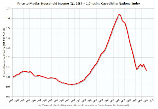
 The second graph shows the Case Shiller National price index through Q4 2010 and the median household income (from the Census Bureau, Table H-8, 2010 estimated as increasing 0.5%).
This ratio is still a little high, and could decline another 5% to 10% (and more if prices overshoot). The decline in the ratio could be a combination of falling house prices and an increase in the median household income.
Real House Prices
Earlier I posted real house prices using the Case-Shiller National Index, the Case-Shiller Composite 20 index, and the CoreLogic House Price Index in real terms (adjusted for inflation using CPI less shelter). Note: some people use other inflation measures to adjust for real prices. Here is a repeat of that graph:
 In real terms, the National index is back to Q1 2000 levels, the Composite 20 index is back to January 2001, and the CoreLogic index back to October 2000.
It looks like real prices could fall another 5% to 10% (more with overshoot). However what everyone wants to know is the change in nominal prices (not inflation adjusted). If real prices eventually fall 10%, that doesn't mean nominal prices will fall that far (it depends on inflation).
My guess: Although Professor Shiller was quoted today saying house prices could fall another 15% to 25%, I'm sticking with my forecast that nominal national house prices - as measured by these repeat sales indexes - will decline another 5% to 10% from the October levels.
Earlier on house prices:
• Real House Prices fall to 2000 Levels, Update on NAR Overstating Sales
• Case-Shiller: National Home Prices Are Close to the 2009Q1 Trough
FHA: REO inventory up 47% over last year
by Calculated Risk on 2/22/2011 05:25:00 PM
The FHA released the December Monthly Report today. The report shows the FHA REO inventory was at 60,739 at the end of December, up 9.5% from 55,488 in November, and up 47.5% from December 2009.
The combined REO inventory for the "Fs" (Fannie, Freddie and FHA) was at a record 293,171 at the end of Q3 2010. Fannie and Freddie will report for Q4 soon, and based on the increase at the FHA, REO inventory will be well over 300,000 at year end.
Here is the graph of Fannie, Freddie and FHA inventory over the last three years through Q3 2010.
Earlier on house prices:
• Real House Prices fall to 2000 Levels, Update on NAR Overstating Sales
• Case-Shiller: National Home Prices Are Close to the 2009Q1 Trough


