by Calculated Risk on 3/17/2015 02:24:00 PM
Tuesday, March 17, 2015
Comments on February Housing Starts
As always, we we shouldn't let one month of data influence us too much. For February it appears housing starts were impacted by the weather, especially in the Northeast.
Here is a table showing starts in the four Census Bureau regions. Starts in the Northeast were down 46% year-over-year:
| Housing Starts (000) | |||
|---|---|---|---|
| Feb-15 | Feb-14 | YoY Change | |
| Northeast | 47 | 87 | -46.0% |
| Midwest | 97 | 122 | -20.5% |
| South | 514 | 502 | 2.4% |
| West | 239 | 217 | 10.1% |
| Total | 897 | 928 | -3.3% |
However, even if starts had increased year-over-year in February at the rate in the South and the West, housing starts would still have been below expectations. So overall this was a disappointing report.
Note: It is also possible that the West Coast port slowdown impacted starts a little. The labor situation was resolved in February, so any impact should disappear quickly.
 Click on graph for larger image.
This graph shows the month to month comparison between 2014 (blue) and 2015 (red).
Even with the weak February, starts are running 8.4% ahead of 2014 through February.
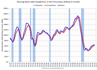
Below is an update to the graph comparing multi-family starts and completions. Since it usually takes over a year on average to complete a multi-family project, there is a lag between multi-family starts and completions. Completions are important because that is new supply added to the market, and starts are important because that is future new supply (units under construction is also important for employment).
These graphs use a 12 month rolling total for NSA starts and completions.
 The blue line is for multifamily starts and the red line is for multifamily completions.
 The rolling 12 month total for starts (blue line) increased steadily over the last few years, and completions (red line) have lagged behind - but completions have been catching up (more deliveries), and will continue to follow starts up (completions lag starts by about 12 months).
Note that the blue line (multi-family starts) might be starting to move more sideways.
I think most of the growth in multi-family starts is probably behind us - although I expect solid multi-family starts for a few more years (based on demographics).
 The second graph shows single family starts and completions. It usually only takes about 6 months between starting a single family home and completion - so the lines are much closer. The blue line is for single family starts and the red line is for single family completions.
Note the exceptionally low level of single family starts and completions. The "wide bottom" was what I was forecasting several years ago, and now I expect several years of increasing single family starts and completions.
BLS: Twenty-four States had Unemployment Rate Decreases in January
by Calculated Risk on 3/17/2015 10:55:00 AM
From the BLS: Regional and State Employment and Unemployment Summary
Regional and state unemployment rates were little changed in January. Twenty-four states had unemployment rate decreases from December, 8 states had increases, and 18 states and the District of Columbia had no change, the U.S. Bureau of Labor Statistics reported today.
...
North Dakota had the lowest jobless rate in January, 2.8 percent. Mississippi and Nevada had the highest unemployment rates among the states, 7.1 percent each.
 Click on graph for larger image.
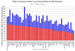
This graph shows the current unemployment rate for each state (red), and the max during the recession (blue). All states are well below the maximum unemployment rate for the recession.
The size of the blue bar indicates the amount of improvement.
The states are ranked by the highest current unemployment rate. Mississippi and Nevada, at 7.1%, had the highest state unemployment rate although D.C was higher.
 The second graph shows the number of states (and D.C.) with unemployment rates at or above certain levels since January 2006. At the worst of the employment recession, there were 10 states with an unemployment rate at or above 11% (red).
Currently no state has an unemployment rate at or above 8% (light blue); Three states and D.C. are still at or above 7% (dark blue).
CoreLogic: "1.2 Million US Borrowers Regained Equity in 2014, 5.4 Million Properties Remain in Negative Equity"
by Calculated Risk on 3/17/2015 09:38:00 AM
From CoreLogic: CoreLogic Reports 1.2 Million US Borrowers Regained Equity in 2014
CoreLogic ... today released new analysis showing 1.2 million borrowers regained equity in 2014, bringing the total number of mortgaged residential properties with equity at the end of Q4 2014 to approximately 44.5 million or 89 percent of all mortgaged properties. Nationwide, borrower equity increased year over year by $656 billion in Q4 2014. The CoreLogic analysis also indicates approximately 172,000 U.S. homes slipped into negative equity in the fourth quarter of 2014 from the third quarter 2014, increasing the total number of mortgaged residential properties with negative equity to 5.4 million, or 10.8 percent of all mortgaged properties. This compares to 5.2 million homes, or 10.4 percent, that were reported with negative equity in Q3 2014, a quarter-over-quarter increase of 3.3 percent. Compared to 6.6 million homes, or 13.4 percent, reported for Q4 2013, the number of underwater homes has decreased year over year by 1.2 million or 18.9 percent.
... Of the 49.9 million residential properties with a mortgage, approximately 10 million, or 20 percent, have less than 20-percent equity (referred to as “under-equitied”) and 1.4 million of those have less than 5-percent equity (referred to as near-negative equity). Borrowers who are “under-equitied” “under-equitied” may have a more difficult time refinancing their existing homes or obtaining new financing to sell and buy another home due to underwriting constraints. Borrowers with near negative equity are considered at risk of moving into negative equity if home prices fall. In contrast, if home prices rose by as little as 5 percent, an additional 1 million homeowners now in negative equity would regain equity. ...
“The share of homeowners that had negative equity increased slightly in the fourth quarter of 2014, reflecting the typical weakness in home values during the final quarter of the year,” said Dr. Frank Nothaft, chief economist for CoreLogic. “Our CoreLogic HPI dipped 0.7 percent from September to December, and the percent of owners 'underwater' increased to 10.8 percent. However, from December-to-December, the CoreLogic index was up 4.8 percent, and the negative equity share fell by 2.6 percentage points.”
emphasis added
 Click on graph for larger image.
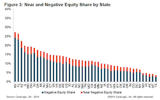
This graph shows the break down of negative equity by state. Note: Data not available for some states. From CoreLogic:
"Nevada had the highest percentage of mortgaged properties in negative equity at 24.2 percent; followed by Florida (23.2 percent); Arizona (18.7 percent); Illinois (16.2 percent) and Rhode Island (15.8 percent). These top five states combined account for 31.7 percent of negative equity in the United States."
Note: The share of negative equity is still very high in Nevada and Florida, but down from a year ago (Q4 2013) when the negative equity share in Nevada was at 30.4 percent, and at 28.1 percent in Florida.
 The second graph shows the distribution of home equity in Q4 compared to Q3 2014. Close to 4% of residential properties have 25% or more negative equity.
In Q4 2013, there were 6.6 million properties with negative equity - now there are 5.4 million. A significant change.
Housing Starts decreased sharply to 897 thousand Annual Rate in February
by Calculated Risk on 3/17/2015 08:30:00 AM
From the Census Bureau: Permits, Starts and Completions
Housing Starts:
Privately-owned housing starts in February were at a seasonally adjusted annual rate of 897,000. This is 17.0 percent below the revised January estimate of 1,081,000 and is 3.3 percent (±12.5%)* below the February 2014 rate of 928,000.
Single-family housing starts in February were at a rate of 593,000; this is 14.9 percent (±10.0%) below the revised January figure of 697,000. The February rate for units in buildings with five units or more was 297,000.
emphasis added
Building Permits:
Privately-owned housing units authorized by building permits in February were at a seasonally adjusted annual rate of 1,092,000. This is 3.0 percent above the revised January rate of 1,060,000 and is 7.7 percent above the February 2014 estimate of 1,014,000.
Single-family authorizations in February were at a rate of 620,000; this is 6.2 percent (±0.9%) below the revised January figure of 661,000. Authorizations of units in buildings with five units or more were at a rate of 445,000 in February.
 Click on graph for larger image.
The first graph shows single and multi-family housing starts for the last several years.
Multi-family starts (red, 2+ units) decreased sharply in February. Multi-family starts are down 10% year-over-year.
Single-family starts (blue) decreased in February and are up slightly year-over-year.
The second graph shows total and single unit starts since 1968.
 The second graph shows the huge collapse following the housing bubble, and then - after moving sideways for a couple of years - housing is now recovering (but still historically low),
This was well below expectations of 1.040 million starts in February, although starts in January were revised up. Overall this was a weak report, although permits were decent (an indicator for March), and a large portion of the weakness was in the volatile multi-family sector. I'll have more later ...
Monday, March 16, 2015
Sacramento Housing in February: Total Sales up 12% Year-over-year
by Calculated Risk on 3/16/2015 09:01:00 PM
During the recession, I started following the Sacramento market to look for changes in the mix of houses sold (equity, REOs, and short sales). For some time, not much changed. But over the last 2+ years we've seen some significant changes with a dramatic shift from foreclosures (REO: lender Real Estate Owned) to short sales, and the percentage of total distressed sales declining sharply.
This data suggests healing in the Sacramento market and other distressed markets are showing similar improvement. Note: The Sacramento Association of REALTORS® started breaking out REOs in May 2008, and short sales in June 2009.
In February, 14.8% of all resales were distressed sales. This was down from 16.6% last month, and down from 19.1% in February 2014. Since distressed sales happen year round, but conventional sales decline in December and January, the percent of distressed sales bumps up in the winter (seasonal).
The percentage of REOs was at 8.3%, and the percentage of short sales was 6.5%.
Here are the statistics for February.

This graph shows the percent of REO sales, short sales and conventional sales.
There has been a sharp increase in conventional (equity) sales that started in 2012 (blue) as the percentage of distressed sales declined sharply.
Active Listing Inventory for single family homes increased 13.9% year-over-year (YoY) in February. In general the YoY increases have been trending down after peaking at close to 100%. This is the smallest YoY increase in inventory since May 2013.
Cash buyers accounted for 16.8% of all sales (frequently investors).
Total sales were up 11.6% from February 2014, and conventional equity sales were up 17.6% compared to the same month last year.
Summary: This data suggests a healing market with fewer distressed sales, more equity sales, and less investor buying.


