by Calculated Risk on 7/06/2014 11:39:00 AM
Sunday, July 06, 2014
More Employment Graphs: Duration of Unemployment, Unemployment by Education, Construction Employment and Diffusion Indexes
Thursday on the employment report:
• June Employment Report: 288,000 Jobs, 6.1% Unemployment Rate
• Comments on Employment Report
A few more employment graphs by request ...
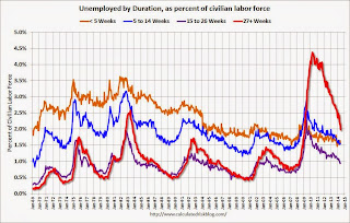
 This graph shows the duration of unemployment as a percent of the civilian labor force. The graph shows the number of unemployed in four categories: less than 5 week, 6 to 14 weeks, 15 to 26 weeks, and 27 weeks or more.
The general trend is down for all categories, and both the "less than 5 weeks" and 6 to 14 weeks" are close to normal levels.
The long term unemployed is just below 2.0% of the labor force - the lowest since February 2009 - however the number (and percent) of long term unemployed remains a serious problem.
 This graph shows the unemployment rate by four levels of education (all groups are 25 years and older).
Unfortunately this data only goes back to 1992 and only includes one previous recession (the stock / tech bust in 2001). Clearly education matters with regards to the unemployment rate - and it appears all four groups are generally trending down.
Although education matters for the unemployment rate, it doesn't appear to matter as far as finding new employment.
Note: This says nothing about the quality of jobs - as an example, a college graduate working at minimum wage would be considered "employed".
 This graph shows total construction employment as reported by the BLS (not just residential).
Since construction employment bottomed in January 2011, construction payrolls have increased by 583 thousand.
Historically there is a lag between an increase in activity and more hiring - and it appears hiring should pickup more this year.
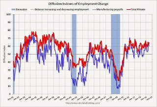
 The BLS diffusion index for total private employment was at 64.8 in June, up from 62.9 in May.
For manufacturing, the diffusion index decreased to 61.1, down from 63.6 in May.
Think of this as a measure of how widespread job gains are across industries. The further from 50 (above or below), the more widespread the job losses or gains reported by the BLS. From the BLS:
Figures are the percent of industries with employment increasing plus one-half of the industries with unchanged employment, where 50 percent indicates an equal balance between industries with increasing and decreasing employment.Job growth was widespread in June.
Saturday, July 05, 2014
Unofficial Problem Bank list declines to 465 Institutions
by Calculated Risk on 7/05/2014 05:29:00 PM
This is an unofficial list of Problem Banks compiled only from public sources.
Here is the unofficial problem bank list for July 3, 2014.
Changes and comments from surferdude808:
Generally a quiet week for the Unofficial Problem Bank List with three removals but none from failure as no one expected the FDIC to close on bank on the July 4th weekend. After the removals, the list count drops to 465 institutions with assets of $147.6 billion. The list is down significantly from a year ago when it included 743 institutions with assets of $271.5 billion.CR Note: The first unofficial problem bank list was published in August 2009 with 389 institutions. The list peaked at 1,002 institutions on June 10, 2011, and is now down to 465.
The FDIC terminated the action against Monroe Bank & Trust, Monroe, MI ($1.2 billion Ticker: MBTF). The other two banks removed -- Harrington Bank, FSB, Chapel Hill, NC ($225 million) and Community Bank of San Joaquin, Stockton, CA ($125 million Ticker: BKOT) -- found their way off the list through a merger with a healthier bank.
Next week is expected to see few changes as the OCC likely will not be providing an update on it enforcement actions until July 18th. Enjoy the holiday weekend.
Schedule for Week of July 6th
by Calculated Risk on 7/05/2014 08:37:00 AM
This will be a very light week for economic data.
No economic releases scheduled.
7:30 AM ET: NFIB Small Business Optimism Index for June.
 10:00 AM: Job Openings and Labor Turnover Survey for May from the BLS.
 This graph shows job openings (yellow line), hires (purple), Layoff, Discharges and other (red column), and Quits (light blue column) from the JOLTS.
In April, the number of job openings (yellow) were up 17% year-over-year compared to April 2013, and Quits were up 11% year-over-year.
3:00 PM: Consumer Credit for May from the Federal Reserve. The consensus is for credit to increase $17.5 billion.
7:00 AM: The Mortgage Bankers Association (MBA) will release the results for the mortgage purchase applications index.
2:00 PM: FOMC Minutes for the Meeting of June 17-18, 2014.
Early: Trulia Price Rent Monitors for June. This is the index from Trulia that uses asking house prices adjusted both for the mix of homes listed for sale and for seasonal factors.
8:30 AM: The initial weekly unemployment claims report will be released. The consensus is for claims to increase to 316 thousand from 315 thousand.
10:00 AM: Monthly Wholesale Trade: Sales and Inventories for May. The consensus is for a 0.6% increase in inventories.
At 4:30 PM, Speech by Fed Vice Chairman Stanley Fischer, Financial Sector Reform, At the Martin Feldstein Lecture, hosted by the National Bureau of Economic Research, Cambridge, Massachusetts
2:00 PM ET: The Monthly Treasury Budget Statement for June.
Friday, July 04, 2014
The Kids are Alright: Living in Dorms counted as Living in Parents' Home
by Calculated Risk on 7/04/2014 08:53:00 PM
An interesting point from Derek Thompson at the Atlantic: The Misguided Freakout About Basement-Dwelling Millennials
More than 15.3 million twentysomethings—and half of young people under 25—live "in their parents’ home," according to official Census statistics..
There's just one problem with those official statistics. They're criminally misleading. When you read the full Census reports, you often come upon this crucial sentence:
It is important to note that the Current Population Survey counts students living in dormitories as living in their parents' home
Public and Private Sector Payroll Jobs: Carter, Reagan, Bush, Clinton, Bush, Obama
by Calculated Risk on 7/04/2014 03:01:00 PM
By request, here is an update on an earlier post through the June employment report.
Important: There are many differences between these periods. Overall employment was smaller in the '80s, so a different comparison might be to look at the percentage change. Of course the participation rate was increasing in the '80s (younger population and women joining the labor force), and the participation rate is declining now. But these graphs give an overview of employment changes.
First, here is a table for private sector jobs. The top two private sector terms were both under President Clinton. Reagan's 2nd term saw about the same job growth as during Carter's term. Note: There was a severe recession at the beginning of Reagan's first term (when Volcker raised rates to slow inflation) and a recession near the end of Carter's term (gas prices increased sharply and there was an oil embargo).
| Term | Private Sector Jobs Added (000s) |
|---|---|
| Carter | 9,041 |
| Reagan 1 | 5,360 |
| Reagan 2 | 9,357 |
| GHW Bush | 1,510 |
| Clinton 1 | 10,885 |
| Clinton 2 | 10,070 |
| GW Bush 1 | -841 |
| GW Bush 2 | 379 |
| Obama 1 | 1,998 |
| Obama 21 | 3,477 |
| 1Seventeen months into 2nd term | |
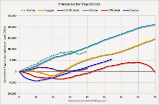
The first graph shows the change in private sector payroll jobs from when each president took office until the end of their term(s). President George H.W. Bush only served one term, and President Obama is in the second year of his second term.
Mr. G.W. Bush (red) took office following the bursting of the stock market bubble, and left during the bursting of the housing bubble. Mr. Obama (blue) took office during the financial crisis and great recession. There was also a significant recession in the early '80s right after Mr. Reagan (yellow) took office.
There was a recession towards the end of President G.H.W. Bush (purple) term, and Mr Clinton (light blue) served for eight years without a recession.
 Click on graph for larger image.
The first graph is for private employment only.
The employment recovery during Mr. G.W. Bush's (red) first term was very sluggish, and private employment was down 841,000 jobs at the end of his first term. At the end of Mr. Bush's second term, private employment was collapsing, and there were net 462,000 private sector jobs lost during Mr. Bush's two terms.
Private sector employment increased slightly under President G.H.W. Bush (purple), with 1,510,000 private sector jobs added.
Private sector employment increased by 20,955,000 under President Clinton (light blue), by 14,717,000 under President Reagan (yellow), and 9,041,000 under President Carter (dashed green).
There were only 1,998,000 more private sector jobs at the end of Mr. Obama's first term. Seventeen months into Mr. Obama's second term, there are now 5,475,000 more private sector jobs than when he initially took office.
 A big difference between the presidencies has been public sector employment. Note the bumps in public sector employment due to the decennial Census in 1980, 1990, 2000, and 2010.
 The public sector grew during Mr. Carter's term (up 1,304,000), during Mr. Reagan's terms (up 1,414,000), during Mr. G.H.W. Bush's term (up 1,127,000), during Mr. Clinton's terms (up 1,934,000), and during Mr. G.W. Bush's terms (up 1,744,000 jobs).
However the public sector has declined significantly since Mr. Obama took office (down 671,000 jobs). These job losses have mostly been at the state and local level, but more recently at the Federal level. This has been a significant drag on overall employment.
And a table for public sector jobs. Public sector jobs declined the most during Obama's first term, and increased the most during Reagan's 2nd term.
| Term | Public Sector Jobs Added (000s) |
|---|---|
| Carter | 1,304 |
| Reagan 1 | -24 |
| Reagan 2 | 1,438 |
| GHW Bush | 1,127 |
| Clinton 1 | 692 |
| Clinton 2 | 1,242 |
| GW Bush 1 | 900 |
| GW Bush 2 | 844 |
| Obama 1 | -713 |
| Obama 21 | 42 |
| 1Seventeen months into 2nd term | |
Looking forward, I expect the economy to continue to expand for the next few years, so I don't expect a sharp decline in private employment as happened at the end of Mr. Bush's 2nd term (In 2005 and 2006 I was warning of a coming recession due to the bursting of the housing bubble).
A big question is when the public sector layoffs will end. It appears the cutbacks are over at the state and local levels in the aggregate, but there are ongoing cutbacks at the Federal level. Right now I'm expecting some increase in public employment in 2014, but nothing like what happened during Reagan's second term.


