by Calculated Risk on 5/22/2014 04:09:00 PM
Thursday, May 22, 2014
Hotels: Occupancy Rate up 4.6%, RevPAR up 9.6% in Latest Survey
From HotelNewsNow.com: STR: US results for week ending 17 May
In year-over-year measurements, the industry’s occupancy increased 4.6 percent to 69.7 percent. Average daily rate increased 4.8 percent to finish the week at US$116.30. Revenue per available room for the week was up 9.6 percent to finish at US$81.10.Note: ADR: Average Daily Rate, RevPAR: Revenue per Available Room.
emphasis added
The 4-week average of the occupancy rate is solidly above the median for 2000-2007, and is at the highest level since 2000.
The following graph shows the seasonal pattern for the hotel occupancy rate for the last 15 years using the four week average.
 Click on graph for larger image.
The red line is for 2014 and black is for 2009 - the worst year since the Great Depression for hotels. Note: 2001 was briefly worse than 2009 in September.
Year 2000 was the best year for hotel occupancy until late in the year when 2005 had the highest occupancy rate (due to hurricane Katrina).
Right now it looks like 2014 will be the best year since 2000 for hotels.
Data Source: Smith Travel Research, Courtesy of HotelNewsNow.com
"Employment Scars of the Housing Bust"
by Calculated Risk on 5/22/2014 03:03:00 PM
More insight from Atif Mian and Amir Sufi at House of Debt: Employment Scars of the Housing Bust
One way to see the scars of the housing bust is to look at the unemployment rate today in counties that saw the biggest decline in house prices. As we argue in the book, such an approach actually significantly underestimates the impact of the house price-driven spending collapse. This is because even people living in areas that were not hit by housing lost their jobs when people living in areas where house prices crashed stopped buying goods. But even with this under-estimation ... [t]he unemployment rate in counties hit hardest by the housing crash is more than 3% higher in 2013 relative to 2006. The rise in the unemployment rate is twice as high as the rise in counties with the smallest decline in house prices. The housing crash has led to a large and persistent increase in unemployment.This reminds me ... way back in 2006 I disagreed with some analysts on the outlook for the Inland Empire in California. I wrote:
As the housing bubble unwinds, housing related employment will fall; and fall dramatically in areas like the Inland Empire. The more an area is dependent on housing, the larger the negative impact on the local economy will be.And the Inland Empire was crushed. Note: The Inland Empire unemployment rate in March 2007 was 5.3%. The rate peaked at 15.0% in 2010, and was at 9.4% in March 2014.
So I think some pundits have it backwards: Instead of a strong local economy keeping housing afloat, I think the bursting housing bubble will significantly impact housing dependent local economies.
Freddie Mac: "Fixed Mortgage Rates Near Seven Month Low"
by Calculated Risk on 5/22/2014 12:04:00 PM
It is looking more likely that we will see a headline sometime in June: "Mortgage Rates down year-over-year"!
From Freddie Mac: Fixed Mortgage Rates Near Seven Month Low Heading Into Memorial Day Weekend
Freddie Mac today released the results of its Primary Mortgage Market Survey® (PMMS®), showing showing average fixed mortgage rates moving lower for the fourth consecutive week with fixed mortgage rates hitting new lows for this year.
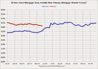
30-year fixed-rate mortgage (FRM) averaged 4.14 percent with an average 0.6 point for the week ending May 22, 2014, down from last week when it averaged 4.20 percent. A year ago at this time, the 30-year FRM averaged 3.59 percent.
 Click on graph for larger image.
Here is a graph of 30 year fixed mortgage rates - according to the PMMS® - for 2013 (blue) and 2014 (red).
Mortgage rates jumped to 4.46% in late June 2013, and it is possible that rates will be lower in late June 2014 (currently 4.14%).
Note: The lowest rate in the PMMS® since June 2013 was 4.10% last October.
Existing Home Sales in April: 4.65 million SAAR, Inventory up 6.5% Year-over-year
by Calculated Risk on 5/22/2014 10:00:00 AM
The NAR reports: April Existing-Home Sales Show Modest Improvement Behind Gaining Inventory
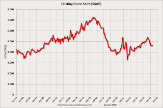
Total existing-home sales, which are completed transactions that include single-family homes, townhomes, condominiums and co-ops, rose 1.3 percent to a seasonally adjusted annual rate of 4.65 million in April from 4.59 million in March, but are 6.8 percent below the 4.99 million-unit level in April 2013.
Total housing inventory at the end of April jumped 16.8 percent to 2.29 million existing homes available for sale, which represents a 5.9-month supply at the current sales pace, up from 5.1 months in March. Unsold inventory is 6.5 percent higher than a year ago, when there was a 5.2-month supply.
 Click on graph for larger image.
This graph shows existing home sales, on a Seasonally Adjusted Annual Rate (SAAR) basis since 1993.
Sales in April (4.65 million SAAR) were higher than last month, but were 6.8% below the April 2013 rate.
The second graph shows nationwide inventory for existing homes.
 According to the NAR, inventory increased to 2.29 million in April from 1.96 million in March. Inventory is not seasonally adjusted, and inventory usually increases from the seasonal lows in December and January, and peaks in mid-to-late summer.
The third graph shows the year-over-year (YoY) change in reported existing home inventory and months-of-supply. Since inventory is not seasonally adjusted, it really helps to look at the YoY change. Note: Months-of-supply is based on the seasonally adjusted sales and not seasonally adjusted inventory.
 Inventory increased 6.5% year-over-year in April compared to April 2013. This year-over-year increase in inventory suggests inventory bottomed early last year.
Months of supply was at 5.9 months in April.
This was slightly below expectations of sales of 4.67 million. For existing home sales, the key number is inventory - and inventory is still low, but up year-over-year. I'll have more later ...
Weekly Initial Unemployment Claims increase to 326,000
by Calculated Risk on 5/22/2014 08:30:00 AM
The DOL reports:
In the week ending May 17, the advance figure for seasonally adjusted initial claims was 326,000, an increase of 28,000 from the previous week's revised level. The previous week's level was revised up by 1,000 from 297,000 to 298,000. The 4-week moving average was 322,500, a decrease of 1,000 from the previous week's revised average. The previous week's average was revised up by 250 from 323,250 to 323,500.The previous week was revised up from 297,000.
There were no special factors impacting this week's initial claims.
The following graph shows the 4-week moving average of weekly claims since January 1971.
 Click on graph for larger image.
The dashed line on the graph is the current 4-week average. The four-week average of weekly unemployment claims decreased to 322,500.
This was above the consensus forecast of 310,000. The 4-week average is close to normal levels for an expansion.


