by Calculated Risk on 5/19/2014 09:25:00 PM
Monday, May 19, 2014
Amusing: A False Story on Auto Inventory
For fun, an interesting story from Barry Ritholtz: The Truth About Auto Sales
This week, an e-mail landed in my inbox with the header “Unsold Cars.” ...From Snopes.com: Unsold Cars
Normally, I would have deleted the e-mail without a second thought. But several things about it warranted further notice.
The first were aerial photos of thousands of cars. Wow, this really was a lot of cars.
The second was the phrase “Timestamp: Friday, May 16th, 2014,” which suggests that these photos were brand new.
What struck me was how familiar it all looked. Maybe that was because I posted those same photos on The Big Picture blog and Business Insider in February 2009.
The origin of the photos was a Jan. 16, 2009, article in the Guardian by Nick Mead. Note that this was smack in the middle of the financial crisis, when anything purchased on credit simply froze
Claim: Photographs show thousands and thousands of unsold cars deteriorating until they are scrapped.From Matt Hardigree at Jalopnik.com That Zero Hedge Article On Unsold Cars Is Bullshit
FALSE
The visuals are strong, the headline is clear, and you almost don't have to read the article to viscerally understand the problem. I, more than anyone, get the appeal of this story because it seems to largely rip off an article I wrote — including the images and headline — more than five years ago (which itself was largely a rehash of a Guardian article)....Glad to see people knock this down so quickly. Unfortunately stories like this never really die ... and the original story hasn't been corrected.
I would think that most intelligent people would read this and obviously see the flaws but, alas, I've had enough emails about it this morning that I feel the need to refute it. And since it's a (bad) copy of something I wrote, I have an extra responsibility to kill this misunderstanding before it has a chance to spread.
Weekly Update: Housing Tracker Existing Home Inventory up 6.8% year-over-year on May 19th
by Calculated Risk on 5/19/2014 03:01:00 PM
Here is another weekly update on housing inventory ...
There is a clear seasonal pattern for inventory, with the low point for inventory in late December or early January, and then usually peaking in mid-to-late summer.
The Realtor (NAR) data is monthly and released with a lag (the most recent data was for March). However Ben at Housing Tracker (Department of Numbers) has provided me some weekly inventory data for the last several years.
 Click on graph for larger image.
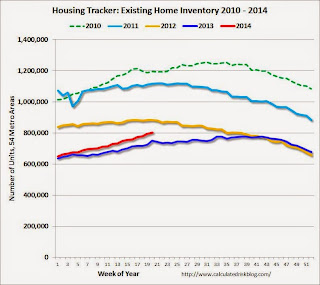
This graph shows the Housing Tracker reported weekly inventory for the 54 metro areas for 2010, 2011, 2012, 2013 and 2014.
In 2011 and 2012, inventory only increased slightly early in the year and then declined significantly through the end of each year.
In 2013 (Blue), inventory increased for most of the year before declining seasonally during the holidays. Inventory in 2013 finished up 2.7% YoY compared to 2012.
Inventory in 2014 (Red) is now 6.8% above the same week in 2013.
Inventory is still very low - still below the level in 2012 (yellow) when prices started increasing - but this increase in inventory should slow house price increases.
Note: One of the key questions for 2014 will be: How much will inventory increase? My guess is inventory will be up 10% to 15% year-over-year by the end of 2014 (inventory would still be below normal).
CoreLogic on Housing: "Cash Sales Share Shows Clear Downward Year-Over-Year Trend"
by Calculated Risk on 5/19/2014 12:05:00 PM
From CoreLogic: Cash Sales Made up 40 Percent of Total Home Sales in February
Cash sales made up 40.2 percent of total home sales in February 2014, down from 43.7 percent the previous year and 40.8 percent the previous month. Cash sales share comparisons should be made on a year-over-year basis due to the seasonal nature of the housing market , and by that measurement, the trend in cash sales is clearly down. Prior to the housing crisis, the cash sales share of total home sales averaged approximately 25 percent. The peak occurred in January 2011, when cash transactions made up 46.2 percent of total home sales.Reports that cash sales were up sharply in 2014 were incorrect. This fits with data from Tom Lawler.
And a post from Sam Khater at CoreLogic: REO Inventory Rising Once Again
After reaching a trough in August of 2013 of 375,000 properties, the number of real estate owned (REO) properties increased 15 percent to 430,000 as of March 2014 (Figure 1). The increase in REO properties was broad based, rising in 46 states. While the increase was moderate nationally, some states had large increases. Idaho led the way with the stock of REO properties nearly doubling between August 2013 and March 2014. Maryland had the 2nd largest increase in the number of REO properties, which increased 78 percent, followed by Nevada (up 70 percent), Oregon (up 47 percent) and North Dakota (up 42 percent).
The rise in REOs across most states reflects several inter-related factors ...
 This graph from CoreLogic shows the recent increase in REOs.
Note: The number of REOs at Fannie and Freddie was down slightly in Q1, but has increased in recent quarters. The FDIC reported a slight decrease in REOs in Q4 (dollars). So most of the recent increase in REOs reported by CoreLogic was probably due to private label (the worst of the worst).
LA area Port Traffic: Up year-over-year in April
by Calculated Risk on 5/19/2014 11:08:00 AM
Container traffic gives us an idea about the volume of goods being exported and imported - and possibly some hints about the trade report for April since LA area ports handle about 40% of the nation's container port traffic.
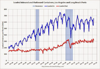
The following graphs are for inbound and outbound traffic at the ports of Los Angeles and Long Beach in TEUs (TEUs: 20-foot equivalent units or 20-foot-long cargo container).
To remove the strong seasonal component for inbound traffic, the first graph shows the rolling 12 month average.
 Click on graph for larger image.
On a rolling 12 month basis, inbound traffic was up 0.9% compared to the rolling 12 months ending in March. Outbound traffic was up 0.6% compared to 12 months ending in March.
Inbound traffic has generally been increasing, and outbound traffic has been moving up a little recently after moving sideways.
The 2nd graph is the monthly data (with a strong seasonal pattern for imports).
 Usually imports peak in the July to October period as retailers import goods for the Christmas holiday, and then decline sharply and bottom in February or March (depending on the timing of the Chinese New Year).
Imports and exports were up solidly year-over-year in April, and this was an all time high for exports for the month of April.
Imports were close to the all time high for April (set in April 2006), and it is possible that imports will be at a record high later this year.
Congratulations to Breanna Grow, the 2014 recipient of the Doris "Tanta" Dungey scholarship!
by Calculated Risk on 5/19/2014 09:34:00 AM
Congratulations to Breanna Grow, the 2014 recipient of the Doris "Tanta" Dungey scholarship!

Here is a picture of Ms. Grow with Tanta's mother (via Tanta's sister Cathy).
A happy day for Tanta's family!
Note: For new readers, Tanta was my co-blogger from from Dec 2006 through November 2008. Please see: Sad News: Tanta Passes Away, NY Times: Doris Dungey, Prescient Finance Blogger, Dies at 47 and much more at In Memoriam: Doris "Tanta" Dungey and on the scholarship.
You can make an additional contribution to the Doris Dungey Endowed Scholarship.


