by Calculated Risk on 5/19/2014 12:05:00 PM
Monday, May 19, 2014
CoreLogic on Housing: "Cash Sales Share Shows Clear Downward Year-Over-Year Trend"
From CoreLogic: Cash Sales Made up 40 Percent of Total Home Sales in February
Cash sales made up 40.2 percent of total home sales in February 2014, down from 43.7 percent the previous year and 40.8 percent the previous month. Cash sales share comparisons should be made on a year-over-year basis due to the seasonal nature of the housing market , and by that measurement, the trend in cash sales is clearly down. Prior to the housing crisis, the cash sales share of total home sales averaged approximately 25 percent. The peak occurred in January 2011, when cash transactions made up 46.2 percent of total home sales.Reports that cash sales were up sharply in 2014 were incorrect. This fits with data from Tom Lawler.
And a post from Sam Khater at CoreLogic: REO Inventory Rising Once Again
After reaching a trough in August of 2013 of 375,000 properties, the number of real estate owned (REO) properties increased 15 percent to 430,000 as of March 2014 (Figure 1). The increase in REO properties was broad based, rising in 46 states. While the increase was moderate nationally, some states had large increases. Idaho led the way with the stock of REO properties nearly doubling between August 2013 and March 2014. Maryland had the 2nd largest increase in the number of REO properties, which increased 78 percent, followed by Nevada (up 70 percent), Oregon (up 47 percent) and North Dakota (up 42 percent).
The rise in REOs across most states reflects several inter-related factors ...
 This graph from CoreLogic shows the recent increase in REOs.
Note: The number of REOs at Fannie and Freddie was down slightly in Q1, but has increased in recent quarters. The FDIC reported a slight decrease in REOs in Q4 (dollars). So most of the recent increase in REOs reported by CoreLogic was probably due to private label (the worst of the worst).
LA area Port Traffic: Up year-over-year in April
by Calculated Risk on 5/19/2014 11:08:00 AM
Container traffic gives us an idea about the volume of goods being exported and imported - and possibly some hints about the trade report for April since LA area ports handle about 40% of the nation's container port traffic.
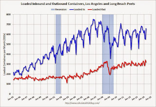
The following graphs are for inbound and outbound traffic at the ports of Los Angeles and Long Beach in TEUs (TEUs: 20-foot equivalent units or 20-foot-long cargo container).
To remove the strong seasonal component for inbound traffic, the first graph shows the rolling 12 month average.
 Click on graph for larger image.
On a rolling 12 month basis, inbound traffic was up 0.9% compared to the rolling 12 months ending in March. Outbound traffic was up 0.6% compared to 12 months ending in March.
Inbound traffic has generally been increasing, and outbound traffic has been moving up a little recently after moving sideways.
The 2nd graph is the monthly data (with a strong seasonal pattern for imports).
 Usually imports peak in the July to October period as retailers import goods for the Christmas holiday, and then decline sharply and bottom in February or March (depending on the timing of the Chinese New Year).
Imports and exports were up solidly year-over-year in April, and this was an all time high for exports for the month of April.
Imports were close to the all time high for April (set in April 2006), and it is possible that imports will be at a record high later this year.
Congratulations to Breanna Grow, the 2014 recipient of the Doris "Tanta" Dungey scholarship!
by Calculated Risk on 5/19/2014 09:34:00 AM
Congratulations to Breanna Grow, the 2014 recipient of the Doris "Tanta" Dungey scholarship!

Here is a picture of Ms. Grow with Tanta's mother (via Tanta's sister Cathy).
A happy day for Tanta's family!
Note: For new readers, Tanta was my co-blogger from from Dec 2006 through November 2008. Please see: Sad News: Tanta Passes Away, NY Times: Doris Dungey, Prescient Finance Blogger, Dies at 47 and much more at In Memoriam: Doris "Tanta" Dungey and on the scholarship.
You can make an additional contribution to the Doris Dungey Endowed Scholarship.
Sunday, May 18, 2014
Sunday Night Futures
by Calculated Risk on 5/18/2014 10:01:00 PM
From Jon Hilsenrath at the WSJ: Fed's Rate-Change System Up for Revamp
In the past, the Fed changed its benchmark interest rate—the fed funds rate—by increasing or decreasing ... reserves. ...Weekend:
...
Since the crisis, the Fed has paid banks interest on the reserves they deposit with the central bank at a rate of 0.25%. When it comes time to raise rates across the economy, the Fed will lift this rate rather than altering the fed funds rate by changing the supply of reserves.
...
The Fed could shed light on the subject Wednesday when it releases minutes of an April meeting at which discussions of the issue intensified. And New York Fed President William Dudley may address the matter in a speech Tuesday.
• Schedule for Week of May 18th
From CNBC: Pre-Market Data and Bloomberg futures: the S&P futures are up 7and DOW futures are up 48 (fair value).
Oil prices were up over the last week with WTI futures at $102.05 per barrel and Brent at $109.85 per barrel.
Below is a graph from Gasbuddy.com for nationwide gasoline prices. Nationally prices are around $3.62 per gallon (might have peaked, and slightly below the level of a year ago). If you click on "show crude oil prices", the graph displays oil prices for WTI, not Brent; gasoline prices in most of the U.S. are impacted more by Brent prices.
| Orange County Historical Gas Price Charts Provided by GasBuddy.com |
Quarterly Housing Starts by Intent, and compared to New Home Sales
by Calculated Risk on 5/18/2014 04:27:00 PM
In addition to housing starts for April, the Census Bureau also released the Q1 "Started and Completed by Purpose of Construction" report last week.
It is important to remember that we can't directly compare single family housing starts to new home sales. For starts of single family structures, the Census Bureau includes owner built units and units built for rent that are not included in the new home sales report. For an explanation, see from the Census Bureau: Comparing New Home Sales and New Residential Construction
We are often asked why the numbers of new single-family housing units started and completed each month are larger than the number of new homes sold. This is because all new single-family houses are measured as part of the New Residential Construction series (starts and completions), but only those that are built for sale are included in the New Residential Sales series.However it is possible to compare "Single Family Starts, Built for Sale" to New Home sales on a quarterly basis.
The quarterly report released last week showed there were 103,000 single family starts, built for sale, in Q1 2014, and that was below the 107,000 new homes sold for the same quarter, so inventory decreased slightly in Q1 (Using Not Seasonally Adjusted data for both starts and sales).
The first graph shows quarterly single family starts, built for sale and new home sales (NSA).
 Click on graph for larger image.
In 2005, and most of 2006, starts were higher than sales, and inventories of new homes increased. The difference on this graph is pretty small, but the builders were starting about 30,000 more homes per quarter than they were selling (speculative building), and the inventory of new homes soared to record levels. Inventory of under construction and completed new home sales peaked at 477,000 in Q3 2006.
In 2008 and 2009, the home builders started far fewer homes than they sold as they worked off the excess inventory that they had built up in 2005 and 2006.
Now it looks like builders are generally starting about the same number of homes that they are selling, and the inventory of under construction and completed new home sales is still very low.
Note: new home sales are reported when contracts are signed, so it is appropriate to compare sales to starts (as opposed to completions). This is not perfect because of the handling of cancellations, but it does suggest the builders are keeping inventories under control.
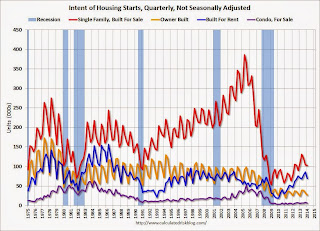
The second graph shows the NSA quarterly intent for four start categories since 1975: single family built for sale, owner built (includes contractor built for owner), starts built for rent, and condos built for sale.
 Single family starts built for sale were down about 4% compared to Q1 2013 (however starts increased sharply in April).
 Owner built starts were up 8% year-over-year. And condos built for sale are just above the record low.
The 'units built for rent' has increased significantly, and were up 20% year-over-year in Q1.


