by Calculated Risk on 4/29/2014 12:04:00 PM
Tuesday, April 29, 2014
NMHC Survey: Apartment Market Conditions Tighter in April 2014
From the National Multi Housing Council (NMHC): Overbuilding Overblown? Apartment Markets Expand in April NMHC Quarterly Survey
Apartment markets rebounded from a soft January, with all four indexes above the breakeven level of 50 in the latest National Multifamily Housing Council (NMHC) Quarterly Survey of Apartment Market Conditions. Last year’s concerns of overbuilding or lack of capital have largely eased, reflected in market tightness (56), sales volume (52), equity financing (53) and debt financing (63) all above 50 for the first time since April 2013.
“Supply appears to have ramped up enough to meet approximate ongoing demand with few, if any, signs of irrational exuberance,” said NMHC Senior Vice President of Research and Chief Economist Mark Obrinsky. “A handful of submarkets are facing a temporary surge in new deliveries that may put downward pressure on occupancy rates or rent growth. However, increased development costs could well keep a lid on new supply.”
...
The Market Tightness Index rose from 41 to 56. Almost half (47 percent) of respondents reported unchanged conditions, and approximately one-third (32 percent) saw conditions as tighter than three months ago, in contrast with January’s survey, where almost one-third saw conditions as looser than three months ago. This is the first time the index has indicated overall improving conditions since July 2013.
emphasis added

Click on graph for larger image.
This graph shows the quarterly Apartment Tightness Index. Any reading above 50 indicates tighter conditions from the previous quarter. The quarterly increase was small, but indicates tighter market conditions.
As I've mentioned before, this index helped me call the bottom for effective rents (and the top for the vacancy rate) early in 2010. This survey has been bouncing around 50 - and now suggests vacancy rates might be close to a bottom.
HVS: Q1 2014 Homeownership and Vacancy Rates
by Calculated Risk on 4/29/2014 10:17:00 AM
The Census Bureau released the Housing Vacancies and Homeownership report for Q1 2014 this morning.
This report is frequently mentioned by analysts and the media to track the homeownership rate, and the homeowner and rental vacancy rates. However, there are serious questions about the accuracy of this survey.
This survey might show the trend, but I wouldn't rely on the absolute numbers. The Census Bureau is investigating the differences between the HVS, ACS and decennial Census, and analysts probably shouldn't use the HVS to estimate the excess vacant supply or household formation, or rely on the homeownership rate,except as a guide to the trend.
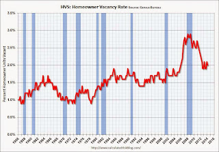
 Click on graph for larger image.
The Red dots are the decennial Census homeownership rates for April 1st 1990, 2000 and 2010. The HVS homeownership rate decreased to 64.8% in Q1, from 65.2% in Q4.
I'd put more weight on the decennial Census numbers - and given changing demographics, the homeownership rate is probably close to a bottom.
 The HVS homeowner vacancy decreased to 2.0% in Q1.
It isn't really clear what this means. Are these homes becoming rentals?
Once again - this probably shows that the general trend is down, but I wouldn't rely on the absolute numbers.
 The rental vacancy rate increased slightly in Q1 to 8.3% from 8.2% in Q4.
I think the Reis quarterly survey (large apartment owners only in selected cities) is a much better measure of the rental vacancy rate - and Reis reported that the rental vacancy rate is at the lowest level since 2001 - and might be close to a bottom.
The quarterly HVS is the most timely survey on households, but there are many questions about the accuracy of this survey. Unfortunately many analysts still use this survey to estimate the excess vacant supply. However this does suggest that most of the bubble excess is behind us.
Case-Shiller: Comp 20 House Prices increased 12.9% year-over-year in February
by Calculated Risk on 4/29/2014 09:00:00 AM
S&P/Case-Shiller released the monthly Home Price Indices for February ("February" is a 3 month average of December, January and February prices).
This release includes prices for 20 individual cities, and two composite indices (for 10 cities and 20 cities).
Note: Case-Shiller reports Not Seasonally Adjusted (NSA), I use the SA data for the graphs.
From S&P: Home Prices Defy Weak Sales Numbers According to the S&P/Case-Shiller Home Price Indices
Data through February 2014, released today by S&P Dow Jones Indices for its S&P/Case-Shiller1 Home Price Indices, the leading measure of U.S. home prices, show that the annual rates of gain slowed for the 10-City and 20-City Composites. The Composites posted 13.1% and 12.9% in the twelve months ending February 2014.
Both Composites remained relatively unchanged month-over-month. Thirteen of the twenty cities declined in February. Cleveland had the largest decline of 1.6% followed by Chicago and Minneapolis at -0.9%. Las Vegas posted -0.1%, marking its first decline in almost two years. Tampa showed its largest decline of 0.7% since January 2012.
“Prices remained steady from January to February for the two Composite indices,” says David M. Blitzer, Chairman of the Index Committee at S&P Dow Jones Indices. “The annual rates cooled the most we’ve seen in some time. The three California cities and Las Vegas have the strongest increases over the last 12 months as the West continues to lead. Denver and Dallas remain the only cities which have reached new post-crisis price peaks. The Northeast with New York, Washington and Boston are seeing some of the slowest year-over-year gains. However, even there prices are above their levels of early 2013. On a month-to-month basis, there is clear weakness. Seasonally adjusted data show prices rose in 19 cities, but a majority at a slower pace than in January.
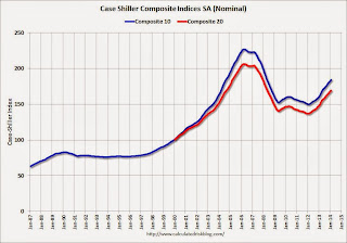
 Click on graph for larger image.
 The first graph shows the nominal seasonally adjusted Composite 10 and Composite 20 indices (the Composite 20 was started in January 2000).
The Composite 10 index is off 18.9% from the peak, and up 0.9% in February (SA). The Composite 10 is up 22.8% from the post bubble low set in Jan 2012 (SA).
The Composite 20 index is off 18.1% from the peak, and up 0.8% (SA) in February. The Composite 20 is up 23.4% from the post-bubble low set in Jan 2012 (SA).
 The second graph shows the Year over year change in both indices.
The Composite 10 SA is up 13.1% compared to February 2013.
The Composite 20 SA is up 12.9% compared to February 2013.
Prices increased (SA) in 19 of the 20 Case-Shiller cities in February seasonally adjusted. (Prices increased in 7 of the 20 cities NSA) Prices in Las Vegas are off 44.5% from the peak, and prices in Denver and Dallas are at new highs (SA).
This was at the consensus forecast for a 13.0% YoY increase. I'll have more on prices later.
Monday, April 28, 2014
Tuesday: Case-Shiller House Prices
by Calculated Risk on 4/28/2014 07:15:00 PM
Here is another graphic of changing demographics: The Next America. Some people look at this graphic and see the need to support an aging population - I look at this graphic, and I see one of the wonders of the 20th Century (increased life expectancy) - I also see that soon (by 2020) all of the largest cohorts will be under 40!
For Tuesday ... just wondering ... Will S&P post the press release online on a timely basis? And will the S&P website crash again?
Tuesday:
• At 9:00 AM ET, S&P/Case-Shiller House Price Index for February. Although this is the February report, it is really a 3 month average of December, January and February. The consensus is for a 13.0% year-over-year increase in the Composite 20 index (NSA) for February. The Zillow forecast is for the Composite 20 to increase 12.8% year-over-year, and for prices to increase 0.6% month-to-month seasonally adjusted.
• At 10:00 AM, Conference Board's consumer confidence index for April. The consensus is for the index to increase to 83.0 from 82.3.
• Also at 10:00 AM, the Q1 Housing Vacancies and Homeownership report from the Census Bureau. This report is frequently mentioned by analysts and the media to report on the homeownership rate, and the homeowner and rental vacancy rates. However, this report doesn't track with other measures (like the decennial Census and the ACS).
Weekly Update: Housing Tracker Existing Home Inventory up 8.2% year-over-year on April 28th
by Calculated Risk on 4/28/2014 04:08:00 PM
Here is another weekly update on housing inventory ...
There is a clear seasonal pattern for inventory, with the low point for inventory in late December or early January, and then usually peaking in mid-to-late summer.
The Realtor (NAR) data is monthly and released with a lag (the most recent data was for March). However Ben at Housing Tracker (Department of Numbers) has provided me some weekly inventory data for the last several years.
 Click on graph for larger image.
This graph shows the Housing Tracker reported weekly inventory for the 54 metro areas for 2010, 2011, 2012, 2013 and 2014.
In 2011 and 2012, inventory only increased slightly early in the year and then declined significantly through the end of each year.
In 2013 (Blue), inventory increased for most of the year before declining seasonally during the holidays. Inventory in 2013 finished up 2.7% YoY compared to 2012.
Inventory in 2014 (Red) is now 8.2% above the same week in 2013.
Inventory is still very low - still below the level in 2012 (yellow) when prices started increasing - but this increase in inventory should slow house price increases.
Note: One of the key questions for 2014 will be: How much will inventory increase? My guess is inventory will be up 10% to 15% year-over-year by the end of 2014 (inventory would still be below normal).


