by Calculated Risk on 6/26/2013 07:59:00 AM
Wednesday, June 26, 2013
MBA: Mortgage Refinance Applications Decline as Mortgage Rates Increase
From the MBA: Mortgage Applications Decrease in Latest MBA Weekly Survey
The Refinance Index decreased 5 percent from the previous week to the lowest level since November 2011. The seasonally adjusted Purchase Index increased 2 percent from one week earlier.
...
“Interest rates moved up sharply following the Federal Reserve press conference last Wednesday where it was indicated that the Fed could begin tapering their asset purchases later this year,” said Mike Fratantoni, MBA’s Vice President of Research and Economics. “Mortgage rates increased by the most in a single week since 2011, and refinance application volume dropped to its lowest level in almost two years. However, applications for conventional purchase loans picked up by more than 3 percent over the week, and total purchase applications were 16 percent higher than one year ago, indicating that homebuyers are not yet dissuaded by the increase in mortgage rates. Government purchase applications dropped again, likely a function of the recent increase in FHA mortgage insurance premiums.”
...
The average contract interest rate for 30-year fixed-rate mortgages with conforming loan balances ($417,500 or less) increased to 4.46 percent, the highest rate since August 2011, from 4.17 percent, with points decreasing to 0.35 from 0.41 (including the origination fee) for 80 percent loan-to-value ratio (LTV) loans.
emphasis added
 Click on graph for larger image.
The first graph shows the refinance index.
With 30 year mortgage rates near 4.5%, refinance activity has fallen sharply, decreasing in 6 of the last 7 weeks.
This index is down 42% over the last seven weeks.
 The second graph shows the MBA mortgage purchase index. The 4-week average of the purchase index has generally been trending up over the last year, and the 4-week average of the purchase index is up almost 10% from a year ago.
Tuesday, June 25, 2013
Wednesday: Q1 GDP (3rd estimate), MBA Mortgage Purchase Index
by Calculated Risk on 6/25/2013 10:13:00 PM
Here is a minor indicator that I follow that is at a new record high, from ATA: ATA Truck Tonnage Index Surged 2.3% in May
The American Trucking Associations’ advanced seasonally adjusted (SA) For-Hire Truck Tonnage Index jumped 2.3% in May after falling 0.2% in April. ... In May, the SA index equaled 126.0 (2000=100) versus 123.2 in April. May 2013 is the highest level on record, surpassing the previous high in December 2011(124.3). Compared with May 2012, the SA index surged 6.7%, which is the largest year-over-year gain since December 2011.
“After bouncing around in a fairly tight band during the previous three months, tonnage skyrocketed in May,” ATA Chief Economist Bob Costello said. Some of the increase is attributable to factory output rising in May for the first time since February (+0.2%) and retail sales performing stronger than expected in May (+0.6%). Costello added, “The 6.8% surge in new housing starts during May obviously pushed tonnage up as home construction generates a significant amount of truck tonnage.”
emphasis added
 Click on graph for larger image.
Here is a long term graph that shows ATA's For-Hire Truck Tonnage index.
The dashed line is the current level of the index.
The index is fairly noisy, but the index is at a record high and is up solidly year-over-year.
Wednesday:
• At 7:00 AM ET, the Mortgage Bankers Association (MBA) will release the results for the mortgage purchase applications index. Expect a spike in mortgage rates, and a decline in refinance activity.
• At 8:30 AM, the third estimate of Q1 GDP will be released by the BEA. The consensus is that real GDP increased 2.4% annualized in Q1, unrevised from the 2nd estimate.
Real House Prices, Price-to-Rent Ratio, City Prices relative to 2000
by Calculated Risk on 6/25/2013 03:32:00 PM
Case-Shiller, CoreLogic and others report nominal house prices, and it is also useful to look at house prices in real terms (adjusted for inflation) and as a price-to-rent ratio.
As an example, if a house price was $200,000 in January 2000, the price would be close to $275,000 today adjusted for inflation. This is why economists also look at real house prices (inflation adjusted).
Note: If were I "wishcasting" as opposed to "forecasting", I'd like to see real house prices mostly move sideways for a few years. But given the low level of inventory, pent up demand, significant investor buying, and some bounce off the bottom in certain areas - real prices have been increasing fairly rapidly over the last year. I expect more inventory to come on the market and for price increases to slow.
Earlier: Case-Shiller: Case-Shiller: Comp 20 House Prices increased 12.1% year-over-year in April
Nominal House Prices
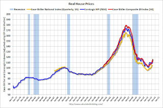
 The first graph shows the quarterly Case-Shiller National Index SA (through Q1 2013), and the monthly Case-Shiller Composite 20 SA and CoreLogic House Price Indexes (through March) in nominal terms as reported.
In nominal terms, the Case-Shiller National index (SA) is back to Q3 2003 levels (and also back up to Q4 2008), and the Case-Shiller Composite 20 Index (SA) is back to February 2004 levels, and the CoreLogic index (NSA) is back to April 2004.
Real House Prices
 The second graph shows the same three indexes in real terms (adjusted for inflation using CPI less Shelter). Note: some people use other inflation measures to adjust for real prices.
In real terms, the National index is back to Q2 2000 levels, the Composite 20 index is back to September 2001, and the CoreLogic index back to October 2001.
In real terms, house prices are back to early '00s levels.
Price-to-Rent
In October 2004, Fed economist John Krainer and researcher Chishen Wei wrote a Fed letter on price to rent ratios: House Prices and Fundamental Value. Kainer and Wei presented a price-to-rent ratio using the OFHEO house price index and the Owners' Equivalent Rent (OER) from the BLS.
 Here is a similar graph using the Case-Shiller National, Composite 20 and CoreLogic House Price Indexes.
This graph shows the price to rent ratio (January 1998 = 1.0).
On a price-to-rent basis, the Case-Shiller National index is back to Q2 2000 levels, the Composite 20 index is back to February 2002 levels, and the CoreLogic index is back to April 2002.
In real terms - and as a price-to-rent ratio - prices are mostly back to early 2000 levels.
Nominal Prices: Cities relative to Jan 2000
 The last graph shows the bubble peak, the post bubble minimum, and current nominal prices relative to January 2000 prices for all the Case-Shiller cities in nominal terms.
As an example, at the peak, prices in Phoenix were 127% above the January 2000 level. Then prices in Phoenix fell slightly below the January 2000 level, and are now up 34% above January 2000. Some cities - like Denver and Dallas - are at new highs. Detroit prices are still below the January 2000 level.
A few comments on House Prices and New Home Sales
by Calculated Risk on 6/25/2013 12:10:00 PM
First on house prices, Zillow's chief economist Stan Humphries wrote this morning:
“Today’s Case-Shiller numbers may reflect where the housing market has been in some of the frothier metros, but they are not indicative of where it’s headed. The housing market worm has turned over the past few weeks – inventory levels are beginning to show signs of easing, and mortgage interest rates are creeping up. Going forward, both of these factors will help mitigate extreme price spikes caused by very strong housing demand and very low housing supply,” said Zillow Chief Economist Dr. Stan Humphries. “Runaway appreciation in many of the large, coastal metros that form the backbone of the Case-Shiller indices will begin to moderate. Home value appreciation in some of these areas will have to slow down, or potentially fall, as higher bottom-line prices are no longer masked by rock-bottom mortgage rates. In general, the national housing recovery is strong and sustainable, but pockets of volatility will emerge as local fundamentals shift. Buyers expecting home values to continue rising at this pace indefinitely may be in for a shock.”I agree with Humphries view on prices. I've been tracking inventory weekly, and it appears inventory levels are starting to increase (even after seasonal adjustment). Also I've heard reports from several real estate agents that the market has "slowed" (fewer multiple offer situations), even before mortgage rates increased. I also think Humphries is correct that this will slow down price increases going forward.
emphasis added
However I don't think this will impact the ongoing recovery in residential investment (housing starts and new home sales). The new home sales report this morning was solid with sales above expectations and significant upward revisions to prior months. The key points right now are that sales are increasing and will probably continue to increase for some time.
Now that we have five months of data for 2013, one way to look at the growth rate is to use the "not seasonally adjusted" (NSA) year-to-date data. According to the Census Bureau, there were 202 thousand new homes sold in 2013 through May, up about 29% from the 156 thousand sold during the same period in 2012. That is a very solid increase in sales, and this was the highest sales for these months since 2008.
Note: For 2013, estimates are sales will increase to around 450 to 460 thousand, or an increase of around 22% to 25% on an annual basis from the 369 thousand in 2012.
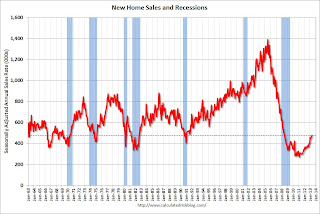
Although there has been a large increase in the sales rate, sales are just above the lows for previous recessions. This suggests significant upside over the next few years. Based on estimates of household formation and demographics, I expect sales to increase to 750 to 800 thousand over the next several years - substantially higher than the current sales rate.
And an important point worth repeating every month: Housing is historically the best leading indicator for the economy, and this is one of the reasons I think The future's so bright, I gotta wear shades.
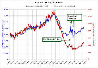
And here is another update to the "distressing gap" graph that I first started posting over four years ago to show the emerging gap caused by distressed sales. Now I'm looking for the gap to start to close over the next few years.
 Click on graph for larger image.
The "distressing gap" graph shows existing home sales (left axis) and new home sales (right axis) through May 2013. This graph starts in 1994, but the relationship has been fairly steady back to the '60s.
Following the housing bubble and bust, the "distressing gap" appeared mostly because of distressed sales. The flood of distressed sales kept existing home sales elevated, and depressed new home sales since builders weren't able to compete with the low prices of all the foreclosed properties.
I don't expect much of an increase in existing home sales (distressed sales will slowly decline and be offset by more conventional sales). But I do expect this gap to continue to close - mostly from an increase in new home sales.
 Another way to look at this is a ratio of existing to new home sales.
This ratio was fairly stable from 1994 through 2006, and then the flood of distressed sales kept the number of existing home sales elevated and depressed new home sales. (Note: This ratio was fairly stable back to the early '70s, but I only have annual data for the earlier years).
In general the ratio has been trending down, and I expect this ratio to trend down over the next several years as the number of distressed sales declines and new home sales increase.
Note: Existing home sales are counted when transactions are closed, and new home sales are counted when contracts are signed. So the timing of sales is different.
New Home Sales at 476,000 SAAR in May
by Calculated Risk on 6/25/2013 10:00:00 AM
The Census Bureau reports New Home Sales in May were at a seasonally adjusted annual rate (SAAR) of 476 thousand. This was up from 466 thousand SAAR in April (April sales were revised up from 454 thousand).
February sales were revised up from 429 thousand to 445 thousand, and March sales were revised up from 444 thousand to 451 thousand. Very strong upward revisions.
The first graph shows New Home Sales vs. recessions since 1963. The dashed line is the current sales rate.
"Sales of new single-family houses in May 2013 were at a seasonally adjusted annual rate of 476,000, according to estimates released jointly today by the U.S. Census Bureau and the Department of Housing and Urban Development. This is 2.1 percent above the revised April rate of 466,000 and is 29.0 percent above the May 2012 estimate of 369,000."
 Click on graph for larger image in graph gallery.
The second graph shows New Home Months of Supply.
The months of supply increased in May to 4.1 months from 4.0 months in April.
The all time record was 12.1 months of supply in January 2009.
 This is now in the normal range (less than 6 months supply is normal).
"The seasonally adjusted estimate of new houses for sale at the end of May was 161,000. This represents a supply of 4.1 months at the current sales rate."On inventory, according to the Census Bureau:
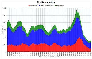
"A house is considered for sale when a permit to build has been issued in permit-issuing places or work has begun on the footings or foundation in nonpermit areas and a sales contract has not been signed nor a deposit accepted."Starting in 1973 the Census Bureau broke this down into three categories: Not Started, Under Construction, and Completed.
 This graph shows the three categories of inventory starting in 1973.
The inventory of completed homes for sale is at a record low. The combined total of completed and under construction is also just above the record low.
The last graph shows sales NSA (monthly sales, not seasonally adjusted annual rate).
In May 2013 (red column), 45 thousand new homes were sold (NSA). Last year 35 thousand homes were sold in May. The high for May was 120 thousand in 2005, and the low for May was 26 thousand in 2010.

This was above expectations of 460,000 sales in May, and a very solid report, especially with all the upward revision to previous months. I'll have more later today.


