by Calculated Risk on 10/11/2012 08:30:00 AM
Thursday, October 11, 2012
Weekly Initial Unemployment Claims declined sharply to 339,000
The DOL reports:
In the week ending October 6, the advance figure for seasonally adjusted initial claims was 339,000, a decrease of 30,000 from the previous week's revised figure of 369,000. The 4-week moving average was 364,000, a decrease of 11,500 from the previous week's revised average of 375,500.The previous week was revised up from 367,000.
The following graph shows the 4-week moving average of weekly claims since January 2000.

Click on graph for larger image.
The dashed line on the graph is the current 4-week average. The four-week average of weekly unemployment claims declined sharply to 364,000. This is just above the cycle low for the 4-week average of 363,000 in March.
Weekly claims were lower than the consensus forecast of 370,000.

And here is a long term graph of weekly claims:
Mostly moving sideways this year, but starting to decline again recently.
Wednesday, October 10, 2012
Thursday: Trade Deficit, Unemployment Claims
by Calculated Risk on 10/10/2012 09:56:00 PM
From the Financial Times Alphaville: S&P downgrades Spain
On Oct. 10, 2012, Standard & Poor’s Ratings Services lowered its long-term sovereign credit rating on the Kingdom of Spain to ‘BBB-’ from ‘BBB+’. At the same time, we lowered the short-term sovereign credit rating to ‘A-3′ from A-2′. The outlook on the long-term rating is negative.Alphaville has the entire S&P press release.
And from the LA Times: Gasoline prices fall for first time in a week, barely
Motorists in the state paid an average of $4.666 for a gallon of regular gasoline Wednesday, down half a cent overnight, according to AAA's daily survey of fuel prices.Ouch!
On Oct. 1, the day Exxon Mobil Corp.'s Torrance refinery went out of service temporarily because of a power outage, the average was $4.168. The average leaped to record levels, peaking Monday at $4.671, or 50 cents higher than a week earlier.
On Thursday:
• At 8:30 AM, the initial weekly unemployment claims report will be released. The consensus is for claims to increase to 370 thousand from 367 thousand.
• Also at 8:30 AM, the Trade Balance report for August will be released by the Census Bureau. The consensus is for the U.S. trade deficit to increase to $44.0 billion in August, up from from $42.0 billion in July. Export activity to Europe will be closely watched due to economic weakness.
• Also at 8:30 AM, Import and Export Prices for September will be released. The consensus is a for a 0.7% increase in import prices.
• At 10:00 AM, Fed Governor Jeremy Stein will speak, "Evaluating Large-Scale Asset Purchases", At the Brookings Institution Discussion, Washington, D.C.
Another question for the October economic prediction contest (Note: You can now use Facebook, Twitter, or OpenID to log in).
CoStar: Commercial Real Estate prices increase in August
by Calculated Risk on 10/10/2012 05:50:00 PM
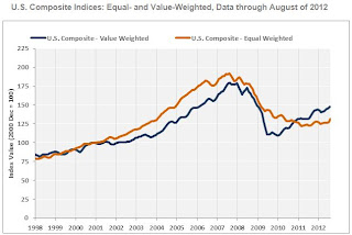
The two broadest measures of aggregate pricing for commercial properties within the CCRSI — the U.S. Value-Weighted Composite Index and the U.S. Equal-Weighted Composite Index — each posted significant gains in August 2012.
The U.S. Value-Weighted Composite Index, which weights each repeat-sale by transaction size or value and therefore is heavily influenced by larger transactions, reached its highest level since early 2009. It has now improved by a cumulative 34.1% since the start of 2010, reflecting strong investor demand for primary gateway metro areas and institutional-grade multifamily assets that have been at the forefront of the pricing recovery for commercial property.
The rate of improvement in the U.S. Equal-Weighted Composite Index, which weights each repeat-sale equally and therefore reflects the influence of the more numerous smaller transactions, has accelerated. The 7.6% year-over–year increase of the Equal-Weighted Composite Index in August 2012 was the largest such gain since August 2006. Despite the increase, cumulative gains in the Equal-Weighted Index have lagged behind those in the Value-Weighted Index, reflecting a slower rate of recovery of tenant demand in the General Commercial segment.
Aggregate net absorption of available space for three major property types—office, retail, and industrial—slowed during the third quarter of 2012 to less than one third of levels in the second quarter of 2012 and less than half of that in the first quarter of this year. The slowdown in leasing activity stems mainly from negative absorption in the General Commercial segment. Should this drawback in tenant demand be sustained by further macroeconomic weakness, near-term transaction volume and pricing could suffer.
The percentage of commercial property selling at distressed prices in August 2012 was the lowest since mid-2009.
 Click on graph for larger image.
This graph from CoStar shows the Value-Weighted and Equal-Weighted indexes. As CoStar noted, the Value-Weighted index is up 34.1% from the bottom (showing the demand for higher end properties), however the Equal-Weighted index is only up 8.2% from the bottom.
Note: These are repeat sales indexes - like Case-Shiller for residential - but this is based on far fewer pairs.
Fed's Beige Book: Economic activity "expanded modestly", Residential real estate showed "widespread improvement"
by Calculated Risk on 10/10/2012 02:00:00 PM
Reports from the twelve Federal Reserve Districts indicated that economic activity generally expanded modestly since the last report.And on real estate:
Consumer spending was generally reported to be flat to up slightly since the last report. A number of Districts characterized retail sales as expanding at a modest pace ...
Residential real estate showed widespread improvement since the last report. All twelve Districts reported that existing home sales strengthened, in some cases substantially. Selling prices were steady or rising. Boston, Atlanta, Minneapolis, Dallas and San Francisco noted declining or tight inventories, which have put upward pressure on prices. Modest price increases were reported in the New York, Richmond, Chicago, and Kansas City Districts. New York and Richmond reported relatively strong demand at the high and low ends of the market, whereas Philadelphia and Kansas City noted relative strength for mid-range homes; Boston indicated a shift in the mix toward lower or medium priced homes. New home construction and sales were more mixed but still mostly improved: increased construction and/or new home sales were reported in the Atlanta, Chicago, St. Louis, Kansas City, Dallas and San Francisco Districts. Multi-family construction, in particular, was described as robust in the Boston, New York, Atlanta, Chicago, and Dallas Districts. Residential rental markets continued to be characterized as strong, even in the New York and Atlanta Districts where rents increased somewhat less strongly than in recent months."Prepared at the Federal Reserve Bank of New York and based on information collected on or before September 28, 2012."
Commercial real estate markets were mixed since the last report. Office markets showed signs of softening in the northeastern Districts--Boston, New York and Philadelphia--with New York remarking on substantial new supply coming on the market in early 2013. In contrast, Atlanta, Minneapolis and San Francisco noted some improvement, while most other Districts reported stable or mixed market conditions. Industrial markets showed some strength in the New York, Philadelphia, Cleveland and Atlanta Districts, while conditions were described as sluggish in Richmond and mixed in St. Louis. Atlanta noted weakness in the market for retail space. Commercial construction activity was also mixed: Atlanta, Minneapolis and Kansas City reported some improvement in non-residential construction activity, while Richmond and Dallas noted that activity was sluggish.
More sluggish "modest" growth. And more positive comments on residential real estate ...
Further Discussion on Labor Force Participation Rate
by Calculated Risk on 10/10/2012 12:26:00 PM
On a Monday I wrote Understanding the Decline in the Participation Rate. Here are a few definitions - and a couple of graphs - that might help understand the issues.
Definitions from the BLS:
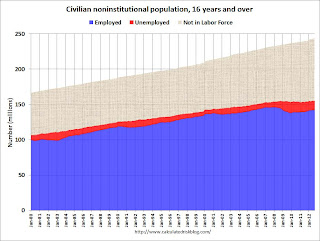
Civilian noninstitutional population: "consists of persons 16 years of age and older residing in the 50 States and the District of Columbia who are not inmates of institutions (for example, penal and mental facilities and homes for the aged) and who are not on active duty in the Armed Forces". If you look at the first graph below, the total of the Blue, Red, and light brown areas is the Civilian noninstitutional population.
"The civilian labor force consists of all persons classified as employed or unemployed". This is Blue and Red combined on the first graph.
"The labor force participation rate represents the proportion of the civilian noninstitutional population that is in the labor force." So this is Blue and Red, divided by all areas combined.
"The employment-population ratio represents the proportion of the civilian noninstitutional population that is employed." This is Blue divided by the total area.
"The unemployment rate is the number of unemployed as a percent of the civilian labor force." This is Red divided by Red and Blue combined. This is the REAL unemployment rate (some claim U-6 is the "real rate", but that is nonsense - although U-6 is an alternative measure of underemployment, it includes many people working part time).
 Click on graph for larger image.
There are some bumps in the total area - usually when there is a decennial census. These are due to changes in population controls.
Note that the Blue area collapsed in 2008 and early 2009, and started increasing in 2010. This shows the increase in employment over the last few years. Over the last few years, the red area (unemployment) has been decreasing.
However the combined area, the civilian labor force, has not increased much - even though the civilian noninstitutional population has been increasing. Some people argue that this evidence of a large number of people who left the labor force because of the weak labor market - and that the actual unemployment rate should be much higher than 7.8%.
However, as I noted on Monday, some decrease in the labor force participation rate was expected, and it appears most of the decline in the participation rate can be explained by demographic shifts.
 The second graph shows the number of people in the US by age group from both the 2000 and 2010 decennial Census.
This graph shows two key shifts. First, baby boomers now moving into lower participation rate age groups (look at increase in the 55-to-59 and 60-to-64 groups from 2000 to 2010).
A second key demographic is the significant increase in people in the 15-to-19 and 20-to-24 age groups. These groups have lower participation rates usually because of school enrollment - and enrollment has been increasing.
Taken together, it is clear why the labor force hasn't increase as quickly as the civilian noninstitutional population, and therefore, why a decline in the labor force participation rate was expected.


