by Calculated Risk on 8/10/2011 04:14:00 PM
Wednesday, August 10, 2011
Dow Down 500+, S&P 500 down 4.4%
This was the third big down day this month ...
From the WSJ: Stocks Slide 4.6%, Erasing Tuesday Gains
The Dow Jones Industrial Average fell 520.29 points, or 4.6%, to 10719.48, while the Standard & Poor's 500-stock index slid 51.83 points, or 4.4%, to 1120.70 and the Nasdaq Composite lost 101.47 points, or 4.1%, to 2381.05.The table below shows the largest down days on the S&P 500 since 1950.
... In a reflection of investor concern, the CBOE Market Volatility Index, the "fear gauge" known as the VIX, surged 18%
| Largest S&P 500 One Day Percentage Declines since 1950 | ||||||
|---|---|---|---|---|---|---|
| Date | Percent Decline | Close | Previous Close | Six Months Later | ||
| 1 | 10/19/1987 | -20.5% | 224.84 | 282.7 | 15.3% | |
| 2 | 10/15/2008 | -9.0% | 907.84 | 998.01 | -4.7% | |
| 3 | 12/1/2008 | -8.9% | 816.21 | 896.24 | 15.7% | |
| 4 | 9/29/2008 | -8.8% | 1106.42 | 1213.27 | -28.8% | |
| 5 | 10/26/1987 | -8.3% | 227.67 | 248.22 | 15.3% | |
| 6 | 10/9/2008 | -7.6% | 909.92 | 984.94 | -5.9% | |
| 7 | 10/27/1997 | -6.9% | 876.99 | 941.64 | 23.7% | |
| 8 | 8/31/1998 | -6.8% | 957.28 | 1027.14 | 28.0% | |
| 9 | 1/8/1988 | -6.8% | 243.4 | 261.07 | 11.7% | |
| 10 | 11/20/2008 | -6.7% | 752.44 | 806.58 | 17.9% | |
| 11 | 5/28/1962 | -6.7% | 55.5 | 59.47 | 10.6% | |
| 12 | 8/8/2011 | -6.7% | 1,119.47 | 1199.38 | --- | |
| 13 | 9/26/1955 | -6.6% | 42.61 | 45.63 | 14.1% | |
| 14 | 10/13/1989 | -6.1% | 333.65 | 355.39 | 3.2% | |
| 15 | 11/19/2008 | -6.1% | 806.58 | 859.12 | 10.1% | |
| 16 | 10/22/2008 | -6.1% | 896.78 | 955.05 | -5.0% | |
| 17 | 4/14/2000 | -5.8% | 1356.56 | 1440.51 | -2.0% | |
| 18 | 10/7/2008 | -5.7% | 996.23 | 1056.89 | -18.1% | |
| 19 | 6/26/1950 | -5.4% | 18.11 | 19.14 | 10.0% | |
| 20 | 1/20/2009 | -5.3% | 805.22 | 850.12 | 18.1% | |
| 21 | 11/5/2008 | -5.3% | 952.77 | 1005.75 | -4.8% | |
| 22 | 11/12/2008 | -5.2% | 852.3 | 898.95 | 4.8% | |
| 23 | 10/16/1987 | -5.2% | 282.7 | 298.08 | -8.1% | |
| 24 | 11/6/2008 | -5.0% | 904.88 | 952.77 | 2.7% | |
| 25 | 9/17/2001 | -4.9% | 1038.77 | 1092.54 | 12.2% | |
| 26 | 2/10/2009 | -4.9% | 827.16 | 869.89 | 21.8% | |
| 27 | 9/11/1986 | -4.8% | 235.18 | 247.06 | 23.4% | |
| 28 | 8/4/2011 | -4.8% | 1200.07 | 1260.34 | --- | |
| 29 | 9/17/2008 | -4.7% | 1156.39 | 1213.6 | -31.3% | |
| 30 | 9/15/2008 | -4.7% | 1192.7 | 1251.7 | -36.8% | |
| 31 | 3/2/2009 | -4.7% | 700.82 | 735.09 | 47.1% | |
| 32 | 2/17/2009 | -4.6% | 789.17 | 826.84 | 27.2% | |
| 33 | 8/10/2011 | -4.4% | 1,120.75 | 1172.53 | --- | |
| 34 | 4/14/1988 | -4.4% | 259.75 | 271.58 | 7.0% | |
| 35 | 3/12/2001 | -4.3% | 1180.16 | 1233.42 | -8.0% | |
| 36 | 4/20/2009 | -4.3% | 832.39 | 869.6 | 31.7% | |
| 37 | 3/5/2009 | -4.3% | 682.55 | 712.87 | 46.2% | |
| 38 | 11/30/1987 | -4.2% | 230.3 | 240.34 | 10.0% | |
| 39 | 11/14/2008 | -4.2% | 873.29 | 911.29 | 4.2% | |
| 40 | 9/3/2002 | -4.2% | 878.02 | 916.07 | -6.4% | |
| 41 | 10/2/2008 | -4.0% | 1114.28 | 1161.06 | -25.1% | |
| 42 | 10/25/1982 | -4.0% | 133.32 | 138.83 | 20.3% | |
HousingTracker: Homes For Sale inventory down 13.3% Year-over-year in mid-August
by Calculated Risk on 8/10/2011 03:39:00 PM
Back in June, Tom Lawler posted on how the NAR estimates existing home inventory. The NAR does NOT aggregate data from the local boards (see Tom's post for how the NAR estimates inventory). Sometime this fall, the NAR is expected to revise down their estimates of inventory and sales for the last few years.
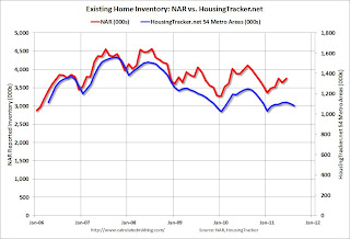
While we wait for the NAR revisions, I think the HousingTracker data that Tom mentioned might be a better estimate of changes in inventory (and always more timely). Ben at HousingTracker.net is tracking the aggregate monthly inventory for 54 metro areas.
 Click on graph for larger image in graph gallery.
This graph shows the NAR estimate of existing home inventory through June (left axis) and the HousingTracker data for the 54 metro areas through mid-August. The HousingTracker data shows a steeper decline (as mentioned above, the NAR will probably revise down their inventory estimates this summer).
 The second graph shows the year-over-year change in inventory for both the NAR and HousingTracker.
HousingTracker reported that the mid-August listings - for the 54 metro areas - declined 13.3% from last year.
Of course there is a large percentage of distressed inventory, many seriously delinquent loans and various categories of "shadow inventory" too. But the decline in listed inventory is something to watch carefully.
The QE3 Watch
by Calculated Risk on 8/10/2011 01:01:00 PM
It was obvious the Fed would not announce QE3 yesterday. Instead they announced an extended "extended period". But they also hinted at QE3 in the last couple of sentences of the statement:
The Committee discussed the range of policy tools available to promote a stronger economic recovery in a context of price stability. It will continue to assess the economic outlook in light of incoming information and is prepared to employ these tools as appropriate.That led Goldman Sachs chief economist Jan Hatzius to write last night: "QE3 Now Our Base Case"
We now see a greater-than-even chance that the FOMC will resume quantitative easing later this year or in early 2012.Last year, Fed Chairman Ben Bernanke paved the way for QE2 at the Jackson Hole economic symposium. Here is his speech from last August.
This year Bernanke will speak on August 26th at the Kansas City Economic Symposium in Jackson Hole, Wymong.
More from Hatzius:
Although QE3 is now our base case, it is not a certainty. We see three main ways in which our revised call could turn out to be incorrect. First, of course, the economy may turn out to be stronger than our forecast. ... Second, inflation might pose a higher hurdle to additional easing than we have allowed. ... Third, the anti-Fed backlash late last year might argue against further QE.Earlier Bernanke made it clear that further accommodation would require both a weaker economy and a renewed threat of deflation. Although the economy is weaker than the Fed expected, I think the Fed will wait for more evidence of a threat of deflation.
BLS: Job Openings "essentially unchanged" in June
by Calculated Risk on 8/10/2011 10:15:00 AM
From the BLS: Job Openings and Labor Turnover Summary
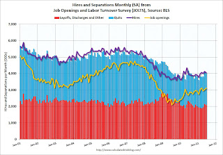
The number of job openings in June was 3.1 million, essentially unchanged from May. Although the number of job openings in June was 997,000 higher than in July 2009 (the series trough), it has been relatively flat since February 2011 and remains well below the 4.4 million openings when the recession began in December 2007.The following graph shows job openings (yellow line), hires (purple), Layoff, Discharges and other (red column), and Quits (light blue column) from the JOLTS.
Unfortunately this is a new series and only started in December 2000.
Note: The difference between JOLTS hires and separations is similar to the CES (payroll survey) net jobs headline numbers. This report is for June, the most recent employment report was for July.
 Click on graph for larger image in graph gallery.
Notice that hires (purple) and total separations (red and blue columns stacked) are pretty close each month. When the purple line is above the two stacked columns, the economy is adding net jobs - when it is below the columns, the economy is losing jobs.
In general job openings (yellow) has been trending up - and job openings increased slightly again in June - and are up about 16% year-over-year compared to June 2010.
Overall turnover is increasing too, but remains low. Quits decreased slightly in June, but have been trending up - and quits are now up about 4% year-over-year.
Ceridian-UCLA: Diesel Fuel index decreased slightly in July
by Calculated Risk on 8/10/2011 09:00:00 AM
This is the UCLA Anderson Forecast and Ceridian Corporation index using real-time diesel fuel consumption data: Pulse of Commerce Index Idles – Down 0.2 Percent in July
The Ceridian-UCLA Pulse of Commerce Index™ (PCI), issued today by the UCLA Anderson School of Management and Ceridian Corporation dipped 0.2 percent in July on a seasonally and workday adjusted basis, offsetting some of the relatively strong 1.0 percent gain posted in June.
“In July, the U.S. economy remained in ‘she loves me, she loves me not’ mode,” said Ed Leamer, chief PCI economist and director of the UCLA Anderson Forecast. “July’s result falls in the ‘she loves me not’ category and represents a continuation of the idling economic conditions that have persisted for over a year. Over this time period, bad news has been alternating with good, leaving investors and forecasters nervous and unable to identify sustainable trends.”
 Click on graph for larger image in graph gallery.
This graph shows the index since January 2000.
“Over time, the PCI has also proven to be a leading and amplified indicator of Industrial Production”, explained Craig Manson, senior vice president and Index expert for Ceridian. “For June, the PCI was anticipating Industrial Production to show modest growth of 0.17 percent. The government’s subsequent release on July 15, 2011 turned out to be 0.19 percent, which was almost identical to our forecast. This represented the fifth time in the past six months in which the monthly PCI forecast for U.S. Industrial Production was right in-line with the government’s subsequent report. Based on the weakness evident in the PCI over the last several months, our forecast calls for a flat performance in July Industrial Production when the government estimate is released on August 16.”This index has mostly been moving sideways all year. Note: This index does appear to track Industrial Production over time (with plenty of noise).
...
The Ceridian-UCLA Pulse of Commerce Index™ is based on real-time diesel fuel consumption data for over the road trucking ...


