by Calculated Risk on 8/05/2011 08:30:00 PM
Friday, August 05, 2011
Bank Failure #62: Illinois
We Shorewood like more money
Heartland, Fed say no.
by Soylent Green is People
From the FDIC: Heartland Bank and Trust Company, Bloomington, Illinois, Assumes All of the Deposits of Bank of Shorewood, Shorewood, Illinois
As of June 30, 2011, Bank of Shorewood had approximately $110.7 million in total assets and $104.0 million in total deposits. ... The FDIC estimates that the cost to the Deposit Insurance Fund (DIF) will be $25.6 million. ... Bank of Shorewood is the 62nd FDIC-insured institution to fail in the nation this year, and the sixth in Illinois.
Misc: S&P Plans U.S. Downgrade, makes math error, ECB to Buy Italian Bonds
by Calculated Risk on 8/05/2011 07:41:00 PM
A few stories ...
• From CNN: S&P rethinking planned downgrade of U.S. after White House objects
• From CNBC: ECB Agrees to Start Buying Italian Bonds on Monday: Italian Minister
• From Reuters: Italy brings forward budget plans as crisis mounts
Q2 2011 Details: Investment in Office, Mall, and Lodging, Residential Components
by Calculated Risk on 8/05/2011 04:05:00 PM
Here are the earlier employment posts (with graphs):
• July Employment Report: 117,000 Jobs, 9.1% Unemployment Rate
• Employment Summary, Part Time Workers, and Unemployed over 26 Weeks
• More Employment (Duration, Education, Diffusion Index)
• Employment graph gallery
The BEA released the underlying detail data today for the Q2 Advance GDP report. Here is a look at office, mall and lodging investment:
 Click on graph for larger image in new graph gallery.
This graph shows investment in offices, malls and lodging as a percent of GDP. Office investment as a percent of GDP peaked at 0.46% in Q1 2008 and has declined sharply to a new series low as a percent of GDP (data series starts in 1959).
Investment in multimerchandise shopping structures (malls) peaked in 2007 and has fallen by 66% (note that investment includes remodels, so this will not fall to zero). Mall investment increased slightly in Q2 (probably remodels).
The bubble boom in lodging investment was stunning. Lodging investment peaked at 0.32% of GDP in Q2 2008 and has fallen by 80%.
Notice that investment for all three categories typically falls for a year or two after the end of a recession, and then usually recovers very slowly (flat as a percent of GDP for 2 or 3 years). Something similar will probably happen again, and there will not be a recovery in these categories until the vacancy rates fall significantly.
The second graph is for Residential investment (RI) components. According to the Bureau of Economic Analysis, RI includes new single family structures, multifamily structures, home improvement, broker's commissions, and a few minor categories (dormitories, manufactured homes).
 This graph shows the various components of RI as a percent of GDP for the last 50 years. Usually the most important components are investment in single family structures followed by home improvement.
Investment in single family structures was just above the record low set in Q2 2009.
Investment in home improvement was at a $153.1 billion Seasonally Adjusted Annual Rate (SAAR) in Q2 (about 1.0% of GDP), significantly above the level of investment in single family structures of $105.8 billion (SAAR) (or 0.7% of GDP).
Brokers' commissions increased slightly in Q2, and are near the lowest level (as a percent of GDP) since the early '80s.
And investment in multifamily structures has been bouncing along at a series low for the last few quarters, although this is expected to increase this year as starts increase.
These graphs show there is currently very little investment in offices, malls and lodging - and also very little investment in most components of residential investment. For Residential Investment, I expect RI to make a positive contribution to GDP this year for the first time since 2005 - mostly because of increases in multifamily investment and home improvement.
More Employment
by Calculated Risk on 8/05/2011 01:15:00 PM
Here are the earlier employment posts (with graphs):
• July Employment Report: 117,000 Jobs, 9.1% Unemployment Rate
• Employment Summary, Part Time Workers, and Unemployed over 26 Weeks
• Employment graph gallery
And a few more graphs based on the employment report ...
 This graph shows the duration of unemployment as a percent of the civilian labor force. The graph shows the number of unemployed in four categories: less than 5 week, 6 to 14 weeks, 15 to 26 weeks, and 27 weeks or more.
Two key categories moved down in a little in July. The 27 weeks and more (the long term unemployed) declined slightly to 6.2 million workers, or 4.0% of the labor force.
Also the less than 5 weeks category declined in July after increasing in June.
 This graph shows the unemployment rate by four levels of education (all groups are 25 years and older).
Unfortunately this data only goes back to 1992 and only includes one previous recession (the stock / tech bust in 2001). Clearly education matters with regards to the unemployment rate - and it appears all four groups are generally trending down.
Although education matters for the unemployment rate, it doesn't appear to matter as far as finding new employment (all four categories are only gradually declining).
Note: This says nothing about the quality of job - many college graduates are underemployed.
 This is a little more technical. The BLS diffusion index for total private employment was at 58.6 in July, up from 56.6 in June, and for manufacturing, the diffusion index increased slightly to 53.1.
 Think of this as a measure of how widespread job gains are across industries. The further from 50 (above or below), the more widespread the job losses or gains reported by the BLS. From the BLS:
Figures are the percent of industries with employment increasing plus one-half of the industries with unchanged employment, where 50 percent indicates an equal balance between industries with increasing and decreasing employment.
Employment Summary, Part Time Workers, and Unemployed over 26 Weeks
by Calculated Risk on 8/05/2011 10:22:00 AM
This was an improvement over May and June, but still a weak report. As I noted yesterday, the BLS survey reference week includes the 12th of the month (the 2nd full week of July), and that was before the economy froze up due to the D.C. debate, and also before the European crisis really flared up again. That might be why this report was a little better than expected.
There were more jobs added in July (117,000 total and 154,000 private sector). The unemployment rate decreased from 9.2% to 9.1%, and the participation rate declined to 63.9%. This is the lowest participation rate since the early ‘80s. Note: This is the percentage of the working age population in the labor force.
The employment population ratio fell to 58.1%, also a new cycle low.
U-6, an alternate measure of labor underutilization that includes part time workers and marginally attached workers, decreased to 16.1%; barely off the high for the year.
The BLS revised up the May and June payrolls, showing a gain of 56,000 more jobs were created than previously reported.
The average workweek was unchanged at 34.3 hours, and average hourly earnings increased. "In July, average hourly earnings for all employees on private nonfarm payrolls increased by 10 cents, or 0.4 percent, to $23.13. Over the past 12 months, average hourly earnings have increased by 2.3 percent."
Through the first seven months of 2011, the economy has added 930,000 total non-farm jobs or just 133 thousand per month. This is a better pace of payroll job creation than last year, but the economy still has 6.8 million fewer payroll jobs than at the beginning of the 2007 recession.
There are a total of 13.9 million Americans unemployed and 6.2 million have been unemployed for more than 6 months. Very grim numbers.
Even though this was an improvement over May and June, overall this was a weak report and reminds us that unemployment and underemployment are critical problems in the U.S.
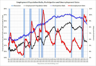
The following graph shows the employment population ratio, the participation rate, and the unemployment rate.
 Click on graph for larger image in graph gallery.
The unemployment rate decreased to 9.1% (red line).
The Labor Force Participation Rate declined to 63.9% in July (blue line). This is the percentage of the working age population in the labor force. This is a new cycle low - and the lowest participation rate since the early '80s.
The Employment-Population ratio declined to 58.1% in July (black line). This is also at a new cycle low and the lowest since the early '80s.
Percent Job Losses During Recessions
 This graph shows the job losses from the start of the employment recession, in percentage terms - this time aligned at maximum job losses.
In the previous post, the graph showed the job losses aligned at the start of the employment recession.
In terms of lost payroll jobs, the 2007 recession was by far the worst since WWII.
Part Time for Economic Reasons
 From the BLS report:
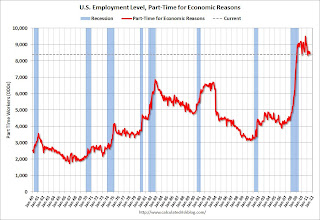
The number of persons employed part time for economic reasons (sometimes referred to as involuntary part-time workers) was about unchanged in July at 8.4 million. These individuals were working part time because their hours had been cut back or because they were unable to find a full-time job.The number of workers only able to find part time jobs (or have had their hours cut for economic reasons) decreased to 8.396 million in July from 8.552 million in June.
These workers are included in the alternate measure of labor underutilization (U-6) that decreased to 16.1% in July from 16.2% in June.
Unemployed over 26 Weeks
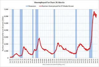
 This graph shows the number of workers unemployed for 27 weeks or more.
 According to the BLS, there are 6.185 million workers who have been unemployed for more than 26 weeks and still want a job. This was down from 6.3 million in June. This is very high, and long term unemployment is one of the defining features of this employment recession.
• Earlier Employment post: July Employment Report: 117,000 Jobs, 9.1% Unemployment Rate


