by Calculated Risk on 8/02/2011 03:47:00 PM
Tuesday, August 02, 2011
U.S. Light Vehicle Sales 12.23 million Annual Rate in July
Based on an estimate from Autodata Corp, light vehicle sales were at a 12.23 million SAAR in July. That is up 6.1% from July 2010, and up 6.2% from the sales rate last month (June 2011).
Although still below the sales rate earlier this year - before the tragedy in Japan - this was above the consensus forecast of 11.9 million SAAR.
It appears most of the supply issues will be resolved over the next 30 to 60 days, and sales will probably be stronger in August.
 Click on graph for larger image in graph gallery.
This graph shows the historical light vehicle sales (seasonally adjusted annual rate) from the BEA (blue) and an estimate for July (red, light vehicle sales of 12.23 million SAAR from Autodata Corp).
The second graph shows light vehicle sales since the BEA started keeping data in 1967.
 Note: dashed line is current estimated sales rate.
Growth in auto sales should make a solid contribution to Q3 GDP as sales bounce back from Q2, however further sales growth will obviously depend on the overall economy and jobs and income growth.
FHA sells record number of REO in June
by Calculated Risk on 8/02/2011 03:11:00 PM
Note: I'll post on vehicle sales soon.
Earlier this year, Tom Lawler noted that the FHA was having REO inventory problems, and the FHA's REO inventory increased in Q1.
It now appears the FHA REO problem has been solved. The FHA sold a record number of REO in April, more in May, and another new record in June.
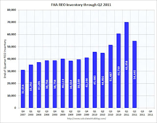
According to HUD, the FHA acquired 7,667 REO in June and sold a record 13,609 properties (breaking the record of 12,671 properties sold in May). The FHA REO inventory has declined from 69,958 at the end of Q1 2011, to 54,645 at the end of Q2.
 Click on graph for larger image in graph gallery.
Fannie and Freddie are expected to release results including REO aquisitions and inventory later this week. From Diana Golobay at HousingWire: Fannie Earnings Expected Later This Week, Freddie After
Freddie Mac spokesperson Michael Cosgrove noted the company could release its Q210 earnings later this week but may wait until close of business Monday. Fannie Mae spokesperson Jason Vasquez also said earnings are anticipated "sometime this week," ... it is believed that Fannie will release Thursday, with Freddie to follow after, sources say.I expect Fannie and Freddie to report declines in REO inventory in Q2 too.
Recession Measures
by Calculated Risk on 8/02/2011 12:55:00 PM
By request, here are four key indicators used by the NBER for business cycle dating: GDP, Employment, Industrial production and real personal income less transfer payments.
Note: The following graphs are all constructed as a percent of the peak in each indicator. This shows when the indicator has bottomed - and when the indicator has returned to the level of the previous peak. If the indicator is at a new peak, the value is 100%.
These graphs show that no major indicator has returned to the pre-recession levels - and most are still way below the pre-recession peaks.
 Click on graph for larger image in graph gallery.
This graph is for real GDP through Q2 2011 and shows real GDP is still 0.4% below the previous pre-recession peak.
At the worst point, real GDP was off 5.1% from the 2007 peak.
And real GDP has performed better than other indicators ...
 This graph shows real personal income less transfer payments as a percent of the previous peak.
With the revisions, this measure was off almost 11% at the trough - a significant downward revision and shows the recession was much worse than originally thought.
Real personal income less transfer payments is still 5.1% below the previous peak.
It will be some time before this indicator returns to pre-recession levels.
 This graph is for industrial production through June.
Industrial production had been one of the stronger performing sectors because of inventory restocking and some growth in exports.
However industrial production is still 7.6% below the pre-recession peak, and it will probably be some time before industrial production returns to pre-recession levels.
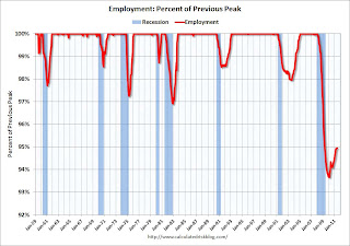
 The final graph is for employment. This is similar to the graph I post every month comparing percent payroll jobs lost in several recessions.
On the timing of the trough of the recession, GDP and industrial production would suggest the end of Q2 2009 (and June 2009). The other two indicators would suggest later troughs.
And of course the recovery in all indicators has been very sluggish compared to recent recessions.
Personal Income less Transfer Payments Revised Down Sharply
by Calculated Risk on 8/02/2011 10:41:00 AM
On Friday, the BEA released revisions for GDP that showed the recession was significantly worse than originally estimated. This morning the BEA released revisions for Personal Income and Outlays.
One of the key measures of the economy is personal income less transfer payments, in real terms. This is also one of the measures the National Bureau of Economic Research (NBER) uses in business cycle dating:
The committee places particular emphasis on two monthly measures of activity across the entire economy: (1) personal income less transfer payments, in real terms and (2) employment.The following graph shows personal income less transfer payments as a percent of the previous peak.
 Click on graph for larger image in graph gallery.
Prior to the revisions, the BEA reported this measure was off close to 7% from the previous peak at the trough of the recession.
With the revisions, this measure was off almost 11% at the trough - a significant downward revision and shows the recession was much worse than originally thought.
Real personal income less transfer payments is still 5.1% below the previous peak.
Personal Income increased 0.1% in June, PCE decreased 0.2%
by Calculated Risk on 8/02/2011 09:03:00 AM
The BEA released the Personal Income and Outlays report for June:
Personal income increased $18.7 billion, or 0.1 percent ... Personal consumption expenditures (PCE) decreased $21.9 billion, or 0.2 percent.The following graph shows real Personal Consumption Expenditures (PCE) through June (2005 dollars). Note that the y-axis doesn't start at zero to better show the change.
...
Real PCE decreased less than 0.1 percent. ... The price index for PCE decreased 0.2 percent in June
 Click on graph for larger image in graph gallery.
PCE decreased 0.2 in June, and real PCE decreased less than 0.1% as the price index for PCE decreased 0.2 percent in June. On a quarterly basis, PCE barely increased in Q2 from Q1 (this was in the GDP report Friday).
Note: The PCE price index, excluding food and energy, increased 0.1 percent.
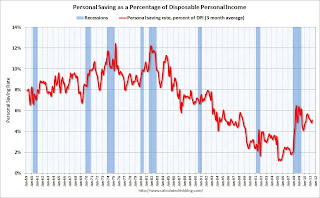
The personal saving rate was at 5.4% in June.
Personal saving -- DPI less personal outlays -- was $620.6 billion in June, compared with $581.7 billion in May. Personal saving as a percentage of disposable personal income was 5.4 percent in June, compared with 5.0 percent in May.
 This graph shows the saving rate starting in 1959 (using a three month trailing average for smoothing) through the June Personal Income report.
Real PCE has declined for three straight months - this was expected based on the weak GDP report, but this is very weak.


