by Calculated Risk on 7/26/2011 02:45:00 PM
Tuesday, July 26, 2011
Home Sales: Distressing Gap
The following graph shows existing home sales (left axis) and new home sales (right axis) through June. This graph starts in 1994, but the relationship has been fairly steady back to the '60s.
Then along came the housing bubble and bust, and the "distressing gap" appeared due mostly to distressed sales. The flood of distressed sales has kept existing home sales elevated, and depressed new home sales since builders can't compete with the low prices of all the foreclosed properties.
 Click on graph for larger image in graph gallery.
I expect this gap to close over the next few years once the number of distressed sales starts to decline.
Note: Existing home sales are counted when transactions are closed, and new home sales are counted when contracts are signed. So the timing of sales is different. Also the National Association of Realtors (NAR) is working on a benchmark revision for existing home sales numbers and I expect significant downward revisions to sales estimates for the last few years - perhaps as much as 10% to 15% for 2009 and 2010. Even with these revisions, most of the "distressing gap" will remain.
On June Home Sales:
• New Home Sales in June at 312,000 Annual Rate
• Existing Home Sales in June: 4.77 million SAAR, 9.5 months of supply
• Graph Galleries: New Home Sales and Existing Home Sales
On House Prices:
• Case Shiller: Home Prices increase in May
• Real House Prices and Price-to-Rent
• Graph Galleries: Home Prices
Update: Real House Prices and Price-to-Rent
by Calculated Risk on 7/26/2011 12:24:00 PM
Note: New Home sales NSA fixed in graph gallery.
Case-Shiller, CoreLogic and others report nominal house prices. However it is also useful to look at house prices in real terms (adjusted for inflation), as a price-to-rent ratio, and also price-to-income (not shown here).
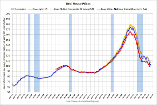
Below are three graphs showing nominal prices (as reported), real prices and a price-to-rent ratio. Real prices are back to 1999/2000 levels, and the price-to-rent ratio is also back to 2000 levels.
Nominal House Prices

The first graph shows the quarterly Case-Shiller National Index SA (through Q1 2011), and the monthly Case-Shiller Composite 20 SA (through May) and CoreLogic House Price Indexes (through May) in nominal terms (as reported).
In nominal terms, the Case-Shiller National index is back to Q3 2002 levels, the Case-Shiller Composite 20 Index (SA) is back to June 2003 levels, and the CoreLogic index is back to March 2003.
Real House Prices
 The second graph shows the same three indexes in real terms (adjusted for inflation using CPI less Shelter). Note: some people use other inflation measures to adjust for real prices.
In real terms, the National index is back to Q4 1999 levels, the Composite 20 index is back to August 2000, and the CoreLogic index back to March 2000.
In real terms, all appreciation in the last decade is gone.
Price-to-Rent
In October 2004, Fed economist John Krainer and researcher Chishen Wei wrote a Fed letter on price to rent ratios: House Prices and Fundamental Value. Kainer and Wei presented a price-to-rent ratio using the OFHEO house price index and the Owners' Equivalent Rent (OER) from the BLS.
 Here is a similar graph using the Case-Shiller Composite 20 and CoreLogic House Price Index (through May).
This graph shows the price to rent ratio (January 1998 = 1.0).
Note: the measure of Owners' Equivalent Rent (OER) was mostly flat for two years - so the price-to-rent ratio mostly followed changes in nominal house prices. In recent months, OER has been increasing - lowering the price-to-rent ratio.
On a price-to-rent basis, the Composite 20 index is back to October 2000 levels, and the CoreLogic index is back to March 2000.
Earlier ...
• New Home Sales in June at 312,000 Annual Rate
• Case Shiller: Home Prices increase in May
• Graph Galleries: Home Prices and New Home Sales
New Home Sales in June at 312,000 Annual Rate
by Calculated Risk on 7/26/2011 10:00:00 AM
The Census Bureau reports New Home Sales in June were at a seasonally adjusted annual rate (SAAR) of 312 thousand. This was down from a revised 315 thousand in May (revised from 319 thousand).
The first graph shows New Home Sales vs. recessions since 1963. The dashed line is the current sales rate.
Sales of new single-family houses in June 2011 were at a seasonally adjusted annual rate of 312,000 ... This is 1.0 percent (±12.5%)* below the revised May rate of 315,000, but is 1.6 percent (±14.1%)* above the June 2010 estimate of 307,000.
 Click on graph for larger image in graph gallery.
The second graph shows New Home Months of Supply.
Months of supply decreased to 6.3 in June from 6.4 months in May. The all time record was 12.1 months of supply in January 2009. This is still higher than normal (less than 6 months supply is normal).

The seasonally adjusted estimate of new houses for sale at the end of June was 164,000. This represents a supply of 6.3 months at the current sales rate.On inventory, according to the Census Bureau:
"A house is considered for sale when a permit to build has been issued in permit-issuing places or work has begun on the footings or foundation in nonpermit areas and a sales contract has not been signed nor a deposit accepted."
 Starting in 1973 the Census Bureau broke this down into three categories: Not Started, Under Construction, and Completed.
This graph shows the three categories of inventory starting in 1973.
The inventory of completed homes for sale fell to 60,000 units in June. The combined total of completed and under construction is at the lowest level since this series started.
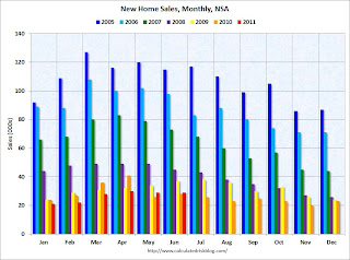
 The last graph shows sales NSA (monthly sales, not seasonally adjusted annual rate).
In June 2011 (red column), 29 thousand new homes were sold (NSA). The record low for June was 28 thousand in 2010 (following the expiration of the homebuyer tax credit). The high for June was 115 thousand in 2005.
This was below the consensus forecast of 321 thousand, and was just above the record low for the month of June - and new home sales have averaged only 300 thousand SAAR over the 14 months since the expiration of the tax credit ... moving sideways at a very low level.
Case Shiller: Home Prices increase in May
by Calculated Risk on 7/26/2011 09:00:00 AM
S&P/Case-Shiller released the monthly Home Price Indices for May (actually a 3 month average of March, April and May).
This includes prices for 20 individual cities and and two composite indices (for 10 cities and 20 cities).
Note: Case-Shiller reports NSA, I use the SA data.
From S&P: Some More Seasonal Improvement in Home Prices
Data through May 2011 ... showed a second consecutive month of increase in prices for the 10- and 20-City Composites. The 10- and 20-City Composites were up 1.1% and 1.0%, respectively, in May over April. Sixteen of the 20 MSAs and both Composites posted positive monthly increases; Detroit, Las Vegas and Tampa were down over the month and Phoenix was unchanged.
...
In May 2011, the 10- and 20-City Composites recorded annual returns of -3.6% and -4.5%, respectively. Both Composites and 11 MSAs – Atlanta, Dallas, Detroit, Las Vegas, Los Angeles, Minneapolis, New York, Phoenix, San Diego, Seattle and Tampa – saw their annual rates worsen in May compared to April.
 Click on graph for larger image in graph gallery.
 The first graph shows the nominal seasonally adjusted Composite 10 and Composite 20 indices (the Composite 20 was started in January 2000).
The Composite 10 index is off 31.8% from the peak, and up slightly in May (SA). The Composite 10 is 1.7% above the May 2009 post-bubble bottom (Seasonally adjusted).
The Composite 20 index is off 31.8% from the peak, and down slightly in May (SA). The Composite 20 is slightly above the March 2011 post-bubble bottom seasonally adjusted.
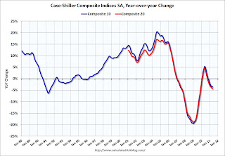
 The second graph shows the Year over year change in both indices.
The Composite 10 SA is down 3.6% compared to May 2010.
The Composite 20 SA is down 4.5% compared to May 2010.
The third graph shows the price declines from the peak for each city included in S&P/Case-Shiller indices.
 Prices increased (SA) in 9 of the 20 Case-Shiller cities in May seasonally adjusted. Prices in Las Vegas are off 59% from the peak, and prices in Dallas only off 9.5% from the peak.
From S&P (NSA):
As of May 2011, 16 of the 20 MSAs and both Composites posted positive monthly changes. Phoenix was flat. Detroit, Las Vegas and Tampa were the markets where levels fell in May versus April, with Detroit down by 2.8% and Las Vegas posting its eighth consecutive monthly decline. These three cities also posted new index level lows in May 2011. They are now 51.2%, 59.3% and 47.5% below their 2005-6 peak levels, respectively.There could be some confusion between the SA and NSA numbers, but this improvement is mostly seasonal. I'll have more ...
Monday, July 25, 2011
Busy Day Tomorrow: Case-Shiller and New Home Sales
by Calculated Risk on 7/25/2011 10:18:00 PM
The Asian markets are mostly green tonight, with the Hang Seng up 0.75%.
From CNBC: Pre-Market Data and Bloomberg futures: the S&P 500 is off about 4 points, and Dow futures are off about 25 points.
Tuesday ...
9:00 AM: S&P/Case-Shiller Home Price Index for May. Although this is the May report, it is really a 3 month average of March, April and May. The consensus is for flat prices in May, however I expect prices to increase NSA.
10:00 AM: New Home Sales for June. The consensus is for a slight increase in sales to 321 thousand Seasonally Adjusted Annual Rate (SAAR) in June from 319 thousand in May.
10:00 AM: Richmond Fed Survey of Manufacturing Activity for July. The consensus is for the index to be at 4, up from 3 in June (above zero is expansion).


