by Calculated Risk on 6/28/2011 10:19:00 PM
Tuesday, June 28, 2011
BofA Settlement
Two stories on the proposed BofA settlement with MBS investors:
• From the WSJ: BofA Nears Huge Settlement
Bank of America Corp. is close to an agreement to pay $8.5 billion ... with a group of 22 investors who hold mortgage-backed securities originally valued at $105 billion, including the giant money manager BlackRock Inc., the insurer MetLife• From the NY Times: $8.5 Billion Deal Near in Suit on Bank Mortgage Debt
The settlement goes beyond the securities owned by these investors, however. It covers nearly all of Countrywide’s first-lien mortgages, which total $424 billion worth of original, unpaid principal balances. As a result, investors beyond those that are concluding the settlement stand to benefit.This potential settlement started with repurchase requests from private investors based on Reps and Warranties for the mortgages included in the MBS. This was a complicated negotiation because these loans had significant risk layering (stated income, option ARMs, high LTV, and high debt-to-income ratios etc.) and these risk factors were disclosed to the investors. However, even with the disclosures, many of the loans were clearly defective; the underwriting didn't even meet the disclosed loose standards. I guess they should have disclosed that the underwriting standard was "fog a mirror, get a loan"!
Earlier on Case-Shiller:
• Case Shiller: Home Prices increase in April
• Update: Real House Prices and Price-to-Rent
HousingTracker: Homes For Sale inventory down 8.5% Year-over-year in June
by Calculated Risk on 6/28/2011 05:05:00 PM
A couple of key points on existing home inventory:
1) Changes in inventory usually lead prices.
2) The NAR method for estimating inventory has probably led to inventory being overstated for the last few years (along with sales). It appears this discrepancy started in 2007 (or earlier), and the error has probably increased since then.
Keeping those two points in mind, here is a repeat of a graph I posted last week.
 Click on graph for larger image in graph gallery.
This graph shows the year-over-year (YoY) change in reported existing home inventory and months-of-supply. Since inventory is not seasonally adjusted, it really helps to look at the YoY change.
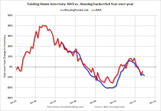
According to the NAR, inventory decreased 4.4% year-over-year in May from May 2010. This was the fourth consecutive month with a YoY decrease in inventory. So even though inventory (and months-of-supply) is still very high, it appears that inventory is now decreasing.
However it appears the NAR is understating the decline in inventory.
A few weeks ago, Tom Lawler posted on how the NAR estimates existing home inventory. The NAR does NOT aggregate data from the local boards (see Tom's post for how the NAR estimates inventory). Sometime this summer, I expect the NAR to revise down their estimates of inventory and sales for the last few years. Also the NAR methodology for estimating sales and inventory will likely (hopefully) be changed.
 While we wait for the NAR, I think the HousingTracker data that Tom mentioned might be a better estimate of changes in inventory (and always more timely). Ben at HousingTracker.net is tracking the aggregate monthly inventory for 54 metro areas.
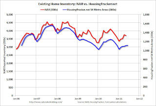
This graph shows the NAR estimate of existing home inventory through May (left axis) and the HousingTracker data for the 54 metro areas through June. The HousingTracker data shows a steeper decline (as mentioned above, the NAR will probably revise down their inventory estimates this summer).
 The third graph shows the year-over-year change in inventory for both the NAR and HousingTracker.
HousingTracker reported that the weekly average for June listings - for the 54 metro areas - declined 8.5% from last June.
Although inventory is still high, the decline in inventory will put less downward pressure on house prices and is something to watch carefully this year.
Earlier ...
• Case Shiller: Home Prices increase in April
• Update: Real House Prices and Price-to-Rent
Richmond Fed: Manufacturing Activity Stabilized in June
by Calculated Risk on 6/28/2011 02:05:00 PM
Earlier today from the Richmond Fed: Manufacturing Activity Stabilized in June; Expectations Edge Higher
In June, the seasonally adjusted composite index of manufacturing activity — our broadest measure of the sector — picked up nine points to 3 from May's reading of −6. Among the index's components, shipments added twelve points to −1, new orders rose sixteen points to finish at 1, while the jobs index slipped two points to 12.This is the second regional survey to show expansion in June and was slightly stronger than expected (the Dallas Fed showed slower expansion in June).
...
Hiring activity at District plants was also mixed in June. The manufacturing employment index eased two points to 12 and the average workweek measure turned negative, losing five points to −5. However, wage growth edged higher, gaining three points to finish at 9.
Earlier this month, the Philly and Empire State surveys indicated contraction. So far these regional surveys suggest the ISM index will be in the low 50s in June (or possibly even below 50). I'll post a graph of the regional surveys vs. the ISM index on Thursday. The ISM index will be released Friday.
Earlier ...
• Case Shiller: Home Prices increase in April
• Update: Real House Prices and Price-to-Rent
Update: Real House Prices and Price-to-Rent
by Calculated Risk on 6/28/2011 11:13:00 AM
First a comment on the Case-Shiller seasonal adjustment: A few years ago, several people (including me), noticed that the seasonal adjustments weres getting pretty "wild". This was because of all the distressed sales - distressed sales are distributed throughout the year (with no seasonal pattern), and non-distressed sales were still following the usual pattern. So there was a very large percentage of distressed sales in the winter, and this led to huge swings in the seasonal adjustment.
In response, S&P started reporting on the Not Seasonally Adjusted (NSA) data. This is OK, but it can be a little confusing. Seasonally prices usually increase in April from March - so some of the increase this morning was due to seasonal factors. In fact the Seasonally Adjusted (SA) Case-Shiller composite 20 index was at a new post-bubble low. Note: April is still a seasonally weak month (the NSA index is below the SA index), but not as weak as March.
Just on a seasonal basis, the NSA index should increase through September. Starting in June, the NSA index will be above the SA index. A little confusing.
Case-Shiller, CoreLogic and others report nominal house prices. However it is also useful to look at house prices in real terms (adjusted for inflation), as a price-to-rent ratio, and also price-to-income (not shown here).
Below are three graphs showing nominal prices (as reported), real prices and a price-to-rent ratio. Real prices are back to 1999/2000 levels, and the price-to-rent ratio is also back to 1999/2000 levels.
Nominal House Prices
 Click on graph for larger image in graph gallery.
The first graph shows the quarterly Case-Shiller National Index SA (through Q1 2011), and the monthly Case-Shiller Composite 20 SA (through April) and CoreLogic House Price Indexes (through April) in nominal terms (as reported).
In nominal terms, the Case-Shiller National index is back to Q3 2002 levels, the Case-Shiller Composite 20 Index (SA) is back to June 2003 levels, and the CoreLogic index is back to January 2003.
Real House Prices
 The second graph shows the same three indexes in real terms (adjusted for inflation using CPI less Shelter). Note: some people use other inflation measures to adjust for real prices.
In real terms, the National index is back to Q4 1999 levels, the Composite 20 index is back to September 2000, and the CoreLogic index back to January 2000.
A few key points:
• In real terms, all appreciation in the last decade is gone.
• Real prices are probably still too high. This isn't like in 2005 when prices were way out of the normal range. In many areas - with an increasing population and land constraints - there is an upward slope to real prices (see: The upward slope of Real House Prices)
Price-to-Rent
In October 2004, Fed economist John Krainer and researcher Chishen Wei wrote a Fed letter on price to rent ratios: House Prices and Fundamental Value. Kainer and Wei presented a price-to-rent ratio using the OFHEO house price index and the Owners' Equivalent Rent (OER) from the BLS.
 Here is a similar graph using the Case-Shiller Composite 20 and CoreLogic House Price Index (through March).
This graph shows the price to rent ratio (January 1998 = 1.0).
Note: the measure of Owners' Equivalent Rent (OER) was mostly flat for two years - so the price-to-rent ratio mostly followed changes in nominal house prices. In recent months, OER has been increasing - lowering the price-to-rent ratio.
On a price-to-rent basis, the Composite 20 index is back to October 2000 levels, and the CoreLogic index is back to February 2000.
Earlier ...
• Case Shiller: Home Prices increase in April
Case Shiller: Home Prices increase in April
by Calculated Risk on 6/28/2011 09:00:00 AM
S&P/Case-Shiller released the monthly Home Price Indices for April (actually a 3 month average of February, March and April).
This includes prices for 20 individual cities and and two composite indices (for 10 cities and 20 cities).
Note: Case-Shiller reports NSA, I use the SA data.
From S&P:April Seasonal Boost in Home Prices
Data through April 2011 ... show a monthly increase in prices for the 10- and 20-City Composites for the first time in eight months. The 10- and 20-City Composites were up 0.8% and 0.7%, respectively, in April versus March. Both indices are lower than a year ago; the 10-City Composite fell 3.1% and the 20-City Composite is down 4.0% from April 2010 levels.
...
Six of the 20 MSAs showed new index lows in April – Charlotte, Chicago, Detroit, Las Vegas, Miami and Tampa. Thirteen of the cities and both composites posted positive monthly changes. With index levels of 152.51 and 138.84, respectively, both the 10- and 20-City Composites are above their March 2011 levels, which had been a new crisis low for the 20-City Composite.
 Click on graph for larger image in graph gallery.
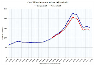
 The first graph shows the nominal seasonally adjusted Composite 10 and Composite 20 indices (the Composite 20 was started in January 2000).
The Composite 10 index is off 31.8% from the peak, and up slightly in April (SA). The Composite 10 is still 1.6% above the May 2009 post-bubble bottom (Seasonally adjusted).
The Composite 20 index is off 31.8% from the peak, and down slightly in April (SA). The Composite 20 is slightly below the May 2009 post-bubble bottom seasonally adjusted.
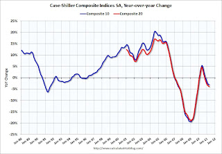
 The second graph shows the Year over year change in both indices.
The Composite 10 SA is down 3.1% compared to April 2010.
The Composite 20 SA is down 3.9% compared to April 2010.
The third graph shows the price declines from the peak for each city included in S&P/Case-Shiller indices.
 Prices increased (SA) in 9 of the 20 Case-Shiller cities in April seasonally adjusted. Prices in Las Vegas are off 58.6% from the peak, and prices in Dallas only off 8.8% from the peak.
From S&P (NSA):
As of April 2011, 19 of the 20 MSAs and both Composites are down compared to April 2010. Washington D.C. continues to be the only market to post a year-over-year gain, at +4.0%. Minneapolis was the only city that demonstrated a double-digit annual decline, -11.1%. While 13 markets rose on a monthly basis, 16 markets saw their annual rates of change fall deeper into negative territory.There could be some confusion between the SA and NSA numbers, but this is some improvement over the last few months.
From their 2006/2007 peaks, six MSAs posted new index level lows in April 2011, a modest improvement over March’s report when 12 MSAs reported new lows. Thirteen of the markets rose in April over March, with six of them increasing by more than 1.0%. Washington DC, once again, stands out with a +3.0% monthly increase and a +4.0% annual growth rate.
With respective index levels of 100.36 and 101.95, Phoenix and Atlanta are two markets that are close to losing any value gained since January 2000. As of April 2011, Cleveland, Detroit and Las Vegas are the three markets where average home prices are lower than where they were 11 years ago.
I'll have more ...


