by Calculated Risk on 4/21/2011 06:12:00 PM
Thursday, April 21, 2011
Correct Reporting and the Philly Fed Manufacturing Index
When the Philly Fed business outlook report was released this morning, I made several points:
• The index showed slower expansion in April than in March.
• This was below expectations, but ...
• This index showed decent growth in April, and this suggests the ISM index will be in the low 60s for April.
Several readers have sent me other reports arguing the Philly Fed report suggests, well, the end of the world or something. That is wrong.
First, the Philly Fed index is noisy month-to-month.
Second, the reading of 18.5 is above the median during expansions for the last 40 years. The median during expansions is 14.
Third, the reading in March was the highest since January 1984 - and a decline was expected (although this reading was below expectations).
Here is a long term graph of the index:
 Click on graph for larger image.
Obviously this index is noisy, and this is just one month. Still a reading of 18.5 shows decent expansion, not the end of the world as we know it.
Because this index is noisy, I average it with the NY Fed (Empire state) each month. Remember the NY Fed index showed faster expansion in April, and was at the highest level in a year.
Then I average both the Philly Fed and NY Fed indexes with several other regional surveys - and that helps predict the ISM manufacturing index.
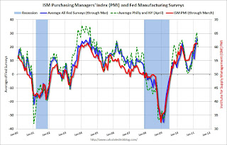
 This graph compares the regional Fed surveys and the ISM manufacturing index. The dashed green line is an average of the NY Fed (Empire State) and Philly Fed surveys through April. The ISM and total Fed surveys are through March.
And what does a 60 reading for the ISM mean? Here is a long term graph of the ISM manufacturing index:
 The dashed line is for the March ISM PMI of 61.2% (very strong).
Clearly a reading in the low 60s (or even high 50s) shows pretty decent expansion for manufacturing.
One reader told me he was surprised by the negativity. He wrote: "We're finally seeing signs of real growth here. Kinda sad in a way. I was getting comfortable coming in late and still finding a parking spot close to the door." Too bad - my guess he is going to have to get in a little earlier, or walk a little further!
Hotels: Occupancy Rate improves in Latest Survey
by Calculated Risk on 4/21/2011 02:38:00 PM
Here is the weekly update on hotels from HotelNewsNow.com: Oahu Island reports strong weekly results
Overall, the U.S. hotel industry’s occupancy was up 4.8% to 63.2%, ADR increased 3.6% to US$102.28, and RevPAR finished the week up 8.5%to US$64.67.Note: ADR: Average Daily Rate, RevPAR: Revenue per Available Room.
 Click on graph for larger image in graph gallery.
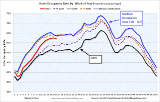
This graph shows the seasonal pattern for the hotel occupancy rate.
The occupancy rate is well above the levels in 2009 and 2010, but still below the occupancy rate for the same period in 2008.
RevPAR and ADR are well below the peak levels prior to the recession. So even though the occupancy rate has improved, hotel income is still much lower now than prior to the recession.
Data Source: Smith Travel Research, Courtesy of HotelNewsNow.com
Other House Price Indexes
by Calculated Risk on 4/21/2011 12:28:00 PM
The most followed house price indexes are Case-Shiller and CoreLogic - and also the FHFA index based on repeat sales of homes with loans sold to or guaranteed by Fannie Mae or Freddie Mac.
The FHFA reported this morning: U.S. Monthly House Price Index Declined 1.6 Percent from January to February
U.S. house prices declined 1.6 percent on a seasonally adjusted basis from January to February, according to the Federal Housing Finance Agency’s monthly House Price Index. The previously reported 0.3 percent decrease in January was revised to a 1.0 percent decrease. For the 12 months ending in February, U.S. prices fell 5.7 percent. The U.S. index is 18.6 percent below its April 2007 peak and roughly the same as the February 2004 index level.There are several other house price indexes that I follow: RadarLogic (based on a house price per square foot method, to be released this afternoon for February), FNC Residential Price Index (a hedonic price index), Clear Capital and more.
I'm planning on mentioning these other indexes, in addition to Case-Shiller and CoreLogic, and discussing some of the differences.
From FNC this morning: February Single-Family Home Prices Decline 0.7 Percent
FNC announced Thursday that U.S. home prices weakened only slightly in February—a better-than-expected price seasonality.According to FNC, house prices are at a post-bubble low, and are back to May 2003 prices. You can see the FNC composite index, and prices for 30 cities here.
Based on the latest data on non-distressed home sales (existing and new homes), FNC’s Residential Price Index™ (RPI) indicated that home prices in February declined 0.7% from January, or 5.3% from a year ago.
Contrary to expectations of relatively rapid price deteriorations, February delivered instead the slowest one-month price declines since November. Even so, the trend shows that weak housing demand and spillovers from rising distressed sales continue to affect the mortgage market.
FNC’s RPI – the industry’s first hedonic price index built on a comprehensive database blending public records with real-time appraisals – also showed home prices nationwide are currently 1.9% below the end of 2010 and comparable to May 2003 on a cyclical basis.
Note on comments: The comment server is down due to an Amazon server failure. You can see the status here (comments are hosted in N. Virginia). Hopefully this will be resolved soon.
Philly Fed Survey shows slower expansion in April
by Calculated Risk on 4/21/2011 10:00:00 AM
From the Philly Fed: April 2011 Business Outlook Survey
The survey’s broadest measure of manufacturing conditions, the diffusion index of current activity, decreased from 43.4 in March to 18.5 this month. [any reading above zero is expanion]. The demand for manufactured goods, as measured by the current new orders index, showed a similar slowing: The index fell 22 points, following seven consecutive months of increase. The shipments index declined 6 points and remained at a relatively high level. Firms continued to report that unfilled orders and delivery times were still rising.This indicates continued expansion in April, but at a slower pace. This was well below the consensus of 36.8. The concern remains the pickup in both prices paid and received:
Firms’ responses continue to indicate overall improvement in labor markets. The current employment index fell 6 points but has remained positive for eight consecutive months. The percentage of firms reporting an increase in employment (20 percent) is higher than the percentage reporting a decline (8 percent). Over twice as many firms reported a longer workweek (32 percent) than reported a shorter one (14 percent) and the workweek index increased 5 points.
Firms continue to report price increases for inputs as well as their own manufactured goods. The prices paid index declined 7 points this month but remains about 45 points higher than readings just seven months ago. Fifty-nine percent of the firms reported higher prices for inputs this month, compared to 64 percent last month. On balance, firms also reported an increase in prices for their own manufactured goods
 Click on graph for larger image in graph gallery.
Here is a graph comparing the regional Fed surveys and the ISM manufacturing index. The dashed green line is an average of the NY Fed (Empire State) and Philly Fed surveys through April. The ISM and total Fed surveys are through March.
This early reading suggests the ISM index will be in the low 60s again in April. This showed slower expansion, but still decent growth in April.
Weekly Initial Unemployment Claims decrease, 4-Week average increases to 399,000
by Calculated Risk on 4/21/2011 08:30:00 AM
The DOL reports on weekly unemployment insurance claims:
In the week ending April 16, the advance figure for seasonally adjusted initial claims was 403,000, a decrease of 13,000 from the previous week's revised figure of 416,000. The 4-week moving average was 399,000, an increase of 2,250 from the previous week's revised average of 396,750.
 Click on graph for larger image in graph gallery.
This graph shows the 4-week moving average of weekly claims for the last 40 years. The dashed line on the graph is the current 4-week average. The four-week average of weekly unemployment claims increased this week to 399,000.
This is the 8th consecutive week with the 4-week average below the 400,000 level (not by much).


