 RSS Feed
 by Calculated Risk on 9/09/2010 09:11:00 AM
Thursday, September 09, 2010
Trade Deficit declines in July
The Census Bureau reports:
[T]otal July exports of $153.3 billion and imports of $196.1 billion resulted in a goods and services deficit of $42.8 billion, down from $49.8 billion in June, revised.
 Click on graph for larger image.
The first graph shows the monthly U.S. exports and imports in dollars through June 2010.
Although imports declined in July, imports have been increasing much faster than exports.
The second graph shows the U.S. trade deficit, with and without petroleum, through July.
 The blue line is the total deficit, and the black line is the petroleum deficit, and the red line is the trade deficit ex-petroleum products.
The decrease in the deficit in July was across the board, although the oil deficit only declined slightly. And the trade gap with China declined slightly to $25.92 billion from $26.15 billion in June - essentially unchanged.
This is the 2nd largest monthly trade deficit since the 2008 collapse in trade.
Weekly Initial Unemployment Claims decline
by Calculated Risk on 9/09/2010 08:30:00 AM
UPDATE: BofA noted this morning that 9 states reported delays in filing jobless claims because of labor day weekend ... so the actual was probably higher (ht Brian)
The DOL reports on weekly unemployment insurance claims:
In the week ending Sept. 4, the advance figure for seasonally adjusted initial claims was 451,000, a decrease of 27,000 from the previous week's revised figure of 478,000. The 4-week moving average was 477,750, a decrease of 9,250 from the previous week's revised average of 487,000.
 Click on graph for larger image in new window.
This graph shows the 4-week moving average of weekly claims since January 2000.
The dashed line on the graph is the current 4-week average. The four-week average of weekly unemployment claims decreased this week by 9,250 to 477,750.
Claims for last week were revised up from 472,000 to 478,000.
This is the lowest level for weekly claims since early July, but it is still very high - and the current level of the 4-week average suggests a weak job market.
Wednesday, September 08, 2010
The Frugal are Losers Too
by Calculated Risk on 9/08/2010 08:34:00 PM
From Graham Bowley at the NY Times: Debtors Feast at the Expense of the Frugal
For example, anyone keeping $500,000 in a 12-month certificate of deposit earning a rate of 1.5 percent annually — one of the best savings rates available nationally these days — would earn $7,500 a year, hardly enough to live on. Just three years ago, that same investment would have generated $26,250.Obviously retired people, living on bond yields, are taking a hit as bonds mature. And this is pushing some conservative investors into riskier assets too.
... Anyone investing $500,000 in 10-year Treasuries at current yields would earn $13,500 a year.
The BEA has been reporting that Personal interest income has been falling since Sept 2008, and I expect interest income will fall further as bonds and CDs mature.
Lawler: Again on Existing Home Months’ Supply: What’s “Normal?”
by Calculated Risk on 9/08/2010 04:49:00 PM
CR Note: This is from economist Tom Lawler.
It has become “common practice” when talking about the “months’ supply” of existing homes for sale for folks to say that the “normal” months’ supply, or the months’ supply that means it is neither a “buyers” or a “sellers” market, is around 6 to 7 months. Yet here is the history of months’ supply for existing SF homes from the National Association of Realtors.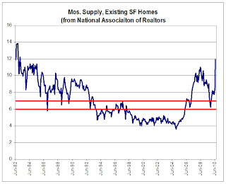 Click on graph for larger image in new window.
As one can see, this “metric” actually has not been in the six-to-seven month range very often. From mid-1982 through 1992, the months’ supply measure was above seven months in all but a handful of months, while from 1998 to the spring of 2006 it was always below six months.
The measure, of course, is quite volatile, and sorta weird in that the inventory number (the numerator) is not seasonally adjusted while the sales data (the denominator) is seasonally adjusted. The measure also can be extremely volatile as sales tend to be impacted more by “special factors” (weather, tax credits, etc.) than listings.
But the measure is only one of many measures that may be “indicative” of “excess” supply, and it probably isn’t even close to the best measure. However, it is the most timely, so folks watch it closely – but sometimes place WAY to much meaning in month-to-month swings.
CR Note: The above was from economist Tom Lawler.
From CR: I'm one of the people who has called 6 to 7 months a "normal" months-of-supply. As the graph above shows, it is hard to define a normal based on the last 30 years.
I've heard the 6 to 7 months metric for years - and it fits the data I have. Perhaps the idea that 6 to 7 months is "normal" comes from new home inventory. This graph shows new home inventory back to 1963 (unfortunately Tom Lawler's graph only goes back to 1982).
For new homes, it does look like around 6 months supply is normal. I suspect if the existing home graph went back to the '60s, something like 6 months would be normal.
Lawler's caution is something to keep in mind. But double digit months-of-supply is clearly very high.
Consumer Credit Declines in July
by Calculated Risk on 9/08/2010 03:09:00 PM
The Federal Reserve reports:
In July, total consumer credit decreased at an annual rate of 1-3/4 percent. Revolving credit decreased at an annual rate of 6-1/4
percent, and nonrevolving credit increased at an annual rate of 1/2 percent.
 Click on graph for larger image in new window.
This graph shows the increase in consumer credit since 1978. The amounts are nominal (not inflation adjusted).
Revolving credit (credit card debt) is off 15.2% from the peak. Non-revolving debt (auto, furniture, and other loans) is off 1.1% from the peak. Note: Consumer credit does not include real estate debt.


