 RSS Feed
 by Calculated Risk on 2/27/2005 03:21:00 PM
Sunday, February 27, 2005
Overview: The National Debt, Budget Deficit and SS Surplus
Here is an overview of the National Debt and the Federal Budget deficit. For the purposes of this analysis:
Income to the Federal Government includes all Income taxes, Payroll Taxes, Corporate Taxes, etc, but does NOT include the surplus payments that are credited to the various Trust Funds (like Social Security and military retirement).
Outlays from the Federal Government includes all expenses (including certain off-budget items) but does NOT include payments to the same Trust Funds (as above).
The General Fund Deficit (or Surplus) then equals:
Deficit/Surplus = Income - Outlays.
This is not quite technically correct, but it is very close. Using this approach, the annual increase in the National Debt = General Fund Deficit (Surprise!). For you accountants: Balance!
NOTE: We could account for the Trust Funds the other way: add the surpluses to income and add the credit to the Trust Fund as an outlay. Of course, the Government adds the surpluses to income but doesn't add the Trust Fund credit to outlays. They call this the "unified budget". Under the Unified Budget, the annual deficit does not equal the increase in National Debt. Don't try that in a Public Company or plan on spending time in jail!
Main data sources: U.S. Treasury Historical Monthly Statements, CBO Historical Budget Data, SS Administration: Social Security Trust Funds
Here is a graph of Federal Income vs. Outlay as % of GDP since 1971:
NOTE: Click on graphs for larger image.
Source: U.S. Treasury


In the '80s you can see the impact of the Reagan tax cuts as Federal Government tax receipts dropped significantly. Although Reagan slowed the rate of increase of Government spending, outlays as a % of GDP still were high and the annual deficits grew significantly. In the '90s, under President Clinton, with a combination of higher taxes, lower spending (as a % of GDP) and a healthy economy, the deficit was reduced to close to zero in 2000. It took almost 10 years of fiscal discipline to bring the budget into balance.
After 2000, spending increased and taxes were reduced substantially. Once again this has caused ever larger annual budget deficits. This second graph shows the main two reasons for the lower tax receipts:
Source: U.S. Treasury
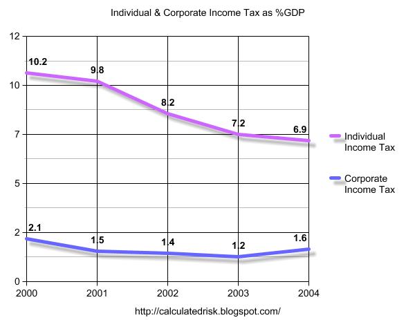
The lower Individual Income taxes are the primary reason for the lower tax receipts. Corporate Income taxes, and a few other sources (mostly other corporate tax breaks), account for most of the remaining fall in Federal income. Record low tax receipts (as a % of GDP) and increased spending has led to budget deficits approaching 6% of GDP.
But what is wrong with including the Trust Fund surplus as part of the Federal Government Income (without a corresponding debit)? First, take a look at just the SS portion of the Trust Fund. The following graph shows the SS payroll tax (income to the SS program) and the SS payments (Outlay).
Source: U.S. Treasury
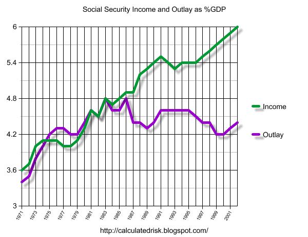
In the '70s and early '80s the SS outlays were increasing faster than SS income for demographic reasons. In fact the SS program ran a deficit for several years (the Purple line higher than the Green line). In 1983, Reagan appointed current Fed Chairman Alan Greenspan to head a commission on SS reform ("The Greenspan Commission"). To satisfy the needs of retirees from 1983 until now, the Greenspan Commission only had to make minor changes. As the graph shows, over the last 20 years outlays have decreased slightly as a % of GDP. However in the next few years outlays will start increasing again. Since the Greenspan Commission was concerned about the retirement of the Baby Boomer generation, they proposed having the Boomers pre-pay a portion of their retirement insurance. That is the increase in the "income" line. The difference between the "income" and "outlays" is the Social Security surplus that is credited to the SS Trust Fund.
If we include the SS overpayment as part of the income for the Federal Government (without including a corresponding debit), then we are using a regressive tax to replace the progressive individual income tax. That substitution doesn't make any economic sense.
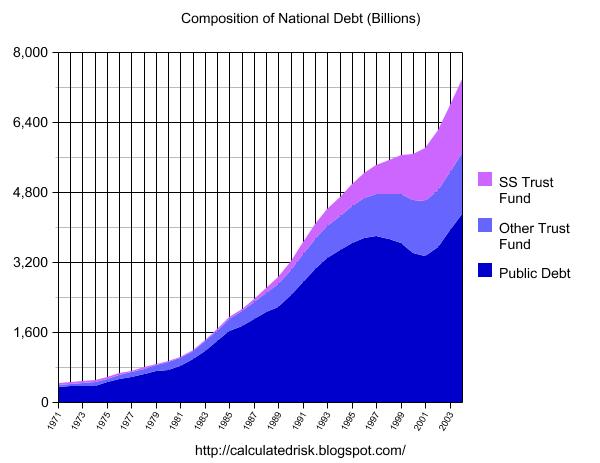
The final graph shows the growth of the SS Trust Fund since 1983. As the program is today, the SS Trust Fund will peak around 2026 and then start declining. It is important to note that SS only accounts for a little over half of the Federal Government Trust Funds. The other portion includes Medicare, Civil Service retirement funds, Military Retirement Funds, Unemployment Insurance, and about 150 other programs.
Source: U.S. Treasury
Hopefully this overview was informative.
Best Regards to All.
Friday, February 25, 2005
Housing: The Good News
by Calculated Risk on 2/25/2005 02:34:00 PM
After a few posts of Gloom and Doom, here are a few positives on the housing market:
From "California January Home Sales" we learn that "Last month was the strongest January in DataQuick's records, which go back to 1988." Also:
"Market stress indicators are still very low: Down payments are stable, speculation buying is moderate, there are no significant shifts in market mix and default rates are low. A recent rise in ARM usage has leveled off. Earlier increases in non owner-occupied purchase activity and flipping activity have leveled off."
And this AP article: "Existing Home Sales Slip in January" was actually positive despite the headline.
"Realtors chief economist David Lereah said even with the small overall decline in sales, demand for homes remained strong. In fact, the supply of homes fell to a record low of 3.7 months, the amount of time it would take to sell all of the homes on the market at the January sales pace."
And finally I'd like to point out the Fed paper by Jonathan McCarthy and Richard W. Peach last year that asked: "Are Home Prices the Next 'Bubble'?" The authors concluded:
"Our analysis of the U.S. housing market in recent years finds
little evidence to support the existence of a national home price bubble. Rather, it appears that home prices have risen in line with increases in personal income and declines in nominal interest rates. Moreover, expectations of rapid price appreciation do not appear to be a major factor behind the strong housing market.
Our observations also suggest that home prices are not likely to plunge in response to deteriorating fundamentals to the extent envisioned by some analysts."
I agree that we are not likely to see a "plunge" in prices; Real Estate prices are sticky and they tend to slowly decline during a bust. Besides I'm more concerned about a slowdown in volume that would impact employment than a "bust". And I disgree about pricing; I think we are seeing a housing bubble.
Thursday, February 24, 2005
More on Housing
by Calculated Risk on 2/24/2005 06:11:00 PM
Here are three interesting stories about credit quality, refinancing and over-supply in the housing market.
From chief economist David Berson, "Data Pointing to Home Sales Slowdown":
"Recent trends in production versus sales are a bit disturbing, and may suggest the excess inventories of unsold homes may have increased in early 2005 from already relatively high levels ... The obvious implication, if these data are indicative of actual trends, is that housing production may be exceeding demand."And this article about Downpayment Aassistance Programs (DAPs): "Plan To Boost Homeownership May Spur Problems, Critics Say" FHA loans are about 10% of all mortgages. They offer a 3% down payment loan - and that is still to0 much. So non-profit organization step in and pay the downpayment ... OK, actually the seller donates the downpayment to the non-profit and the non-profit gives it to the buyer. Amazing. DAPs were essentially non-existent 4 years ago and now make up 25% of FHA loans! See this chart:
Source: IBD

And finally this article related to my previous post "Americans using home equity pile up billions in extra debt". This chart shows Americans using their homes as ATMs:
Source: SacBee

Mortgage Debt and the "Recovery"
by Calculated Risk on 2/24/2005 04:56:00 PM
Is the current recovery built on a "marshland of debt"?
Over the last 4 years, GDP has increased 19%. Meanwhile, mortgage debt (by households) has increased 54% and the National Debt 30%. In dollars, mortgage debt increased $2.6 Trillion and the National Debt $1.7 Trillion. Over that same period, the GDP grew by $1.88 Trillion. So it is easy to imagine that America just "bought" GDP growth by adding debt.
Primarily I've focused on the increases in the National Debt and the astounding increase in mortgage debt over the last 4 years. The following graph shows the increases in the National Debt and Mortgage debt since 1971.
Source: Federal Reserve

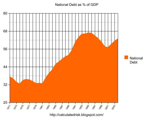
If we normalize the data (by comparing to the GDP), we can really understand what is happening. The following graph shows the enormous increase in National Debt in the '80s and early '90s, followed by a period of declining debt (as a % of GDP). However, starting in 2001, the National Debt started to climb once again. Since the structural General Fund deficit is forecast at almost $650 Billion for fiscal 2005 (ends Sept 30th), so the chart will continue to climb for the foreseeable future.
Source: U.S. Treasury
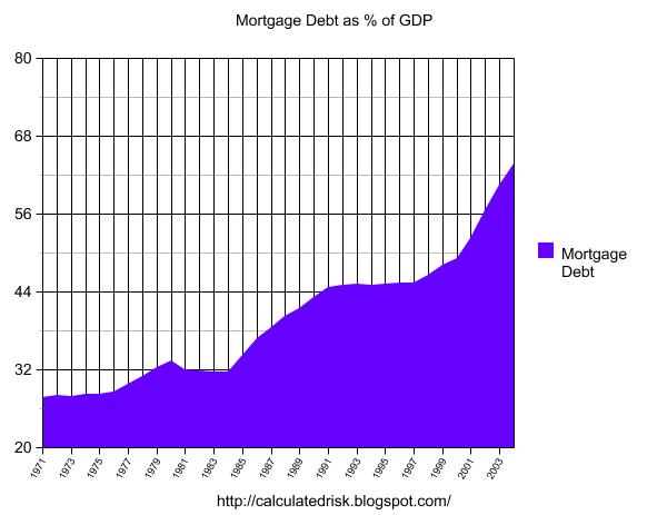
The following chart shows household mortgage debt as a % of GDP. Although mortgage debt has been increasing for years, the last four years have seen a tremendous increase in debt. Last year alone mortgage debt increased close to $800 Billion - almost 7% of GDP.
Source: Federal Reserve
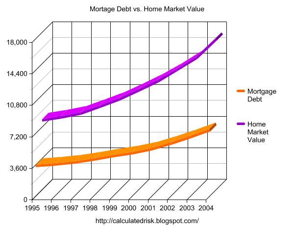
Some obervers have remarked that mortgage debt is still below 50% of household RE assets - and that is an accurate statement. In fact, if you plot mortgage debt vs. household RE assets everything looks reasonable.
Source: Federal Reserve
But lets plot household RE assets as a % of GDP.
Source: Federal Reserve
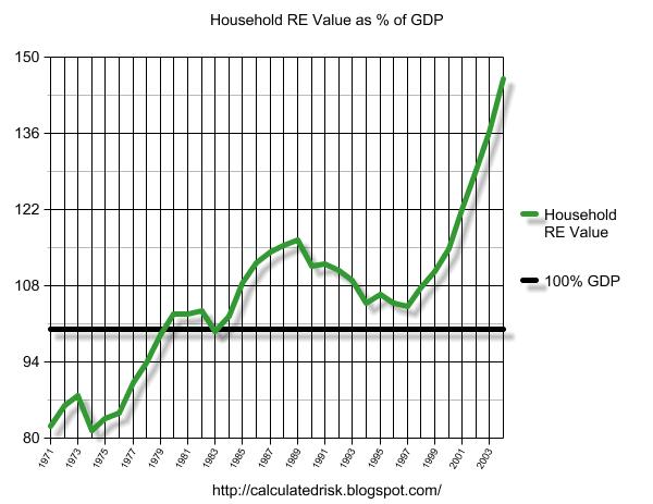
This final graph shows the potential problem. Household assets have really soared in the last few years. Many homeowners have refinanced their homes (or moved and taken cash out), in essense using their homes as an ATM.
It wouldn't take a RE bust to impact the general economy. Just a slowdown in both volume (to impact employment) and in prices (to slow down borrowing) might push the general economy into recession. An actual bust, especially with all of the extensive sub-prime lending, might cause a serious problem.
Wednesday, February 23, 2005
Real Earnings Decline - Again
by Calculated Risk on 2/23/2005 09:48:00 AM
The BLS reports that real weekly earnings declined 0.2% from Dec '04 to Jan '05. For the full year, real weekly earnings decreased by 0.7%.
Average weekly hours declined 0.3% from Dec '04 to Jan '05. This decrease in weekly hours is unusual for a "recovering" economy.
The annual decline in real wages and the decline in hours worked are concerning. One of my points in yesterday's post, A Recovery Built on a Marshland of Debt?, was that "an astounding increase in debt ... has occurred while the median real wage has hardly changed." That trend is continuing.
NOTE: The BLS offers a service that provides News Releases via email. I recommend it.


