 RSS Feed
 by Calculated Risk on 8/09/2021 03:50:00 PM
Monday, August 09, 2021
August 9th COVID-19: New Cases, Hospitalizations, Vaccinations
Note: Data reported on Monday is always low, and is revised up as data is received.
This data is from the CDC.
According to the CDC, on Vaccinations.
Total doses administered: 351,933,175, as of a week ago 346,924,345. Average doses last week: 0.72 million per day.
| COVID Metrics | ||||
|---|---|---|---|---|
| Today | Yesterday | Week Ago | Goal | |
| Percent over 18, One Dose✅ | 71.1% | 71.0% | 70.0% | ≥70.0%1,2 |
| Fully Vaccinated✅ (millions) | 166.7 | 166.5 | 164.9 | ≥1601 |
| New Cases per Day3🚩 | 97,399 | 100,830 | 84,338 | ≤5,0002 |
| Hospitalized3🚩 | 49,586 | 50,764 | 38,987 | ≤3,0002 |
| Deaths per Day3🚩 | 456 | 457 | 321 | ≤502 |
| 1 America's Short Term Goals, 2my goals to stop daily posts, 37 day average for Cases, Hospitalized, and Deaths 🚩 Increasing 7 day average week-over-week for Cases, Hospitalized, and Deaths ✅ Short term goal met (even if late). | ||||
KUDOS to the residents of the 21 states and D.C. that have achieved the 70% goal (percent over 18 with at least one dose): Vermont, Hawaii, Massachusetts, Connecticut, Maine, New Jersey and New Mexico are at 80%+, and Rhode Island, Pennsylvania, California, Maryland, Washington, New Hampshire, New York, Illinois, Virginia, Delaware, Minnesota, Oregon, Colorado, Florida and D.C. are all over 70%.
Next up are Utah at 69.0%, Nebraska at 68.5%, Wisconsin at 68.3%, Kansas at 67.6%, South Dakota at 67.2%, Nevada at 67.1%, and Iowa at 66.5%.
 Click on graph for larger image.
This graph shows the daily (columns) and 7 day average (line) of positive tests reported.
This data is from the CDC.
Fannie and Freddie: REO inventory declined in Q2, Down 49% Year-over-year
by Calculated Risk on 8/09/2021 01:03:00 PM
Fannie and Freddie earlier reported results for Q2 2021. Here is some information on single-family Real Estate Owned (REOs).
Note that COVID is impacting foreclosure activity, from Fannie:
"The decline in single-family REO properties in the first half of 2021 compared with the first half of 2020 was due to the suspension of foreclosures that began in March 2020 as a result of the COVID-19 pandemic. In response to the pandemic and with instruction from FHFA, we have prohibited our servicers from completing foreclosures on our single-family loans through July 31, 2021, except in the case of vacant or abandoned properties." emphasis added
Freddie Mac reported the number of REO declined to 1,477 at the end of Q2 2021 compared to 2,812 at the end of Q2 2020.
For Freddie, this is down 98% from the 74,897 peak number of REOs in Q3 2010.
Fannie Mae reported the number of REO declined to 6,363 at the end of Q2 2021 compared to 12,675 at the end of Q2 2020.
For Fannie, this is down 96% from the 166,787 peak number of REOs in Q3 2010.
 Click on graph for larger image.
Here is a graph of Fannie and Freddie Real Estate Owned (REO).
REO inventory decreased in Q2 2021, and combined inventory is down 49% year-over-year.
This is well below a normal level of REOs for Fannie and Freddie.
North Texas Real Estate in July: Sales Down 16% YoY, Inventory Down 33% YoY
by Calculated Risk on 8/09/2021 12:35:00 PM
I'm posting data for many local markets around the U.S.
From the NTREIS for North Texas (including Dallas/Ft. Worth):
Single Family Homes sold in July 2021 were 11,299, down 17.4% from 11,896 in July 2020.
Condos and Townhomes sold in July 2021 were 834, up 9.3% from 763 in July 2020.
Combined, sales were down 16.0% year-over-year.
Single Family Active Listings in July 2021 were 11,105, down 31.4% from 16,177 in July 2020.
Combined, sales were down 16.0% year-over-year.
Single Family Active Listings in July 2021 were 11,105, down 31.4% from 16,177 in July 2020.
For Condos and Townhomes, Active Listings in July 2021 were 1,258, down 45.1% from 2,293 in July 2020.
Combined, active listings declined 33.1% year-over-year.
Combined, active listings declined 33.1% year-over-year.
Although down sharply year-over-year, active inventory was up 26.8% compared to last month, and up 72.7% from the record low in March 2021.
Housing Inventory August 9th Update: Inventory Increased Slightly Week-over-week, Up 34% from Low in early April
by Calculated Risk on 8/09/2021 11:09:00 AM
Tracking existing home inventory will be very important this year.
 Click on graph for larger image in graph gallery.
This inventory graph is courtesy of Altos Research.
As of August 6th, inventory was at 412 thousand (7 day average), compared to 613 thousand for the same week a year ago. That is a decline of 32.8%.
A week ago, inventory was at 407 thousand, and was down 35.0% YoY.
Seasonally, inventory has bottomed. Inventory was about 34.3% above the record low in early April.
Key question: Usually inventory peaks in the Summer, and then declines into the Fall. Will inventory follow the normal seasonal pattern, or will inventory continue to increase over the coming months? This will be important to watch for house prices and housing activity.
Mike Simonsen discusses this data regularly on Youtube.
Altos Research has also seen a significant pickup in price decreases - back to the level of a year ago - but still well below a normal rate for August.
BLS: Job Openings Increase to Series High 10.1 Million in June
by Calculated Risk on 8/09/2021 10:07:00 AM
From the BLS: Job Openings and Labor Turnover Summary
The number of job openings increased to a series high of 10.1 million on the last business day of June, the U.S. Bureau of Labor Statistics reported today. Hires rose to 6.7 million and total separations edged up to 5.6 million. Within separations, the quits rate increased to 2.7 percent. The layoffs and discharges rate was unchanged at 0.9 percent, matching the series low reached last month.The following graph shows job openings (yellow line), hires (dark blue), Layoff, Discharges and other (red column), and Quits (light blue column) from the JOLTS.
emphasis added
This series started in December 2000.
Note: The difference between JOLTS hires and separations is similar to the CES (payroll survey) net jobs headline numbers. This report is for June, the most recent employment report was for July.
 Click on graph for larger image.
Note that hires (dark blue) and total separations (red and light blue columns stacked) are usually pretty close each month. This is a measure of labor market turnover. When the blue line is above the two stacked columns, the economy is adding net jobs - when it is below the columns, the economy is losing jobs.
The huge spikes in layoffs and discharges in March 2020 are labeled, but off the chart to better show the usual data.
Jobs openings increased in June to 10.073 million from 9.483 million in May. This is a new record high for this series.
The number of job openings (yellow) were up 65% year-over-year.
Quits were up 46% year-over-year. These are voluntary separations. (see light blue columns at bottom of graph for trend for "quits").
Seven High Frequency Indicators for the Economy
by Calculated Risk on 8/09/2021 08:18:00 AM
These indicators are mostly for travel and entertainment. It will interesting to watch these sectors recover as the pandemic subsides.
The TSA is providing daily travel numbers.
This data is as of August 8th.
 Click on graph for larger image.
This data shows the 7-day average of daily total traveler throughput from the TSA for 2019 (Light Blue), 2020 (Blue) and 2021 (Red).
The dashed line is the percent of 2019 for the seven day average.
The 7-day average is down 21.7% from the same day in 2019 (78.3% of 2019). (Dashed line)
There was a slow increase from the bottom starting in May 2020 - and then TSA data picked up in 2021 - but the dashed line has mostly sideways over the last six weeks.
The second graph shows the 7-day average of the year-over-year change in diners as tabulated by OpenTable for the US and several selected cities.
IMPORTANT: OpenTable notes: "we’ve updated the data including downloadable dataset from January 1, 2021 onward to compare seated diners from 2021 to 2019, as opposed to year over year." Thanks!
 Thanks to OpenTable for providing this restaurant data:
This data is updated through August 7, 2021.
This data is "a sample of restaurants on the OpenTable network across all channels: online reservations, phone reservations, and walk-ins. For year-over-year comparisons by day, we compare to the same day of the week from the same week in the previous year."
Note that this data is for "only the restaurants that have chosen to reopen in a given market". Since some restaurants have not reopened, the actual year-over-year decline is worse than shown.
Dining picked up during the holidays, then slumped with the huge winter surge in cases. Dining was generally picking up, but has moved sideways or down recently. The 7-day average for the US is down 9% compared to 2019.
----- Movie Tickets: Box Office Mojo -----
 This data shows domestic box office for each week and the median for the years 2016 through 2019 (dashed light blue).
 Thanks to OpenTable for providing this restaurant data:
This data is updated through August 7, 2021.
This data is "a sample of restaurants on the OpenTable network across all channels: online reservations, phone reservations, and walk-ins. For year-over-year comparisons by day, we compare to the same day of the week from the same week in the previous year."
Note that this data is for "only the restaurants that have chosen to reopen in a given market". Since some restaurants have not reopened, the actual year-over-year decline is worse than shown.
Dining picked up during the holidays, then slumped with the huge winter surge in cases. Dining was generally picking up, but has moved sideways or down recently. The 7-day average for the US is down 9% compared to 2019.
 This data shows domestic box office for each week and the median for the years 2016 through 2019 (dashed light blue).
 Blue is 2020 and Red is 2021.
The data is from BoxOfficeMojo through August 5th.
Note that the data is usually noisy week-to-week and depends on when blockbusters are released.
Movie ticket sales were at $119 million last week, down about 47% from the median for the week.
Note that the data is usually noisy week-to-week and depends on when blockbusters are released.
Movie ticket sales were at $119 million last week, down about 47% from the median for the week.
 This graph shows the seasonal pattern for the hotel occupancy rate using the four week average.
 The red line is for 2021, black is 2020, blue is the median, dashed purple is 2019, and dashed light blue is for 2009 (the worst year on record for hotels prior to 2020).
Occupancy is well above the horrible 2009 levels. With solid leisure travel, the Summer months have had decent occupancy - but it is uncertain what will happen in the Fall with business travel.
This data is through July 31st. The occupancy rate is down 6.2% compared to the same week in 2019. Note: Occupancy was up year-over-year, since occupancy declined sharply at the onset of the pandemic.
Notes: Y-axis doesn't start at zero to better show the seasonal change.
 This graph, based on weekly data from the U.S. Energy Information Administration (EIA), shows gasoline supplied compared to the same week of 2019.
Blue is for 2020. Red is for 2021.
As of July 30th, gasoline supplied was up 1.3% compared to the same week in 2019.
This is the 4th week so far this year when gasoline supplied was up compared to the same week in 2019.
This graph is from Apple mobility. From Apple: "This data is generated by counting the number of requests made to Apple Maps for directions in select countries/regions, sub-regions, and cities." This is just a general guide - people that regularly commute probably don't ask for directions.
There is also some great data on mobility from the Dallas Fed Mobility and Engagement Index. However the index is set "relative to its weekday-specific average over January–February", and is not seasonally adjusted, so we can't tell if an increase in mobility is due to recovery or just the normal increase in the Spring and Summer.
 This data is through August 7th for the United States and several selected cities.
The graph is the running 7-day average to remove the impact of weekends.
IMPORTANT: All data is relative to January 13, 2020. This data is NOT Seasonally Adjusted. People walk and drive more when the weather is nice, so I'm just using the transit data.
According to the Apple data directions requests, public transit in the 7 day average for the US is at 99.8% of the January 2020 level.
Strangely, New York City is doing well by this metric, but subway usage in NYC is down sharply (next graph). I'd put much more weight on subway usage!
----- New York City Subway Usage -----
Here is some interesting data on New York subway usage (HT BR).
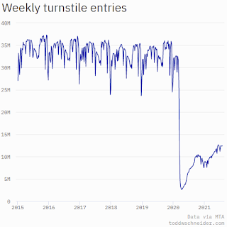 This graph is from Todd W Schneider. This is weekly data since 2015.
Here is some interesting data on New York subway usage (HT BR).
 This graph is from Todd W Schneider. This is weekly data since 2015.
 Most weeks are between 30 and 35 million entries, and currently there are over 12 million subway turnstile entries per week - and generally increasing.
This data is through Friday, August 6th.
Schneider has graphs for each borough, and links to all the data sources.
He notes: "Data updates weekly from the MTA’s public turnstile data, usually on Saturday mornings".
This data is through Friday, August 6th.
Schneider has graphs for each borough, and links to all the data sources.
He notes: "Data updates weekly from the MTA’s public turnstile data, usually on Saturday mornings".
Sunday, August 08, 2021
Monday: Job Openings
by Calculated Risk on 8/08/2021 06:07:00 PM
Weekend:
• Schedule for Week of August 8, 2021
Monday:
• At 10:00 AM ET, Job Openings and Labor Turnover Survey for June from the BLS.
From CNBC: Pre-Market Data and Bloomberg futures S&P 500 and DOW futures are mostly unchanged (fair value).
Oil prices were down over the last week with WTI futures at $68.28 per barrel and Brent at $70.70 per barrel. A year ago, WTI was at $41, and Brent was at $44 - so WTI oil prices are UP about 65% year-over-year (oil prices collapsed at the beginning of the pandemic).
Here is a graph from Gasbuddy.com for nationwide gasoline prices. Nationally prices are at $3.18 per gallon. A year ago prices were at $2.17 per gallon, so gasoline prices are up $1.01 per gallon year-over-year.
August 8th COVID-19: 7-Day Average Hospitalizations Over 50,000
by Calculated Risk on 8/08/2021 03:18:00 PM
Note: Cases and Deaths are not updated on Sundays.
The 7-day average cases is the highest since February 10th.
The 7-day average hospitalizations is the highest since February 25th.
The 7-day average deaths is the highest since May 27th.
This data is from the CDC.
According to the CDC, on Vaccinations.
Total doses administered: 351,400,930, as of a week ago 346,456,669. Average doses last week: 0.71 million per day.
| COVID Metrics | ||||
|---|---|---|---|---|
| Today | Yesterday | Week Ago | Goal | |
| Percent over 18, One Dose✅ | 71.0% | 70.6% | 69.9% | ≥70.0%1,2 |
| Fully Vaccinated✅ (millions) | 166.5 | 165.9 | 164.8 | ≥1601 |
| New Cases per Day3🚩 | 99,727 | 96,781 | 75,712 | ≤5,0002 |
| Hospitalized3🚩 | 50,502 | 49,620 | 36,952 | ≤3,0002 |
| Deaths per Day3🚩 | 454 | 424 | 302 | ≤502 |
| 1 America's Short Term Goals, 2my goals to stop daily posts, 37 day average for Cases, Hospitalized, and Deaths 🚩 Increasing 7 day average week-over-week for Cases, Hospitalized, and Deaths ✅ Short term goal met (even if late). | ||||
KUDOS to the residents of the 21 states and D.C. that have achieved the 70% goal (percent over 18 with at least one dose): Vermont, Hawaii, Massachusetts, Connecticut, Maine, New Jersey and New Mexico are at 80%+, and Rhode Island, Pennsylvania, California, Maryland, Washington, New Hampshire, New York, Illinois, Virginia, Delaware, Minnesota, Oregon, Colorado, Florida and D.C. are all over 70%.
Next up are Utah at 69.0%, Nebraska at 68.2%, Wisconsin at 68.2%, Kansas at 67.5%, South Dakota at 67.2%, Nevada at 66.9%, Texas at 66.5%, and Iowa at 66.4%.
 Click on graph for larger image.
This graph shows the daily (columns) and 7 day average (line) of hospitalizations reported.
This data is from the CDC.
Leading Index for Commercial Real Estate "Pulls Back in July"
by Calculated Risk on 8/08/2021 08:15:00 AM
From Dodge Data Analytics: Dodge Momentum Index Pulls Back in July
The Dodge Momentum Index fell to 155.8 (2000=100) in July, a 6% decline from the revised June reading of 164.9. The Momentum Index, issued by Dodge Data & Analytics, is a monthly measure of the first (or initial) report for nonresidential building projects in planning, which have been shown to lead construction spending for nonresidential buildings by a full year.
Both components of the Momentum Index fell in July. Commercial planning fell 3%, while institutional planning dropped 9%.
The Momentum Index posted strong gains through much of the winter and spring as the economy and building markets began to stabilize following the recession. While the economy has continued its forward progress through the summer, the Index has regressed somewhat as higher material prices and shortages of skilled labor continue to exert a strong influence over the construction sector. Despite the declines in June and July, the Momentum Index remains near levels last seen in 2018. Compared to a year earlier, the Momentum Index was 25% higher than in July 2020 — institutional planning was up 27% and commercial planning was 25% higher than last year.
emphasis added
 Click on graph for larger image.
This graph shows the Dodge Momentum Index since 2002. The index was at 155.8 in June, down from 164.9 in June.
According to Dodge, this index leads "construction spending for nonresidential buildings by a full year". This index suggests a decline in Commercial Real Estate construction through most of 2021, but a pickup towards the end of the year, and growth in 2022 (even with the decline in the July index).
Saturday, August 07, 2021
August 7th COVID-19: 125,000 New Cases Reported Today
by Calculated Risk on 8/07/2021 05:12:00 PM
Congratulations to the residents of New Mexico on joining the 80% club! Go for 90%!!! (80% of adults have had at least one shot).
The 7-day average cases is the highest since February 10th.
The 7-day average hospitalizations is the highest since February 26th.
The 7-day average deaths is the highest since May 27th.
This data is from the CDC.
According to the CDC, on Vaccinations.
Total doses administered: 350,627,188, as of a week ago 345,640,466. Average doses last week: 0.71 million per day.
| COVID Metrics | ||||
|---|---|---|---|---|
| Today | Yesterday | Week Ago | Goal | |
| Percent over 18, One Dose✅ | 70.8% | 70.6% | 69.7% | ≥70.0%1,2 |
| Fully Vaccinated✅ (millions) | 166.2 | 165.9 | 164.4 | ≥1601 |
| New Cases per Day3🚩 | 99,727 | 96,781 | 75,712 | ≤5,0002 |
| Hospitalized3🚩 | 49,588 | 47,388 | 35,013 | ≤3,0002 |
| Deaths per Day3🚩 | 454 | 424 | 302 | ≤502 |
| 1 America's Short Term Goals, 2my goals to stop daily posts, 37 day average for Cases, Hospitalized, and Deaths 🚩 Increasing 7 day average week-over-week for Cases, Hospitalized, and Deaths ✅ Short term goal met (even if late). | ||||
KUDOS to the residents of the 21 states and D.C. that have achieved the 70% goal (percent over 18 with at least one dose): Vermont, Hawaii, Massachusetts, Connecticut, Maine, New Jersey and New Mexico are at 80%+, and Rhode Island, Pennsylvania, California, Maryland, Washington, New Hampshire, New York, Illinois, Virginia, Delaware, Minnesota, Oregon, Colorado, Florida and D.C. are all over 70%.
Next up are Utah at 69.0%, Nebraska at 68.2%, Wisconsin at 68.0%, Kansas at 67.4%, South Dakota at 67.2%, Nevada at 66.7%, and Iowa at 66.4%.
 Click on graph for larger image.
This graph shows the daily (columns) and 7 day average (line) of positive tests reported.
This data is from the CDC.


