 RSS Feed
 by Calculated Risk on 7/04/2021 11:40:00 AM
Sunday, July 04, 2021
By Request: Public and Private Sector Payroll Jobs During Presidential Terms
Note: I used to post this monthly, but I stopped during the COVID-19 pandemic. I've received a number of requests lately to post this again, so here is another update of tracking employment during Presidential terms. We frequently use Presidential terms as time markers - we could use Speaker of the House, Fed Chair, or any other marker.
Important: There are many differences between these periods. Overall employment was smaller in the '80s, however the participation rate was increasing in the '80s (younger population and women joining the labor force), and the participation rate is generally declining now. But these graphs give an overview of employment changes.
The first graph shows the change in private sector payroll jobs from when each president took office until the end of their term(s). Presidents Carter, George H.W. Bush and Trump only served one term.
Mr. G.W. Bush (red) took office following the bursting of the stock market bubble, and left during the bursting of the housing bubble. Mr. Obama (dark blue) took office during the financial crisis and great recession. There was also a significant recession in the early '80s right after Mr. Reagan (dark red) took office.
There was a recession towards the end of President G.H.W. Bush (light purple) term, and Mr. Clinton (light blue) served for eight years without a recession. And there was a pandemic related recession in 2020.
 Click on graph for larger image.
The first graph is for private employment only.
The employment recovery during Mr. G.W. Bush's (red) first term was sluggish, and private employment was down 824,000 jobs at the end of his first term. At the end of Mr. Bush's second term, private employment was collapsing, and there were net 387,000 private sector jobs lost during Mr. Bush's two terms.
Private sector employment increased by 9,039,000 under President Carter (dashed green), by 14,714,000 under President Reagan (dark red), 1,511,000 under President G.H.W. Bush (light purple), 20,970,000 under President Clinton (light blue), and 11,828,000 under President Obama (dark dashed blue). During Trump's term (Orange), the economy lost 2,135,000 private sector jobs.
In the first five months of President Biden's term (Blue), the economy has added 2,750,000 private sector jobs, as the economy recovers from the pandemic.
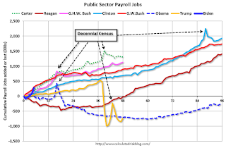 A big difference between the presidencies has been public sector employment. Note: the bumps in public sector employment due to the decennial Census in 1980, 1990, 2000, 2010 and 2020.
The public sector grew during Mr. Carter's term (up 1,304,000), during Mr. Reagan's terms (up 1,414,000), during Mr. G.H.W. Bush's term (up 1,127,000), during Mr. Clinton's terms (up 1,934,000), and during Mr. G.W. Bush's terms (up 1,744,000 jobs). However the public sector declined significantly while Mr. Obama was in office (down 271,000 jobs). During Trump's term, the economy lost 741,000 public sector jobs.
 A big difference between the presidencies has been public sector employment. Note: the bumps in public sector employment due to the decennial Census in 1980, 1990, 2000, 2010 and 2020.
 The public sector grew during Mr. Carter's term (up 1,304,000), during Mr. Reagan's terms (up 1,414,000), during Mr. G.H.W. Bush's term (up 1,127,000), during Mr. Clinton's terms (up 1,934,000), and during Mr. G.W. Bush's terms (up 1,744,000 jobs). However the public sector declined significantly while Mr. Obama was in office (down 271,000 jobs). During Trump's term, the economy lost 741,000 public sector jobs.
In the first five months of President Biden's term, the economy has added 273,000 public sector jobs (mostly education).
Saturday, July 03, 2021
July 3rd COVID-19 New Cases, Vaccinations, Hospitalizations
by Calculated Risk on 7/03/2021 05:38:00 PM
Congratulations to the residents of Colorado and Oregon on joining the 70% club! Go for 80%!!!
This data is from the CDC.
According to the CDC, on Vaccinations.
Total doses administered: 329,970,551, as of a week ago 322,123,103. Average doses last week: 1.12 million per day.
| COVID Metrics | ||||
|---|---|---|---|---|
| Today | Yesterday | Week Ago | Goal | |
| Percent over 18, One Dose | 67.0% | 66.8% | 65.9% | ≥70.0%1,2 |
| Fully Vaccinated (millions) | 157.0 | 156.3 | 152.2 | ≥1601 |
| New Cases per Day3🚩 | 13,241 | 12,914 | 11,969 | ≤5,0002 |
| Hospitalized3 | 12,101 | 12,015 | 12,125 | ≤3,0002 |
| Deaths per Day3 | 215 | 213 | 238 | ≤502 |
| 1 America's Goal by July 4th, 2my goals to stop daily posts, 37 day average for Cases, Hospitalized, and Deaths 🚩 Increasing week-over-week | ||||
KUDOS to the residents of the 20 states and D.C. that have already achieved the 70% goal: Vermont, Hawaii and Massachusetts are at 80%+, and Connecticut, Maine, New Jersey, Rhode Island, Pennsylvania, New Mexico, Maryland, California, Washington, New Hampshire, New York, Illinois, Virginia, Delaware, Minnesota, Colorado, Oregon and D.C. are all over 70%.
Next up are Wisconsin at 65.6%, Nebraska at 65.3%, Florida at 64.8%, South Dakota at 64.3%, and Utah at 64.3%.
 Click on graph for larger image.
This graph shows the daily (columns) and 7 day average (line) of positive tests reported.
This data is from the CDC.
30 Year Mortgage Rates at 3.16%
by Calculated Risk on 7/03/2021 10:46:00 AM
From Matthew Graham at Mortgage News Daily: Rates Defy Jobs Report (And Other Weekly Highlights)
Rates had a good week, with most lenders at or near their best levels since mid June at the very least. 10yr Treasury yields trickled to their best levels in months by Friday afternoon after managing to break the 1.44% floor that had turned away several recent attempts. [30YR FIXED - 3.16%]
emphasis added
 Click on graph for larger image.
This is a graph from Mortgage News Daily (MND) showing 30 year fixed rates from three sources (MND, MBA, Freddie Mac). Go to MND and you can adjust the graph for different time periods.
30 year mortgage rates are up from the record lows in 2020, but still historically very low.
Schedule for Week of July 4, 2021
by Calculated Risk on 7/03/2021 08:11:00 AM
This will be a light week for economic data.
The focus will be on Job Openings.
All US markets will be closed in observance of Independence Day.
8:00 AM: Corelogic House Price index for May.
10:00 AM: the ISM non-Manufacturing Index for June. The consensus is for a reading of 63.9, down from 64.0.
7:00 AM ET: The Mortgage Bankers Association (MBA) will release the results for the mortgage purchase applications index.
 10:00 AM ET: Job Openings and Labor Turnover Survey for May from the BLS.
 This graph shows job openings (yellow line), hires (purple), Layoff, Discharges and other (red column), and Quits (light blue column) from the JOLTS.
Jobs openings increased in April to a record 9.286 million from 8.288 million in March.
The number of job openings (yellow) were up 100% year-over-year, and Quits were up 88% year-over-year (compared to worst of pandemic).
2:00 PM: FOMC Minutes, Meeting of June 15-16, 2021
8:30 AM: The initial weekly unemployment claims report will be released. The consensus is for a decrease to 350 thousand from 364 thousand last week.
No major economic releases scheduled.
Friday, July 02, 2021
July 2nd COVID-19 New Cases, Vaccinations, Hospitalizations
by Calculated Risk on 7/02/2021 03:47:00 PM
This data is from the CDC.
According to the CDC, on Vaccinations.
Total doses administered: 328,809,470, as of a week ago 321,199,379. Average doses last week: 1.09 million per day.
| COVID Metrics | ||||
|---|---|---|---|---|
| Today | Yesterday | Week Ago | Goal | |
| Percent over 18, One Dose | 66.8% | 66.7% | 65.8% | ≥70.0%1,2 |
| Fully Vaccinated (millions) | 156.3 | 155.9 | 151.6 | ≥1601 |
| New Cases per Day3,4🚩 | 12,878 | 12,528 | 11,733 | ≤5,0002 |
| Hospitalized3 | 12,015 | 11,974 | 12,235 | ≤3,0002 |
| Deaths per Day3,4 | 214 | 205 | 226 | ≤502 |
| 1 America's Goal by July 4th, 2my goals to stop daily posts, 37 day average for Cases, Hospitalized, and Deaths 4Cases and Deaths updated Mon - Fri 🚩 Increasing week-over-week | ||||
KUDOS to the residents of the 18 states and D.C. that have already achieved the 70% goal: Vermont, Hawaii and Massachusetts are at 80%+, and Connecticut, Maine, New Jersey, Rhode Island, Pennsylvania, New Mexico, Maryland, California, Washington, New Hampshire, New York, Illinois, Virginia, Delaware, Minnesota and D.C. are all over 70%.
Next up are Colorado at 69.9%, Oregon at 69.8%, Wisconsin at 65.5%, Nebraska at 65.3%, Florida at 64.7%, South Dakota at 64.3%, and Utah at 64.3%.
 Click on graph for larger image.
This graph shows the daily (columns) and 7 day average (line) of positive tests reported.
This data is from the CDC.
Trade Deficit Increased to $71.2 Billion in May
by Calculated Risk on 7/02/2021 01:59:00 PM
From the Department of Commerce reported:
The U.S. Census Bureau and the U.S. Bureau of Economic Analysis announced today that the goods and services deficit was $71.2 billion in May, up $2.2 billion from $69.1 billion in April, revised.
May exports were $206.0 billion, $1.3 billion more than April exports. May imports were $277.3 billion, $3.5 billion more than April imports.
emphasis added
 Click on graph for larger image.
Exports and imports increased in May.
Exports are up 41% compared to May 2020; imports are up 38% compared to May 2020.
Both imports and exports decreased sharply due to COVID-19, and have now bounced back (imports more than exports),
The second graph shows the U.S. trade deficit, with and without petroleum.
 The blue line is the total deficit, and the black line is the petroleum deficit, and the red line is the trade deficit ex-petroleum products.
Note that net, imports and exports of petroleum products are close to zero.
The trade deficit with China decreased to $26.3 billion in May, from $26.9 billion in May 2020.
Q2 GDP Forecasts: Revised Down, under 10%
by Calculated Risk on 7/02/2021 01:34:00 PM
From BofA:
The construction spending data sliced another 0.5pp from 2Q GDP tracking, leaving us at a still impressive 9.5% qoq saar. [July 2 estimate]From Goldman Sachs:
emphasis added
We left our Q2 GDP tracking estimate unchanged at +8.5% (qoq ar). [July 2 estimate]From the NY Fed Nowcasting Report
The New York Fed Staff Nowcast stands at 3.2% for 2021:Q2 and 3.9% for 2021:Q3. [July 2 estimate]And from the Altanta Fed: GDPNow
The GDPNow model estimate for real GDP growth (seasonally adjusted annual rate) in the second quarter of 2021 is 7.8 percent on July 2, down from 8.6 percent on July 1. [July 2 estimate]
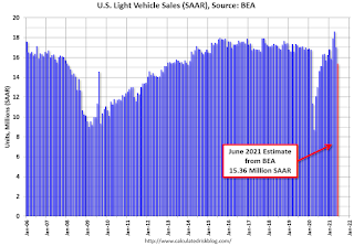
June Vehicles Sales Decreased Sharply to 15.36 Million SAAR
by Calculated Risk on 7/02/2021 11:14:00 AM
The BEA released their estimate of light vehicle sales for June this morning. The BEA estimates sales of 15.36 million SAAR in June 2021 (Seasonally Adjusted Annual Rate), down 9.8% from the May sales rate, and up 18% from June 2020.
This was well below the consensus estimate of 17.1 million SAAR.
 Click on graph for larger image.
This graph shows light vehicle sales since 2006 from the BEA (blue) and the BEA's estimate for June (red).
The impact of COVID-19 was significant, and April 2020 was the worst month.
Since April 2020, sales have increased, and were close to sales in 2019 (the year before the pandemic).
Sales-to-date are down 1.3% compared to the same period in 2019.
The second graph shows light vehicle sales since the BEA started keeping data in 1967.
 Note: dashed line is current estimated sales rate of 15.36 million SAAR.
Sales in June were likely impacted by supply issues.
Comments on June Employment Report
by Calculated Risk on 7/02/2021 09:51:00 AM
The headline jobs number in the June employment report was above expectations, and employment for the previous two months was revised up. However, the participation rate was unchanged and the unemployment rate increased slightly to 5.9%.
Leisure and hospitality gained 343 thousand jobs. In March and April of 2020, leisure and hospitality lost 8.2 million jobs, and are now down 2.2 million jobs since February 2020. So leisure and hospitality has now added back almost 73% of the jobs lost in March and April 2020.
Construction employment declined 7 thousand in June, and manufacturing added 15 thousand jobs.
NOTE: State and Local education added 230 thousand jobs, seasonally adjusted. But this is a seasonal quirk - there were actually 413 thousand education jobs lost in June NSA, but that was fewer than normal for June, so seasonally adjusted this showed a gain.
Earlier: June Employment Report: 850 Thousand Jobs, 5.9% Unemployment Rate
In June, the year-over-year employment change was 7.919 million jobs. This turned positive in April due to the sharp jobs losses in April 2020.
Permanent Job Losers
 Click on graph for larger image.
This graph shows permanent job losers as a percent of the pre-recession peak in employment through the report today. (ht Joe Weisenthal at Bloomberg).
This data is only available back to 1994, so there is only data for three recessions.
In June, the number of permanent job losers decreased to 3.187 million from 3.234 million in May.
In June, the number of permanent job losers decreased to 3.187 million from 3.234 million in May.
These jobs will likely be the hardest to recover.
Prime (25 to 54 Years Old) Participation
 Since the overall participation rate has declined due to cyclical (recession) and demographic (aging population, younger people staying in school) reasons, here is the employment-population ratio for the key working age group: 25 to 54 years old.
The prime working age will be key as the economy recovers.
The 25 to 54 participation rate increased in June to 81.7% from 81.3% in May, and the 25 to 54 employment population ratio increased to 77.2% from 77.1% in May.
Part Time for Economic Reasons
 From the BLS report:
"The number of persons employed part time for economic reasons decreased by 644,000 to 4.6 million in June. This decline reflected a drop in the number of persons whose hours were cut due to slack work or business conditions. The number of persons employed part time for economic reasons is up by 229,000 since February 2020. These individuals, who would have preferred full-time employment, were working part time because their hours had been reduced or they were unable to find full-time jobs."The number of persons working part time for economic reasons decreased in June to 4.627 million from 5.271 million in May.
These workers are included in the alternate measure of labor underutilization (U-6) that decreased to 9.8% from 10.2% in May. This is down from the record high in April 22.9% for this measure since 1994 and close to pre-recession lows.
Unemployed over 26 Weeks
 This graph shows the number of workers unemployed for 27 weeks or more.
 According to the BLS, there are 3.985 million workers who have been unemployed for more than 26 weeks and still want a job, up from 3.752 million in May.
This does not include all the people that left the labor force. This will be a key measure to follow during the recovery.
Summary:
The headline monthly jobs number was above expectations, and the previous two months were revised up by 15,000 combined. However, the headline unemployment rate increased slightly to 5.9%.
There was a sharp decline in part time workers (for economic reasons), but the number of permanent job losers - and the long term unemployed - remain high.
June Employment Report: 850 Thousand Jobs, 5.9% Unemployment Rate
by Calculated Risk on 7/02/2021 08:42:00 AM
From the BLS:
Total nonfarm payroll employment rose by 850,000 in June, and the unemployment rate was little changed at 5.9 percent, the U.S. Bureau of Labor Statistics reported today. Notable job gains occurred in leisure and hospitality, public and private education, professional and business services, retail trade, and other services.
...
The change in total nonfarm payroll employment for April was revised down by 9,000, from +278,000 to +269,000, and the change for May was revised up by 24,000, from +559,000 to +583,000. With these revisions, employment in April and May combined is 15,000 higher than previously reported.
emphasis added
 Click on graph for larger image.
The first graph shows the year-over-year change in total non-farm employment since 1968.
In June, the year-over-year change was 7.919 million jobs. This was up significantly - since employment collapsed in April 2020.
Total payrolls increased by 850 thousand in June. Private payrolls increased by 662 thousand.
Payrolls for April and May were revised up 15 thousand, combined.
 The second graph shows the job losses from the start of the employment recession, in percentage terms.
The current employment recession was by far the worst recession since WWII in percentage terms, but currently is not as severe as the worst of the "Great Recession".
The third graph shows the employment population ratio and the participation rate.
 The Labor Force Participation Rate was unchanged at 61.6% in June, from 61.6% in May. This is the percentage of the working age population in the labor force.
 The Employment-Population ratio was unchanged at 58.0% from 58.0% (black line).
I'll post the 25 to 54 age group employment-population ratio graph later.
 The fourth graph shows the unemployment rate.
 The unemployment rate increased in June to 5.9% from 5.8% in May.
This was above consensus expectations, and April and May were revised up by 15,000 combined.
I'll have more later ...


