 RSS Feed
 by Calculated Risk on 6/01/2021 08:00:00 AM
Tuesday, June 01, 2021
CoreLogic: House Prices up 13% Year-over-year in April
Notes: This CoreLogic House Price Index report is for April. The recent Case-Shiller index release was for March. The CoreLogic HPI is a three month weighted average and is not seasonally adjusted (NSA).
From CoreLogic: Multi-Generational Demand: US Home Prices Post Third Month of Double-Digit Growth in April, CoreLogic Reports
CoreLogic® ... released the CoreLogic Home Price Index (HPI™) and HPI Forecast™ for April 2021.
Sparse inventory and high demand continues to place upward pressure on home prices, creating challenges across generations as buyer preferences shift. Younger millennials continue to enter the market in droves while older millennials look to upgrade and upsize their homes. In a recent CoreLogic consumer survey, the need for more space was noted as the top driver (64%) for demand among these cohorts.
The increased competition among buyers may cause a ripple effect and create affordability challenges for baby boomers interested in downsizing or relocating. Notably, 72% of this cohort list the desire for a new location as the main reason for wanting to purchase a new home. However, in response to rising prices, baby boomers — who own 54% of the nation’s homes — may wait to sell, creating further inventory pressures for older millennials seeking move up-purchases.
“As older homeowners become more comfortable with listing their homes, they are faced with the reality that if they sell, they may get a smaller home for the same price as what they already have,” said Frank Martell, president and CEO of CoreLogic. “Rather than decreasing their financial burden and cashing out equity to support their retirement, baby boomers may choose to stay put — which could exacerbate inventory challenges.”
...
Nationally, home prices increased 13% in April 2021, compared with April 2020. On a month-over-month basis, home prices increased by 2.1% compared to March 2021.
At the state level, Idaho and Arizona continued to have the strongest price growth at 27.2% and 20.4%, respectively. South Dakota also had a 19.3% year-over-year increase as new home buyers seek out more affordable options, space and low property taxes.
emphasis added
Monday, May 31, 2021
Tuesday: ISM Manufacturing, Construction Spending, Vehicle Sales
by Calculated Risk on 5/31/2021 07:31:00 PM
Tuesday:
• At 8:00 AM ET, Corelogic House Price index for April.
• At 10:00 AM, ISM Manufacturing Index for May. The consensus is for the ISM to be at 61.0, up from 60.7 in April. The employment index was at 55.1% in April, and the new orders index was at 64.3%.
• Also at 10:00 AM, Construction Spending for April. The consensus is for a 0.6% increase in construction spending.
• At 10:30 AM, Dallas Fed Survey of Manufacturing Activity for May. This is the last of the regional surveys for May.
• All day, Light vehicle sales for May. The consensus is for light vehicle sales to be 18.0 million SAAR in May, down from 18.5 million in April (Seasonally Adjusted Annual Rate). Wards Auto is forecasting a decline in sales to 16.5 million SAAR.
Housing Inventory May 31st Update: Inventory Increased Week-over-week
by Calculated Risk on 5/31/2021 10:47:00 AM
One of the key questions for 2021 is: Will inventory increase as the pandemic subsides, or will inventory decrease further in 2021?
Tracking inventory will be very important this year.
 Click on graph for larger image in graph gallery.
This inventory graph is courtesy of Altos Research.
As of May 28th, inventory was at 327 thousand (7 day average), compared to 719 thousand the same week a year ago. That is a decline of 54.5%.
A week ago, inventory was at 324 thousand, and was down 55.3% YoY. Seasonally, inventory has bottomed.
Inventory was about 6.7% above the low in early April.
Mike Simonsen discusses this data regularly on Youtube.
Seven High Frequency Indicators for the Economy
by Calculated Risk on 5/31/2021 08:40:00 AM
These indicators are mostly for travel and entertainment. It will interesting to watch these sectors recover as the vaccine is distributed.
IMPORTANT: Be safe now - if all goes well, everyone could be vaccinated by July 4th.
----- Airlines: Transportation Security Administration -----
The TSA is providing daily travel numbers.
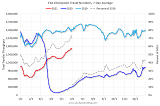 Click on graph for larger image.
This data shows the seven day average of daily total traveler throughput from the TSA for 2019 (Light Blue), 2020 (Blue) and 2021 (Red).
The dashed line is the percent of 2019 for the seven day average.
This data is as of May 30th.
The seven day average is down 29.8% from the same day in 2019 (70.2% of 2019). (Dashed line)
There was a slow increase from the bottom - and TSA data has picked up in 2021.
----- Restaurants: OpenTable -----
The second graph shows the 7 day average of the year-over-year change in diners as tabulated by OpenTable for the US and several selected cities.
----- Hotel Occupancy: STR -----
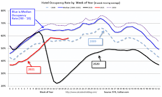 This graph shows the seasonal pattern for the hotel occupancy rate using the four week average.
The red line is for 2021, black is 2020, blue is the median, dashed purple is 2019, and dashed light blue is for 2009 (the worst year on record for hotels prior to 2020).
Occupancy is now slightly above the horrible 2009 levels.
This data is through May 22nd. Hotel occupancy is currently down 15% compared to same week in 2019). Note: Occupancy was up year-over-year, since occupancy declined sharply at the onset of the pandemic. However, occupancy is still down significantly from normal levels.
Notes: Y-axis doesn't start at zero to better show the seasonal change.
----- Gasoline Supplied: Energy Information Administration -----
 This graph, based on weekly data from the U.S. Energy Information Administration (EIA), shows gasoline supplied compared to the same week of 2019.
Blue is for 2020. Red is for 2021.
As of May 21st, gasoline supplied was up about 0.9% (about 100.9% of the same week in 2019).
This is the first week this year with gasoline supplied up compared to the same week in 2019.
----- Transit: Apple Mobility -----
This graph is from Apple mobility. From Apple: "This data is generated by counting the number of requests made to Apple Maps for directions in select countries/regions, sub-regions, and cities." This is just a general guide - people that regularly commute probably don't ask for directions.
There is also some great data on mobility from the Dallas Fed Mobility and Engagement Index. However the index is set "relative to its weekday-specific average over January–February", and is not seasonally adjusted, so we can't tell if an increase in mobility is due to recovery or just the normal increase in the Spring and Summer.
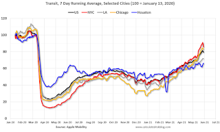 This data is through May 29th for the United States and several selected cities.
The graph is the running 7 day average to remove the impact of weekends.
IMPORTANT: All data is relative to January 13, 2020. This data is NOT Seasonally Adjusted. People walk and drive more when the weather is nice, so I'm just using the transit data.
According to the Apple data directions requests, public transit in the 7 day average for the US is at 79% of the January 2020 level and moving up.
----- New York City Subway Usage -----
Here is some interesting data on New York subway usage (HT BR).
 This graph is from Todd W Schneider. This is weekly data since 2015.
The TSA is providing daily travel numbers.
 Click on graph for larger image.
This data shows the seven day average of daily total traveler throughput from the TSA for 2019 (Light Blue), 2020 (Blue) and 2021 (Red).
The dashed line is the percent of 2019 for the seven day average.
This data is as of May 30th.
The seven day average is down 29.8% from the same day in 2019 (70.2% of 2019). (Dashed line)
There was a slow increase from the bottom - and TSA data has picked up in 2021.
The second graph shows the 7 day average of the year-over-year change in diners as tabulated by OpenTable for the US and several selected cities.
IMPORTANT: OpenTable notes: "we’ve updated the data including downloadable dataset from January 1, 2021 onward to compare seated diners from 2021 to 2019, as opposed to year over year." Thanks!
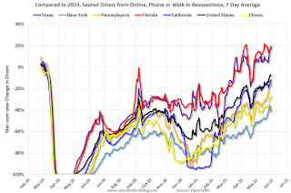 Thanks to OpenTable for providing this restaurant data:
This data is updated through May 29, 2021.
This data is "a sample of restaurants on the OpenTable network across all channels: online reservations, phone reservations, and walk-ins. For year-over-year comparisons by day, we compare to the same day of the week from the same week in the previous year."
Note that this data is for "only the restaurants that have chosen to reopen in a given market". Since some restaurants have not reopened, the actual year-over-year decline is worse than shown.
Dining picked up during the holidays, then slumped with the huge winter surge in cases. Dining is picking up again. Florida and Texas are above 2019 levels.
----- Movie Tickets: Box Office Mojo -----
 This data shows domestic box office for each week and the median for the years 2016 through 2019 (dashed light blue).
 Thanks to OpenTable for providing this restaurant data:
This data is updated through May 29, 2021.
This data is "a sample of restaurants on the OpenTable network across all channels: online reservations, phone reservations, and walk-ins. For year-over-year comparisons by day, we compare to the same day of the week from the same week in the previous year."
Note that this data is for "only the restaurants that have chosen to reopen in a given market". Since some restaurants have not reopened, the actual year-over-year decline is worse than shown.
Dining picked up during the holidays, then slumped with the huge winter surge in cases. Dining is picking up again. Florida and Texas are above 2019 levels.
 This data shows domestic box office for each week and the median for the years 2016 through 2019 (dashed light blue).
 Blue is 2020 and Red is 2021.
The data is from BoxOfficeMojo through May 27th.
Note that the data is usually noisy week-to-week and depends on when blockbusters are released.
Movie ticket sales were at $20 million last week, down about 92% from the median for the week.
Note that the data is usually noisy week-to-week and depends on when blockbusters are released.
Movie ticket sales were at $20 million last week, down about 92% from the median for the week.
 This graph shows the seasonal pattern for the hotel occupancy rate using the four week average.
 The red line is for 2021, black is 2020, blue is the median, dashed purple is 2019, and dashed light blue is for 2009 (the worst year on record for hotels prior to 2020).
Occupancy is now slightly above the horrible 2009 levels.
This data is through May 22nd. Hotel occupancy is currently down 15% compared to same week in 2019). Note: Occupancy was up year-over-year, since occupancy declined sharply at the onset of the pandemic. However, occupancy is still down significantly from normal levels.
Notes: Y-axis doesn't start at zero to better show the seasonal change.
 This graph, based on weekly data from the U.S. Energy Information Administration (EIA), shows gasoline supplied compared to the same week of 2019.
Blue is for 2020. Red is for 2021.
As of May 21st, gasoline supplied was up about 0.9% (about 100.9% of the same week in 2019).
This is the first week this year with gasoline supplied up compared to the same week in 2019.
This graph is from Apple mobility. From Apple: "This data is generated by counting the number of requests made to Apple Maps for directions in select countries/regions, sub-regions, and cities." This is just a general guide - people that regularly commute probably don't ask for directions.
There is also some great data on mobility from the Dallas Fed Mobility and Engagement Index. However the index is set "relative to its weekday-specific average over January–February", and is not seasonally adjusted, so we can't tell if an increase in mobility is due to recovery or just the normal increase in the Spring and Summer.
 This data is through May 29th for the United States and several selected cities.
The graph is the running 7 day average to remove the impact of weekends.
IMPORTANT: All data is relative to January 13, 2020. This data is NOT Seasonally Adjusted. People walk and drive more when the weather is nice, so I'm just using the transit data.
According to the Apple data directions requests, public transit in the 7 day average for the US is at 79% of the January 2020 level and moving up.
Here is some interesting data on New York subway usage (HT BR).
 This graph is from Todd W Schneider. This is weekly data since 2015.
 Most weeks are between 30 and 35 million entries, and currently there are almost 12 million subway turnstile entries per week - and increasing.
This data is through Friday, May 28th.
Schneider has graphs for each borough, and links to all the data sources.
He notes: "Data updates weekly from the MTA’s public turnstile data, usually on Saturday mornings".
This data is through Friday, May 28th.
Schneider has graphs for each borough, and links to all the data sources.
He notes: "Data updates weekly from the MTA’s public turnstile data, usually on Saturday mornings".
Sunday, May 30, 2021
May 30th COVID-19 New Cases, Vaccinations, Hospitalizations
by Calculated Risk on 5/30/2021 04:23:00 PM
Note: Many local areas will not report tomorrow due to the Memorial Holiday.
According to the CDC, on Vaccinations.
Total doses administered: 294,928,850, as of yesterday 293,705,050. Day: 1.22 million.
| COVID Metrics | |||
|---|---|---|---|
| Current | Yesterday | Goal | |
| Percent over 18, One Dose | 62.6% | 62.4% | ≥70.0%1,2 |
| Fully Vaccinated (millions) | 135.1 | 134.4 | ≥1601 |
| New Cases per Day3 | 18,913 | 20,277 | ≤5,0002 |
| Hospitalized3 | 20,780 | 21,571 | ≤3,0002 |
| Deaths per Day3 | 442 | 454 | ≤502 |
| 1 America's Goal by July 4th, 2my goals to stop daily posts, 37 day average for Cases, Hospitalized, and Deaths | |||
KUDOS to the residents of the ten states that have already achieved the 70% goal: Vermont and Hawaii are over 80%, plus Massachusetts, Connecticut, Maine, New Jersey, Rhode Island, New Mexico, Pennsylvania and New Hampshire all over 70%.
Next up are Maryland at 69.9%, California at 69.8%, Washington at 69.1%, D.C. at 68.2%, and New York at 67.7%, Minnesota at 67.4%, Illinois at 67.3%, and Virginia at 67.2%.
The Atlantic: "Why You Should Wait Out the Wild Housing Market"
by Calculated Risk on 5/30/2021 11:12:00 AM
I'm quoted several times in this article from Derek Thompson at the Atlantic: Why You Should Wait Out the Wild Housing Market
“In my time studying housing markets, I’ve seen bubbles and I’ve seen busts,” says Bill McBride, an economics writer who famously predicted the 2007 housing crash. “But I’ve never seen anything quite like this. It’s a perfect storm.”In the article, I suggested waiting ... but I'd like to add, if you do buy now, be careful about location (like near a busy street) because that can't be fixed. Also bad layouts are difficult and expensive to fix.
...
“It’s not clear at all to me that things are going to slow down significantly in the near future,” he said. “In 2005, I had a strong sense that the hot market would turn and that, when it turned, things would get very ugly. Today, I don’t have that sense at all, because all of the fundamentals are there. Demand will be high for a while, because Millennials need houses. Prices will keep rising for a while, because inventory is so low.”
Defective homes will make you unhappy, and they are also hard to sell in a normal market (you might have to wait for the next boom).
Hot markets are when the defective homes (bad location, bad layout, etc.) are sold. Don’t buy one of those!
Saturday, May 29, 2021
May 29th COVID-19 New Cases, Vaccinations, Hospitalizations
by Calculated Risk on 5/29/2021 05:10:00 PM
This data is from the CDC.
According to the CDC, on Vaccinations.
Total doses administered: 293,705,050, as of yesterday 292,099,778. Day: 1.61 million.
| COVID Metrics | |||
|---|---|---|---|
| Current | Yesterday | Goal | |
| Percent over 18, One Dose | 62.4% | 62.2% | 70.0%1,2 |
| Fully Vaccinated (millions) | 134.4 | 133.5 | 1601 |
| New Cases per Day3 | 20,277 | 20,901 | 5,0002 |
| Hospitalized3 | 21,571 | 21,928 | 3,0002 |
| Deaths per Day3 | 447 | 453 | 502 |
| 1 America's Goal by July 4th, 2my goals to stop daily posts, 37 day average for Cases, Hospitalized, and Deaths | |||
KUDOS to the ten states that have already achieved the 70% goal: Vermont and Hawaii over 80%, plus Massachusetts, Connecticut, Maine, New Jersey, Rhode Island, New Mexico, Pennsylvania and New Hampshire all over 70%.
Next up are Maryland at 69.9%, California at 69.6%, Washington at 68.8%, D.C. at 68.0%, and New York at 67.5%.
Schedule for Week of May 30, 2021
by Calculated Risk on 5/29/2021 08:11:00 AM
The key report scheduled for this week is the May employment report.
Other key reports include the May ISM Manufacturing and Service surveys, and May Vehicle Sales.
All US markets will be closed in observance of Memorial Day.
8:00 AM: Corelogic House Price index for April.
10:00 AM: ISM Manufacturing Index for May. The consensus is for the ISM to be at 61.0, up from 60.7 in April. The employment index was at 55.1% in April, and the new orders index was at 64.3%.
10:00 AM: Construction Spending for April. The consensus is for a 0.6% increase in construction spending.
10:30 AM: Dallas Fed Survey of Manufacturing Activity for May. This is the last of the regional surveys for May.
 All day: Light vehicle sales for May. The consensus is for light vehicle sales to be 18.0 million SAAR in May, down from 18.5 million in April (Seasonally Adjusted Annual Rate).
Wards Auto is forecasting a decline in sales to 16.5 million SAAR.
This graph shows light vehicle sales since the BEA started keeping data in 1967. The dashed line is the sales rate for last month.
----- Wednesday, June 2nd -----
7:00 AM ET: The Mortgage Bankers Association (MBA) will release the results for the mortgage purchase applications index.
2:00 PM: the Federal Reserve Beige Book, an informal review by the Federal Reserve Banks of current economic conditions in their Districts.
----- Thursday, June 3rd -----
8:15 AM: The ADP Employment Report for May. This report is for private payrolls only (no government). The consensus is for 650,000 payroll jobs added in May, down from 742,000 in April.
8:30 AM: The initial weekly unemployment claims report will be released. The consensus is for a decrease to 395 thousand from 406 thousand last week.
10:00 AM: the ISM Services Index for May. The consensus is for a reading of 63.0, up from 62.7.
----- Friday, June 4th -----
7:00 AM: Speech, Fed Chair Jerome Powell, Central banks and climate change, At the Green Swan 2021 Global Virtual Conference
 8:30 AM: Employment Report for May. The consensus is for 650,000 jobs added, and for the unemployment rate to decrease to 5.9%.
There were 266,000 jobs added in April, and the unemployment rate was at 6.1%.
This graph shows the job losses from the start of the employment recession, in percentage terms.
The current employment recession was by far the worst recession since WWII in percentage terms, but currently is not as severe as the worst of the "Great Recession".
This graph shows light vehicle sales since the BEA started keeping data in 1967. The dashed line is the sales rate for last month.
7:00 AM ET: The Mortgage Bankers Association (MBA) will release the results for the mortgage purchase applications index.
2:00 PM: the Federal Reserve Beige Book, an informal review by the Federal Reserve Banks of current economic conditions in their Districts.
8:15 AM: The ADP Employment Report for May. This report is for private payrolls only (no government). The consensus is for 650,000 payroll jobs added in May, down from 742,000 in April.
8:30 AM: The initial weekly unemployment claims report will be released. The consensus is for a decrease to 395 thousand from 406 thousand last week.
10:00 AM: the ISM Services Index for May. The consensus is for a reading of 63.0, up from 62.7.
7:00 AM: Speech, Fed Chair Jerome Powell, Central banks and climate change, At the Green Swan 2021 Global Virtual Conference
 8:30 AM: Employment Report for May. The consensus is for 650,000 jobs added, and for the unemployment rate to decrease to 5.9%.
There were 266,000 jobs added in April, and the unemployment rate was at 6.1%.
This graph shows the job losses from the start of the employment recession, in percentage terms.
The current employment recession was by far the worst recession since WWII in percentage terms, but currently is not as severe as the worst of the "Great Recession".
Friday, May 28, 2021
Real Personal Income less Transfer Payments Above Previous Peak
by Calculated Risk on 5/28/2021 03:48:00 PM
Government transfer payments decreased sharply in April compared to March, but were still almost $1.4 trillion (on SAAR basis) above the February 2020 level (pre-pandemic). Most of the increase in transfer payments - compared to the levels prior to the crisis - is from unemployment insurance and "other" (includes direct payments).
This table shows the amount of unemployment insurance and "Other" transfer payments since February 2020 (pre-crisis level). The increase in "Other" was mostly due to parts of the relief acts including direct payments.
There was a large increase in "Other" in March due to the American Rescue Plan Act.
Note: Not in the table below, but Social Security payments haven't increased significantly since the pre-recession levels (from $1,065 billion SAAR in Jan 2020 to $1,108 billion SAAR in Apr 2021).
A key measure of the health of the economy (Used by NBER in recession dating) is Real Personal Income less Transfer payments.
 Click on graph for larger image.
This graph shows real personal income less transfer payments since 1990.
This measure of economic activity increased 0.5% in April, compared to March, and was up 0.3% compared to February 2020 (previous peak).
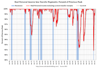 Another way to look at this data is as a percent of the previous peak.
Real personal income less transfer payments was off 8.1% in April 2020. That was a larger decline than the worst of the great recession.
Currently personal income less transfer payments are at a new peak.
This is the first of the key NBER measures - GDP, Employment, Industrial Production, Real Personal Income less Transfer Payments - that is above pre-recession levels. GDP will be above pre-recession levels in Q2.
| Selected Transfer Payments Billions of dollars, SAAR | ||
|---|---|---|
| Other | Unemployment Insurance | |
| Feb-20 | $506 | $28 |
| Mar-20 | $515 | $74 |
| Apr-20 | $3,379 | $493 |
| May-20 | $1,360 | $1,356 |
| Jun-20 | $758 | $1,405 |
| Jul-20 | $760 | $1,331 |
| Aug-20 | $692 | $636 |
| Sep-20 | $936 | $359 |
| Oct-20 | $732 | $304 |
| Nov-20 | $620 | $281 |
| Dec-20 | $654 | $304 |
| Jan-21 | $2,354 | $556 |
| Feb-21 | $777 | $535 |
| Mar-21 | $4,747 | $541 |
| Apr-21 | $1,400 | $495 |
A key measure of the health of the economy (Used by NBER in recession dating) is Real Personal Income less Transfer payments.
 Click on graph for larger image.
This graph shows real personal income less transfer payments since 1990.
This measure of economic activity increased 0.5% in April, compared to March, and was up 0.3% compared to February 2020 (previous peak).
 Another way to look at this data is as a percent of the previous peak.
Real personal income less transfer payments was off 8.1% in April 2020. That was a larger decline than the worst of the great recession.
Currently personal income less transfer payments are at a new peak.
This is the first of the key NBER measures - GDP, Employment, Industrial Production, Real Personal Income less Transfer Payments - that is above pre-recession levels. GDP will be above pre-recession levels in Q2.
May 28th COVID-19 New Cases, Vaccinations, Hospitalizations
by Calculated Risk on 5/28/2021 03:42:00 PM
This data is from the CDC.
According to the CDC, on Vaccinations.
Total doses administered: 292,099,778, as of yesterday 290,724,607. Day: 1.38 million.
| COVID Metrics | |||
|---|---|---|---|
| Current | Yesterday | Goal | |
| Percent over 18, One Dose | 62.2% | 62.0% | 70.0%1,2 |
| Fully Vaccinated (millions) | 133.5 | 132.8 | 1601 |
| New Cases per Day3 | 20,882 | 21,659 | 5,0002 |
| Hospitalized3 | 21,928 | 22,443 | 3,0002 |
| Deaths per Day3 | 453 | 437 | 502 |
| 1 America's Goal by July 4th, 2my goals to stop daily posts, 37 day average for Cases, Hospitalized, and Deaths | |||
KUDOS to the ten states that have already achieved the 70% goal: Vermont, Hawaii, Massachusetts, Connecticut, Maine, New Jersey, Rhode Island, New Mexico, Pennsylvania and New Hampshire.
Next up are Maryland at 69.6%, California at 69.3%, and Washington at 68.2%.


