 RSS Feed
 by Calculated Risk on 5/18/2021 12:01:00 PM
Tuesday, May 18, 2021
Rhode Island Real Estate in April: Sales Up 27% YoY, Inventory Down 48% YoY
Note: I'm tracking data for many local markets around the U.S. I think it is especially important to watch inventory this year. Remember sales were weak in April 2020 due to the pandemic, so the YoY sales comparison is easy.
For for the entire state Rhode Island:
Closed sales (single family and condos) in April 2021 were 1,080, up 26.6% from 853 in April 2020.
Active Listings (single family and condos) in April 2021 were 1,520, down 48.0% from 2,922 in April 2020.
Inventory in April was down 7.1% from last month.
Comments on April Housing Starts
by Calculated Risk on 5/18/2021 10:39:00 AM
Earlier: Housing Starts decreased to 1.569 Million Annual Rate in April
It is possible that supply constraints held back housing starts in April. Here is a comment from MBA SVP and Chief Economist Mike Fratantoni:
“Single-family starts in April dropped more than 13% compared to last month, but permits to build single-family homes saw a smaller decline. This is consistent with reports that builders are delaying starting new construction because of the marked increase in costs for lumber and other inputs. Moreover, builders are also reporting difficulty obtaining other inputs like appliances."
Total housing starts in April were below expectations, and starts in February and March were revised down slightly. Single family starts decreased in April, but were up 59% year-over-year (starts declined at the beginning of the pandemic).
The volatile multi-family sector is up sharply year-over-year (apartments were under pressure from COVID).
The housing starts report showed total starts were down 9.5% in April compared to March, and total starts were up 67.3% year-over-year compared to April 2020.
The housing starts report showed total starts were down 9.5% in April compared to March, and total starts were up 67.3% year-over-year compared to April 2020.
Low mortgage rates and limited existing home inventory have given a boost to single family housing starts.
The first graph shows the month to month comparison for total starts between 2020 (blue) and 2021 (red).
 Click on graph for larger image.
Starts were up 67.3% in April compared to April 2020. The year-over-year comparison will be easy again in May and June.
2020 was off to a strong start before the pandemic, and with low interest rates and little competing existing home inventory, starts finished 2020 strong. Starts have started 2021 strong (February was impacted by the harsh weather).
Below is an update to the graph comparing multi-family starts and completions. Since it usually takes over a year on average to complete a multi-family project, there is a lag between multi-family starts and completions. Completions are important because that is new supply added to the market, and starts are important because that is future new supply (units under construction is also important for employment).
These graphs use a 12 month rolling total for NSA starts and completions.
 The blue line is for multifamily starts and the red line is for multifamily completions.
The rolling 12 month total for starts (blue line) increased steadily for several years following the great recession - then mostly moved sideways. Completions (red line) had lagged behind - then completions caught up with starts- then starts picked up a little again late last year, but have fallen off with the pandemic.
 The last graph shows single family starts and completions. It usually only takes about 6 months between starting a single family home and completion - so the lines are much closer. The blue line is for single family starts and the red line is for single family completions.
Single family starts are getting back to more normal levels, but I still expect some further increases in single family starts and completions on a rolling 12 month basis - especially given the low level of existing home inventory.
These graphs use a 12 month rolling total for NSA starts and completions.
 The blue line is for multifamily starts and the red line is for multifamily completions.
 The rolling 12 month total for starts (blue line) increased steadily for several years following the great recession - then mostly moved sideways. Completions (red line) had lagged behind - then completions caught up with starts- then starts picked up a little again late last year, but have fallen off with the pandemic.
 The last graph shows single family starts and completions. It usually only takes about 6 months between starting a single family home and completion - so the lines are much closer. The blue line is for single family starts and the red line is for single family completions.
Single family starts are getting back to more normal levels, but I still expect some further increases in single family starts and completions on a rolling 12 month basis - especially given the low level of existing home inventory.
Housing Starts decreased to 1.569 Million Annual Rate in April
by Calculated Risk on 5/18/2021 08:39:00 AM
From the Census Bureau: Permits, Starts and Completions
Housing Starts:
Privately‐owned housing starts in April were at a seasonally adjusted annual rate of 1,569,000. This is 9.5 percent below the revised March estimate of 1,733,000, but is 67.3 percent above the April 2020 rate of 938,000. Single‐family housing starts in April were at a rate of 1,087,000; this is 13.4 percent below the revised March figure of 1,255,000. The April rate for units in buildings with five units or more was 470,000.
Building Permits:
Privately‐owned housing units authorized by building permits in April were at a seasonally adjusted annual rate of 1,760,000. This is 0.3 percent above the revised March rate of 1,755,000 and is 60.9 percent above the April 2020 rate of 1,094,000. Single‐family authorizations in April were at a rate of 1,149,000; this is 3.8 percent below the revised March figure of 1,194,000. Authorizations of units in buildings with five units or more were at a rate of 559,000 in April
emphasis added
 Click on graph for larger image.
The first graph shows single and multi-family housing starts for the last several years.
Multi-family starts (red, 2+ units) increased slightly in April compared to March. Multi-family starts were up 91% year-over-year in April.
Single-family starts (blue) decreased in April, and were up 59% year-over-year (starts slumped at the beginning of the pandemic).
 The second graph shows total and single unit starts since 1968.
 The second graph shows the huge collapse following the housing bubble, and then the eventual recovery (but still not historically high).
Total housing starts in April were below expectations, and starts in February and March were revised down.
I'll have more later …
Monday, May 17, 2021
May 17th COVID-19 New Cases, Hospitalizations, Vaccinations
by Calculated Risk on 5/17/2021 11:16:00 PM
Hopefully everyone is part of the solution and is getting vaccinated!
According to the CDC, on Vaccinations. Total administered: 274,411,901, as of yesterday 272,925,411. Day: 1.49 million. (U.S. Capacity is around 4 million per day)
1) 59.8% of the population over 18 has had at least one dose (70% goal by July 4th).
2) 123.8 million Americans are fully vaccinated (160 million goal by July 4th)
Note: I'll stop posting this daily once all four of these criteria are met:
1) 70% of the population over 18 has had at least one dose of vaccine, and
2) new cases are under 5,000 per day, and
3) hospitalizations are below 3,000, and
4) average daily deaths under 50 (currently 545 per day).
And check out COVID Act Now to see how each state is doing.
Almost 9,500 US deaths were reported so far in May due to COVID.
 Click on graph for larger image.
This graph shows the daily (columns) 7 day average (line) of positive tests reported.
This data is from the CDC.
 Click on graph for larger image.
This graph shows the daily (columns) 7 day average (line) of positive tests reported.
This data is from the CDC.
The 7-day average is 30,211, down from 31,629 yesterday, and down sharply from the recent peak of 69,881 on April 13, 2021. This is the lowest since June 23, 2020.
The second graph shows the number of people hospitalized.
 This data is also from the CDC.
The CDC cautions that due to reporting delays, the area in grey will probably increase.
The current 7-day average is 26,726, down from 27,992 reported yesterday, but still above the post-summer surge low of 23,000.
Tuesday: Housing Starts
by Calculated Risk on 5/17/2021 09:00:00 PM
From Matthew Graham at Mortgage News Daily: MBS RECAP: Super Slow Day; Still Waiting For Breakout
Whether it's the narrow range between 1.62 and 1.68% in 10yr yields or the wider 1.53-1.75%, bond watchers continue waiting for evidence of a breakout. It certainly didn't arrive today, and even if it did, the ultra low volume profile would argue against reading too much into it. [30 year fixed 3.14%]Tuesday:
emphasis added
• At 8:30 AM ET: Housing Starts for April. The consensus is for 1.710 million SAAR, down from 1.739 million SAAR in March.
MBA Survey: "Share of Mortgage Loans in Forbearance Decreases to 4.22%"
by Calculated Risk on 5/17/2021 04:00:00 PM
Note: This is as of May 9th.
From the MBA: Share of Mortgage Loans in Forbearance Decreases to 4.22%
The Mortgage Bankers Association’s (MBA) latest Forbearance and Call Volume Survey revealed that the total number of loans now in forbearance decreased by 14 basis points from 4.36% of servicers’ portfolio volume in the prior week to 4.22% as of May 9, 2021. According to MBA’s estimate, 2.1 million homeowners are in forbearance plans.
The share of Fannie Mae and Freddie Mac loans in forbearance decreased 8 basis points to 2.24%. Ginnie Mae loans in forbearance decreased 21 basis points to 5.61%, while the forbearance share for portfolio loans and private-label securities (PLS) decreased by 29 basis points to 8.26%. The percentage of loans in forbearance for independent mortgage bank (IMB) servicers decreased 16 basis points to 4.42%, and the percentage of loans in forbearance for depository servicers declined 12 basis points to 4.35%.
“More homeowners exited forbearance in the first full week of May, leading to a 14-basis-point decrease in the forbearance share – the 11th straight week of declines. The rate of new requests dropped to 4 basis points, which is the lowest level since last March,” said Mike Fratantoni, MBA’s Senior Vice President and Chief Economist. “Of those in forbearance extensions, more than half have been in forbearance for more than 12 months.”
Added Fratantoni, “The opening of the economy, as the successful vaccination effort continues, should lead to further reductions in the forbearance share. However, many homeowners continue to struggle. Borrowers who are reaching the end of their forbearance term should reach out to their servicer to review their options.”
emphasis added
 Click on graph for larger image.
This graph shows the percent of portfolio in forbearance by investor type over time. Most of the increase was in late March and early April, and has trended down since then.
The MBA notes: "Total weekly forbearance requests as a percent of servicing portfolio volume (#) decreased relative to the prior week: from 0.05% to 0.04%"
California April Housing: Sales up 65% YoY, Active Listings down 50% YoY
by Calculated Risk on 5/17/2021 12:04:00 PM
Note: Remember sales were weak in April 2020 due to the pandemic, so the YoY comparison is easy.
The CAR reported: California median home price breaks $800,000 in April with home sales remaining robust as spring home-buying season kicks off, C.A.R. reports
Heated market conditions and a shortage of homes for sale continued to put upward pressure on home prices in California, driving the state’s median price above the $800,000 benchmark for the first time ever in April, as home sales soared from last year’s pandemic-level lows, the CALIFORNIA ASSOCIATION OF REALTORS® (C.A.R.) said today.Note that inventory was up 7.4% from March to April.
Closed escrow sales of existing, single-family detached homes in California totaled a seasonally adjusted annualized rate of 458,170 in April, according to information collected by C.A.R. from more than 90 local REALTOR® associations and MLSs statewide. The statewide annualized sales figure represents what would be the total number of homes sold during 2021 if sales maintained the April pace throughout the year. It is adjusted to account for seasonal factors that typically influence home sales.
April home sales increased on a monthly basis for the third consecutive month, rising 2.6 percent from 446,410 in in March and up 65.1 percent from a year ago, when 277,440 homes were sold on an annualized basis. The sharp yearly sales jump was expected as the housing market was hit hard by the pandemic shutdown last year, when home sales dropped more than 30 percent over the previous April.
“California continues to experience one of the hottest housing markets as homes sell at the fastest pace ever, with the share of homes sold above asking price, the price per square foot and the sales-to-list price all at record highs, while active listings remain at historic lows,” said C.A.R. President Dave Walsh, vice president and manager of the Compass San Jose office.
...
The Unsold Inventory Index (UII) dropped to 1.6 months in April from 1.7 months in March and was down sharply from a year ago, when there was 3.4 months of housing inventory. The index indicates the number of months it would take to sell the supply of homes on the market at the current rate of sales.
Active listings continue to fall more than 50 percent in April from last year, recording four straight months that housing supply was cut in half from a year ago. The ongoing decline in inventory is due partly to the surge in demand in the past 10 months, but the lack of new listings is also a contributing factor. While new active listings did experience a robust year-over-year growth from last April due to the pandemic shutdown, the level of newly added supply is still significantly below the pre-pandemic level. On a month-to-month basis, for-sale properties inched up by 7.4 percent in April and should climb further in the coming months if the market follows its typical seasonal pattern.
emphasis added
Housing Inventory May 17th Update: Slight Increase Week-to-Week
by Calculated Risk on 5/17/2021 10:38:00 AM
One of the key questions for 2021 is: Will inventory increase as the pandemic subsides, or will inventory decrease further in 2021?
Tracking inventory will be very important this year.
 Click on graph for larger image in graph gallery.
This inventory graph is courtesy of Altos Research.
As of May 14th, inventory was at 314 thousand (7 day average), compared to 729 thousand the same week a year ago. That is a decline of 57.0%.
A week ago, inventory was at 310 thousand, and was down 57.6% YoY. Seasonally, inventory might have bottomed - this has been at about the same level for the last eight weeks. Inventory was about 2% above the low in early April.
Mike Simonsen discusses this data regularly on Youtube.
NAHB: Builder Confidence Unchanged at 83 in May
by Calculated Risk on 5/17/2021 10:04:00 AM
The National Association of Home Builders (NAHB) reported the housing market index (HMI) was at 83, unchanged from 83 in April. Any number above 50 indicates that more builders view sales conditions as good than poor.
From the NAHB: Building Materials Top Housing Concerns
Builder confidence held stable in May, despite growing concerns over the price and availability of most building materials, including lumber. The latest NAHB/Wells Fargo Housing Market Index (HMI) released today shows that builder confidence in the market for newly built single-family homes is 83 in May, unchanged from April.
“Builder confidence in the market remains strong due to a lack of resale inventory, low mortgage interest rates, and a growing demographic of prospective home buyers,” said NAHB Chairman Chuck Fowke. “However, first-time and first-generation home buyers are particularly at risk for losing a purchase due to cost hikes associated with increasingly scarce material availability. Policymakers must take note and find ways to increase production of domestic building materials, including lumber and steel, and suspend tariffs on imports of construction materials.”
“Low interest rates are supporting housing affordability in a market where the cost of most materials is rising,” said NAHB Chief Economist Robert Dietz. “In recent months, aggregate residential construction material costs were up 12% year over year, and our surveys suggest those costs are rising further. Some builders are slowing sales to manage their own supply chains, which means growing affordability challenges for a market in critical need of more inventory.”
...
The HMI index gauging current sales conditions held steady at 88, and the gauge charting sales expectations in the next six months rose one point to 81. The component measuring traffic of prospective buyers fell one point to 73.
Looking at the three-month moving averages for regional HMI scores, the South rose one point to 84, and the West held steady at 90. The Northeast fell four points to 82, and the Midwest posted a three-point drop to 75.
 Click on graph for larger image.
This graph show the NAHB index since Jan 1985.
This was at the consensus forecast, and a very strong reading.
Housing and homebuilding have been one of the best performing sectors during the pandemic.
Seven High Frequency Indicators for the Economy
by Calculated Risk on 5/17/2021 08:40:00 AM
These indicators are mostly for travel and entertainment. It will interesting to watch these sectors recover as the vaccine is distributed.
IMPORTANT: Be safe now - if all goes well, everyone could be vaccinated by June.
----- Airlines: Transportation Security Administration -----
The TSA is providing daily travel numbers.
 Click on graph for larger image.
This data shows the seven day average of daily total traveler throughput from the TSA for 2019 (Light Blue), 2020 (Blue) and 2021 (Red).
The dashed line is the percent of 2019 for the seven day average.
This data is as of May 16th.
The seven day average is down 34.5% from the same day in 2019 (65.5% of 2019). (Dashed line)
There was a slow increase from the bottom - and TSA data has picked up in 2021.
----- Restaurants: OpenTable -----
The second graph shows the 7 day average of the year-over-year change in diners as tabulated by OpenTable for the US and several selected cities.
----- Hotel Occupancy: STR -----
 This graph shows the seasonal pattern for the hotel occupancy rate using the four week average.
The red line is for 2021, black is 2020, blue is the median, and dashed light blue is for 2009 (the worst year since the Great Depression for hotels - before 2020).
Occupancy is now slightly above the horrible 2009 levels.
This data is through May 8th. Hotel occupancy is currently down 17% compared to same week in 2019). Note: Occupancy was up year-over-year, since occupancy declined sharply at the onset of the pandemic. However, occupancy is still down significantly from normal levels.
Notes: Y-axis doesn't start at zero to better show the seasonal change.
----- Gasoline Supplied: Energy Information Administration -----
 This graph, based on weekly data from the U.S. Energy Information Administration (EIA), shows gasoline supplied compared to the same week of 2019.
Blue is for 2020. Red is for 2021.
As of May 7th, gasoline supplied was off about 3.8% (about 96.2% of the same week in 2019).
Gasoline supplied was up year-over-year, since at one point, gasoline supplied was off almost 50% YoY in 2020.
----- Transit: Apple Mobility -----
This graph is from Apple mobility. From Apple: "This data is generated by counting the number of requests made to Apple Maps for directions in select countries/regions, sub-regions, and cities." This is just a general guide - people that regularly commute probably don't ask for directions.
There is also some great data on mobility from the Dallas Fed Mobility and Engagement Index. However the index is set "relative to its weekday-specific average over January–February", and is not seasonally adjusted, so we can't tell if an increase in mobility is due to recovery or just the normal increase in the Spring and Summer.
 This data is through May 15th for the United States and several selected cities.
The graph is the running 7 day average to remove the impact of weekends.
IMPORTANT: All data is relative to January 13, 2020. This data is NOT Seasonally Adjusted. People walk and drive more when the weather is nice, so I'm just using the transit data.
According to the Apple data directions requests, public transit in the 7 day average for the US is at 74% of the January 2020 level and moving up.
----- New York City Subway Usage -----
Here is some interesting data on New York subway usage (HT BR).
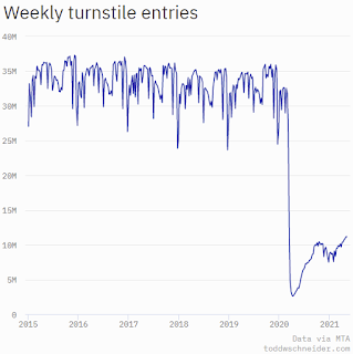 This graph is from Todd W Schneider. This is weekly data since 2015.
The TSA is providing daily travel numbers.
 Click on graph for larger image.
This data shows the seven day average of daily total traveler throughput from the TSA for 2019 (Light Blue), 2020 (Blue) and 2021 (Red).
The dashed line is the percent of 2019 for the seven day average.
This data is as of May 16th.
The seven day average is down 34.5% from the same day in 2019 (65.5% of 2019). (Dashed line)
There was a slow increase from the bottom - and TSA data has picked up in 2021.
The second graph shows the 7 day average of the year-over-year change in diners as tabulated by OpenTable for the US and several selected cities.
IMPORTANT: OpenTable notes: "we’ve updated the data including downloadable dataset from January 1, 2021 onward to compare seated diners from 2021 to 2019, as opposed to year over year." Thanks!
 Thanks to OpenTable for providing this restaurant data:
This data is updated through May 15, 2021.
This data is "a sample of restaurants on the OpenTable network across all channels: online reservations, phone reservations, and walk-ins. For year-over-year comparisons by day, we compare to the same day of the week from the same week in the previous year."
Note that this data is for "only the restaurants that have chosen to reopen in a given market". Since some restaurants have not reopened, the actual year-over-year decline is worse than shown.
Dining picked up during the holidays, then slumped with the huge winter surge in cases. Dining was picking up again. Florida and Texas are above 2019 levels.
----- Movie Tickets: Box Office Mojo -----
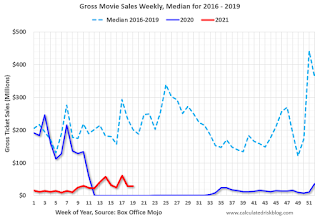 This data shows domestic box office for each week and the median for the years 2016 through 2019 (dashed light blue).
 Thanks to OpenTable for providing this restaurant data:
This data is updated through May 15, 2021.
This data is "a sample of restaurants on the OpenTable network across all channels: online reservations, phone reservations, and walk-ins. For year-over-year comparisons by day, we compare to the same day of the week from the same week in the previous year."
Note that this data is for "only the restaurants that have chosen to reopen in a given market". Since some restaurants have not reopened, the actual year-over-year decline is worse than shown.
Dining picked up during the holidays, then slumped with the huge winter surge in cases. Dining was picking up again. Florida and Texas are above 2019 levels.
 This data shows domestic box office for each week and the median for the years 2016 through 2019 (dashed light blue).
 Blue is 2020 and Red is 2021.
The data is from BoxOfficeMojo through May 13th.
Note that the data is usually noisy week-to-week and depends on when blockbusters are released.
Movie ticket sales were at $30 million last week, down about 85% from the median for the week.
Note that the data is usually noisy week-to-week and depends on when blockbusters are released.
Movie ticket sales were at $30 million last week, down about 85% from the median for the week.
 This graph shows the seasonal pattern for the hotel occupancy rate using the four week average.
 The red line is for 2021, black is 2020, blue is the median, and dashed light blue is for 2009 (the worst year since the Great Depression for hotels - before 2020).
Occupancy is now slightly above the horrible 2009 levels.
This data is through May 8th. Hotel occupancy is currently down 17% compared to same week in 2019). Note: Occupancy was up year-over-year, since occupancy declined sharply at the onset of the pandemic. However, occupancy is still down significantly from normal levels.
Notes: Y-axis doesn't start at zero to better show the seasonal change.
 This graph, based on weekly data from the U.S. Energy Information Administration (EIA), shows gasoline supplied compared to the same week of 2019.
Blue is for 2020. Red is for 2021.
As of May 7th, gasoline supplied was off about 3.8% (about 96.2% of the same week in 2019).
Gasoline supplied was up year-over-year, since at one point, gasoline supplied was off almost 50% YoY in 2020.
This graph is from Apple mobility. From Apple: "This data is generated by counting the number of requests made to Apple Maps for directions in select countries/regions, sub-regions, and cities." This is just a general guide - people that regularly commute probably don't ask for directions.
There is also some great data on mobility from the Dallas Fed Mobility and Engagement Index. However the index is set "relative to its weekday-specific average over January–February", and is not seasonally adjusted, so we can't tell if an increase in mobility is due to recovery or just the normal increase in the Spring and Summer.
 This data is through May 15th for the United States and several selected cities.
The graph is the running 7 day average to remove the impact of weekends.
IMPORTANT: All data is relative to January 13, 2020. This data is NOT Seasonally Adjusted. People walk and drive more when the weather is nice, so I'm just using the transit data.
According to the Apple data directions requests, public transit in the 7 day average for the US is at 74% of the January 2020 level and moving up.
Here is some interesting data on New York subway usage (HT BR).
 This graph is from Todd W Schneider. This is weekly data since 2015.
 Most weeks are between 30 and 35 million entries, and currently there more than 11 million subway turnstile entries per week - and increasing.
This data is through Friday, May 14th.
Schneider has graphs for each borough, and links to all the data sources.
He notes: "Data updates weekly from the MTA’s public turnstile data, usually on Saturday mornings".
This data is through Friday, May 14th.
Schneider has graphs for each borough, and links to all the data sources.
He notes: "Data updates weekly from the MTA’s public turnstile data, usually on Saturday mornings".


