 RSS Feed
 by Calculated Risk on 2/08/2021 10:41:00 AM
Monday, February 08, 2021
Las Vegas Real Estate in January: Sales up 13% YoY, Inventory down 50% YoY
This report is for closed sales in January; sales are counted at the close of escrow, so the contracts for these homes were mostly signed in November and December.
The Las Vegas Realtors reported Southern Nevada housing market starts year with prices still rising, supply shrinking; LVR housing statistics for January 2021
LVR reported a total of 3,262 existing local homes, condos and townhomes were sold during January. Compared to the same time last year, January sales were up 15.5% for homes and up 5.4% for condos and townhomes.1) Overall sales were up 13.4% year-over-year to 3,262 in January 2021 from 2,875 in January 2020.
According to LVR, the total number of existing local homes, condos, townhomes and other residential properties sold in Southern Nevada during 2020 was 41,617. That’s up from 41,269 total sales in 2019. By comparison, LVR reported 42,876 total sales in 2018 and 45,388 in 2017.
…
By the end of January, LVR reported 2,315 single-family homes listed for sale without any sort of offer. That’s down 52.8% from one year ago. For condos and townhomes, the 847 properties listed without offers in January represent a 40.3% drop from one year ago.
...
Despite the coronavirus crisis and economic downturn, the number of so-called distressed sales remains near historically low levels. LVR reported that short sales and foreclosures combined accounted for just 1.2% of all existing local property sales in January. That compares to 2.7% of all sales one year ago, 2.8% two years ago, 4.3% three years ago and 11% four years ago.
emphasis added
2) Active inventory (single-family and condos) is down from a year ago, from a total of 6,324 in January 2020 to 3,162 in January 2021. Note: Total inventory was down 50% year-over-year. And months of inventory is low.
3) Low level of distressed sales.
Seven High Frequency Indicators for the Economy
by Calculated Risk on 2/08/2021 08:45:00 AM
These indicators are mostly for travel and entertainment. It will interesting to watch these sectors recover as the vaccine is distributed.
IMPORTANT: Be safe now - if all goes well, we could all be vaccinated by Q2 2021.
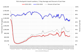
----- Airlines: Transportation Security Administration -----
The TSA is providing daily travel numbers.
 Click on graph for larger image.
This data shows the seven day average of daily total traveler throughput from the TSA for 2019-2020 (Blue) and 2020-2021 (Red).
The dashed line is the percent of last year for the seven day average.
This data is as of February 7th.
The seven day average is down 64.0% from last year (36.0% of last year). (Dashed line)
There was a slow increase from the bottom, with ups and downs due to the holidays - but TSA data has mostly moved sideways.
----- Restaurants: OpenTable -----
The second graph shows the 7 day average of the year-over-year change in diners as tabulated by OpenTable for the US and several selected cities.
 Thanks to OpenTable for providing this restaurant data:
This data is updated through February 7, 2021.
This data is "a sample of restaurants on the OpenTable network across all channels: online reservations, phone reservations, and walk-ins. For year-over-year comparisons by day, we compare to the same day of the week from the same week in the previous year."
Note that this data is for "only the restaurants that have chosen to reopen in a given market". Since some restaurants have not reopened, the actual year-over-year decline is worse than shown.
Dining picked up during the holidays. Note that dining is generally lower in the northern states - Illinois, Pennsylvania, and New York. Note that California dining picked up now after the orders to close was lifted.
----- Movie Tickets: Box Office Mojo -----
 This data shows domestic box office for each week (red) and the maximum and minimum for the years 2016 through 2019. Blue is 2020 and Red is 2021.
The TSA is providing daily travel numbers.
 Click on graph for larger image.
This data shows the seven day average of daily total traveler throughput from the TSA for 2019-2020 (Blue) and 2020-2021 (Red).
The dashed line is the percent of last year for the seven day average.
This data is as of February 7th.
The seven day average is down 64.0% from last year (36.0% of last year). (Dashed line)
There was a slow increase from the bottom, with ups and downs due to the holidays - but TSA data has mostly moved sideways.
The second graph shows the 7 day average of the year-over-year change in diners as tabulated by OpenTable for the US and several selected cities.
 Thanks to OpenTable for providing this restaurant data:
This data is updated through February 7, 2021.
This data is "a sample of restaurants on the OpenTable network across all channels: online reservations, phone reservations, and walk-ins. For year-over-year comparisons by day, we compare to the same day of the week from the same week in the previous year."
Note that this data is for "only the restaurants that have chosen to reopen in a given market". Since some restaurants have not reopened, the actual year-over-year decline is worse than shown.
Dining picked up during the holidays. Note that dining is generally lower in the northern states - Illinois, Pennsylvania, and New York. Note that California dining picked up now after the orders to close was lifted.
 This data shows domestic box office for each week (red) and the maximum and minimum for the years 2016 through 2019. Blue is 2020 and Red is 2021.
 The data is from BoxOfficeMojo through February 4th.
Note that the data is usually noisy week-to-week and depends on when blockbusters are released.
Movie ticket sales were at $13 million last week (compared to usually around $150 million per week at this time of year).
----- Hotel Occupancy: STR -----
 This graph shows the seasonal pattern for the hotel occupancy rate using the four week average.
The red line is for 2021, black is 2020, blue is the median, and dashed light blue is for 2009 (the worst year since the Great Depression for hotels - before 2020).
This data is through January 30th. Hotel occupancy is currently down 29.6% year-over-year. Seasonally we'd expect that business travel would start to pick up in the new year, but there will probably not be much pickup early in 2021.
Notes: Y-axis doesn't start at zero to better show the seasonal change.
----- Gasoline Supplied: Energy Information Administration -----
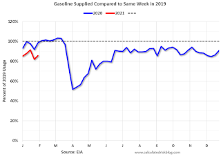 This graph, based on weekly data from the U.S. Energy Information Administration (EIA), shows gasoline supplied compared to the same week of 2019.
Blue is for 2020. At one point, gasoline supplied was off almost 50% YoY. Red is for 2021.
As of January 29th, gasoline supplied was off about 14.4% (about 85.6% of the same week in 2019).
Note: People driving instead of flying might have boosted gasoline consumption.
----- Transit: Apple Mobility -----
This graph is from Apple mobility. From Apple: "This data is generated by counting the number of requests made to Apple Maps for directions in select countries/regions, sub-regions, and cities." This is just a general guide - people that regularly commute probably don't ask for directions.
There is also some great data on mobility from the Dallas Fed Mobility and Engagement Index. However the index is set "relative to its weekday-specific average over January–February", and is not seasonally adjusted, so we can't tell if an increase in mobility is due to recovery or just the normal increase in the Spring and Summer.
 This data is through February 6th for the United States and several selected cities.
The graph is the running 7 day average to remove the impact of weekends.
IMPORTANT: All data is relative to January 13, 2020. This data is NOT Seasonally Adjusted. People walk and drive more when the weather is nice, so I'm just using the transit data.
According to the Apple data directions requests, public transit in the 7 day average for the US is at 47% of the January 2020 level. It is at 39% in Chicago, and 53% in Houston - and mostly moving sideways, and moving up a little recently.
----- New York City Subway Usage -----
Here is some interesting data on New York subway usage (HT BR).
 This graph is from Todd W Schneider. This is daily data since early 2020.
This data is through Friday, February 5th.
Schneider has graphs for each borough, and links to all the data sources.
He notes: "Data updates weekly from the MTA’s public turnstile data, usually on Saturday mornings".
Note that the data is usually noisy week-to-week and depends on when blockbusters are released.
Movie ticket sales were at $13 million last week (compared to usually around $150 million per week at this time of year).
 This graph shows the seasonal pattern for the hotel occupancy rate using the four week average.
 The red line is for 2021, black is 2020, blue is the median, and dashed light blue is for 2009 (the worst year since the Great Depression for hotels - before 2020).
This data is through January 30th. Hotel occupancy is currently down 29.6% year-over-year. Seasonally we'd expect that business travel would start to pick up in the new year, but there will probably not be much pickup early in 2021.
Notes: Y-axis doesn't start at zero to better show the seasonal change.
 This graph, based on weekly data from the U.S. Energy Information Administration (EIA), shows gasoline supplied compared to the same week of 2019.
Blue is for 2020. At one point, gasoline supplied was off almost 50% YoY. Red is for 2021.
As of January 29th, gasoline supplied was off about 14.4% (about 85.6% of the same week in 2019).
Note: People driving instead of flying might have boosted gasoline consumption.
This graph is from Apple mobility. From Apple: "This data is generated by counting the number of requests made to Apple Maps for directions in select countries/regions, sub-regions, and cities." This is just a general guide - people that regularly commute probably don't ask for directions.
There is also some great data on mobility from the Dallas Fed Mobility and Engagement Index. However the index is set "relative to its weekday-specific average over January–February", and is not seasonally adjusted, so we can't tell if an increase in mobility is due to recovery or just the normal increase in the Spring and Summer.
 This data is through February 6th for the United States and several selected cities.
The graph is the running 7 day average to remove the impact of weekends.
IMPORTANT: All data is relative to January 13, 2020. This data is NOT Seasonally Adjusted. People walk and drive more when the weather is nice, so I'm just using the transit data.
According to the Apple data directions requests, public transit in the 7 day average for the US is at 47% of the January 2020 level. It is at 39% in Chicago, and 53% in Houston - and mostly moving sideways, and moving up a little recently.
Here is some interesting data on New York subway usage (HT BR).
 This graph is from Todd W Schneider. This is daily data since early 2020.
This data is through Friday, February 5th.
Schneider has graphs for each borough, and links to all the data sources.
He notes: "Data updates weekly from the MTA’s public turnstile data, usually on Saturday mornings".
Sunday, February 07, 2021
Sunday Night Futures
by Calculated Risk on 2/07/2021 08:51:00 PM
Weekend:
• Schedule for Week of February 7, 2021
Monday:
• No major economic releases scheduled.
From CNBC: Pre-Market Data and Bloomberg futures S&P 500 are up 12 and DOW futures are up 75 (fair value).
Oil prices were up over the last week with WTI futures at $57.36 per barrel and Brent at $59.85 barrel. A year ago, WTI was at $52, and Brent was at $58 - so WTI oil prices are UP about 10% year-over-year.
Here is a graph from Gasbuddy.com for nationwide gasoline prices. Nationally prices are at $2.46 per gallon. A year ago prices were at $2.43 per gallon, so gasoline prices are up $0.03 per gallon year-over-year.
February 7 COVID-19 Test Results and Vaccinations
by Calculated Risk on 2/07/2021 06:49:00 PM
SPECIAL NOTE: The Covid Tracking Project will end daily updates on March 7th. Heroes that filled a critical void! Quality government data will likely be available soon.
From Bloomberg on vaccinations as of Feb 7th.
"In the U.S., more Americans have now received at least one dose than have tested positive for the virus since the pandemic began. So far, 42 million doses have been given, according to a state-by-state tally. In the last week, an average of 1.46 million doses per day were administered."Also check out the graphs at COVID-19 Vaccine Projections The site has several interactive graphs related to US COVID vaccinations including a breakdown of how many have had one shot, and how many have had both shots.
The US is now averaging close to 2.0 million tests per day. Based on the experience of other countries, for adequate test-and-trace (and isolation) to reduce infections, the percent positive needs to be under 5% (probably close to 1%), so the US has far too many daily cases - and percent positive - to do effective test-and-trace.
There were 1,480,757 test results reported over the last 24 hours.
There were 96,003 positive tests. The first day with under 100,000 cases since November 2nd.
Almost 22,000 US deaths have been reported in February. See the graph on US Daily Deaths here.
This data is from the COVID Tracking Project.
And check out COVID Act Now to see how each state is doing. (updated link to new site)
 Click on graph for larger image.
This graph shows the 7 day average of positive tests reported and daily hospitalizations.
The percent positive over the last 24 hours was 6.5%. The percent positive is calculated by dividing positive results by total tests (including pending).
Both cases and hospitalizations have peaked, but are declining from a very high level.
By Request: Public and Private Sector Payroll Jobs During Presidential Terms
by Calculated Risk on 2/07/2021 10:14:00 AM
Note: I usually post this monthly, but I hesitated recently due to the COVID-19 pandemic. But I've received a number of requests lately - the recent numbers are ugly.
Here is another update of tracking employment during Presidential terms. We frequently use Presidential terms as time markers - we could use Speaker of the House, Fed Chair, or any other marker.
NOTE: Several readers have asked if I could add a lag to these graphs (obviously a new President has zero impact on employment for the month they are elected). But that would open a debate on the proper length of the lag, so I'll just stick to the beginning of each term.
Important: There are many differences between these periods. Overall employment was smaller in the '80s, however the participation rate was increasing in the '80s (younger population and women joining the labor force), and the participation rate is generally declining now. But these graphs give an overview of employment changes.
The first graph shows the change in private sector payroll jobs from when each president took office until the end of their term(s). Presidents Carter and George H.W. Bush only served one term.
Mr. G.W. Bush (red) took office following the bursting of the stock market bubble, and left during the bursting of the housing bubble. Mr. Obama (dark blue) took office during the financial crisis and great recession. There was also a significant recession in the early '80s right after Mr. Reagan (dark red) took office.
There was a recession towards the end of President G.H.W. Bush (light purple) term, and Mr. Clinton (light blue) served for eight years without a recession. And there was a pandemic related recession in 2020.
 Click on graph for larger image.
The first graph is for private employment only.
Trump is in Orange.
The employment recovery during Mr. G.W. Bush's (red) first term was sluggish, and private employment was down 824,000 jobs at the end of his first term. At the end of Mr. Bush's second term, private employment was collapsing, and there were net 387,000 private sector jobs lost during Mr. Bush's two terms.
Private sector employment increased by 9,039,000 under President Carter (dashed green), by 14,714,000 under President Reagan (dark red), 1,511,000 under President G.H.W. Bush (light purple), 20,970,000 under President Clinton (light blue), and 11,828,000 under President Obama (dark blue).
During Trump's term, the economy lost 2,181,000 private sector jobs.
 A big difference between the presidencies has been public sector employment. Note: the bumps in public sector employment due to the decennial Census in 1980, 1990, 2000, 2010 and 2020.
The public sector grew during Mr. Carter's term (up 1,304,000), during Mr. Reagan's terms (up 1,414,000), during Mr. G.H.W. Bush's term (up 1,127,000), during Mr. Clinton's terms (up 1,934,000), and during Mr. G.W. Bush's terms (up 1,744,000 jobs). However the public sector declined significantly while Mr. Obama was in office (down 271,000 jobs).
During Trump's term, the economy lost 800,000 public sector jobs.
Saturday, February 06, 2021
February 6 COVID-19 Test Results and Vaccinations
by Calculated Risk on 2/06/2021 06:33:00 PM
SPECIAL NOTE: The Covid Tracking Project will end daily updates on March 7th. Heroes that filled a critical void! Quality government data will likely be available soon.
From Bloomberg on vaccinations as of Feb 6th.
"In the U.S., more Americans have now received at least one dose than have tested positive for the virus since the pandemic began. So far, 40.5 million doses have been given, according to a state-by-state tally. In the last week, an average of 1.43 million doses per day were administered."Also check out the graphs at COVID-19 Vaccine Projections The site has several interactive graphs related to US COVID vaccinations including a breakdown of how many have had one shot, and how many have had both shots.
The US is now averaging close to 2.0 million tests per day. Based on the experience of other countries, for adequate test-and-trace (and isolation) to reduce infections, the percent positive needs to be under 5% (probably close to 1%), so the US has far too many daily cases - and percent positive - to do effective test-and-trace.
There were 1,847,899 test results reported over the last 24 hours.
There were 113,927 positive tests.
Over 20,000 US deaths have been reported in February. See the graph on US Daily Deaths here.
This data is from the COVID Tracking Project.
And check out COVID Act Now to see how each state is doing. (updated link to new site)
 Click on graph for larger image.
This graph shows the 7 day average of positive tests reported and daily hospitalizations.
The percent positive over the last 24 hours was 6.2%. The percent positive is calculated by dividing positive results by total tests (including pending).
Both cases and hospitalizations have peaked, but are declining from a very high level.
Q1 GDP Forecasts
by Calculated Risk on 2/06/2021 11:40:00 AM
Some forecasters have increased their 2021 forecasts significantly, and see possible further upside. However, there is ongoing concern about the pandemic, and the impact of the COVID variants.
From Merrrill Lynch:
2021 is poised for a robust rebound in real activity, with growth likely to reach 6.0%. Strong fiscal support and a successful vaccine rollout will provide a spark particularly in 2Q and 3Q. [Q1 GDP of 4.0%] [Feb 5 estimate] emphasis addedFrom Goldman Sachs:
We left our Q1 GDP tracking estimate unchanged at +5.0%. [Feb 5 estimate]From the NY Fed Nowcasting Report
The New York Fed Staff Nowcast stands at 6.8% for 2021:Q1. [Feb 5 estimate]And from the Altanta Fed: GDPNow
The GDPNow model estimate for real GDP growth (seasonally adjusted annual rate) in the first quarter of 2021 is 4.6 percent on February 5, down from 6.0 percent on February 1 [Feb 5 estimate]
Schedule for Week of February 7, 2021
by Calculated Risk on 2/06/2021 08:11:00 AM
The key report this week is January CPI.
Fed Chair Jerome Powell speaks on Wednesday on the "State of the U.S. Labor Market"
No major economic releases scheduled.
6:00 AM ET: NFIB Small Business Optimism Index for January.
 10:00 AM ET: Job Openings and Labor Turnover Survey for December from the BLS.
 This graph shows job openings (yellow line), hires (purple), Layoff, Discharges and other (red column), and Quits (light blue column) from the JOLTS.
Jobs openings decreased in November to 6.527 million from 6.632 million in October.
The number of job openings (yellow) were down 3.9% year-over-year, and Quits were down 10.5% year-over-year.
7:00 AM ET: The Mortgage Bankers Association (MBA) will release the results for the mortgage purchase applications index.
8:30 AM: The Consumer Price Index for January from the BLS. The consensus is for 0.4% increase in CPI, and a 0.2% increase in core CPI.
2:00 PM: Speech, Fed Chair Jerome Powell, State of the U.S. Labor Market, At the Economic Club of New York Webinar
8:30 AM: The initial weekly unemployment claims report will be released. The consensus is for a decrease to 760 thousand from 779 thousand last week.
10:00 AM: University of Michigan's Consumer sentiment index (Preliminary for February). The consensus is for a reading of 80.5.
Friday, February 05, 2021
February 5 COVID-19 Test Results and Vaccinations
by Calculated Risk on 2/05/2021 07:38:00 PM
SPECIAL NOTE: The Covid Tracking Project will end daily updates on March 7th. Heroes that filled a critical void! Quality government data will likely be available soon.
From Bloomberg on vaccinations as of Feb 5th.
"In the U.S., more Americans have now received at least one dose than have tested positive for the virus since the pandemic began. So far, 38.5 million doses have been given, according to a state-by-state tally. In the last week, an average of 1.36 million doses per day were administered."Also check out the graphs at COVID-19 Vaccine Projections The site has several interactive graphs related to US COVID vaccinations including a breakdown of how many have had one shot, and how many have had both shots.
The US is now averaging close to 1.5 million tests per day. Based on the experience of other countries, for adequate test-and-trace (and isolation) to reduce infections, the percent positive needs to be under 5% (probably close to 1%), so the US has far too many daily cases - and percent positive - to do effective test-and-trace.
There were 1,879,114 test results reported over the last 24 hours.
There were 131,146 positive tests.
Over 17,000 US deaths have been reported in February. See the graph on US Daily Deaths here.
This data is from the COVID Tracking Project.
And check out COVID Act Now to see how each state is doing. (updated link to new site)
 Click on graph for larger image.
This graph shows the 7 day average of positive tests reported and daily hospitalizations.
The percent positive over the last 24 hours was 7.0%. The percent positive is calculated by dividing positive results by total tests (including pending).
Both cases and hospitalizations have peaked, but are declining from a very high level.
AAR: January Rail Carloads down 2.1% YoY, Intermodal Up 12.1% YoY
by Calculated Risk on 2/05/2021 02:45:00 PM
From the Association of American Railroads (AAR) Rail Time Indicators. Graphs and excerpts reprinted with permission.
U.S. rail volumes in January 2021 weren’t exemplary, but they were encouraging. Total carloads averaged 232,576 per week in January, the highest weekly average for any month in a year. Ten out of 20 carload categories had higher volumes in January 2021 than in January 2020. In January 2021, U.S. intermodal volume and carloads of chemicals were both higher than ever before (on a weekly average basis); carloads of grain were higher than in any month since October 2007 and the eleventh most for any month on record; and carloads for several other major carload categories, including primary metal products, lumber, paper, and iron and steel scrap, were higher than they’ve been since the pandemic began. Total carloads excluding coal were up 2.3% in January 2021 over January 2020, their second yearover-year increase in a row following 22 straight year-over-year monthly declines.
emphasis added
 Click on graph for larger image.
This graph from the Rail Time Indicators report shows the six week average of U.S. Carloads in 2018, 2019 and 2020:
U.S. railroads originated 930,303 total carloads in January 2021, down 2.1% (19,799 carloads) from January 2020. January 2021 was the 24th consecutive month with a year-over-year decline for total carloads, but 2.1% is the smallest percentage decline in 21 months.
 The second graph shows the six week average of U.S. intermodal in 2018, 2019 and 2020: (using intermodal or shipping containers):
U.S. railroads originated 1.17 million intermodal containers and trailers in January 2021, an average of 293,305 per week — a new all-time record and up 12.1% (126,548 units) over January 2020.Note that rail traffic was weak prior to the pandemic, however intermodal has come back strong.


