 RSS Feed
 by Calculated Risk on 12/14/2020 09:04:00 PM
Monday, December 14, 2020
Tuesday: Industrial Production, NY Fed Mfg
From Matthew Graham at Mortgage News Daily: Mortgage Rates Barely Higher For Some; Lower For Others
What do you get when you add a modest amount of cost to the average mortgage rate from last Friday? Rates that are still effectively right in line with all-time lows. ... Purchase rates (30yr fixed, conventional, top tier) are in the 2.375-2.625% range while refinance rates are another 0.25% higher for most lenders (some have even bigger gaps between purchase and refi rates).Tuesday:
emphasis added
• At 8:30 AM ET, The New York Fed Empire State manufacturing survey for December. The consensus is for a reading of 6.8, up from 6.3.
• At 9:15 AM, The Fed will release Industrial Production and Capacity Utilization for November. The consensus is for a 0.3% increase in Industrial Production, and for Capacity Utilization to increase to 72.9%.
December 14 COVID-19 Test Results; Record 7-Day Cases and Deaths, Record Hospitalizations
by Calculated Risk on 12/14/2020 07:32:00 PM
Note: The week-over-week growth in positive cases has slowed. Hopefully that continues.
The US is now averaging well over 1 million tests per day. Based on the experience of other countries, for adequate test-and-trace (and isolation) to reduce infections, the percent positive needs to be under 5% (probably close to 1%), so the US has far too many daily cases - and percent positive - to do effective test-and-trace.
There were 1,883,575 test results reported over the last 24 hours.
There were 193,384 positive tests.
Almost 33,000 US deaths have been reported so far in December. See the graph on US Daily Deaths here.
 Click on graph for larger image.
This data is from the COVID Tracking Project.
The percent positive over the last 24 hours was 10.3% (red line is 7 day average). The percent positive is calculated by dividing positive results by the sum of negative and positive results (I don't include pending).
And check out COVID Exit Strategy to see how each state is doing.
 The second graph shows the 7 day average of positive tests reported and daily hospitalizations.
• Record Hospitalizations (Over 110,000)
• Record 7 Day Average Cases
• Record 7 Day Average Deaths
MBA Survey: "Share of Mortgage Loans in Forbearance Decreases to 5.48%", More Borrowers Seeking Relief
by Calculated Risk on 12/14/2020 04:00:00 PM
Note: This is as of December 6th.
From the MBA: Share of Mortgage Loans in Forbearance Decreases to 5.48%
The Mortgage Bankers Association’s (MBA) latest Forbearance and Call Volume Survey revealed that the total number of loans now in forbearance decreased from 5.54% of servicers’ portfolio volume in the prior week to 5.48% as of December 6, 2020. According to MBA’s estimate, 2.7 million homeowners are in forbearance plans.
...
“The share of loans in forbearance decreased in the first week of December. However, more borrowers sought relief, with new forbearance requests reaching their highest level since the week ending August 2, and servicer call volume hitting its highest level since the week ending April 19,” said Mike Fratantoni, MBA’s Senior Vice President and Chief Economist. “Compared to the last two months, more homeowners exiting forbearance are using a modification – a sign that they have not been able to fully get back on their feet, even if they are working again.”
Added Fratantoni, “The latest economic data is showing a slowdown, particularly an increase in layoffs and long-term unemployment. Coupled with the latest surge in COVID-19 cases, it is not surprising to see more homeowners seeking relief.”
...
By stage, 18.72% of total loans in forbearance are in the initial forbearance plan stage, while 78.72% are in a forbearance extension. The remaining 2.56% are forbearance re-entries.
emphasis added
 Click on graph for larger image.
This graph shows the percent of portfolio in forbearance by investor type over time. Most of the increase was in late March and early April, and has been trending down for the last few months.
The MBA notes: "Total weekly forbearance requests as a percent of servicing portfolio volume (#) increased relative to the prior week: from 0.08% to 0.12%. ... As a percent of servicing portfolio volume (#), calls increased from the previous week from 5.3% to 9.4%."
Phoenix Real Estate in November: Sales Up 27.4% YoY, Active Inventory Down 45% YoY
by Calculated Risk on 12/14/2020 01:37:00 PM
The Arizona Regional Multiple Listing Service (ARMLS) reports ("Stats Report"):
1) Overall sales were at 8,886 in November, down from 9,690 in October, and up from 6,974 in November 2019. Sales were down 8.3% from October 2020 (last month), and up 27.4% from November 2019.
2) Active inventory was at 7,564, down from 13,675 in November 2019. That is down 45% year-over-year.
3) Months of supply decreased to 1.40 in November from 1.41 in October. This is very low.
Sales are reported at the close of escrow, so these sales were mostly signed in September and October.
The Employment Situation is Worse than the Headline Unemployment Rate Suggests
by Calculated Risk on 12/14/2020 11:33:00 AM
The headline unemployment rate has fallen to 6.7% in November, but that significantly understates the current situation. Note that the headline unemployment rate was 3.5% at the end of 2019.
Here is a table that shows the current number of unemployed and the unemployment rate. Then I calculated the unemployment rate by including the number of people that have left the labor force since early 2020, and the expected growth in the labor force.
As the economy recovers, many of the people that left the labor force will probably return, and there will likely be more entrants into the labor force (although recent demographic data has been dismal). This will keep the unemployment rate elevated for some time, and suggests the need for additional disaster relief.
| Number (000s) | Unemployment Rate | |
|---|---|---|
| Unemployed | 10,735 | 6.7% |
| Left Labor Force | 4,139 | 9.0% |
| Expected Labor Force Growth | 1,000 | 9.6% |
This is just the headline unemployment rate. There are also 2.3 million additional involuntary part time workers than in February (these workers are included in U-6).
Note: I'd be careful looking at the weekly initial claims report in addition to the BLS report. The weekly claims report suggests there are millions of workers receiving pandemic assistance, but this should be captured in the BLS household surveys (so I wouldn't add the numbers together).
Seven High Frequency Indicators for the Economy
by Calculated Risk on 12/14/2020 08:19:00 AM
These indicators are mostly for travel and entertainment. It will interesting to watch these sectors recover as the vaccine is distributed.
IMPORTANT: Be safe now - if all goes well, we could all be vaccinated by Q2 2021.
----- Airlines: Transportation Security Administration -----
The TSA is providing daily travel numbers.
 Click on graph for larger image.
This data shows the seven day average of daily total traveler throughput from the TSA for 2019 (Blue) and 2020 (Red).
The dashed line is the percent of last year for the seven day average.
This data is as of December 13th.
The seven day average is down 67.9% from last year (32.1% of last year). (Dashed line)
There had been a slow increase from the bottom, but has declined since Thanksgiving.
----- Restaurants: OpenTable -----
The second graph shows the 7 day average of the year-over-year change in diners as tabulated by OpenTable for the US and several selected cities.
 Thanks to OpenTable for providing this restaurant data:
This data is updated through December 5, 2020.
This data is "a sample of restaurants on the OpenTable network across all channels: online reservations, phone reservations, and walk-ins. For year-over-year comparisons by day, we compare to the same day of the week from the same week in the previous year."
Note that this data is for "only the restaurants that have chosen to reopen in a given market". Since some restaurants have not reopened, the actual year-over-year decline is worse than shown.
Note that dining is generally lower in the northern states - Illinois, Pennsylvania, and New York - but declining in the southern states. Note that California dining is off sharply with new orders to close.
----- Movie Tickets: Box Office Mojo -----
 This data shows domestic box office for each week (red) and the maximum and minimum for the previous four years. Data is from BoxOfficeMojo through December 10th.
Note that the data is usually noisy week-to-week and depends on when blockbusters are released.
Movie ticket sales have picked up slightly over the last couple of months, but were down last week to $10 million (compared to usually around $125 million per week at this time of year).
Some movie theaters have reopened (probably with limited seating).
----- Hotel Occupancy: STR -----
 This graph shows the seasonal pattern for the hotel occupancy rate using the four week average.
The red line is for 2020, dash light blue is 2019, blue is the median, and black is for 2009 (the worst year since the Great Depression for hotels - prior to 2020).
This data is through December 5th. Hotel occupancy is currently down 37.9% year-over-year.
Notes: Y-axis doesn't start at zero to better show the seasonal change.
Since there is a seasonal pattern to the occupancy rate, we can track the year-over-year change in occupancy to look for any improvement. This table shows the year-over-year change since the week ending Sept 19, 2020:
This suggests no improvement over the last few months.
----- Gasoline Supplied: Energy Information Administration -----
 This graph, based on weekly data from the U.S. Energy Information Administration (EIA), shows gasoline supplied compared to the same week last year of .
At one point, gasoline supplied was off almost 50% YoY.
As of December 4th, gasoline supplied was off about 14.4% YoY (about 85.6% of last year).
Note: People driving instead of flying might have boosted gasoline consumption over the summer.
----- Transit: Apple Mobility -----
This graph is from Apple mobility. From Apple: "This data is generated by counting the number of requests made to Apple Maps for directions in select countries/regions, sub-regions, and cities." This is just a general guide - people that regularly commute probably don't ask for directions.
There is also some great data on mobility from the Dallas Fed Mobility and Engagement Index. However the index is set "relative to its weekday-specific average over January–February", and is not seasonally adjusted, so we can't tell if an increase in mobility is due to recovery or just the normal increase in the Spring and Summer.
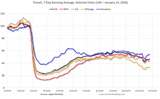 This data is through December 12th for the United States and several selected cities.
The graph is the running 7 day average to remove the impact of weekends.
IMPORTANT: All data is relative to January 13, 2020. This data is NOT Seasonally Adjusted. People walk and drive more when the weather is nice, so I'm just using the transit data.
According to the Apple data directions requests, public transit in the 7 day average for the US is at 46% of the January level. It is at 33% in Chicago, and 54% in Houston - and mostly up slightly over the last couple of weeks.
----- New York City Subway Usage -----
Here is some interesting data on New York subway usage (HT BR).
 This graph is from Todd W Schneider. This is daily data for this year.
This data is through Friday, December 11th.
Schneider has graphs for each borough, and links to all the data sources.
He notes: "Data updates weekly from the MTA’s public turnstile data, usually on Saturday mornings".
The TSA is providing daily travel numbers.
 Click on graph for larger image.
This data shows the seven day average of daily total traveler throughput from the TSA for 2019 (Blue) and 2020 (Red).
The dashed line is the percent of last year for the seven day average.
This data is as of December 13th.
The seven day average is down 67.9% from last year (32.1% of last year). (Dashed line)
There had been a slow increase from the bottom, but has declined since Thanksgiving.
The second graph shows the 7 day average of the year-over-year change in diners as tabulated by OpenTable for the US and several selected cities.
 Thanks to OpenTable for providing this restaurant data:
This data is updated through December 5, 2020.
This data is "a sample of restaurants on the OpenTable network across all channels: online reservations, phone reservations, and walk-ins. For year-over-year comparisons by day, we compare to the same day of the week from the same week in the previous year."
Note that this data is for "only the restaurants that have chosen to reopen in a given market". Since some restaurants have not reopened, the actual year-over-year decline is worse than shown.
Note that dining is generally lower in the northern states - Illinois, Pennsylvania, and New York - but declining in the southern states. Note that California dining is off sharply with new orders to close.
 This data shows domestic box office for each week (red) and the maximum and minimum for the previous four years. Data is from BoxOfficeMojo through December 10th.
Note that the data is usually noisy week-to-week and depends on when blockbusters are released.
Movie ticket sales have picked up slightly over the last couple of months, but were down last week to $10 million (compared to usually around $125 million per week at this time of year).
Some movie theaters have reopened (probably with limited seating).
 This graph shows the seasonal pattern for the hotel occupancy rate using the four week average.
 The red line is for 2020, dash light blue is 2019, blue is the median, and black is for 2009 (the worst year since the Great Depression for hotels - prior to 2020).
This data is through December 5th. Hotel occupancy is currently down 37.9% year-over-year.
Notes: Y-axis doesn't start at zero to better show the seasonal change.
Since there is a seasonal pattern to the occupancy rate, we can track the year-over-year change in occupancy to look for any improvement. This table shows the year-over-year change since the week ending Sept 19, 2020:
| Week Ending | YoY Change, Occupancy Rate |
|---|---|
| 9/19 | -31.9% |
| 9/26 | -31.5% |
| 10/3 | -29.6% |
| 10/10 | -29.2% |
| 10/17 | -30.7% |
| 10/24 | -31.7% |
| 10/31 | -29.0% |
| 11/7 | -35.9% |
| 11/14 | -32.7% |
| 11/21 | -32.6% |
| 11/28 | -28.5% |
| 11/28 | -37.9% |
This suggests no improvement over the last few months.
 This graph, based on weekly data from the U.S. Energy Information Administration (EIA), shows gasoline supplied compared to the same week last year of .
At one point, gasoline supplied was off almost 50% YoY.
As of December 4th, gasoline supplied was off about 14.4% YoY (about 85.6% of last year).
Note: People driving instead of flying might have boosted gasoline consumption over the summer.
This graph is from Apple mobility. From Apple: "This data is generated by counting the number of requests made to Apple Maps for directions in select countries/regions, sub-regions, and cities." This is just a general guide - people that regularly commute probably don't ask for directions.
There is also some great data on mobility from the Dallas Fed Mobility and Engagement Index. However the index is set "relative to its weekday-specific average over January–February", and is not seasonally adjusted, so we can't tell if an increase in mobility is due to recovery or just the normal increase in the Spring and Summer.
 This data is through December 12th for the United States and several selected cities.
The graph is the running 7 day average to remove the impact of weekends.
IMPORTANT: All data is relative to January 13, 2020. This data is NOT Seasonally Adjusted. People walk and drive more when the weather is nice, so I'm just using the transit data.
According to the Apple data directions requests, public transit in the 7 day average for the US is at 46% of the January level. It is at 33% in Chicago, and 54% in Houston - and mostly up slightly over the last couple of weeks.
Here is some interesting data on New York subway usage (HT BR).
 This graph is from Todd W Schneider. This is daily data for this year.
This data is through Friday, December 11th.
Schneider has graphs for each borough, and links to all the data sources.
He notes: "Data updates weekly from the MTA’s public turnstile data, usually on Saturday mornings".
Sunday, December 13, 2020
Sunday Night Futures
by Calculated Risk on 12/13/2020 09:29:00 PM
Weekend:
• Schedule for Week of December 13, 2020
Monday:
• No major economic releases scheduled.
From CNBC: Pre-Market Data and Bloomberg futures S&P 500 futures are up 20 and DOW futures are up 160 (fair value).
Oil prices were up over the last week with WTI futures at $46.76 per barrel and Brent at $50.15 barrel. A year ago, WTI was at $60, and Brent was at $67 - so WTI oil prices are down about 20% year-over-year.
Here is a graph from Gasbuddy.com for nationwide gasoline prices. Nationally prices are at $2.15 per gallon. A year ago prices were at $2.57 per gallon, so gasoline prices are down $0.42 per gallon year-over-year.
December 13 COVID-19 Test Results; Record 7-Day Cases and Deaths, Record Hospitalizations
by Calculated Risk on 12/13/2020 07:31:00 PM
Note: The week-over-week growth in positive cases has slowed. Hopefully that continues.
The US is now averaging well over 1 million tests per day. Based on the experience of other countries, for adequate test-and-trace (and isolation) to reduce infections, the percent positive needs to be under 5% (probably close to 1%), so the US has far too many daily cases - and percent positive - to do effective test-and-trace.
There were 1,397,965 test results reported over the last 24 hours.
There were 186,884 positive tests.
Over 31,000 US deaths have been reported so far in December. See the graph on US Daily Deaths here.
 Click on graph for larger image.
This data is from the COVID Tracking Project.
The percent positive over the last 24 hours was 13.3% (red line is 7 day average). The percent positive is calculated by dividing positive results by the sum of negative and positive results (I don't include pending).
And check out COVID Exit Strategy to see how each state is doing.
 The second graph shows the 7 day average of positive tests reported and daily hospitalizations.
Note that there were very few tests available in March and April, and many cases were missed, so the hospitalizations was higher relative to the 7-day average of positive tests in July.
• Record Hospitalizations (Over 109,000)
• Record 7 Day Average Cases
• Record 7 Day Average Deaths
FOMC Preview
by Calculated Risk on 12/13/2020 10:13:00 AM
Expectations are there will be no change to rate policy when the FOMC meets on Tuesday and Wednesday this week.
Here are some comments from Goldman Sachs economists David Mericle and Laura Nicolae:
"Fed officials are likely to see larger near-term risks but a brighter medium-term outlook as they head into their December meeting next week. The winter virus resurgence has grown much worse since the last meeting, but the vaccine news should inspire more confidence in 2021 recovery prospects than when Fed officials last wrote down projections in September.For review, here are the September FOMC projections.
We expect this brighter outlook to translate to slightly rosier economic projections including a 2021 growth forecast of just over 4% ... We also expect a somewhat lower unemployment rate path, but no changes to the inflation projections beyond this year.
...
Markets will be most focused on possible changes to the Fed’s asset purchase policy next week. The minutes to the November meeting indicate that the FOMC discussed both forward guidance for asset purchases and possible changes to the composition or size of asset purchases.
emphasis added
Note that GDP decreased at a 5.0% annual rate in Q1, decreased at a 31.4% annual rate in Q2, and increased at 33.1% annual rate in Q3. This leaves real GDP down 3.5% from Q4 2019.
Wall Street forecasts are for GDP to increase at a 5% to 6% annual rate in Q4. These forecasts would put the economy down around 2.1% to 2.3% Q4-over-Q4. That would be above the high end of their September forecast.
The course of the economy will depend on the course of the pandemic, so the FOMC has to factor in their expectations of the impact of the current surge of the pandemic - and when the pandemic will subside and end (likely sometime in mid-2021 with the vaccine). The FOMC also has to factor in further disaster relief, and that is still unknown.
It is likely that GDP forecasts for 2020 will be revised up, and also for 2021.
1 Projections of change in real GDP and inflation are from the fourth quarter of the previous year to the fourth quarter of the year indicated.
The unemployment rate was at 6.7% in November, down from 6.9% in October, and might decrease more in December. This will put the unemployment rate for Q4 below the lower end of the September projections.
PCE core inflation was up 1.4% in October year-over-year. This was also in the middle of the September projections for Q4. Note that inflation will not be a concern for the FOMC for the foreseeable future.
| GDP projections of Federal Reserve Governors and Reserve Bank presidents, Change in Real GDP1 | ||||
|---|---|---|---|---|
| Projection Date | 2020 | 2021 | 2022 | 2023 |
| Sept 2020 | -4.0 to -3.0 | 3.6 to 4.7 | 2.5 to 3.3 | 2.4 to 3.0 |
The unemployment rate was at 6.7% in November, down from 6.9% in October, and might decrease more in December. This will put the unemployment rate for Q4 below the lower end of the September projections.
So the unemployment rate for Q4 2020 will be revised down.
Note that the unemployment rate doesn't remotely capture the economic damage to the labor market. Not only are there 10.7 million people unemployed, and 4.1 million people have left the labor force since January. And millions more are being supported by various provisions of the CARES Act - that still hasn't been renewed and is schedule to expire on December 26th.
2 Projections for the unemployment rate are for the average civilian unemployment rate in the fourth quarter of the year indicated.
As of October 2020, PCE inflation was up 1.2% from October 2019. This was in the middle of the September projections for Q4.
Note that the unemployment rate doesn't remotely capture the economic damage to the labor market. Not only are there 10.7 million people unemployed, and 4.1 million people have left the labor force since January. And millions more are being supported by various provisions of the CARES Act - that still hasn't been renewed and is schedule to expire on December 26th.
| Unemployment projections of Federal Reserve Governors and Reserve Bank presidents, Unemployment Rate2 | ||||
|---|---|---|---|---|
| Projection Date | 2020 | 2021 | 2022 | 2023 |
| Sept 2020 | 7.0 to 8.0 | 5.0 to 6.2 | 4.0 to 5.0 | 3.5 to 4.4 |
As of October 2020, PCE inflation was up 1.2% from October 2019. This was in the middle of the September projections for Q4.
| Inflation projections of Federal Reserve Governors and Reserve Bank presidents, PCE Inflation1 | ||||
|---|---|---|---|---|
| Projection Date | 2020 | 2021 | 2022 | 2023 |
| Sept 2020 | 1.1 to 1.3 | 1.6 to 1.9 | 1.7 to 1.9 | 1.9 to 2.0 |
PCE core inflation was up 1.4% in October year-over-year. This was also in the middle of the September projections for Q4. Note that inflation will not be a concern for the FOMC for the foreseeable future.
| Core Inflation projections of Federal Reserve Governors and Reserve Bank presidents, Core Inflation1 | ||||
|---|---|---|---|---|
| Projection Date | 2020 | 2021 | 2022 | 2023 |
| Sept 2020 | 1.3 to 1.5 | 1.6 to 1.8 | 1.7 to 1.9 | 1.9 to 2.0 |
Saturday, December 12, 2020
December 12 COVID-19 Test Results; Record 7-Day Cases, Record Hospitalizations
by Calculated Risk on 12/12/2020 07:55:00 PM
I'm looking forward to not posting this data in a few months. Please stay healthy!
The US is now averaging well over 1 million tests per day. Based on the experience of other countries, for adequate test-and-trace (and isolation) to reduce infections, the percent positive needs to be under 5% (probably close to 1%), so the US has far too many daily cases - and percent positive - to do effective test-and-trace.
There were 1,497,861 test results reported over the last 24 hours.
There were 223,365 positive tests.
Almost 30,000 US deaths have been reported so far in December. See the graph on US Daily Deaths here.
 Click on graph for larger image.
This data is from the COVID Tracking Project.
The percent positive over the last 24 hours was 14.9% (red line is 7 day average). The percent positive is calculated by dividing positive results by the sum of negative and positive results (I don't include pending).
And check out COVID Exit Strategy to see how each state is doing.
 The second graph shows the 7 day average of positive tests reported and daily hospitalizations.
Note that there were very few tests available in March and April, and many cases were missed, so the hospitalizations was higher relative to the 7-day average of positive tests in July.
• Record Hospitalizations (Over 108,000)
• Record 7 Day Average Cases
• Tied Yesterday for record 7 Day Average Deaths


