 RSS Feed
 by Calculated Risk on 12/07/2020 11:31:00 AM
Monday, December 07, 2020
Employment: November Diffusion Indexes
The employment diffusion indexes are useful in indicating how widespread job gains are in a given month.
For manufacturing, the diffusion index was at 58.6, down from 60.5 in October.
Think of this as a measure of how widespread job gains or losses are across industries. The further from 50 (above or below), the more widespread the job losses or gains reported by the BLS. From the BLS:
Figures are the percent of industries with employment increasing plus one-half of the industries with unchanged employment, where 50 percent indicates an equal balance between industries with increasing and decreasing employment.
 Click on graph for larger image.
Both indexes declined sharply in March 2020, and collapsed to new record lows in April, due to the impact from COVID-19.
Then the indexes increased as the economy bounced back.
Both indexes declined in October, but are still at decent levels, indicating job growth was fairly widespread across industries.
Black Knight Mortgage Monitor for October: "2020 On Pace to See More than 9 Million Refinance Transactions"
by Calculated Risk on 12/07/2020 11:25:00 AM
Black Knight released their Mortgage Monitor report for October today. According to Black Knight, 6.44% of mortgages were delinquent in October, down from 6.66% of mortgages in September, and up from 3.39% in October 2019. Black Knight also reported that 0.33% of mortgages were in the foreclosure process, down from 0.48% a year ago.
This gives a total of 6.77% delinquent or in foreclosure.
Press Release: 2020 On Pace to See More than 9 Million Refinance Transactions; 82% of Refinancing Borrowers Not Retained
Today, the Data & Analytics division of Black Knight, Inc. (NYSE:BKI) released its latest Mortgage Monitor Report, based upon the company’s industry-leading mortgage performance, real estate and public records datasets. This month, the company looked into Q3 2020 mortgage originations – with a focus on refinance lending – and mortgage servicers’ success in retaining the business of refinancing homeowners. As Black Knight Data & Analytics President Ben Graboske explained, while Q3 2020 quarterly origination volumes broke records across the board, retention rates have suffered amid the surge of lending activity.
“As our rate lock data had suggested last month, Q3 2020 originations hit record highs in purchase, refinance and overall lending as record-low mortgage rates and a delay to the normal spring home-buying season spurred both the purchase and refinance markets,” said Graboske. “Some 2.7 million homeowners refinanced their first-lien mortgages in the third quarter, bringing the total through September 2020 to 6.4 million. What’s more, consolidated rate lock data from Black Knight’s Compass Analytics and Optimal Blue divisions suggests that number could climb above 9 million by year’s end. And, with rates continuing to sit at record lows, refinance incentive remains at historic highs. As of the last week of November, 19.4 million 30-year mortgage holders could likely both qualify for and benefit from a refinance.
emphasis added
 Click on graph for larger image.
Here is a graph from the Mortgage Monitor that shows first lien refinance activity.
From Black Knight:
• Through the first three quarters of the year, some 6.4 million homeowners have refinanced their primary mortgage, with that number on pace to climb above 9 million by the end of the year
• While cash-out activity has ridden the wave higher, cash-outs only made up 27% of Q3 refinance lending, the lowest such share in seven years
• The average cash-out amount fell to $51,600 (from $63,000 in Q2), pushing the volume of equity withdrawn in Q3 to down $37 billion, the lowest such equity withdrawal volume since Q2 2019
• This suggests cashing out equity was a distant second priority to borrowers locking in record low rates as their primary driver to refinance
 And on delinquencies from Black Knight:
 • Delinquencies improved in October, falling to 6.44%, their lowest level since MarchThere is much more in the mortgage monitor.
• Despite five consecutive months of improvement, there are still nearly 2X as many delinquent mortgages (+1.6 million/+91%) as there were entering 2020
• Serious delinquencies (90+ Days) improved in October as well, but volumes remain at more than 5x (+1.8M) their pre-pandemic levels
• Though COVID-19 case rates are rising across the country, new delinquencies remain below the three-month average and have been unaffected by these surges, at least for now
Seven High Frequency Indicators for the Economy
by Calculated Risk on 12/07/2020 08:50:00 AM
These indicators are mostly for travel and entertainment. It will interesting to watch these sectors recover as the vaccine is distributed.
IMPORTANT: Be safe now - if all goes well, we could all be vaccinated by Q2 2021.
----- Airlines: Transportation Security Administration -----
The TSA is providing daily travel numbers.
 Click on graph for larger image.
This data shows the seven day average of daily total traveler throughput from the TSA for 2019 (Blue) and 2020 (Red).
The dashed line is the percent of last year for the seven day average.
This data is as of December 6th.
The seven day average is down 65.5% from last year (34.5% of last year). (Dashed line)
There had been a slow increase from the bottom, but has declined following the Thanksgiving week holiday.
----- Restaurants: OpenTable -----
The second graph shows the 7 day average of the year-over-year change in diners as tabulated by OpenTable for the US and several selected cities.
 Thanks to OpenTable for providing this restaurant data:
This data is updated through December 5, 2020.
This data is "a sample of restaurants on the OpenTable network across all channels: online reservations, phone reservations, and walk-ins. For year-over-year comparisons by day, we compare to the same day of the week from the same week in the previous year."
Note that this data is for "only the restaurants that have chosen to reopen in a given market". Since some restaurants have not reopened, the actual year-over-year decline is worse than shown.
Note that dining is generally lower in the northern states - Illinois, Pennsylvania, and New York - but declining in the southern states.
----- Movie Tickets: Box Office Mojo -----
 This data shows domestic box office for each week (red) and the maximum and minimum for the previous four years. Data is from BoxOfficeMojo through December 3rd.
Note that the data is usually noisy week-to-week and depends on when blockbusters are released.
Movie ticket sales have picked up slightly over the last couple of months, and were at $16 million last week (compared to usually around $200 million per week).
Some movie theaters have reopened (probably with limited seating).
----- Hotel Occupancy: STR -----
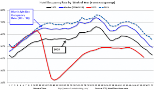 This graph shows the seasonal pattern for the hotel occupancy rate using the four week average.
The red line is for 2020, dash light blue is 2019, blue is the median, and black is for 2009 (the worst year since the Great Depression for hotels - prior to 2020).
This data is through November 28th. Hotel occupancy is currently down 28.5% year-over-year.
Notes: Y-axis doesn't start at zero to better show the seasonal change.
Since there is a seasonal pattern to the occupancy rate, we can track the year-over-year change in occupancy to look for any improvement. This table shows the year-over-year change since the week ending Sept 19, 2020:
This suggests no improvement over the last 11 weeks.
----- Gasoline Supplied: Energy Information Administration -----
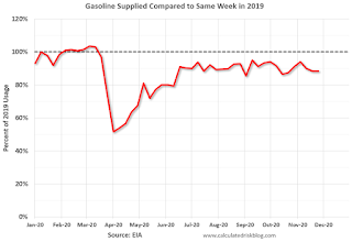 This graph, based on weekly data from the U.S. Energy Information Administration (EIA), shows gasoline supplied compared to the same week last year of .
At one point, gasoline supplied was off almost 50% YoY.
As of November 27th, gasoline supplied was off about 11.7% YoY (about 88.3% of last year).
Note: People driving instead of flying might have boosted gasoline consumption over the summer.
----- Transit: Apple Mobility -----
This graph is from Apple mobility. From Apple: "This data is generated by counting the number of requests made to Apple Maps for directions in select countries/regions, sub-regions, and cities." This is just a general guide - people that regularly commute probably don't ask for directions.
There is also some great data on mobility from the Dallas Fed Mobility and Engagement Index. However the index is set "relative to its weekday-specific average over January–February", and is not seasonally adjusted, so we can't tell if an increase in mobility is due to recovery or just the normal increase in the Spring and Summer.
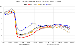 This data is through December 5th for the United States and several selected cities.
The graph is the running 7 day average to remove the impact of weekends.
IMPORTANT: All data is relative to January 13, 2020. This data is NOT Seasonally Adjusted. People walk and drive more when the weather is nice, so I'm just using the transit data.
According to the Apple data directions requests, public transit in the 7 day average for the US is at 46% of the January level. It is at 33% in Chicago, and 52% in Houston - and declining recently (the bump down and up was due to Thanksgiving).
----- New York City Subway Usage -----
Here is some interesting data on New York subway usage (HT BR).
 This graph is from Todd W Schneider. This is daily data for this year.
This data is through Friday, December 4th.
Schneider has graphs for each borough, and links to all the data sources.
He notes: "Data updates weekly from the MTA’s public turnstile data, usually on Saturday mornings".
The TSA is providing daily travel numbers.
 Click on graph for larger image.
This data shows the seven day average of daily total traveler throughput from the TSA for 2019 (Blue) and 2020 (Red).
The dashed line is the percent of last year for the seven day average.
This data is as of December 6th.
The seven day average is down 65.5% from last year (34.5% of last year). (Dashed line)
There had been a slow increase from the bottom, but has declined following the Thanksgiving week holiday.
The second graph shows the 7 day average of the year-over-year change in diners as tabulated by OpenTable for the US and several selected cities.
 Thanks to OpenTable for providing this restaurant data:
This data is updated through December 5, 2020.
This data is "a sample of restaurants on the OpenTable network across all channels: online reservations, phone reservations, and walk-ins. For year-over-year comparisons by day, we compare to the same day of the week from the same week in the previous year."
Note that this data is for "only the restaurants that have chosen to reopen in a given market". Since some restaurants have not reopened, the actual year-over-year decline is worse than shown.
Note that dining is generally lower in the northern states - Illinois, Pennsylvania, and New York - but declining in the southern states.
 This data shows domestic box office for each week (red) and the maximum and minimum for the previous four years. Data is from BoxOfficeMojo through December 3rd.
Note that the data is usually noisy week-to-week and depends on when blockbusters are released.
Movie ticket sales have picked up slightly over the last couple of months, and were at $16 million last week (compared to usually around $200 million per week).
Some movie theaters have reopened (probably with limited seating).
 This graph shows the seasonal pattern for the hotel occupancy rate using the four week average.
 The red line is for 2020, dash light blue is 2019, blue is the median, and black is for 2009 (the worst year since the Great Depression for hotels - prior to 2020).
This data is through November 28th. Hotel occupancy is currently down 28.5% year-over-year.
Notes: Y-axis doesn't start at zero to better show the seasonal change.
Since there is a seasonal pattern to the occupancy rate, we can track the year-over-year change in occupancy to look for any improvement. This table shows the year-over-year change since the week ending Sept 19, 2020:
| Week Ending | YoY Change, Occupancy Rate |
|---|---|
| 9/19 | -31.9% |
| 9/26 | -31.5% |
| 10/3 | -29.6% |
| 10/10 | -29.2% |
| 10/17 | -30.7% |
| 10/24 | -31.7% |
| 10/31 | -29.0% |
| 11/7 | -35.9% |
| 11/14 | -32.7% |
| 11/21 | -32.6% |
| 11/28 | -28.5% |
This suggests no improvement over the last 11 weeks.
 This graph, based on weekly data from the U.S. Energy Information Administration (EIA), shows gasoline supplied compared to the same week last year of .
At one point, gasoline supplied was off almost 50% YoY.
As of November 27th, gasoline supplied was off about 11.7% YoY (about 88.3% of last year).
Note: People driving instead of flying might have boosted gasoline consumption over the summer.
This graph is from Apple mobility. From Apple: "This data is generated by counting the number of requests made to Apple Maps for directions in select countries/regions, sub-regions, and cities." This is just a general guide - people that regularly commute probably don't ask for directions.
There is also some great data on mobility from the Dallas Fed Mobility and Engagement Index. However the index is set "relative to its weekday-specific average over January–February", and is not seasonally adjusted, so we can't tell if an increase in mobility is due to recovery or just the normal increase in the Spring and Summer.
 This data is through December 5th for the United States and several selected cities.
The graph is the running 7 day average to remove the impact of weekends.
IMPORTANT: All data is relative to January 13, 2020. This data is NOT Seasonally Adjusted. People walk and drive more when the weather is nice, so I'm just using the transit data.
According to the Apple data directions requests, public transit in the 7 day average for the US is at 46% of the January level. It is at 33% in Chicago, and 52% in Houston - and declining recently (the bump down and up was due to Thanksgiving).
Here is some interesting data on New York subway usage (HT BR).
 This graph is from Todd W Schneider. This is daily data for this year.
This data is through Friday, December 4th.
Schneider has graphs for each borough, and links to all the data sources.
He notes: "Data updates weekly from the MTA’s public turnstile data, usually on Saturday mornings".
Sunday, December 06, 2020
Sunday Night Futures
by Calculated Risk on 12/06/2020 09:23:00 PM
Weekend:
• Schedule for Week of December 6, 2020
Monday:
• At 3:00 PM, Consumer Credit from the Federal Reserve.
From CNBC: Pre-Market Data and Bloomberg futures S&P 500 and DOW futures are up slightly (fair value).
Oil prices were up over the last week with WTI futures at $46.19 per barrel and Brent at $49.19 barrel. A year ago, WTI was at $58, and Brent was at $65 - so WTI oil prices are down about 25% year-over-year.
Here is a graph from Gasbuddy.com for nationwide gasoline prices. Nationally prices are at $2.16 per gallon. A year ago prices were at $2.60 per gallon, so gasoline prices are down $0.44 per gallon year-over-year.
December 6 COVID-19 Test Results; Record 7-Day Deaths, Record Hospitalizations
by Calculated Risk on 12/06/2020 06:50:00 PM
I'm looking forward to not posting this data in a few months. Please stay healthy!
The US is now averaging over 1 million tests per day. Based on the experience of other countries, for adequate test-and-trace (and isolation) to reduce infections, the percent positive needs to be well under 5% (probably close to 1%), so the US still needs to increase the number of tests per day significantly (or take actions to push down the number of new infections).
There were 1,349,361 test results reported over the last 24 hours.
There were 176,771 positive tests.
Over 14,000 US deaths have been reported so far in December. See the graph on US Daily Deaths here.
 Click on graph for larger image.
This data is from the COVID Tracking Project.
The percent positive over the last 24 hours was 13.1% (red line is 7 day average). The percent positive is calculated by dividing positive results by the sum of negative and positive results (I don't include pending).
And check out COVID Exit Strategy to see how each state is doing.
 The second graph shows the 7 day average of positive tests reported and daily hospitalizations.
Note that there were very few tests available in March and April, and many cases were missed, so the hospitalizations was higher relative to the 7-day average of positive tests in July.
• Record Hospitalizations (Over 101,000)
• Record 7 Day Average Cases
• Record 7 Day Average Deaths
Q4 GDP Forecasts: Uncertainty
by Calculated Risk on 12/06/2020 09:34:00 AM
Economic activity in the fourth quarter is dependent on the impact of the pandemic. With the number of new cases per day of COVID approaching 200,000, hospitalizations at record levels (over 100,000), and deaths per day at new record highs, it is likely that economic activity will slow in December.
Most of the slowdown will be related to individuals being more cautious, and some will be related to government actions. For example, from the AP: Most of California to enter sweeping new virus lockdown
Economic activity was solid in October, and that would suggest PCE growth of close to 6% in Q4, even if November and December see no month-over-month growth. No one expects a lockdown like at the end of March and in April, but it is possible that activity slowed in November and will decline in December.
The high level of uncertainty over the next few months makes forecasting extremely difficult. The automated approaches (below) do not capture this uncertainty.
From Goldman Sachs:
We left our Q4 GDP tracking estimate unchanged at +3.2% (qoq ar) [Dec 2 estimate]From Merrill Lynch:
We continue to track 33.1% for 3Q GDP and 6.0% for 4Q GDP. [Dec 4 estimate]From the NY Fed Nowcasting Report
The New York Fed Staff Nowcast stands at 2.5% for 2020:Q4 and 5.9% for 2021:Q1. [Dec 4 estimate]And from the Altanta Fed: GDPNow
The GDPNow model estimate for real GDP growth (seasonally adjusted annual rate) in the fourth quarter of 2020 is 11.2 percent on December 4, up from 11.1 percent on December 1. [Dec 4 estimate]It is also important to note that GDP is reported at a seasonally adjusted annual rate (SAAR). A 3.3% annualized increase in Q4 GDP (close to Goldman's forecast), is about 0.8% QoQ, and would leave real GDP down about 2.7% from Q4 2019.
The following graph illustrates this decline.
 Click on graph for larger image.
This graph shows the percent decline in real GDP from the previous peak (currently the previous peak was in Q4 2019).
This graph is through Q3 2020, and real GDP is currently off 3.5% from the previous peak. For comparison, at the depth of the Great Recession, real GDP was down 4.0% from the previous peak.
The black arrow shows what a 3.3% annualized increase in real GDP would look like in Q4.
Saturday, December 05, 2020
December 5 COVID-19 Test Results; Record 7-Day Deaths
by Calculated Risk on 12/05/2020 07:21:00 PM
I'm looking forward to not posting this data in a few months. Please stay healthy!
The US is now averaging over 1 million tests per day. Based on the experience of other countries, for adequate test-and-trace (and isolation) to reduce infections, the percent positive needs to be well under 5% (probably close to 1%), so the US still needs to increase the number of tests per day significantly (or take actions to push down the number of new infections).
There were 1,738,068 test results reported over the last 24 hours.
There were 211,073 positive tests.
Almost 13,000 US deaths have been reported so far in December. See the graph on US Daily Deaths here.
 Click on graph for larger image.
This data is from the COVID Tracking Project.
The percent positive over the last 24 hours was 12.1% (red line is 7 day average). The percent positive is calculated by dividing positive results by the sum of negative and positive results (I don't include pending).
And check out COVID Exit Strategy to see how each state is doing.
 The second graph shows the 7 day average of positive tests reported and daily hospitalizations.
Note that there were very few tests available in March and April, and many cases were missed, so the hospitalizations was higher relative to the 7-day average of positive tests in July.
• Near Record Hospitalizations (Over 101,000)
• Record 7 Day Average Cases
• Highest 7 Day Average Deaths
Schedule for Week of December 6, 2020
by Calculated Risk on 12/05/2020 08:11:00 AM
The key economic report this week is November CPI .
3:00 PM: Consumer Credit from the Federal Reserve.
6:00 AM: NFIB Small Business Optimism Index for November.
7:00 AM ET: The Mortgage Bankers Association (MBA) will release the results for the mortgage purchase applications index.
 10:00 AM ET: Job Openings and Labor Turnover Survey for October from the BLS.
 This graph shows job openings (yellow line), hires (purple), Layoff, Discharges and other (red column), and Quits (light blue column) from the JOLTS.
Jobs openings increased in September to 6.436 million from 6.352 million in August.
8:30 AM: The initial weekly unemployment claims report will be released. The consensus is for 700,000 initial claims, down from 712,000 last week.
8:30 AM: The Consumer Price Index for November from the BLS. The consensus is for a 0.1% increase in CPI, and a 0.2% increase in core CPI.
12:00 PM: Q3 Flow of Funds Accounts of the United States from the Federal Reserve.
8:30 AM: The Producer Price Index for November from the BLS. The consensus is for a 0.2% increase in PPI, and a 0.2% increase in core PPI.
10:00 AM: University of Michigan's Consumer sentiment index (Preliminary for December).
Friday, December 04, 2020
December 4 COVID-19 Test Results; Record Cases, Hospitalizations
by Calculated Risk on 12/04/2020 07:22:00 PM
I'm looking forward to not posting this data in a few months. Please stay healthy!
The US is now averaging over 1 million tests per day. Based on the experience of other countries, for adequate test-and-trace (and isolation) to reduce infections, the percent positive needs to be well under 5% (probably close to 1%), so the US still needs to increase the number of tests per day significantly (or take actions to push down the number of new infections).
There were 1,443,932 test results reported over the last 24 hours.
There were 224,831 positive tests.
Almost 10,500 US deaths have been reported so far in December. See the graph on US Daily Deaths here.
 Click on graph for larger image.
This data is from the COVID Tracking Project.
The percent positive over the last 24 hours was 15.6% (red line is 7 day average). The percent positive is calculated by dividing positive results by the sum of negative and positive results (I don't include pending).
And check out COVID Exit Strategy to see how each state is doing.
 The second graph shows the 7 day average of positive tests reported and daily hospitalizations.
The dashed line is the previous hospitalization maximum.
Note that there were very few tests available in March and April, and many cases were missed, so the hospitalizations was higher relative to the 7-day average of positive tests in July.
• Record Hospitalizations (Over 101,000)
• Record 7 Day Average Cases
• Highest 7 Day Average Deaths since April
AAR: November Rail Carloads down 5.8% YoY, Intermodal Up 11.5% YoY
by Calculated Risk on 12/04/2020 04:00:00 PM
From the Association of American Railroads (AAR) Rail Time Indicators. Graphs and excerpts reprinted with permission.
Total U.S. carloads in November 2020 were down 5.8% from November 2019, their smallest year over-year percentage decline since August 2019. (The peak recent decline was 27.7% in May 2020.) In November, 9 of the 20 carload categories the AAR tracks had year-over-year carload gains. Grain and chemicals led the way. In November, U.S. grain carloads were the most since October 2007, while carloads of chemicals were the second most for any November on record. Meanwhile, November 2020 was the sixth-best month ever (in terms of weekly average originations) for U.S. intermodal. It might have been the best month ever if Thanksgiving week hadn’t pulled down November’s weekly average.
emphasis added
 Click on graph for larger image.
This graph from the Rail Time Indicators report shows the six week average of U.S. Carloads in 2018, 2019 and 2020:
Total U.S. carloads (not including intermodal) were 900,194 in November 2020, down 5.8% from November 2019. That’s the smallest year-over-year percentage decline for total carloads since August 2019. The peak decline was 27.7% in May 2020. That said, total carloads averaged 225,049 per week in November 2020, the smallest weekly average for November in our records which begin in 1988.
 The second graph shows the six week average of U.S. intermodal in 2018, 2019 and 2020: (using intermodal or shipping containers):
U.S. railroads originated an average of 284,174 intermodal containers and trailers per week in November 2020 — the most ever for November and the sixth best month overall. Thanksgiving week (246,504 units) pulled down November’s average — the second week of November (295,316 units) and the third week of November (301,129 units) were the fifth-best and thirdbest weeks, respectively, in history for U.S. intermodal.Note that rail traffic was weak prior to the pandemic, and intermodal has come back strong.
U.S. intermodal volume in November 2020 was up 11.5% over November 2019. That’s intermodal’s fourth straight year-over-year monthly gain and the biggest year-over-year percentage gain since February 2016.


