 RSS Feed
 by Calculated Risk on 11/23/2020 08:50:00 AM
Monday, November 23, 2020
Seven High Frequency Indicators for the Economy
These indicators are mostly for travel and entertainment. It will interesting to watch these sectors recover as the vaccine is distributed.
IMPORTANT: Be safe now - if all goes well, we could all be vaccinated by Q2 2021.
----- Airlines: Transportation Security Administration -----
The TSA is providing daily travel numbers.
 Click on graph for larger image.
This data shows the seven day average of daily total traveler throughput from the TSA for 2019 (Blue) and 2020 (Red).
The dashed line is the percent of last year for the seven day average.
This data is as of Nov 22nd.
The seven day average is down 60% from last year (40% of last year).
There has been a slow increase from the bottom, and appears to have increased for the Thanksgiving week holiday.
----- Restaurants: OpenTable -----
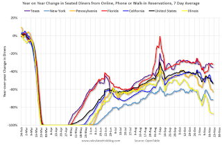
The second graph shows the 7 day average of the year-over-year change in diners as tabulated by OpenTable for the US and several selected cities.
 Thanks to OpenTable for providing this restaurant data:
This data is updated through November 21, 2020.
This data is "a sample of restaurants on the OpenTable network across all channels: online reservations, phone reservations, and walk-ins. For year-over-year comparisons by day, we compare to the same day of the week from the same week in the previous year."
Note that this data is for "only the restaurants that have chosen to reopen in a given market". Since some restaurants have not reopened, the actual year-over-year decline is worse than shown.
Note that dining is generally lower in the northern states - Illinois, Pennsylvania, and New York - and only down slightly in the southern states.
----- Movie Tickets: Box Office Mojo -----
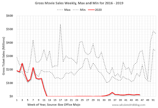 This data shows domestic box office for each week (red) and the maximum and minimum for the previous four years. Data is from BoxOfficeMojo through November 19th.
Note that the data is usually noisy week-to-week and depends on when blockbusters are released.
Movie ticket sales have picked up slightly over the last couple of months, and were at $13 million last week (compared to usually around $250 million per week during the Thanksgiving blockbuster period).
Some movie theaters have reopened (probably with limited seating).
----- Hotel Occupancy: STR -----
 This graph shows the seasonal pattern for the hotel occupancy rate using the four week average.
The red line is for 2020, dash light blue is 2019, blue is the median, and black is for 2009 (the worst year since the Great Depression for hotels - prior to 2020).
This data is through November 14th. Hotel occupancy is currently down 32.7% year-over-year.
Notes: Y-axis doesn't start at zero to better show the seasonal change.
Since there is a seasonal pattern to the occupancy rate, we can track the year-over-year change in occupancy to look for any improvement. This table shows the year-over-year change since the week ending Sept 19, 2020:
This suggests no improvement over the last 9 weeks, and occupancy might be getting worse.
----- Gasoline Supplied: Energy Information Administration -----
 This graph, based on weekly data from the U.S. Energy Information Administration (EIA), shows gasoline supplied compared to the same week last year of .
At one point, gasoline supplied was off almost 50% YoY.
As of November 13th, gasoline supplied was off about 10.2% YoY (about 89.8% of last year).
Note: People driving instead of flying might have boosted gasoline consumption.
----- Transit: Apple Mobility -----
This graph is from Apple mobility. From Apple: "This data is generated by counting the number of requests made to Apple Maps for directions in select countries/regions, sub-regions, and cities." This is just a general guide - people that regularly commute probably don't ask for directions.
There is also some great data on mobility from the Dallas Fed Mobility and Engagement Index. However the index is set "relative to its weekday-specific average over January–February", and is not seasonally adjusted, so we can't tell if an increase in mobility is due to recovery or just the normal increase in the Spring and Summer.
 This data is through November 21st for the United States and several selected cities.
The graph is the running 7 day average to remove the impact of weekends.
IMPORTANT: All data is relative to January 13, 2020. This data is NOT Seasonally Adjusted. People walk and drive more when the weather is nice, so I'm just using the transit data.
According to the Apple data directions requests, public transit in the 7 day average for the US is at 50% of the January level. It is at 36% in Chicago, and 54% in Houston - and declining recently.
----- New York City Subway Usage -----
Here is some interesting data on New York subway usage (HT BR).
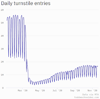 This graph is from Todd W Schneider. This is daily data for this year.
This data is through Friday, November 20th.
Schneider has graphs for each borough, and links to all the data sources.
He notes: "Data updates weekly from the MTA’s public turnstile data, usually on Saturday mornings".
The TSA is providing daily travel numbers.
 Click on graph for larger image.
This data shows the seven day average of daily total traveler throughput from the TSA for 2019 (Blue) and 2020 (Red).
The dashed line is the percent of last year for the seven day average.
This data is as of Nov 22nd.
The seven day average is down 60% from last year (40% of last year).
There has been a slow increase from the bottom, and appears to have increased for the Thanksgiving week holiday.
The second graph shows the 7 day average of the year-over-year change in diners as tabulated by OpenTable for the US and several selected cities.
 Thanks to OpenTable for providing this restaurant data:
This data is updated through November 21, 2020.
This data is "a sample of restaurants on the OpenTable network across all channels: online reservations, phone reservations, and walk-ins. For year-over-year comparisons by day, we compare to the same day of the week from the same week in the previous year."
Note that this data is for "only the restaurants that have chosen to reopen in a given market". Since some restaurants have not reopened, the actual year-over-year decline is worse than shown.
Note that dining is generally lower in the northern states - Illinois, Pennsylvania, and New York - and only down slightly in the southern states.
 This data shows domestic box office for each week (red) and the maximum and minimum for the previous four years. Data is from BoxOfficeMojo through November 19th.
Note that the data is usually noisy week-to-week and depends on when blockbusters are released.
Movie ticket sales have picked up slightly over the last couple of months, and were at $13 million last week (compared to usually around $250 million per week during the Thanksgiving blockbuster period).
Some movie theaters have reopened (probably with limited seating).
 This graph shows the seasonal pattern for the hotel occupancy rate using the four week average.
 The red line is for 2020, dash light blue is 2019, blue is the median, and black is for 2009 (the worst year since the Great Depression for hotels - prior to 2020).
This data is through November 14th. Hotel occupancy is currently down 32.7% year-over-year.
Notes: Y-axis doesn't start at zero to better show the seasonal change.
Since there is a seasonal pattern to the occupancy rate, we can track the year-over-year change in occupancy to look for any improvement. This table shows the year-over-year change since the week ending Sept 19, 2020:
| Week Ending | YoY Change, Occupancy Rate |
|---|---|
| 9/19 | -31.9% |
| 9/26 | -31.5% |
| 10/3 | -29.6% |
| 10/10 | -29.2% |
| 10/17 | -30.7% |
| 10/24 | -31.7% |
| 10/31 | -29.0% |
| 11/7 | -35.9% |
| 11/14 | -32.7% |
This suggests no improvement over the last 9 weeks, and occupancy might be getting worse.
 This graph, based on weekly data from the U.S. Energy Information Administration (EIA), shows gasoline supplied compared to the same week last year of .
At one point, gasoline supplied was off almost 50% YoY.
As of November 13th, gasoline supplied was off about 10.2% YoY (about 89.8% of last year).
Note: People driving instead of flying might have boosted gasoline consumption.
This graph is from Apple mobility. From Apple: "This data is generated by counting the number of requests made to Apple Maps for directions in select countries/regions, sub-regions, and cities." This is just a general guide - people that regularly commute probably don't ask for directions.
There is also some great data on mobility from the Dallas Fed Mobility and Engagement Index. However the index is set "relative to its weekday-specific average over January–February", and is not seasonally adjusted, so we can't tell if an increase in mobility is due to recovery or just the normal increase in the Spring and Summer.
 This data is through November 21st for the United States and several selected cities.
The graph is the running 7 day average to remove the impact of weekends.
IMPORTANT: All data is relative to January 13, 2020. This data is NOT Seasonally Adjusted. People walk and drive more when the weather is nice, so I'm just using the transit data.
According to the Apple data directions requests, public transit in the 7 day average for the US is at 50% of the January level. It is at 36% in Chicago, and 54% in Houston - and declining recently.
Here is some interesting data on New York subway usage (HT BR).
 This graph is from Todd W Schneider. This is daily data for this year.
This data is through Friday, November 20th.
Schneider has graphs for each borough, and links to all the data sources.
He notes: "Data updates weekly from the MTA’s public turnstile data, usually on Saturday mornings".
Sunday, November 22, 2020
Sunday Night Futures
by Calculated Risk on 11/22/2020 09:11:00 PM
Weekend:
• Schedule for Week of November 22, 2020
• Two Key Economic Dates in December
Monday:
• At 8:30 AM ET, Chicago Fed National Activity Index for October. This is a composite index of other data.
From CNBC: Pre-Market Data and Bloomberg futures S&P 500 are up 3 and DOW futures are up 22 (fair value).
Oil prices were up over the last week with WTI futures at $42.46 per barrel and Brent at $45.13 barrel. A year ago, WTI was at $57, and Brent was at $62 - so WTI oil prices are down over 30% year-over-year.
Here is a graph from Gasbuddy.com for nationwide gasoline prices. Nationally prices are at $2.10 per gallon. A year ago prices were at $2.60 per gallon, so gasoline prices are down $0.50 per gallon year-over-year.
November 22 COVID-19 Test Results; Record Hospitalizations
by Calculated Risk on 11/22/2020 07:01:00 PM
Note: Week-over-week case growth is slowing, so maybe cases per day will peak soon (A virtual Thanksgiving is recommended by the CDC). Stay Safe!!!
The US is now averaging over 1 million tests per day. Based on the experience of other countries, for adequate test-and-trace (and isolation) to reduce infections, the percent positive needs to be well under 5% (probably close to 1%), so the US still needs to increase the number of tests per day significantly (or take actions to push down the number of new infections).
There were 1,401,167 test results reported over the last 24 hours.
There were 150,098 positive tests.
Over 25,000 US deaths have been reported so far in November. See the graph on US Daily Deaths here.
 Click on graph for larger image.
This data is from the COVID Tracking Project.
The percent positive over the last 24 hours was 10.7% (red line is 7 day average). The percent positive is calculated by dividing positive results by the sum of negative and positive results (I don't include pending).
And check out COVID Exit Strategy to see how each state is doing.
 The second graph shows the 7 day average of positive tests reported and daily hospitalizations.
The dashed line is the previous hospitalization maximum.
Note that there were very few tests available in March and April, and many cases were missed, so the hospitalizations was higher relative to the 7-day average of positive tests in July.
• 7-day average cases are at a new record.
• 7-day average deaths at highest level since May.
• Record Hospitalizations.
Two Key Economic Dates in December
by Calculated Risk on 11/22/2020 09:46:00 AM
December 12th: Possible Government shutdown. From the WaPo: White House chief of staff ‘can’t guarantee’ U.S. government will avert December shutdown
Congress and the White House have until Dec. 11 to approve new spending legislation to prevent the federal government from shutting down in the middle of a pandemic and amid a surge in coronavirus cases. Meadows said he was hopeful an agreement would be reached but did not rule out that an impasse. There has already been two government shutdowns during President Trump’s four years in office, one lasting more than a month.It is possible that there will be a shutdown from December 12th through January 20th. This would eclipse the previous longest government shutdown of 35 days in 2018-2019.
December 26th: End of CARES Act provisions. There are two COVID related unemployment programs that end on December 26th.
The first is the Pandemic Unemployment Assistance (PUA) Program. This is a special program that provides up to 39 weeks of benefits for business owners, self-employed, independent contractors or gig workers not receiving other unemployment insurance.
PUA is not payable for any week of unemployment ending after December 31, 2020. Accordingly, in states where the week of unemployment ends on a Saturday, the last week that PUA may be paid is the week ending December 26, 2020. For states where the week of unemployment ends on a Sunday, the last week that PUA is payable is the week ending December 27, 2020.As of October 31st, in the most recent report (lags weekly claims), there were 8.7 million receiving PUA benefits (there are questions about these numbers).
The second is the Pandemic Emergency Unemployment Compensation (PEUC) Program. This program "provides up to 13 additional weeks of benefits to individuals who have exhausted their regular unemployment compensation (UC) entitlement". Just like the PUA, this program ends on December 26th. There are currently 4.4 million people receiving these extended benefits, and this has been increasing sharply. On October 1st, about 1.8 million people were receiving benefits from the PEUC, so this has most than doubled over the last month as people exhaust their regular benefits. This number will probably continue to increase over the next month.
Note that if people get laid off again, as COVID surges, many more people could exhaust their regular benefits.
So there are significant fiscal issues that need to be addressed in December.
Saturday, November 21, 2020
November 21 COVID-19 Test Results; Record Hospitalizations
by Calculated Risk on 11/21/2020 07:19:00 PM
Note: Week-over-week case growth is slowing, so maybe cases per day will peak soon (A virtual Thanksgiving is recommended by the CDC). Stay Safe!!!
The US is now averaging over 1 million tests per day. Based on the experience of other countries, for adequate test-and-trace (and isolation) to reduce infections, the percent positive needs to be well under 5% (probably close to 1%), so the US still needs to increase the number of tests per day significantly (or take actions to push down the number of new infections).
There were 1,604,859 test results reported over the last 24 hours.
There were 178,309 positive tests.
Almost 25,000 US deaths have been reported so far in November. See the graph on US Daily Deaths here.
 Click on graph for larger image.
This data is from the COVID Tracking Project.
The percent positive over the last 24 hours was 11.1% (red line is 7 day average). The percent positive is calculated by dividing positive results by the sum of negative and positive results (I don't include pending).
And check out COVID Exit Strategy to see how each state is doing.
 The second graph shows the 7 day average of positive tests reported and daily hospitalizations.
The dashed line is the previous hospitalization maximum.
Note that there were very few tests available in March and April, and many cases were missed, so the hospitalizations was higher relative to the 7-day average of positive tests in July.
• 7-day average cases are at a new record.
• 7-day average deaths at highest level since May.
• Record Hospitalizations.
Schedule for Week of November 22, 2020
by Calculated Risk on 11/21/2020 08:11:00 AM
The key reports this week are October New Home sales, and the second estimate of Q3 GDP.
Other key indicators include Personal Income and Outlays for October and Case-Shiller house prices for September.
For manufacturing, the Richmond Fed manufacturing survey will be released this week.
8:30 AM ET: Chicago Fed National Activity Index for October. This is a composite index of other data.
 9:00 AM ET: S&P/Case-Shiller House Price Index for September.
This graph shows graph shows the Year over year change in the seasonally adjusted National Index, Composite 10 and Composite 20 indexes through the most recent report (the Composite 20 was started in January 2000).
The consensus is for a 5.8% year-over-year increase in the National index for September.
9:00 AM: FHFA House Price Index for September. This was originally a GSE only repeat sales, however there is also an expanded index.
10:00 AM: Richmond Fed Survey of Manufacturing Activity for November.
7:00 AM ET: The Mortgage Bankers Association (MBA) will release the results for the mortgage purchase applications index.
8:30 AM: The initial weekly unemployment claims report will be released. The consensus is initial claims decreased to 710 thousand from 742 thousand last week.
8:30 AM: Gross Domestic Product, 3nd quarter 2020 (Second estimate). The consensus is that real GDP increased 33.1% annualized in Q3, unchanged from the advance estimate of GDP.
8:30 AM: Durable Goods Orders for October from the Census Bureau. The consensus is for a 1.9% increase in durable goods orders.
10:00 AM: Personal Income and Outlays for October. The consensus is for a 0.1% increase in personal income, and for a 0.3% increase in personal spending. And for the Core PCE price index to increase 0.2%.
 10:00 AM: New Home Sales for October from the Census Bureau.
 This graph shows New Home Sales since 1963. The dashed line is the sales rate for last month.
The consensus is for 975 thousand SAAR, up from 959 thousand in September.
10:00 AM: University of Michigan's Consumer sentiment index (Final for November). The consensus is for a reading of 77.0.
2:00 PM: FOMC Minutes, Meeting of November 4-5, 2020
All US markets will be closed in observance of the Thanksgiving Day Holiday.
The NYSE and the NASDAQ will close early at 1:00 PM ET.
Friday, November 20, 2020
November 20 COVID-19 Test Results; Record Cases, Hospitalizations
by Calculated Risk on 11/20/2020 06:59:00 PM
From Bloomberg on the Covid Tracking Project: Data Heroes of Covid Tracking Project Are Still Filling U.S. Government Void. Awesome work!
The US is now averaging over 1 million tests per day. Based on the experience of other countries, for adequate test-and-trace (and isolation) to reduce infections, the percent positive needs to be well under 5% (probably close to 1%), so the US still needs to increase the number of tests per day significantly (or take actions to push down the number of new infections).
There were 1,582,323 test results reported over the last 24 hours.
There were 192,805 positive tests.
Over 23,000 US deaths have been reported so far in November. See the graph on US Daily Deaths here.
 Click on graph for larger image.
This data is from the COVID Tracking Project.
The percent positive over the last 24 hours was 12.2% (red line is 7 day average). The percent positive is calculated by dividing positive results by the sum of negative and positive results (I don't include pending).
And check out COVID Exit Strategy to see how each state is doing.
 The second graph shows the 7 day average of positive tests reported and daily hospitalizations.
The dashed line is the previous hospitalization maximum.
Note that there were very few tests available in March and April, and many cases were missed, so the hospitalizations was higher relative to the 7-day average of positive tests in July.
• 7-day average cases are at a new record.
• 7-day average deaths at highest level since May.
• Record Hospitalizations.
Quarterly Starts by Purpose and Design
by Calculated Risk on 11/20/2020 02:32:00 PM
Along with the monthly housing starts for October this week, the Census Bureau released Quarterly Starts by Purpose and Design through Q3 2020.
This graph shows the NSA quarterly intent for four start categories since 1975: single family built for sale, owner built (includes contractor built for owner), starts built for rent, and condos built for sale.
 Click on graph for larger image.
Single family starts built for sale (red) were up 23.3% in Q3 2020 compared to Q3 2019.
Owner built starts (orange) were down 7.1% year-over-year.
Condos built for sale decreased, and are still low.
The 'units built for rent' (blue) and were up 6.4% in Q3 2020 compared to Q3 2019.
The housing boom has been mostly in single family homes.
Q4 GDP Forecasts
by Calculated Risk on 11/20/2020 11:17:00 AM
Most economists are revisiting their Q4 forecasts, and many are not releasing weekly updates. In their previous forecasts, many assumed some additional disaster relief in Q4, and many underestimated the current surge in COVID.
Depending on further delays in disaster relief, and the impact of the current COVID surge, we might see some significant Q4 GDP downgrades soon.
It appears activity was solid in October, and that would suggest PCE growth of close to 4% in Q4, even if November and December see no month-over-month growth. No one expects a lockdown like at the end of March and in April, but it is possible that activity will decline in December.
It is also possible Q1 will start very weak. Merrill Lynch economists noted this morning:
From the NY Fed Nowcasting Report
The following graph illustrates this decline.
 Click on graph for larger image.
This graph shows the percent decline in real GDP from the previous peak (currently the previous peak was in Q4 2019).
This graph is through Q3 2020, and real GDP is currently off 3.5% from the previous peak. For comparison, at the depth of the Great Recession, real GDP was down 4.0% from the previous peak.
The black arrow shows what a 3.3% annualized increase in real GDP would look like in Q4.
"We estimate that the expiration of federal UI programs—PUA and PEUC—alone could be a drag of 1.5pp in 1Q. Cutoff of other provisions will be added headwinds at the start of the year."The high level of uncertainty over the next few months makes forecasting extremely difficult. The automated approaches (below) do not capture this uncertainty.
From the NY Fed Nowcasting Report
The New York Fed Staff Nowcast stands at 2.86% for 2020:Q4. [Nov 20 estimate]And from the Altanta Fed: GDPNow
The GDPNow model estimate for real GDP growth (seasonally adjusted annual rate) in the fourth quarter of 2020 is 5.6 percent on November 18, up from 5.4 percent on November 17. [Nov 18 estimate]It is also important to note that GDP is reported at a seasonally adjusted annual rate (SAAR). A 3.3% annualized increase in Q4 GDP, is about 0.8% QoQ, and would leave real GDP down about 2.7% from Q4 2019.
The following graph illustrates this decline.
 Click on graph for larger image.
This graph shows the percent decline in real GDP from the previous peak (currently the previous peak was in Q4 2019).
This graph is through Q3 2020, and real GDP is currently off 3.5% from the previous peak. For comparison, at the depth of the Great Recession, real GDP was down 4.0% from the previous peak.
The black arrow shows what a 3.3% annualized increase in real GDP would look like in Q4.
BLS: October Unemployment rates down in 37 States, Higher in 8 States
by Calculated Risk on 11/20/2020 10:14:00 AM
From the BLS: Regional and State Employment and Unemployment Summary
Unemployment rates were lower in October in 37 states and the District of Columbia, higher in 8 states, and stable in 5 states, the U.S. Bureau of Labor Statistics reported today. Forty-seven states and the District had jobless rate increases from a year earlier and three states had little or no change. The national unemployment rate declined by 1.0 percentage point over the month to 6.9 percent but was 3.3 points higher than in October 2019.Hawaii and Nevada are being impacted by the lack of tourism.
Nonfarm payroll employment increased in 32 states, decreased in 2 states, and was essentially unchanged in 16 states and the District of Columbia in October 2020. Over the year, nonfarm payroll employment decreased in 48 states and the District and was essentially unchanged in 2 states.
...
Hawaii had the highest unemployment rate in October, 14.3 percent, followed by Nevada, 12.0 percent. Nebraska and Vermont had the lowest rates, 3.0 percent and 3.2 percent, respectively.


