 RSS Feed
 by Calculated Risk on 11/09/2020 08:13:00 AM
Monday, November 09, 2020
Seven High Frequency Indicators for the Economy
These indicators are mostly for travel and entertainment. It will interesting to watch these sectors recover as the vaccine is distributed.
IMPORTANT: Be safe now - if all goes well, we could all be vaccinated by Q2 2021.
----- Airlines: Transportation Security Administration -----
The TSA is providing daily travel numbers.
 Click on graph for larger image.
This data shows the seven day average of daily total traveler throughput from the TSA for 2019 (Blue) and 2020 (Red).
The dashed line is the percent of last year for the seven day average.
This data is as of Nov 8th.
The seven day average is down 65% from last year (35% of last year).
There has been a slow increase from the bottom, but has been weak lately.
----- Restaurants: OpenTable -----
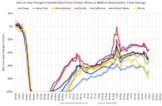
The second graph shows the 7 day average of the year-over-year change in diners as tabulated by OpenTable for the US and several selected cities.
 Thanks to OpenTable for providing this restaurant data:
This data is updated through November 7, 2020.
This data is "a sample of restaurants on the OpenTable network across all channels: online reservations, phone reservations, and walk-ins. For year-over-year comparisons by day, we compare to the same day of the week from the same week in the previous year."
Note that this data is for "only the restaurants that have chosen to reopen in a given market". Since some restaurants have not reopened, the actual year-over-year decline is worse than shown.
Note that dining is generally turning down more in the northern states - Illinois, Pennsylvania, and New York - but only turning down slightly in the southern states.
----- Movie Tickets: Box Office Mojo -----
 This data shows domestic box office for each week (red) and the maximum and minimum for the previous four years. Data is from BoxOfficeMojo through November 5th.
Note that the data is usually noisy week-to-week and depends on when blockbusters are released.
Movie ticket sales have picked up slightly over the last couple of months, and were at $12 million last week (compared to usually around $150 million per week in the early Fall).
Some movie theaters have reopened (probably with limited seating).
----- Hotel Occupancy: STR -----
 This graph shows the seasonal pattern for the hotel occupancy rate using the four week average.
The red line is for 2020, dash light blue is 2019, blue is the median, and black is for 2009 (the worst year since the Great Depression for hotels - prior to 2020).
This data is through October 31st. Hotel occupancy is currently down 29.0% year-over-year.
Notes: Y-axis doesn't start at zero to better show the seasonal change.
Since there is a seasonal pattern to the occupancy rate, we can track the year-over-year change in occupancy to look for any improvement. This table shows the year-over-year change since the week ending Sept 19, 2020:
This suggests little improvement over the last 7 weeks. Some of the recent decline in the occupancy rate is just seasonal.
----- Gasoline Supplied: Energy Information Administration -----
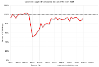 This graph, based on weekly data from the U.S. Energy Information Administration (EIA), shows gasoline supplied compared to the same week last year of .
At one point, gasoline supplied was off almost 50% YoY.
As of October 30th, gasoline supplied was off about 8.8% YoY (about 91.2% of last year).
Note: I know several people that have driven to vacation spots - or to visit family - and they usually would have flown. So this might have boosted gasoline consumption in the Summer and early Fall at the expense of air travel.
----- Transit: Apple Mobility -----
This graph is from Apple mobility. From Apple: "This data is generated by counting the number of requests made to Apple Maps for directions in select countries/regions, sub-regions, and cities." This is just a general guide - people that regularly commute probably don't ask for directions.
There is also some great data on mobility from the Dallas Fed Mobility and Engagement Index. However the index is set "relative to its weekday-specific average over January–February", and is not seasonally adjusted, so we can't tell if an increase in mobility is due to recovery or just the normal increase in the Spring and Summer.
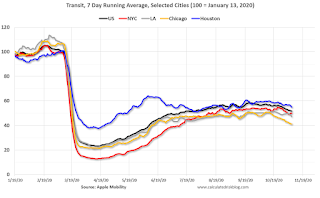 This data is through November 7th for the United States and several selected cities.
The graph is the running 7 day average to remove the impact of weekends.
IMPORTANT: All data is relative to January 13, 2020. This data is NOT Seasonally Adjusted. People walk and drive more when the weather is nice, so I'm just using the transit data.
According to the Apple data directions requests, public transit in the 7 day average for the US is at 52% of the January level. It is at 41% in Chicago, and 55% in Houston - and declining recently.
----- New York City Subway Usage -----
Here is some interesting data on New York subway usage (HT BR).
 This graph is from Todd W Schneider. This is daily data for this year.
This data is through Friday, November 6th.
Schneider has graphs for each borough, and links to all the data sources.
He notes: "Data updates weekly from the MTA’s public turnstile data, usually on Saturday mornings".
The TSA is providing daily travel numbers.
 Click on graph for larger image.
This data shows the seven day average of daily total traveler throughput from the TSA for 2019 (Blue) and 2020 (Red).
The dashed line is the percent of last year for the seven day average.
This data is as of Nov 8th.
The seven day average is down 65% from last year (35% of last year).
There has been a slow increase from the bottom, but has been weak lately.
The second graph shows the 7 day average of the year-over-year change in diners as tabulated by OpenTable for the US and several selected cities.
 Thanks to OpenTable for providing this restaurant data:
This data is updated through November 7, 2020.
This data is "a sample of restaurants on the OpenTable network across all channels: online reservations, phone reservations, and walk-ins. For year-over-year comparisons by day, we compare to the same day of the week from the same week in the previous year."
Note that this data is for "only the restaurants that have chosen to reopen in a given market". Since some restaurants have not reopened, the actual year-over-year decline is worse than shown.
Note that dining is generally turning down more in the northern states - Illinois, Pennsylvania, and New York - but only turning down slightly in the southern states.
 This data shows domestic box office for each week (red) and the maximum and minimum for the previous four years. Data is from BoxOfficeMojo through November 5th.
Note that the data is usually noisy week-to-week and depends on when blockbusters are released.
Movie ticket sales have picked up slightly over the last couple of months, and were at $12 million last week (compared to usually around $150 million per week in the early Fall).
Some movie theaters have reopened (probably with limited seating).
 This graph shows the seasonal pattern for the hotel occupancy rate using the four week average.
 The red line is for 2020, dash light blue is 2019, blue is the median, and black is for 2009 (the worst year since the Great Depression for hotels - prior to 2020).
This data is through October 31st. Hotel occupancy is currently down 29.0% year-over-year.
Notes: Y-axis doesn't start at zero to better show the seasonal change.
Since there is a seasonal pattern to the occupancy rate, we can track the year-over-year change in occupancy to look for any improvement. This table shows the year-over-year change since the week ending Sept 19, 2020:
| Week Ending | YoY Change, Occupancy Rate |
|---|---|
| 9/19 | -31.9% |
| 9/26 | -31.5% |
| 10/3 | -29.6% |
| 10/10 | -29.2% |
| 10/17 | -30.7% |
| 10/24 | -31.7% |
| 10/31 | -29.0% |
This suggests little improvement over the last 7 weeks. Some of the recent decline in the occupancy rate is just seasonal.
 This graph, based on weekly data from the U.S. Energy Information Administration (EIA), shows gasoline supplied compared to the same week last year of .
At one point, gasoline supplied was off almost 50% YoY.
As of October 30th, gasoline supplied was off about 8.8% YoY (about 91.2% of last year).
Note: I know several people that have driven to vacation spots - or to visit family - and they usually would have flown. So this might have boosted gasoline consumption in the Summer and early Fall at the expense of air travel.
This graph is from Apple mobility. From Apple: "This data is generated by counting the number of requests made to Apple Maps for directions in select countries/regions, sub-regions, and cities." This is just a general guide - people that regularly commute probably don't ask for directions.
There is also some great data on mobility from the Dallas Fed Mobility and Engagement Index. However the index is set "relative to its weekday-specific average over January–February", and is not seasonally adjusted, so we can't tell if an increase in mobility is due to recovery or just the normal increase in the Spring and Summer.
 This data is through November 7th for the United States and several selected cities.
The graph is the running 7 day average to remove the impact of weekends.
IMPORTANT: All data is relative to January 13, 2020. This data is NOT Seasonally Adjusted. People walk and drive more when the weather is nice, so I'm just using the transit data.
According to the Apple data directions requests, public transit in the 7 day average for the US is at 52% of the January level. It is at 41% in Chicago, and 55% in Houston - and declining recently.
Here is some interesting data on New York subway usage (HT BR).
 This graph is from Todd W Schneider. This is daily data for this year.
This data is through Friday, November 6th.
Schneider has graphs for each borough, and links to all the data sources.
He notes: "Data updates weekly from the MTA’s public turnstile data, usually on Saturday mornings".
Sunday, November 08, 2020
November 8 COVID-19 Test Results; Hospitalizations almost 57,000
by Calculated Risk on 11/08/2020 08:23:00 PM
Note: I look forward to when I will not be posting this daily!
The US is now averaging close to 1 million tests per day. Based on the experience of other countries, for adequate test-and-trace (and isolation) to reduce infections, the percent positive needs to be well under 5% (probably close to 1%), so the US still needs to increase the number of tests per day significantly (or take actions to push down the number of new infections).
There were 881,251 test results reported over the last 24 hours.
There were 102,588 positive tests. This is a Sunday reporting record.
Almost 7,500 US deaths have been reported so far in November. See the graph on US Daily Deaths here.
 Click on graph for larger image.
This data is from the COVID Tracking Project.
The percent positive over the last 24 hours was 11.6% (red line is 7 day average).
For the status of contact tracing by state, check out testandtrace.com.
And check out COVID Exit Strategy to see how each state is doing.
 The second graph shows the 7 day average of positive tests reported and daily hospitalizations.
The dashed line is the previous hospitalization maximum.
Note that there were very few tests available in March and April, and many cases were missed, so the hospitalizations was higher relative to the 7-day average of positive tests in July.
Now, there are many more tests, and many cases are being detected earlier - so hospitalizations have lagged. However, it is likely that hospitalizations will be at a new high in a few days.
This is a new record 7-day average cases for the USA.
This is a new record 7-day average cases for the USA.
Sunday Night Futures
by Calculated Risk on 11/08/2020 07:42:00 PM
Weekend:
• Schedule for Week of November 8, 2020
• GDP and Employment drag from State and Local Governments
Monday:
• At 2:00 PM ET, Senior Loan Officer Opinion Survey on Bank Lending Practices for October.
From CNBC: Pre-Market Data and Bloomberg futures S&P 500 are up 34 and DOW futures are up 270 (fair value).
Oil prices were down over the last week with WTI futures at $37.83 per barrel and Brent at $40.11 barrel. A year ago, WTI was at $57, and Brent was at $62 - so WTI oil prices are down over 30% year-over-year.
Here is a graph from Gasbuddy.com for nationwide gasoline prices. Nationally prices are at $2.09 per gallon. A year ago prices were at $2.64 per gallon, so gasoline prices are down $0.55 per gallon year-over-year.
GDP and Employment drag from State and Local Governments
by Calculated Risk on 11/08/2020 11:24:00 AM
A key policy issue for 2021 will be how much disaster relief the Federal government will provide to state and local governments. If we look back at the Great Recession, most of the damage was done to the States after the recession. This is because state and local governments are required to run a balanced budget (or something close), and the state governments started cutting after the recession.
Here is a graph showing the contribution to percent change in GDP for state and local governments since 2005.
 Click on graph for larger image.
The red bars are the contribution to the percent change in real GDP from state and local governments.
Although state and local governments were a drag on GDP in Q2 and Q3 in 2020, the worst may happen in 2021 as state and local governments work to balance their budgets.
This next graph shows total state and government payroll employment since January 2005. Note that graph doesn't start at zero to better show the change in employment.
 Following the Great Recession, most of the state and local government layoffs were after the recession. This was a drag on overall employment for a few years.
In 2020, there was a sharp decline in state and local government employment due to the pandemic (mostly in education employment).
Without Federal disaster relief, I expect state and local governments will have further layoffs in 2021.
Saturday, November 07, 2020
November 7 COVID-19 Test Results; Record Cases; Hospitalizations almost 56,000
by Calculated Risk on 11/07/2020 06:58:00 PM
Note: I look forward to when I will not be posting this daily!
The US is now averaging close to 1 million tests per day. Based on the experience of other countries, for adequate test-and-trace (and isolation) to reduce infections, the percent positive needs to be well under 5% (probably close to 1%), so the US still needs to increase the number of tests per day significantly (or take actions to push down the number of new infections).
There were 1,068,815 test results reported over the last 24 hours.
There were 128,396 positive tests. (New record)
Almost 7,000 US deaths have been reported so far in November. See the graph on US Daily Deaths here.
 Click on graph for larger image.
This data is from the COVID Tracking Project.
The percent positive over the last 24 hours was 12.0% (red line is 7 day average).
For the status of contact tracing by state, check out testandtrace.com.
And check out COVID Exit Strategy to see how each state is doing.
 The second graph shows the 7 day average of positive tests reported.
The dashed line is the July high.
Note that there were very few tests available in March and April, and many cases were missed (the percent positive was very high - see first graph). By June, the percent positive had dropped below 5%.
This is a new record 7-day average cases for the USA.
Hotels: Occupancy Rate Declined 29% Year-over-year
by Calculated Risk on 11/07/2020 10:43:00 AM
From HotelNewsNow.com: STR: US hotel results for week ending 31 October
U.S. weekly hotel occupancy was the lowest for any week since late June, according to the latest data from STR through 31 October.Since there is a seasonal pattern to the occupancy rate - see graph below - we can track the year-over-year change in occupancy to look for any improvement. This table shows the year-over-year change since the week ending Sept 19, 2020:
25-31 October 2020 (percentage change from comparable week in 2019):
• Occupancy: 44.4% (-29.0%)
• Average daily rate (ADR): US$91.56 (-27.4%)
• Revenue per available room (RevPAR): US$40.70 (-48.4%)
With rising COVID-19 case numbers and less leisure travel, the U.S. saw a second consecutive week with fewer hotel guests. During October 25-31, room demand fell 1.3 million from the prior week, leading to the country’s lowest occupancy level (44.4%) since the week of June 14-20.
emphasis added
| Week Ending | YoY Change, Occupancy Rate |
|---|---|
| 9/19 | -31.9% |
| 9/26 | -31.5% |
| 10/3 | -29.6% |
| 10/10 | -29.2% |
| 10/17 | -30.7% |
| 10/24 | -31.7% |
| 10/31 | -29.0% |
This suggests little improvement over the last 7 weeks, but not as bad as "lowest since June" would suggest. Some of the recent decline in the occupancy rate is just seasonal.
The following graph shows the seasonal pattern for the hotel occupancy rate using the four week average.
Click on graph for larger image.The red line is for 2020, dash light blue is 2019, blue is the median, and black is for 2009 (the worst year since the Great Depression for hotels - before 2020).
Seasonally we'd expect the occupancy rate to decline into the new year. Note that there was little pickup in business travel that usually happens in the Fall.
Note: Y-axis doesn't start at zero to better show the seasonal change.
Schedule for Week of November 8, 2020
by Calculated Risk on 11/07/2020 08:11:00 AM
The key economic report this week is October CPI.
2:00 PM: Senior Loan Officer Opinion Survey on Bank Lending Practices for October.
6:00 AM: NFIB Small Business Optimism Index for October.
 10:00 AM ET: Job Openings and Labor Turnover Survey for September from the BLS.
 This graph shows job openings (yellow line), hires (purple), Layoff, Discharges and other (red column), and Quits (light blue column) from the JOLTS.
Jobs openings decreased in August to 6.493 million from 6.697 million in July.
Veterans Day Holiday: Most banks will be closed in observance of Veterans Day. The stock market will be open.
7:00 AM ET: The Mortgage Bankers Association (MBA) will release the results for the mortgage purchase applications index.
8:30 AM: The initial weekly unemployment claims report will be released. The consensus is initial claims decreased to 725 thousand from 751 thousand last week.
8:30 AM: The Consumer Price Index for October from the BLS. The consensus is for a 0.2% increase in CPI, and a 0.2% increase in core CPI.
8:30 AM: The Producer Price Index for October from the BLS. The consensus is for a 0.2% increase in PPI, and a 0.2% increase in core PPI.
10:00 AM: University of Michigan's Consumer sentiment index (Preliminary for November).
Friday, November 06, 2020
November 6 COVID-19 Test Results; Record Cases; Hospitalizations almost 55,000
by Calculated Risk on 11/06/2020 08:22:00 PM
Note: I look forward to when I will not be posting this daily!
The US is now averaging close to 1 million tests per day. Based on the experience of other countries, for adequate test-and-trace (and isolation) to reduce infections, the percent positive needs to be well under 5% (probably close to 1%), so the US still needs to increase the number of tests per day significantly (or take actions to push down the number of new infections).
There were 1,238,980 test results reported over the last 24 hours.
There were 125,552 positive tests. (New record)
Over 5,800 US deaths have been reported so far in November. See the graph on US Daily Deaths here.
 Click on graph for larger image.
This data is from the COVID Tracking Project.
The percent positive over the last 24 hours was 10.1% (red line is 7 day average).
For the status of contact tracing by state, check out testandtrace.com.
And check out COVID Exit Strategy to see how each state is doing.
 The second graph shows the 7 day average of positive tests reported.
The dashed line is the July high.
Note that there were very few tests available in March and April, and many cases were missed (the percent positive was very high - see first graph). By June, the percent positive had dropped below 5%.
This is a new record 7-day average cases for the USA.
Seattle Real Estate in October: Sales up 40% YoY, Inventory UP 16% YoY
by Calculated Risk on 11/06/2020 06:19:00 PM
The Northwest Multiple Listing Service reported October Statistical Data
The Northwest MLS report recapping October activity showed a 40% drop in active listings compared to the same month a year ago, an increase of 16% in pending sales (mutually accepted offers), and a year-over-year (YOY) jump of nearly 30% in closed sales. The median price of single family homes and condominiums that sold last month was $500,000, up 19% from the same period a year ago, according to the MLS summary, which encompasses 23 counties, mostly in Western and Central Washington.The press release is for the Northwest MLS area. There were 10,806 sales in October 2020, up 29.7% from 8,335 sales in October 2019.
...
Matthew Gardner, chief economist at Windermere Real Estate, said his biggest concern continues to be the ongoing lack of homes for sale in the Central Puget Sound area. “Keep in mind that a four month supply of homes for sale is a sign of a balanced housing market, but in 14 counties, including the King/Pierce/Snohomish region, there is currently less than one month of supply. This is what is allowing home prices to escalate at double digit rates.”
emphasis added
In King County, sales were up 40% year-over-year, and active inventory was down 21% year-over-year.
In Seattle, sales were up 39.9% year-over-year, and inventory was up 16% year-over-year.. This puts the months-of-supply in Seattle at just 1.7 months.
AAR: October Rail Carloads down 6.6% YoY, Intermodal Up 10.0% YoY
by Calculated Risk on 11/06/2020 02:33:00 PM
From the Association of American Railroads (AAR) Rail Time Indicators. Graphs and excerpts reprinted with permission.
Back in April 2020, when the U.S. economy was basically in a coma, U.S. intermodal originations averaged 219,085 units per week. That was the fewest for any month in more than seven years and the fewest for April in ten years. Back then, no one would have thought that six months later, in October 2020, U.S. railroads would have their best intermodal month in history. Yet that’s where we are: U.S. railroads originated an average of 292,469 containers and trailers per week in October 2020, more than ever before and up a stunning 33.5% over April 2020.
emphasis added
 Click on graph for larger image.
This graph from the Rail Time Indicators report shows the six week average of U.S. Carloads in 2018, 2019 and 2020:
Total U.S. carloads are trending higher, but at a much slower pace than in July and August. U.S. railroads originated an average of 228,193 total carloads per week in October 2020, the most since February 2020 but down 6.6% from October 2019. The 6.6% year-over-year decline is the smallest since the pandemic began.
For the first 10 months of 2020, total carloads were 9.48 million, down 14.5% (1.61 million carloads) from the first 10 months of 2019.
 The second graph shows the six week average of U.S. intermodal in 2018, 2019 and 2020: (using intermodal or shipping containers):
In the 31 years from 1989 to 2019, October was the top U.S. rail intermodal month (in terms of average weekly originations) 25 times. This year will make 26. In October 2020, U.S. railroads originated an average of 292,469 containers and trailers per week, up 10.0% over October 2019 and the highest weekly average for any month in history. (The previous record was 289,994 in June 2018.) The weekly average in October 2020 was 33.5% higher than in April 2020, when they averaged just 219,085 units. That’s the biggest six-month gain in history. Few would have expected that six months ago.Note that rail traffic was weak prior to the pandemic, and intermodal has come back strong.


