by Calculated Risk on 10/27/2020 11:20:00 AM
Tuesday, October 27, 2020
Note: October Employment Report Will Show a Decrease of 147,000 Temporary Census Workers
The Census Bureau released an update today on 2020 Census Paid Temporary Workers
As of the September reference week, there were 246,801 decennial Census temporary workers. As of the October reference week, October 11th - 17th, there were 99,490 temp workers.
That is a decrease of 147,311 temporary jobs.
In August, the employment report showed a gain of 238,000 temporary 2020 Census workers, boosting the headline number.
In September, the employment report showed a decrease of 41,000 temporary 2020 Census workers, reducing the headline number.
The October employment report will show a 147,311 decrease in temporary Census employment.
HVS: Q3 2020 Homeownership and Vacancy Rates
by Calculated Risk on 10/27/2020 11:06:00 AM
The Census Bureau released the Residential Vacancies and Homeownership report for Q3 2020.
It is likely the results of this survey were significantly distorted by the pandemic. See note from Census below.
This report is frequently mentioned by analysts and the media to track household formation, the homeownership rate, and the homeowner and rental vacancy rates. However, there are serious questions about the accuracy of this survey.
This survey might show the trend, but I wouldn't rely on the absolute numbers. The Census Bureau is investigating the differences between the HVS, ACS and decennial Census, and analysts probably shouldn't use the HVS to estimate the excess vacant supply or household formation, or rely on the homeownership rate, except as a guide to the trend.
National vacancy rates in the third quarter 2020 were 6.4 percent for rental housing and 0.9 percent for homeowner housing. The rental vacancy rate of 6.4 percent was 0.4 percentage points lower than the rate in the third quarter 2019 (6.8 percent) and 0.7 percentage points higher than the rate in the second quarter 2020 (5.7 percent). The homeowner vacancy rate of 0.9 percent was 0.5 percentage points lower than the rate in the third quarter 2019 (1.4 percent) and virtually unchanged from the rate in the second quarter 2020 (0.9 percent).
The homeownership rate of 67.4 percent was 2.6 percentage points higher than the rate in the third quarter 2019 (64.8 percent) and not statistically different from the rate in the second quarter 2020 (67.9 percent). "
 Click on graph for larger image.
The Red dots are the decennial Census homeownership rates for April 1st 1990, 2000 and 2010. The HVS homeownership rate decreased to 67.4% in Q3, from 67.9% in Q2.
I'd put more weight on the decennial Census numbers. It is likely the results in Q2 and Q3 were distorted by the pandemic.
 The HVS homeowner vacancy was unchanged at 0.9%.
 Once again - this probably shows the general trend, but I wouldn't rely on the absolute numbers.
From Census:
Due to the coronavirus pandemic (COVID-19), data collection operations for the CPS/HVS were affected during the third quarter of 2020, as in-person interviews were only allowed for portions of the sample in July (41 percent), August (53 percent), and September (100 percent). The remaining interviews were conducted over the telephone. If the Field Representative was unable to get contact information on the sample unit, the unit was made a Type A noninterview (no one home, refusal, etc). We are unable to determine the extent to which this data collection change affected our estimates.
 The rental vacancy rate increased to 6.4% in Q3.
The quarterly HVS is the most timely survey on households, but there are many questions about the accuracy of this survey.
Case-Shiller: National House Price Index increased 5.7% year-over-year in August
by Calculated Risk on 10/27/2020 09:13:00 AM
S&P/Case-Shiller released the monthly Home Price Indices for August ("August" is a 3 month average of June, July and August prices).
This release includes prices for 20 individual cities, two composite indices (for 10 cities and 20 cities) and the monthly National index.
From S&P: S&P CoreLogic Case-Shiller Index Shows Annual Home Price Gains Increased to 5.7% in August
The S&P CoreLogic Case-Shiller U.S. National Home Price NSA Index, covering all nine U.S. census divisions, reported a 5.7% annual gain in August, up from 4.8% in the previous month. The 10-City Composite annual increase came in at 4.7%, up from 3.5% in the previous month. The 20-City Composite posted a 5.2% year-over-year gain, up from 4.1% in the previous month.
Phoenix, Seattle and San Diego reported the highest year-over-year gains among the 19 cities (excluding Detroit) in August. Phoenix led the way with a 9.9% year-over-year price increase, followed by Seattle with an 8.5% increase and San Diego with a 7.6% increase. All 19 cities reported higher price increases in the year ending August 2020 versus the year ending July 2020.
...
The National Index posted a 1.1% month-over-month increase, while the 10-City and 20-City Composites both posted increases of 1.1% before seasonal adjustment in August. After seasonal adjustment, the National Index posted a month-over-month increase of 1.0%, while the 10-City and 20- City Composites both posted increases of 0.5%. In August, all 19 cities (excluding Detroit) reported increases before seasonal adjustment, while 17 of the 19 cities reported increases after seasonal adjustment.
“Housing prices were strong in August,” says Craig J. Lazzara, Managing Director and Global Head of Index Investment Strategy at S&P Dow Jones Indices. “The National Composite Index gained 5.7% relative to its level a year ago, well ahead of July’s 4.8% increase. The 10- and 20-City Composites (up 4.7% and 5.2%, respectively) also rose at an accelerating pace in August. The strength of the housing market was consistent nationally – all 19 cities for which we have August data rose, and all 19 gained more in the 12 months ended in August than they had done in the 12 months ended in July.
“A trend of accelerating increases in the National Composite Index began in August 2019 but was interrupted in May and June, as COVID-related restrictions produced modestly-decelerating price gains. We speculated last month that the accelerating trend might have resumed, and August’s results easily bear that interpretation. The last time that the National Composite matched August’s 5.7% growth rate was 25 months ago, in July 2018. If future reports continue in this vein, we may soon be able to conclude that the COVID-related deceleration is behind us.
emphasis added
 Click on graph for larger image.
 The first graph shows the nominal seasonally adjusted Composite 10, Composite 20 and National indices (the Composite 20 was started in January 2000).
The Composite 10 index is up 5.2% from the bubble peak, and up 0.5% in August (SA) from July.
The Composite 20 index is 9.5% above the bubble peak, and up 0.5% (SA) in August.
The National index is 20.1% above the bubble peak (SA), and up 1.0% (SA) in August. The National index is up 62% from the post-bubble low set in December 2011 (SA).
 The second graph shows the Year over year change in all three indices.
The Composite 10 SA is up 4.7% compared to August 2019. The Composite 20 SA is up 5.2% year-over-year.
The National index SA is up 5.7% year-over-year.
Note: According to the data, prices increased in 18 cities month-over-month seasonally adjusted.
Price increases were above expectations. I'll have more later.
Monday, October 26, 2020
Tuesday: Durable Goods, Case-Shiller House Prices
by Calculated Risk on 10/26/2020 09:00:00 PM
Tuesday:
• At 8:30 AM ET, Durable Goods Orders for September from the Census Bureau. The consensus is for a 0.5% increase in durable goods orders.
• At 9:00 AM, S&P/Case-Shiller House Price Index for August. The consensus is for the Composite 20 index to be up 4.2% year-over-year.
• Also at 9:00 AM, FHFA House Price Index for August. This was originally a GSE only repeat sales, however there is also an expanded index.
• At 10:00 AM, Richmond Fed Survey of Manufacturing Activity for October. This is the last of the regional surveys for October.
October 26 COVID-19 Test Results; New US Record 7-Day Average Cases
by Calculated Risk on 10/26/2020 07:03:00 PM
The US is now mostly reporting 700 thousand to 1 million tests per day. Based on the experience of other countries, the percent positive needs to be well under 5% to really push down new infections (probably close to 1%), so the US still needs to increase the number of tests per day significantly (or take actions to push down the number of new infections).
There were 1,043,423 test results reported over the last 24 hours.
There were 62,315 positive tests.
Almost 18,500 Americans deaths from COVID have been reported in October. See the graph on US Daily Deaths here.

This data is from the COVID Tracking Project.
The percent positive over the last 24 hours was 6.0% (red line is 7 day average).
For the status of contact tracing by state, check out testandtrace.com.
And check out COVID Exit Strategy to see how each state is doing.

The dashed line is the July high.
Note that there were very few tests available in March and April, and many cases were missed (the percent positive was very high - see first graph). By June, the percent positive had dropped below 5%.
This is a new record 7-day average for the USA.
MBA Survey: "Share of Mortgage Loans in Forbearance Decreases Slightly to 5.90%"
by Calculated Risk on 10/26/2020 04:00:00 PM
Note: This is as of October 18th.
From the MBA: Share of Mortgage Loans in Forbearance Decreases Slightly to 5.90%
The Mortgage Bankers Association’s (MBA) latest Forbearance and Call Volume Survey revealed that the total number of loans now in forbearance decreased by 2 basis points from 5.92% of servicers’ portfolio volume in the prior week to 5.90% as of October 18, 2020. According to MBA’s estimate, 3.0 million homeowners are in forbearance plans.
...
“The share of loans in forbearance declined only slightly in the prior week, after two weeks of a flurry of borrowers exiting as they reached the six-month mark,” said Mike Fratantoni, MBA’s Senior Vice President and Chief Economist. “There continues to be a steady improvement for Fannie Mae and Freddie Mac loans, but the forbearance share for Ginnie Mae, portfolio, and PLS loans all increased. This is further evidence of the unevenness in the current economic recovery. The housing market is booming, as shown by the extremely strong pace of home sales last week. However, many homeowners continue to struggle, as the pace of the job market’s improvement has waned.”
...
By stage, 25.02% of total loans in forbearance are in the initial forbearance plan stage, while 73.14% are in a forbearance extension. The remaining 1.84% are forbearance re-entries.
emphasis added
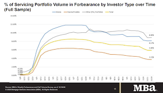 Click on graph for larger image.
This graph shows the percent of portfolio in forbearance by investor type over time. Most of the increase was in late March and early April, and has been trending down for the last few months.
The MBA notes: "Total weekly forbearance requests as a percent of servicing portfolio volume (#) increased relative to the prior week: from 0.10% to 0.11%."
There hasn't been a pickup in forbearance activity related to the end of the extra unemployment benefits.
Dallas Fed: "Texas Manufacturing Expands for Fifth Straight Month" in October
by Calculated Risk on 10/26/2020 01:14:00 PM
From the Dallas Fed: Texas Manufacturing Expands for Fifth Straight Month
Texas factory activity expanded in October for the fifth month in a row following a record contraction due to the COVID-19 pandemic, according to business executives responding to the Texas Manufacturing Outlook Survey. The production index, a key measure of state manufacturing conditions, rose three points to 25.5, indicating a slight acceleration in output growth.
Other measures of manufacturing activity also point to stronger growth this month. The new orders index advanced five points to 19.9, and the growth rate of orders index inched up to 14.3. The capacity utilization index rose from 17.5 to 23.0, while the shipments index was largely unchanged at 21.9.
Perceptions of broader business conditions continued to improve in October. The general business activity index pushed further above average, coming in at 19.8, a two-year high. The company outlook index moved up three points to 17.8, also a two-year high. Uncertainty regarding companies’ outlooks continued to rise, with the index moving up four points to 11.0.
Labor market measures indicated continued but slower growth in employment and work hours. The employment index remained positive but fell from 14.5 to 8.7, suggesting less-robust hiring.
emphasis added
A few Comments on September New Home Sales
by Calculated Risk on 10/26/2020 11:42:00 AM
New home sales for September were reported at 959,000 on a seasonally adjusted annual rate basis (SAAR). Sales for the previous three months were revised down, combined.
This was below consensus expectations, but was still the third highest sales rate since 2006 (behind July and August). Clearly low mortgages rates, low existing home supply, and low sales in March and April (due to the pandemic) have led to a strong increase in sales. Favorable demographics (something I wrote about many times over the last decade) and a surging stock market have probably helped new home sales too.
Earlier: New Home Sales decreased to 959,000 Annual Rate in September.
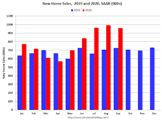
This graph shows new home sales for 2019 and 2020 by month (Seasonally Adjusted Annual Rate).
New home sales were up 32.1% year-over-year (YoY) in August. Year-to-date (YTD) sales are up 16.9%.
And on inventory: since new home sales are reported when the contract is signed - even if the home hasn't been started - new home sales are not limited by inventory (except if no lots are available). Inventory for new home sales is important in that it means there will be more housing starts if inventory is low (like right now) - and fewer starts if inventory is too high (not now).
Usually New Home Sales is a great leading indicator for the economy, however, currently the course of the economy will be determined by the course of the virus, and New Home Sales tell us nothing about the future of the pandemic. Without the pandemic, I'd obviously be very positive about this report.
New Home Sales decreased to 959,000 Annual Rate in September
by Calculated Risk on 10/26/2020 10:14:00 AM
The Census Bureau reports New Home Sales in September were at a seasonally adjusted annual rate (SAAR) of 959 thousand.
The previous three months were revised down, combined.
Sales of new single-family houses in September 2020 were at a seasonally adjusted annual rate of 959,000, according to estimates released jointly today by the U.S. Census Bureau and the Department of Housing and Urban Development. This is 3.5 percent below the revised August rate of 994,000, but is 32.1 percent above the September 2019 estimate of 726,000.
emphasis added
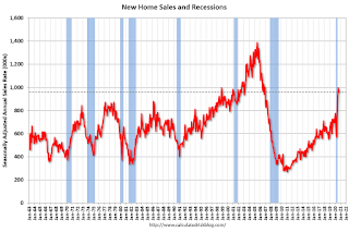 Click on graph for larger image.
The first graph shows New Home Sales vs. recessions since 1963. The dashed line is the current sales rate.
This is the third highest sales rate since 2006 (just below the last two months).
The second graph shows New Home Months of Supply.
 The months of supply increased in September to 3.6 months from 3.4 months in August.
 The all time record high was 12.1 months of supply in January 2009. The all time record low was 3.4 months in August 2020.
This is below the normal range (about 4 to 6 months supply is normal).
"The seasonally-adjusted estimate of new houses for sale at the end of September was 284,000. This represents a supply of 3.6 months at the current sales rate."
 On inventory, according to the Census Bureau:
 "A house is considered for sale when a permit to build has been issued in permit-issuing places or work has begun on the footings or foundation in nonpermit areas and a sales contract has not been signed nor a deposit accepted."Starting in 1973 the Census Bureau broke this down into three categories: Not Started, Under Construction, and Completed.
The third graph shows the three categories of inventory starting in 1973.
The inventory of completed homes for sale is low, and the combined total of completed and under construction is lower than normal.
 The last graph shows sales NSA (monthly sales, not seasonally adjusted annual rate).
In September 2020 (red column), 75 thousand new homes were sold (NSA). Last year, 56 thousand homes were sold in September.
The all time high for September was 99 thousand in 2005, and the all time low for September was 24 thousand in 2011.
This was below expectations of 1,025 thousand sales SAAR, and sales in the three previous months were revised down, combined. I'll have more later today.
Eight High Frequency Indicators for the Economy
by Calculated Risk on 10/26/2020 08:08:00 AM
NOTE: I've added another indicator - the occupancy rate for office buildings with security from Kastle Systems (ht Burt). This is near the bottom.
These indicators are mostly for travel and entertainment - some of the sectors that will recover very slowly.
The TSA is providing daily travel numbers.
 Click on graph for larger image.
This data shows the seven day average of daily total traveler throughput from the TSA for 2019 (Blue) and 2020 (Red).
The dashed line is the percent of last year for the seven day average.
This data is as of Oct 25th.
The seven day average is down 64% from last year (36% of last year).
There has been a slow increase from the bottom.
The second graph shows the 7 day average of the year-over-year change in diners as tabulated by OpenTable for the US and several selected cities.
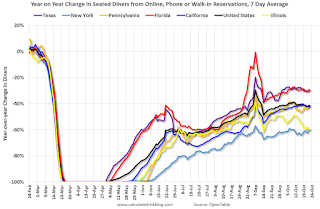 Thanks to OpenTable for providing this restaurant data:
This data is updated through October 24, 2020.
This data is "a sample of restaurants on the OpenTable network across all channels: online reservations, phone reservations, and walk-ins. For year-over-year comparisons by day, we compare to the same day of the week from the same week in the previous year."
Note that this data is for "only the restaurants that have chosen to reopen in a given market". Since some restaurants have not reopened, the actual year-over-year decline is worse than shown.
Note that dining is generally turning down in the northern states - Illinois, Pennsylvania, and New York - but holding up in the southern states.
 This data shows domestic box office for each week (red) and the maximum and minimum for the previous four years. Data is from BoxOfficeMojo through October 22nd.
Note that the data is usually noisy week-to-week and depends on when blockbusters are released.
Movie ticket sales have picked up slightly over the last couple of months, and were at $15 million last week (compared to usually around $150 million per week in the early Fall).
Some movie theaters have reopened (probably with limited seating).
 This graph shows the seasonal pattern for the hotel occupancy rate using the four week average.
 The red line is for 2020, dash light blue is 2019, blue is the median, and black is for 2009 (the worst year since the Great Depression for hotels - prior to 2020).
This data is through October 17th.
Hotel occupancy is currently down 30.7% year-over-year.
Notes: Y-axis doesn't start at zero to better show the seasonal change.
So far there has been little business travel pickup that usually happens in the Fall.
 This graph, based on weekly data from the U.S. Energy Information Administration (EIA), shows gasoline supplied compared to the same week last year of .
At one point, gasoline supplied was off almost 50% YoY.
As of October 16th, gasoline supplied was off about 13.6% YoY (about 86.4% of last year).
Note: I know several people that have driven to vacation spots - or to visit family - and they usually would have flown. So this might have boosted gasoline consumption in the Summer and early Fall at the expense of air travel.
This graph is from Apple mobility. From Apple: "This data is generated by counting the number of requests made to Apple Maps for directions in select countries/regions, sub-regions, and cities." This is just a general guide - people that regularly commute probably don't ask for directions.
There is also some great data on mobility from the Dallas Fed Mobility and Engagement Index. However the index is set "relative to its weekday-specific average over January–February", and is not seasonally adjusted, so we can't tell if an increase in mobility is due to recovery or just the normal increase in the Spring and Summer.
 This data is through October 23rd for the United States and several selected cities.
The graph is the running 7 day average to remove the impact of weekends.
IMPORTANT: All data is relative to January 13, 2020. This data is NOT Seasonally Adjusted. People walk and drive more when the weather is nice, so I'm just using the transit data.
According to the Apple data directions requests, public transit in the 7 day average for the US is still only about 56% of the January level. It is at 46% in Chicago, and 59% in Houston.
Here is some interesting data from Kastle Systems on office occupancy.
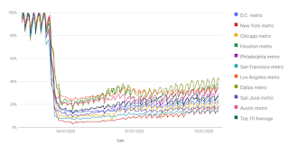 This is just a screen shot. Here is the interactive data. This data is through October 21st.
Currently Office Occupancy is 27% of normal, with a low of 15% in San Francisco, and a high of 41% in Dallas.
"View the average occupancy rate of commercial properties across 10 major U.S. cities, by each municipality and in aggregate, to show the pace of Americans returning to work based on daily unique access entries in Kastle-secured buildings across the nation."
Here is some interesting data on New York subway usage (HT BR).
 This graph is from Todd W Schneider.
This data is through Friday, October 23rd.
Schneider has graphs for each borough, and links to all the data sources.
He notes: "Data updates weekly from the MTA’s public turnstile data, usually on Saturday mornings".


