 RSS Feed
 by Calculated Risk on 10/19/2020 08:17:00 AM
Monday, October 19, 2020
Seven High Frequency Indicators for the Economy
These indicators are mostly for travel and entertainment - some of the sectors that will recover very slowly.
The TSA is providing daily travel numbers.
 Click on graph for larger image.
This data shows the seven day average of daily total traveler throughput from the TSA for 2019 (Blue) and 2020 (Red).
The dashed line is the percent of last year for the seven day average.
This data is as of Oct 18th.
The seven day average is down 64% from last year (36% of last year).
There has been a slow increase from the bottom.
The second graph shows the 7 day average of the year-over-year change in diners as tabulated by OpenTable for the US and several selected cities.
 Thanks to OpenTable for providing this restaurant data:
This data is updated through October 17, 2020.
This data is "a sample of restaurants on the OpenTable network across all channels: online reservations, phone reservations, and walk-ins. For year-over-year comparisons by day, we compare to the same day of the week from the same week in the previous year."
Note that this data is for "only the restaurants that have chosen to reopen in a given market". Since some restaurants have not reopened, the actual year-over-year decline is worse than shown.
Note that dining is turning in the northern states - Illinois, Pennsylvania, and New York - but holding up in the southern states.
 This data shows domestic box office for each week (red) and the maximum and minimum for the previous four years. Data is from BoxOfficeMojo through October 15th.
Note that the data is usually noisy week-to-week and depends on when blockbusters are released.
Movie ticket sales have picked up slightly over the last couple of months, and were at $12 million last week (compared to usually around $150 million per week in the early Fall).
Some movie theaters have reopened (probably with limited seating).
 This graph shows the seasonal pattern for the hotel occupancy rate using the four week average.
 The red line is for 2020, dash light blue is 2019, blue is the median, and black is for 2009 (the worst year since the Great Depression for hotels - prior to 2020).
This data is through October 10th.
Hotel occupancy is currently down 29.2% year-over-year.
Notes: Y-axis doesn't start at zero to better show the seasonal change.
So far there has been little business travel pickup that usually happens in the Fall.
 This graph, based on weekly data from the U.S. Energy Information Administration (EIA), shows gasoline supplied compared to the same week last year of .
At one point, gasoline supplied was off almost 50% YoY.
As of October 9th, gasoline supplied was off about 8.3% YoY (about 91.7% of last year).
Note: I know several people that have driven to vacation spots - or to visit family - and they usually would have flown. So this might have boosted gasoline consumption and the expense of air travel.
This graph is from Apple mobility. From Apple: "This data is generated by counting the number of requests made to Apple Maps for directions in select countries/regions, sub-regions, and cities." This is just a general guide - people that regularly commute probably don't ask for directions.
There is also some great data on mobility from the Dallas Fed Mobility and Engagement Index. However the index is set "relative to its weekday-specific average over January–February", and is not seasonally adjusted, so we can't tell if an increase in mobility is due to recovery or just the normal increase in the Spring and Summer.
 This data is through October 17th for the United States and several selected cities.
The graph is the running 7 day average to remove the impact of weekends.
IMPORTANT: All data is relative to January 13, 2020. This data is NOT Seasonally Adjusted. People walk and drive more when the weather is nice, so I'm just using the transit data.
According to the Apple data directions requests, public transit in the 7 day average for the US is still only about 56% of the January level. It is at 49% in Chicago, and 59% in Houston.
Here is some interesting data on New York subway usage (HT BR).
 This graph is from Todd W Schneider.
This data is through Friday, October 16th.
Schneider has graphs for each borough, and links to all the data sources.
He notes: "Data updates weekly from the MTA’s public turnstile data, usually on Saturday mornings".
Sunday, October 18, 2020
Sunday Night Futures
by Calculated Risk on 10/18/2020 08:18:00 PM
Weekend:
• Schedule for Week of October 18, 2020
Monday:
• At 8:00 AM ET, Discussion, Fed Chair Jerome Powell, Cross-Border Payments and Digital Currencies, At the International Monetary Fund Annual Meeting - Panel on Cross-Border Payments
• At 10:00 AM, The October NAHB homebuilder survey. The consensus is for a reading of 83, unchanged from 83 in September. Any number above 50 indicates that more builders view sales conditions as good than poor.
From CNBC: Pre-Market Data and Bloomberg futures S&P 500 and DOW futures are up slightly (fair value).
Oil prices were up over the last week with WTI futures at $40.97 per barrel and Brent at $43.00 barrel. A year ago, WTI was at $54, and Brent was at $60 - so WTI oil prices are down about 30% year-over-year.
Here is a graph from Gasbuddy.com for nationwide gasoline prices. Nationally prices are at $2.15 per gallon. A year ago prices were at $2.66 per gallon, so gasoline prices are down $0.51 per gallon year-over-year.
October 18 COVID-19 Test Results
by Calculated Risk on 10/18/2020 07:13:00 PM
The US is now mostly reporting 700 thousand to 1 million tests per day. Based on the experience of other countries, the percent positive needs to be well under 5% to really push down new infections (probably close to 1%), so the US still needs to increase the number of tests per day significantly (or take actions to push down the number of new infections).
There were 812,261 test results reported over the last 24 hours.
There were 48,638 positive tests.
ALmost 12,500 Americans deaths from COVID have been reported in October. See the graph on US Daily Deaths here.
 Click on graph for larger image.
This data is from the COVID Tracking Project.
The percent positive over the last 24 hours was 6.0% (red line is 7 day average).
For the status of contact tracing by state, check out testandtrace.com.
And check out COVID Exit Strategy to see how each state is doing.
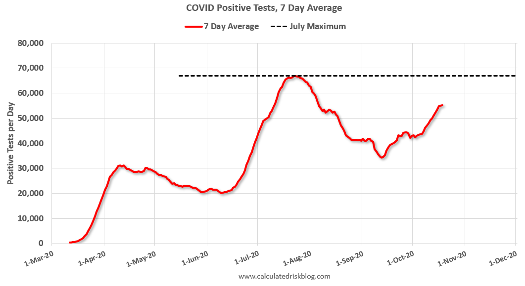 The second graph shows the 7 day average of positive tests reported.
The dashed line is the July high.
Note that there were very few tests available in March and April, and many cases were missed (the percent positive was very high - see first graph). By June, the percent positive had dropped below 5%.
Everyone needs to be vigilant or we might see record high cases before the end of October.
Trends in Educational Attainment in the U.S. Labor Force
by Calculated Risk on 10/18/2020 01:00:00 PM
The first graph shows the unemployment rate by four levels of education (all groups are 25 years and older) through September 2020. Note: This is an update to a post from a few years ago.
Unfortunately this data only goes back to 1992 and includes only three recessions (the stock / tech bust in 2001, and the housing bust/financial crisis, and the 2020 pandemic). Clearly education matters with regards to the unemployment rate, with the lowest rate for college graduates at 4.8% in September, and highest for those without a high school degree at 10.6% in September.
All four groups were generally trending down prior to the pandemic. And all are trending down now.
 Click on graph for larger image.
Note: This says nothing about the quality of jobs - as an example, a college graduate working at minimum wage would be considered "employed".
This brings up an interesting question: What is the composition of the labor force by educational attainment, and how has that been changing over time?
Here is some data on the U.S. labor force by educational attainment since 1992.
 Currently, about 60 million people in the U.S. labor force have a Bachelor's degree or higher. This is almost 42% of the labor force, up from 26.2% in 1992.
This is the only category trending up. "Some college" has been steady (and trending down lately), and both "high school" and "less than high school" have been trending down.
Based on current trends, probably more than half the labor force will have at least a bachelor's degree at the end of this decade (2020s).
Some thoughts: Since workers with bachelor's degrees typically have a lower unemployment rate, rising educational attainment is probably a factor in pushing down the overall unemployment rate over time.
Also, I'd guess more education would mean less labor turnover, and that education is a factor in lower weekly claims (prior to the pandemic).
A more educated labor force is a positive for the future.
Saturday, October 17, 2020
October 17 COVID-19 Test Results
by Calculated Risk on 10/17/2020 05:55:00 PM
The US is now mostly reporting 700 thousand to 1 million tests per day. Based on the experience of other countries, the percent positive needs to be well under 5% to really push down new infections (probably close to 1%), so the US still needs to increase the number of tests per day significantly (or take actions to push down the number of new infections).
There were 1,003,502 test results reported over the last 24 hours.
There were 59,642 positive tests.
Over 12,000 Americans deaths from COVID have been reported in October. See the graph on US Daily Deaths here.
 Click on graph for larger image.
This data is from the COVID Tracking Project.
The percent positive over the last 24 hours was 5.9% (red line is 7 day average).
For the status of contact tracing by state, check out testandtrace.com.
And check out COVID Exit Strategy to see how each state is doing.
 The second graph shows the 7 day average of positive tests reported.
The dashed line is the July high.
Note that there were very few tests available in March and April, and many cases were missed (the percent positive was very high - see first graph). By June, the percent positive had dropped below 5%.
Everyone needs to be vigilant or we might see record high cases before the end of October.
Schedule for Week of October 18, 2020
by Calculated Risk on 10/17/2020 08:11:00 AM
The key economic reports this week are September Housing Starts and Existing Home sales.
8:00 AM: Discussion, Fed Chair Jerome Powell, Cross-Border Payments and Digital Currencies, At the International Monetary Fund Annual Meeting - Panel on Cross-Border Payments
10:00 AM: The October NAHB homebuilder survey. The consensus is for a reading of 83, unchanged from 83 in September. Any number above 50 indicates that more builders view sales conditions as good than poor.
 8:30 AM: Housing Starts for September.
 This graph shows single and total housing starts since 1968.
The consensus is for 1.450 million SAAR, up from 1.416 million SAAR.
10:00 AM: State Employment and Unemployment (Monthly) for September 2020
7:00 AM ET: The Mortgage Bankers Association (MBA) will release the results for the mortgage purchase applications index.
During the day: The AIA's Architecture Billings Index for September (a leading indicator for commercial real estate).
2:00 PM: the Federal Reserve Beige Book, an informal review by the Federal Reserve Banks of current economic conditions in their Districts.
8:30 AM: The initial weekly unemployment claims report will be released. The consensus is initial claims decreased to 860 thousand from 898 thousand last week.
 10:00 AM: Existing Home Sales for September from the National Association of Realtors (NAR). The consensus is for 6.25 million SAAR, up from 6.00 million in August.
The graph shows existing home sales from 1994 through the report last month.
11:00 AM: the Kansas City Fed manufacturing survey for October.
No major economic releases scheduled.
Friday, October 16, 2020
Sacramento Housing in September: Sales increase 22% YoY, Active Inventory down 49% YoY
by Calculated Risk on 10/16/2020 09:55:00 PM
Note that September sales are for contracts typically signed in July and August.
From SacRealtor.org: September 2020 Statistics – Sacramento Housing Market – Single Family Homes
September wrapped up with 1,695 sales, up 8.7% from the 1,560 sales in August. Compared to one year ago (1,383), the current figure is up 21.7%.1) Overall sales increased to 1,695 in September, up 21.7% from 1,383 in September 2019. Sales were up 8.7% from August 2020 (previous month).
...
The Active Listing Inventory increased 1.5% from August to September, from 1,238 units to 1,257 units. Compared with September 2019 (2,457), inventory is down 48.8%. The Months of Inventory decreased from .8 Months to .7 Months. This figure represents the amount of time (in months) it would take for the current rate of sales to deplete the total active listing inventory. The chart below reflects the Months of Inventory in each price range.
...
The Median DOM (days on market) dropped from 7 to 6 and the Average DOM dropped from 21 to 18. “Days on market” represents the days between the initial listing of the home as “active” and the day it goes “pending.” Of the 1,695 sales this month, 84% (1,424) were on the market for 30 days or less and 92.4% (1,566) were on the market for 60 days or less.
emphasis added
2) Active inventory was at 1,238 down from 2,457 in September 2019. That is down 48.8% year-over-year. This is the seventeenth consecutive month with a YoY decline in inventory.
Existing home sales for September will be released next week.
October 16 COVID-19 Test Results
by Calculated Risk on 10/16/2020 06:46:00 PM
The US is now mostly reporting 700 thousand to 1 million tests per day. Based on the experience of other countries, the percent positive needs to be well under 5% to really push down new infections (probably close to 1%), so the US still needs to increase the number of tests per day significantly (or take actions to push down the number of new infections).
There were 1,046,412 test results reported over the last 24 hours.
There were 68,124 positive tests.
Almost 11,300 Americans deaths from COVID have been reported in October. See the graph on US Daily Deaths here.
 Click on graph for larger image.
This data is from the COVID Tracking Project.
The percent positive over the last 24 hours was 6.5% (red line is 7 day average).
For the status of contact tracing by state, check out testandtrace.com.
And check out COVID Exit Strategy to see how each state is doing.
 The second graph shows the 7 day average of positive tests reported.
The dashed line is the July high.
Note that there were very few tests available in March and April, and many cases were missed (the percent positive was very high - see first graph). By June, the percent positive had dropped below 5%.
Everyone needs to be vigilant or we might see record high cases before the end of October.
Q3 GDP Forecasts
by Calculated Risk on 10/16/2020 12:40:00 PM
From Merrill Lynch:
We are tracking 33% qoq saar for 3Q GDP growth. [Oct 16 estimate]From Goldman Sachs:
emphasis added
We boosted our Q3 consumption growth estimate due to the stronger-than-expected September retail sales report. However, this morning’s utilities and goods production data were softer than our previous assumptions. On net, we left our Q3 GDP tracking estimate unchanged at +35% (qoq ar). [Oct 16 estimate]From the NY Fed Nowcasting Report
The New York Fed Staff Nowcast stands at 13.8% for 2020:Q3 and 3.6% for 2020:Q4. [Oct 16 estimate]And from the Altanta Fed: GDPNow
The GDPNow model estimate for real GDP growth (seasonally adjusted annual rate) in the third quarter of 2020 is 35.2 percent on October 16, unchanged from October 9 after rounding. After this week’s data releases by the U.S. Bureau of Labor Statistics, the U.S. Department of the Treasury's Bureau of the Fiscal Service, the Federal Reserve Board of Governors, and the U.S. Census Bureau, a decrease in the nowcast of third-quarter real gross private domestic investment growth from 48.4 percent to 47.0 percent was offset by an increase in the nowcast of third-quarter real personal consumption expenditures growth from 37.0 percent to 37.3 percent. [Oct 16 estimate]It is important to note that GDP is reported at a seasonally adjusted annual rate (SAAR). A 35% annualized increase in Q3 GDP, is about 7.8% QoQ, and would leave real GDP down about 3.3% from Q4 2019.
The following graph illustrates this decline.
 Click on graph for larger image.
This graph shows the percent decline in real GDP from the previous peak (currently the previous peak was in Q4 2019).
This graph is through Q2 2020, and real GDP is currently off 10.2% from the previous peak. For comparison, at the depth of the Great Recession, real GDP was down 4.0% from the previous peak.
The black arrow shows what a 35% annualized increase in real GDP would look like in Q3.
Even with a 35% annualized increase (about 7.8% QoQ), real GDP will be down about 3.3% from Q4 2019; a slightly smaller decline in real GDP than at the depth of the Great Recession.
Black Knight: Number of Homeowners in COVID-19-Related Forbearance Plans Increased Slightly Following Large Decline Last Week
by Calculated Risk on 10/16/2020 10:50:00 AM
Note: Both Black Knight and the MBA (Mortgage Bankers Association) are putting out weekly estimates of mortgages in forbearance.
This data is as of October 13th.
From Forbearance Volumes Increase Slightly Following Largest Weeklyl Drop
Following last week’s largest weekly decline in COVID-19-related forbearances since the pandemic began, the market saw a slight uptick of 19k loans in forbearance this week.
New data released today from Black Knight’s McDash Flash Forbearance Tracker shows that though volumes increased week-over-week, there is still reason to be optimistic about the state of U.S. mortgages in forbearance.
We are seeing the national forbearance rate hold steady at 5.6% week-over-week, with just under 3 million homeowners remaining in active forbearance. This number is down from a peak of 4.76 million in late May.
Click on graph for larger image.
All in, there are currently 708k fewer loans in forbearance now than the same time last month, which is a 19% decline. Of the remaining 2,988,000 current forbearance cases, 78% have had their terms extended with their servicer.


