by Calculated Risk on 10/06/2020 12:49:00 PM
Tuesday, October 06, 2020
CoreLogic: House Prices up 5.9% Year-over-year in August
Notes: This CoreLogic House Price Index report is for August. The recent Case-Shiller index release was for July. The CoreLogic HPI is a three month weighted average and is not seasonally adjusted (NSA).
From CoreLogic: Home Price Insights for August 2020
Home prices nationwide, including distressed sales, increased year over year by 5.9% in August 2020 compared with August 2019 and increased month over month by 1% in August 2020 compared with July 2020 (revisions with public records data are standard, and to ensure accuracy, CoreLogic incorporates the newly released public data to provide updated results).CR Note: The overall impact on house prices will depend on the duration of the crisis.
...
“The imbalance between homebuyer demand and for-sale inventory is particularly acute for lower-priced homes. Because of this imbalance, homes priced more than 25% below the median were up 8.6% in price over the last year, compared with the 5.9% price increase for all homes.” - Dr. Frank Nothaft, Chief Economist for CoreLogic
Despite the continued pressures of the pandemic, consumer home-purchasing power has stayed strong as mortgage rates remain at record lows. Meanwhile, for-sale inventory has continued to dwindle, dropping 17% year over year in August, which created upward pressure on home price appreciation as buyers compete for the limited supply of homes.
Home price growth is expected to slow as greater availability of new and existing homes are placed for sale in 2021 and elevated unemployment saps buyer demand. The HPI Forecast shows prices will start to downshift in early 2021, with annual U.S. HPI gains slowing to just 0.2% by August 2021 and many locations experiencing a decline in prices.
emphasis added
Fed Chair Powell: Recent Economic Developments and the Challenges Ahead
by Calculated Risk on 10/06/2020 10:43:00 AM
The speech is available on youtube.
From Fed Chair Powell: Recent Economic Developments and the Challenges Ahead
We should continue do what we can to manage downside risks to the outlook. One such risk is that COVID-19 cases might again rise to levels that more significantly limit economic activity, not to mention the tragic effects on lives and well-being. Managing this risk as the expansion continues will require following medical experts' guidance, including using masks and social-distancing measures.
A second risk is that a prolonged slowing in the pace of improvement over time could trigger typical recessionary dynamics, as weakness feeds on weakness. A long period of unnecessarily slow progress could continue to exacerbate existing disparities in our economy. That would be tragic, especially in light of our country's progress on these issues in the years leading up to the pandemic.
The expansion is still far from complete. At this early stage, I would argue that the risks of policy intervention are still asymmetric. Too little support would lead to a weak recovery, creating unnecessary hardship for households and businesses. Over time, household insolvencies and business bankruptcies would rise, harming the productive capacity of the economy, and holding back wage growth. By contrast, the risks of overdoing it seem, for now, to be smaller. Even if policy actions ultimately prove to be greater than needed, they will not go to waste. The recovery will be stronger and move faster if monetary policy and fiscal policy continue to work side by side to provide support to the economy until it is clearly out of the woods.
BLS: Job Openings Decreased to 6.5 Million in August
by Calculated Risk on 10/06/2020 10:08:00 AM
From the BLS: Job Openings and Labor Turnover Summary
The number of job openings was little changed at 6.5 million on the last business day of August, the U.S. Bureau of Labor Statistics reported today. Hires were little changed at 5.9 million in August. Total separations decreased to 4.6 million. Within separations, the quits rate was little changed at 2.0 percent while the layoffs and discharges rate decreased to a series low of 1.0 percent.The following graph shows job openings (yellow line), hires (dark blue), Layoff, Discharges and other (red column), and Quits (light blue column) from the JOLTS.
emphasis added
This series started in December 2000.
Note: The difference between JOLTS hires and separations is similar to the CES (payroll survey) net jobs headline numbers. This report is for August, the most recent employment report was for September.
 Click on graph for larger image.
Note that hires (dark blue) and total separations (red and light blue columns stacked) are usually pretty close each month. This is a measure of labor market turnover. When the blue line is above the two stacked columns, the economy is adding net jobs - when it is below the columns, the economy is losing jobs.
The huge spikes in layoffs and discharges in March and April 2020 are labeled, but off the chart to better show the usual data.
Jobs openings decreased in August to 6.493 million from 6.697 million in July.
The number of job openings (yellow) were down 9.4% year-over-year.
Quits were down 21% year-over-year. These are voluntary separations. (see light blue columns at bottom of graph for trend for "quits").
Job openings decreased in August, and are down YoY - and quits are down sharply YoY.
Trade Deficit Increased to $67.1 Billion in August
by Calculated Risk on 10/06/2020 08:41:00 AM
From the Department of Commerce reported:
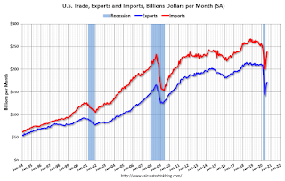
The U.S. Census Bureau and the U.S. Bureau of Economic Analysis announced today that the goods and services deficit was $67.1 billion in August, up $3.7 billion from $63.4 billion in July, revised.
August exports were $171.9 billion, $3.6 billion more than July exports. August imports were $239.0 billion, $7.4 billion more than July imports.
emphasis added
 Click on graph for larger image.
Both exports and imports increased in August.
Exports are down 18% compared to August 2019; imports are down 8.5% compared to August 2019.
Both imports and exports decreased sharply due to COVID-19, and have now bounced back (imports more than exports),
The second graph shows the U.S. trade deficit, with and without petroleum.
 The blue line is the total deficit, and the black line is the petroleum deficit, and the red line is the trade deficit ex-petroleum products.
Note that the U.S. exported a slight net positive petroleum products in recent months.
Oil imports averaged $41.69 per barrel in August, up from $40.60 per barrel in July, and down from $58.57 in August 2019.
The trade deficit with China decreased to $29.8 billion in August, from $31.7 billion in August 2019.
Monday, October 05, 2020
Tuesday: Job Openings, Trade Deficit, Fed Chair Powell Speaks
by Calculated Risk on 10/05/2020 09:00:00 PM
Tuesday:
• At 8:00 AM ET, Corelogic House Price index for August
• At 8:30 AM: Trade Balance report for August from the Census Bureau. The consensus is for the deficit to be $66.2 billion in August, from $63.6 billion in July.
• At 10:00 AM: Job Openings and Labor Turnover Survey for August from the BLS.
• At 10:40 AM: Speech by Fed Chair Jerome Powell, Economic Outlook, At the National Association for Business Economics Annual Meeting
October 5 COVID-19 Test Results
by Calculated Risk on 10/05/2020 06:47:00 PM
The US is now mostly reporting 700 thousand to 1 million tests per day. Based on the experience of other countries, the percent positive needs to be well under 5% to really push down new infections (probably close to 1%), so the US still needs to increase the number of tests per day significantly (or take actions to push down the number of new infections).
There were 882,104 test results reported over the last 24 hours.
There were 38,103 positive tests.
Over 3,100 Americans deaths from COVID have been reported in October. See the graph on US Daily Deaths here.

This data is from the COVID Tracking Project.
The percent positive over the last 24 hours was 4.3% (red line is 7 day average).
For the status of contact tracing by state, check out testandtrace.com.
And check out COVID Exit Strategy to see how each state is doing.

The dashed line is the June low.
Note that there were very few tests available in March and April, and many cases were missed (the percent positive was very high - see first graph). By June, the percent positive had dropped below 5%.
If people stay vigilant, the number of cases might drop to the June low in November (that would still be a large number of new cases, but progress).
MBA Survey: "Share of Mortgage Loans in Forbearance Declines to 6.81%"
by Calculated Risk on 10/05/2020 04:00:00 PM
Note: This is as of September 27th.
From the MBA: Share of Mortgage Loans in Forbearance Declines to 6.81%
The Mortgage Bankers Association’s (MBA) latest Forbearance and Call Volume Survey revealed that the total number of loans now in forbearance decreased by 6 basis points from 6.87% of servicers’ portfolio volume in the prior week to 6.81% as of September 27, 2020. According to MBA’s estimate, 3.4 million homeowners are in forbearance plans.
...
“As of the end of September, there continues to be a slow and steady decrease in the share of loans in forbearance – driven by consistent declines in the GSE loan share – and a persistently high amount in the Ginnie Mae portfolio,” said Mike Fratantoni, MBA’s Senior Vice President and Chief Economist. “The significant churn in the labor market now, more than six months into the pandemic, is still causing financial distress for millions of homeowners. As a result, more than 70 percent of loans in forbearance are now in an extension.”
...
By stage, 28.50% of total loans in forbearance are in the initial forbearance plan stage, while 70.07% are in a forbearance extension. The remaining 1.43% are forbearance re-entries.
emphasis added
 Click on graph for larger image.
This graph shows the percent of portfolio in forbearance by investor type over time. Most of the increase was in late March and early April, and has been trending down for the last few months.
The MBA notes: "Weekly forbearance requests as a percent of servicing portfolio volume (#) decreased to 0.08 percent from 0.11 percent the previous week. This marks the lowest level of forbearance requests since passage of the CARES Act%.
There hasn't been a pickup in forbearance activity related to the end of the extra unemployment benefits.
Black Knight Mortgage Monitor for August: "At Current Rate of Improvement, Delinquencies Will Remain Above Pre-Pandemic Levels Until 2022"
by Calculated Risk on 10/05/2020 10:23:00 AM
Black Knight released their Mortgage Monitor report for August today. According to Black Knight, 6.88% of mortgages were delinquent in August, down from 7.91% in July, and up from 3.45% in August 2019. Black Knight also reported that 0.35% of mortgages were in the foreclosure process, down from 0.48% a year ago.
This gives a total of 7.23% delinquent or in foreclosure.
Press Release: At Current Rate of Improvement, Delinquencies Will Remain Above Pre-Pandemic Levels Until 2022; Loss Mitigation and High Levels of Equity Help Mitigate Foreclosure Risk
Today, the Data & Analytics division of Black Knight, Inc.released its latest Mortgage Monitor Report ... This month’s report found that – after tracking relatively closely to the deterioration and recovery timelines of recent natural disasters – the trend lines of COVID-19’s impact on mortgage performance have begun to diverge. As Black Knight Data & Analytics President Ben Graboske explained, while this divergence suggests a prolonged recovery period may lay ahead, there are several mitigating factors which together could help lessen the size of a follow-on wave of foreclosures.
“When COVID-19 first began to impact the mortgage and housing markets, there was no easy historical precedent by which to gauge the fallout, so we looked to mortgage performance in the wake of recent recessions and natural disasters for clues,” said Graboske. “And for the first several months of the pandemic, the performance impact of COVID tracked relatively closely to that of major hurricanes. Those trends have since begun to diverge, however, and looking at the 3-month average rate of improvement since May’s peak in mortgage delinquencies suggests a longer recovery timeline. At the current rate of improvement, delinquencies would remain above pre-pandemic levels until March 2022. What’s more, when the first wave of COVID-19-related forbearance plans reach their 12-month expiration period, we would still have a million excess delinquencies. As early-stage delinquencies have already returned to pre-pandemic levels, the bulk of these will be seriously delinquent when the forbearance clock runs out – and serious delinquencies have yet to peak, increasing yet again – albeit more mildly – in August.
“While this may seem to paint a bleak picture for the future, multiple mitigating factors could help to reduce any resulting foreclosure wave. First and foremost, while recovery has been slow and incremental, the bulk of homeowners who have come out of forbearance are currently performing on their mortgages. That’s roughly a third of the 6.1 million homeowners who’ve been in forbearance at one time or another since the pandemic began. Of those no longer in forbearance but still past due, the vast majority — some 267,000 — are in active loss mitigation programs with their lenders. Just 54,000 loans at present represent significant risk – having left forbearance, are past due and not engaged in loss mitigation efforts. Seventy percent of those were already delinquent in February, before COVID became a factor. Furthermore, American homeowners now have the most equity available to them in history. Of those in forbearance, just 9% have less than 10% equity in their homes, which offers both borrowers and lenders multiple options in lieu of foreclosure.”
emphasis added
 Click on graph for larger image.
Here is a graph from the Mortgage Monitor that shows the National Delinquency Rate.
From Black Knight:
• The chasm between early-stage delinquencies and seriously past-due mortgages continued to widen in AugustThere is much more in the mortgage monitor.
• Overall delinquencies nationwide fell by 0.03% from July after declining a combined 0.85% over the prior two months, a noticeable slowing in the rate of improvement
• The share of borrowers with a single missed payment had already fallen below pre-pandemic levels; in August, the sum of all early-stage delinquencies (those 30-and 60-days past due) fell 9%, to drop below that benchmark as well
• However, the improvement in early-stage delinquencies was offset by a 5% increase in serious delinquencies – 90 or more days past due – which have now risen in each of the past five months
• At 6.88%, the national delinquency rate is now 3.6% above its pre-pandemic level
ISM Services Index Increased to 57.8% in September
by Calculated Risk on 10/05/2020 10:07:00 AM
The September ISM Services index was at 57.8%, up from 56.9% last month. The employment index increased to 51.8%, from 47.9%. Note: Above 50 indicates expansion, below 50 contraction.
From the Institute for Supply Management: Services PMI™ at 57.8%; September 2020 Services ISM® Report On Business®
Business Activity Index at 63.0%; New Orders Index at 61.5%; Employment Index at 51.8%; Supplier Deliveries Index at 54.9%This was above the consensus forecast, and the employment index was above 50 following six consecutive months of contraction.
Economic activity in the services sector grew in September for the fourth month in a row, say the nation's purchasing and supply executives in the latest Services ISM® Report On Business®.
The report was issued today by Anthony Nieves, CPSM, C.P.M., A.P.P., CFPM, Chair of the Institute for Supply Management® (ISM®) Services Business Survey Committee: "The Services PMI™ registered 57.8 percent, 0.9 percentage point higher than the August reading of 56.9 percent. This reading represents growth in the services sector for the fourth straight month and the 126th time in the last 128 months, except for April's and May's contraction.
"The Supplier Deliveries Index registered 54.9 percent, down 5.6 percentage points from August's reading of 60.5 percent. (Supplier Deliveries is the only ISM® Report On Business® index that is inversed; a reading of above 50 percent indicates slower deliveries, which is typical as the economy improves and customer demand increases.)
emphasis added
Seven High Frequency Indicators for the Economy
by Calculated Risk on 10/05/2020 08:16:00 AM
These indicators are mostly for travel and entertainment - some of the sectors that will recover very slowly.
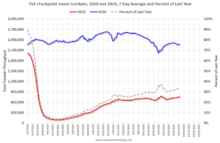
The TSA is providing daily travel numbers.
 Click on graph for larger image.
This data shows the seven day average of daily total traveler throughput from the TSA for 2019 (Blue) and 2020 (Red).
The dashed line is the percent of last year for the seven day average.
This data is as of Oct 4th.
The seven day average is down 67% from last year (33% of last year).
There has been a slow increase from the bottom.
The second graph shows the 7 day average of the year-over-year change in diners as tabulated by OpenTable for the US and several selected cities.
 Thanks to OpenTable for providing this restaurant data:
This data is updated through October 3, 2020.
This data is "a sample of restaurants on the OpenTable network across all channels: online reservations, phone reservations, and walk-ins. For year-over-year comparisons by day, we compare to the same day of the week from the same week in the previous year."
Note that this data is for "only the restaurants that have chosen to reopen in a given market". Since some restaurants have not reopened, the actual year-over-year decline is worse than shown.
The 7 day average for New York is still off 61% YoY, and down 28% in Texas. There was a surge in restaurant dining around Labor Day - hopefully mostly outdoor dining.
 This data shows domestic box office for each week (red) and the maximum and minimum for the previous four years. Data is from BoxOfficeMojo through October 1st.
Note that the data is usually noisy week-to-week and depends on when blockbusters are released.
Movie ticket sales have picked up over the last few weeks, and were at $11 million last week (compared to usually under $200 million per week in the late Summer / early Fall).
Some movie theaters are reopening (probably with limited seating at first).
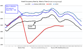
 This graph shows the seasonal pattern for the hotel occupancy rate using the four week average.
 The red line is for 2020, dash light blue is 2019, blue is the median, and black is for 2009 (the worst year since the Great Depression for hotels - prior to 2020).
This data is through September 26th.
Hotel occupancy is currently down 31.5% year-over-year.
Notes: Y-axis doesn't start at zero to better show the seasonal change.
There was some recent boost from natural disasters - perhaps 1 or 2 percentage points total based on previous disasters - but so far there has been little business travel pickup that usually happens in the Fall.
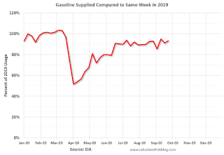
 This graph, based on weekly data from the U.S. Energy Information Administration (EIA), shows gasoline supplied compared to the same week last year of .
At one point, gasoline supplied was off almost 50% YoY.
As of September 25th, gasoline supplied was only off about 6.7% YoY (about 93.3% of normal).
Note: I know several people that have driven to vacation spots - or to visit family - and they usually would have flown. So this might have boosted gasoline consumption and the expense of air travel.
This graph is from Apple mobility. From Apple: "This data is generated by counting the number of requests made to Apple Maps for directions in select countries/regions, sub-regions, and cities." This is just a general guide - people that regularly commute probably don't ask for directions.
There is also some great data on mobility from the Dallas Fed Mobility and Engagement Index. However the index is set "relative to its weekday-specific average over January–February", and is not seasonally adjusted, so we can't tell if an increase in mobility is due to recovery or just the normal increase in the Spring and Summer.
 This data is through October 2nd for the United States and several selected cities.
The graph is the running 7 day average to remove the impact of weekends.
IMPORTANT: All data is relative to January 13, 2020. This data is NOT Seasonally Adjusted. People walk and drive more when the weather is nice, so I'm just using the transit data.
According to the Apple data directions requests, public transit in the 7 day average for the US is still only about 57% of the January level. It is at 48% in Chicago, and 59% in Houston.
Here is some interesting data on New York subway usage (HT BR).
 This graph is from Todd W Schneider.
This data is through Friday, October 2nd.
Schneider has graphs for each borough, and links to all the data sources.
He notes: "Data updates weekly from the MTA’s public turnstile data, usually on Saturday mornings".


