by Calculated Risk on 9/08/2020 04:00:00 PM
Tuesday, September 08, 2020
MBA Survey: "Share of Mortgage Loans in Forbearance Declines to 7.16%"
Note: This is as of August 30th.
From the MBA: Share of Mortgage Loans in Forbearance Declines to 7.16%
The Mortgage Bankers Association’s (MBA) latest Forbearance and Call Volume Survey revealed that the total number of loans now in forbearance decreased by 4 basis points from 7.20% of servicers’ portfolio volume in the prior week to 7.16% as of August 30, 2020. According to MBA’s estimate, 3.6 million homeowners are in forbearance plans.
...
“The share of Ginnie Mae loans in forbearance increased again this week, as the current economic crisis continues to disproportionately impact borrowers with FHA and VA loans. As a result, IMB servicers, which have roughly one-third of their portfolio with Ginnie Mae, had a forbearance share that was unchanged, while depositories, which have a larger share of GSE and portfolio loans, saw a decrease,” said Mike Fratantoni, MBA’s Senior Vice President and Chief Economist. “The labor market continued to heal in August, with strong job growth and a large decline in the unemployment rate. However, the economy still faces an uphill climb and remains far away from full employment. High unemployment, and jobless claims consistently around 1 million a week, continue to cause financial strain for some borrowers – and especially for those who work in industries hardest hit by the pandemic.”
By stage, 35.76% of total loans in forbearance are in the initial forbearance plan stage, while 63.29% are in a forbearance extension. The remaining 0.94% are forbearance re-entries.
emphasis added
 Click on graph for larger image.
This graph shows the percent of portfolio in forbearance by investor type over time. Most of the increase was in late March and early April, and has been trending down for the last ten weeks.
The MBA notes: "Total weekly forbearance requests as a percent of servicing portfolio volume (#) decreased relative to the prior week: from 0.10% to 0.09%, the lowest level reported for this series since March."
There hasn't been a pickup in forbearance activity related to the end of the extra unemployment benefits.
Seattle Real Estate in August: Sales up 15% YoY, Inventory UP 8% YoY
by Calculated Risk on 9/08/2020 11:01:00 AM
The Northwest Multiple Listing Service reported Would-be homebuyers have more buying power, but also more competition for meager inventory
Extremely low interest rates mean would-be home buyers have more buying power, but sparse inventory and increasing home prices in many parts of Washington state are leaving many buyers unable to take advantage of these attractive rates, reported broker Frank Wilson upon reviewing the latest statistical report from Northwest Multiple Listing Service.There were 9,847 sales in August 2020, up 4.8% from 9,392 sales in August 2019.
…
Member-brokers reported 9,847 closed sales, up more than 4.8% from a year ago. That volume was the highest since June 2018 when there were 10,072 completed transactions.
emphasis added
The press release is for the Northwest. In King County, sales were up 9.6% year-over-year, and active inventory was down 27% year-over-year.
In Seattle, sales were up 14.6% year-over-year, and inventory was up 7.7% year-over-year.. This puts the months-of-supply in Seattle at just 1.8 months.
Black Knight Mortgage Monitor for July: "Record-Low Rates, Largest Quarterly Volume on Record"
by Calculated Risk on 9/08/2020 09:43:00 AM
Black Knight released their Mortgage Monitor report for July today. According to Black Knight, 6.91% of mortgages were delinquent in July, down from 7.59% in June, and up from 3.46% in July 2019. Black Knight also reported that 0.36% of mortgages were in the foreclosure process, down from 0.49% a year ago.
This gives a total of 7.40% delinquent or in foreclosure.
Press Release: Black Knight: Surge in Refinance Lending Driven by Record-Low Rates Leads to Largest Quarterly Volume on Record; Just 18% of All Refinancing Borrowers Retained by Servicers
Today, the Data & Analytics division of Black Knight, Inc. released its latest Mortgage Monitor Report, based upon the company’s industry-leading mortgage performance, housing and public records datasets. This month, Black Knight looked at both Q2 2020 origination data as well as interest rate locks thus far in Q3 2020 to get a sense of how the lending market has fared in the era of COVID-19. As Black Knight Data & Analytics President Ben Graboske explained, a period of record-low interest rates has provided a much-needed backstop to the impact of shutdowns, unemployment and economic uncertainty.
“Despite the nation being under pandemic-related lockdowns for much of the quarter, a record-breaking surge in mortgage originations occurred in Q2 2020, driven by the record-low interest rate environment,” said Graboske. “Nearly $1.1 trillion in first lien mortgages were originated in Q2 2020, which is the largest quarterly origination volume we’ve seen since first reporting on the metric in January 2000. Refinance lending grew more than 60% from the previous quarter and more than 200% from the same time last year, accounting for nearly 70% of all Q2 originations by dollar value. At the same time, purchase lending declined 8% year-over-year as the traditional spring homebuying season was impacted by COVID-19-related restrictions. However, mortgage loan rate lock data – a leading indicator of lending activity – suggests that the homebuying season was simply pushed forward into the third quarter.
“Purchase locks in Q3 2020 have already made up for the losses of a COVID-impacted Q2 – and then some – based upon normal seasonal expectations. In fact, rate locks are suggesting that we could see Q3 purchase lending break typical seasonal trends and rise by 30-40%, which would push us to a new record high. Likewise, while Q2 refinance activity was record-breaking, refi lock data suggests Q3 refinance volumes could climb even higher. Locks on refinance loans expected to close in the third quarter, assuming a 45-day lock-to-close timeline, are already up 20% from Q2. With market conditions as they are and given the recent delay of the 50 basis points fee on GSE refinances until December, we would expect near-record low interest rates to continue to buoy the market. After all, there are still nearly 18 million homeowners with good credit and at least 20% equity who stand to cut at least 0.75% off their current first lien rate by refinancing.”
emphasis added
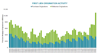 Click on graph for larger image.
This graph from Black Knight shows the surge in first lien originations in Q2.
From Black Knight:
Nearly $1.1T in first lien mortgages were originated in Q2 2020, the largest quarterly origination volume on record since Black Knight began reporting the metric in January 2000
• The surge in lending was driven by record-low interest rates fueling a flurry of refinance activity
• Refinance lending was up more than 60% from Q1 2020 and more than 200% from the same time last year, accounting for nearly 70% of all first lien originations by dollar value, as compared to 39% in Q2 2019
• Despite significant impacts from the pandemic – most acutely felt in May’s closing volumes – purchase lending was only down 8% from the year prior
 And here is a graph from the Mortgage Monitor that shows the National Delinquency Rate.
From Black Knight:
• Overall mortgage delinquencies fell by nearly 9% in July, pushing the national delinquency rate down to 6.9%There is much more in the mortgage monitor.
• While this represents significant improvement, there are still nearly 2M more borrowers delinquent on mortgage payments than there were in February prior to the impacts of COVID-19
• At 860K, 30-day delinquencies have fallen 14% below their pre-pandemic levels, suggesting that the initial wave of COVID-19-related delinquencies has subsided
Seven High Frequency Indicators for the Economy
by Calculated Risk on 9/08/2020 07:59:00 AM
These indicators are mostly for travel and entertainment - some of the sectors that will recover very slowly.
The TSA is providing daily travel numbers.
 Click on graph for larger image.
This data shows the seven day average of daily total traveler throughput from the TSA for 2019 (Blue) and 2020 (Red).
This data is as of September 6th.
The seven day average is down 66% from last year. Usually travel declines at this time of year (see Blue line), but travel is holding steady this year (so increasing as a percent of travel last year).
The second graph shows the 7 day average of the year-over-year change in diners as tabulated by OpenTable for the US and several selected cities.
 Thanks to OpenTable for providing this restaurant data:
This data is updated through September 6, 2020.
This data is "a sample of restaurants on the OpenTable network across all channels: online reservations, phone reservations, and walk-ins. For year-over-year comparisons by day, we compare to the same day of the week from the same week in the previous year."
Note that this data is for "only the restaurants that have chosen to reopen in a given market". Since some restaurants have not reopened, the actual year-over-year decline is worse than shown.
The 7 day average for New York is still off 65% YoY, and down 19% in Florida.
Dining is increasing again, probably mostly outdoor dining.
 This data shows domestic box office for each week (red) and the maximum and minimum for the previous four years. Data is from BoxOfficeMojo through September 3rd.
Note that the data is usually noisy week-to-week and depends on when blockbusters are released.
Movie ticket sales have picked up over the last few weeks, and were close to $16 million last week (compared to usually under $200 million per week in the late Summer / early Fall).
Most movie theaters are still closed, but are reopening (probably with limited seating at first).
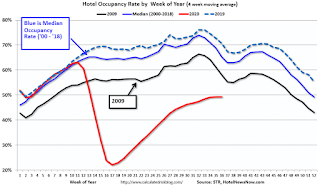 This graph shows the seasonal pattern for the hotel occupancy rate using the four week average.
 The red line is for 2020, dash light blue is 2019, blue is the median, and black is for 2009 (the worst year probably since the Great Depression for hotels).
This data is through August 29th.
COVID-19 crushed hotel occupancy, and is currently down 27.7% year-over-year.
Notes: Y-axis doesn't start at zero to better show the seasonal change.
The leisure travel season usually peaks at the beginning of August, and then the occupancy rate typically declines sharply in the Fall.
With so many schools closed, the leisure travel season might have lasted longer than usual this year, but it is unlikely business travel will pickup significantly in the Fall.
 This graph, based on weekly data from the U.S. Energy Information Administration (EIA), shows gasoline supplied compared to the same week last year of .
At one point, gasoline supplied was off almost 50% YoY.
As of August 28th, gasoline supplied was only off about 7% YoY (about 93% of normal).
Note: I know several people that have driven to vacation spots - or to visit family - and they usually would have flown. So this might be boosting gasoline consumption over the summer - and summer vacation might have lasted a little longer this year.
This graph is from Apple mobility. From Apple: "This data is generated by counting the number of requests made to Apple Maps for directions in select countries/regions, sub-regions, and cities." This is just a general guide - people that regularly commute probably don't ask for directions.
There is also some great data on mobility from the Dallas Fed Mobility and Engagement Index. However the index is set "relative to its weekday-specific average over January–February", and is not seasonally adjusted, so we can't tell if an increase in mobility is due to recovery or just the normal increase in the Spring and Summer.
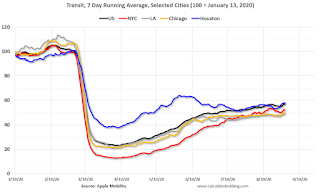 This data is through September 6th for the United States and several selected cities.
The graph is the running 7 day average to remove the impact of weekends.
IMPORTANT: All data is relative to January 13, 2020. This data is NOT Seasonally Adjusted. People walk and drive more when the weather is nice, so I'm just using the transit data.
According to the Apple data directions requests, public transit in the 7 day average for the US is still only about 57% of the January level. It is at 49% in Los Angeles, and 58% in Houston.
Here is some interesting data on New York subway usage (HT BR).
 This graph is from Todd W Schneider.
This data is through Friday, September 4th.
Schneider has graphs for each borough, and links to all the data sources.
He notes: "Data updates weekly from the MTA’s public turnstile data, usually on Saturday mornings"
Monday, September 07, 2020
Monday Night Futures
by Calculated Risk on 9/07/2020 08:50:00 PM
Weekend:
• Schedule for Week of September 6, 2020
• A Pandemic Employment Model
Tuesday:
• At 6:00 AM ET, NFIB Small Business Optimism Index for August.
• At 3:00 PM, Consumer Credit from the Federal Reserve.
From CNBC: Pre-Market Data and Bloomberg futures S&P 500 are up 9 and DOW futures are up 169 (fair value).
Oil prices were down over the last week with WTI futures at $39.13 per barrel and Brent at $42.05 barrel. A year ago, WTI was at $55, and Brent was at $61 - so WTI oil prices are down about 30% year-over-year.
Here is a graph from Gasbuddy.com for nationwide gasoline prices. Nationally prices are at $2.21 per gallon. A year ago prices were at $2.55 per gallon, so gasoline prices are down $0.34 per gallon year-over-year.
September 7 COVID-19 Test Results
by Calculated Risk on 9/07/2020 06:59:00 PM
Note: These are holiday weekend numbers, and some states aren't reporting.
The US is now mostly reporting over 700,000 tests per day. Based on the experience of other countries, the percent positive needs to be well under 5% to really push down new infections, so the US still needs to increase the number of tests per day significantly (or take actions to push down the number of new infections).
There were 586,476 test results reported over the last 24 hours.
There were 28,628 positive tests.
See the graph on US Daily Deaths here.

This data is from the COVID Tracking Project.
The percent positive over the last 24 hours was 4.9% (red line).
For the status of contact tracing by state, check out testandtrace.com.
And check out COVID Exit Strategy to see how each state is doing.

The dashed line is the June low.
Note that there were very few tests available in March and April, and many cases were missed (the percent positive was very high - see first graph).
By June, the percent positive had dropped below 5% (lower than today). If people stay vigilant, the number of cases might drop to the June low by the end of September (that would still be a large number of new cases, but progress).
A Pandemic Employment Model
by Calculated Risk on 9/07/2020 12:37:00 PM
It is possible to consider the impact of the pandemic on employment as being similar to a large number of simultaneous worker strikes, and a concurrent severe recession.
When a strike happens, a large number of jobs are immediately lost. And then, when the strike is settled, the jobs are added back to the economy.
An example would be the August 1983 telecommunications strike when close to 700,000 went on strike. This led to a sharp decline in employment in the August 1983 employment report. The strike ended in late August 1983, and the approximately 700,000 jobs were added back in the September employment report. A true "V" shaped employment recovery.
In March and April of 2020, close to 22.2 million jobs were lost. A large number of these jobs were similar to a "strike", and the employees were able to return to work very quickly.
IMPORTANT: Of course, unlike a labor settlement, returning to work during a pandemic has serious health risks with over 30,000 Americans dying from COVID-19 in August alone. And many more with serious health issues, see this story in the Eugene, Oregon Register-Guard: Marist alum Natalie Hakala went from collegiate runner to coronavirus long-hauler

This graph shows the job losses from the start of the employment recession, in percentage terms.
Some workers were able to return to the jobs fairly quickly. By August, about 10.6 million workers had returned to their jobs (almost half of the jobs lost in March and April).
This would be similar to a large number of simultaneous worker strikes, and then the workers returning to work when a settlement is reached.
However, these returning workers mask the concurrent severe recession.

This data is only available back to 1994, so there is only data for three recessions. Note that the permanent jobs losses data is from the CPS (Household survey), and the jobs data in the first graph is from the CES (Establishment survey).
In August, the number of permanent job losses increased sharply to 3.411 million from 2.877 million in July. In addition, there have been a number of large company layoff announcements recently (some of these layoffs are happening as the CARES act corporate bailouts expire). So the number of permanent job losers will probably increase sharply in the coming months.
Looking back at previous recessions, usually permanent job losers account for about 60% of total jobs lost in the early stages of the recession. It was a much smaller percentage this time since many of the initial job losses were temporary (more like a strike). My guess is about half the remaining jobs lost are already due to the severe recession - and the number is growing quickly.
Note: There is also some distortion from temporary decennial Census hiring too. There were 288 thousand temporary Census workers in August (238 thousand hired in August alone). This boosted employment, especially in August - and will subtract from employment in a few months.
Treating the current situation as a combination of simultaneous strikes, and a concurrent severe recession explains the fairly rapid employment increases, and also the decline in the unemployment rate. However, this also suggests there are only a few million more jobs that can be gained in the short term - until we address the rapidly increasing severe recession.
Sunday, September 06, 2020
September 6 COVID-19 Test Results
by Calculated Risk on 9/06/2020 06:59:00 PM
The US is now mostly reporting over 700,000 tests per day. Based on the experience of other countries, the percent positive needs to be well under 5% to really push down new infections, so the US still needs to increase the number of tests per day significantly (or take actions to push down the number of new infections).
There were 734,990 test results reported over the last 24 hours.
There were 33,767 positive tests.
See the graph on US Daily Deaths here.

This data is from the COVID Tracking Project.
The percent positive over the last 24 hours was 4.6% (red line).
For the status of contact tracing by state, check out testandtrace.com.
And check out COVID Exit Strategy to see how each state is doing.
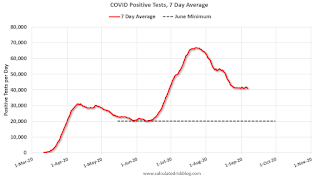
The dashed line is the June low.
Note that there were very few tests available in March and April, and many cases were missed (the percent positive was very high - see first graph).
By June, the percent positive had dropped below 5% (lower than today). If people stay vigilant, the number of cases might drop to the June low by the end of September (that would still be a large number of new cases, but progress).
Saturday, September 05, 2020
September 5 COVID-19 Test Results
by Calculated Risk on 9/05/2020 06:39:00 PM
The US is now mostly reporting over 700,000 tests per day. Based on the experience of other countries, the percent positive needs to be well under 5% to really push down new infections, so the US still needs to increase the number of tests per day significantly (or take actions to push down the number of new infections).
There were 802,252 test results reported over the last 24 hours.
There were 44,636 positive tests.
See the graph on US Daily Deaths here.
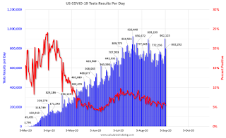
This data is from the COVID Tracking Project.
The percent positive over the last 24 hours was 5.6% (red line).
For the status of contact tracing by state, check out testandtrace.com.
And check out COVID Exit Strategy to see how each state is doing.

The dashed line is the June low.
Note that there were very few tests available in March and April, and many cases were missed (the percent positive was very high - see first graph).
By June, the percent positive had dropped below 5% (lower than today). If people stay vigilant, the number of cases might drop to the June low by the end of September (that would still be a large number of new cases, but progress).
Schedule for Week of September 6, 2020
by Calculated Risk on 9/05/2020 07:53:00 AM
The key economic report this week is the August Consumer Price Index (CPI).
All US markets will be closed in observance of the Labor Day holiday.
6:00 AM: NFIB Small Business Optimism Index for August.
3:00 PM: Consumer Credit from the Federal Reserve.
7:00 AM ET: The Mortgage Bankers Association (MBA) will release the results for the mortgage purchase applications index.
 10:00 AM ET: Job Openings and Labor Turnover Survey for July from the BLS.
 This graph shows job openings (yellow line), hires (purple), Layoff, Discharges and other (red column), and Quits (light blue column) from the JOLTS.
Jobs openings increased in June to 5.889 million from 5.371 million in May.
The number of job openings (yellow) were down 18% year-over-year, and Quits were down 25% year-over-year.
8:30 AM: The initial weekly unemployment claims report will be released. The early consensus is for a 800 thousand initial claims, down from 881 thousand the previous week.
8:30 AM: The Producer Price Index for August from the BLS. The consensus is for a 0.2% increase in PPI, and a 0.2% increase in core PPI.
8:30 AM: The Consumer Price Index for August from the BLS. The consensus is for a 0.3% increase in CPI, and a 0.2% increase in core CPI.


