by Calculated Risk on 8/31/2020 04:21:00 PM
Monday, August 31, 2020
Fannie Mae: Mortgage Serious Delinquency Rate Increased in July
Fannie Mae reported that the Single-Family Serious Delinquency increased to 3.24% in July, from 2.65% in June. The serious delinquency rate is up from 0.67% in July 2019.
This is the highest serious delinquency rate since December 2012.
These are mortgage loans that are "three monthly payments or more past due or in foreclosure".
The Fannie Mae serious delinquency rate peaked in February 2010 at 5.59%.
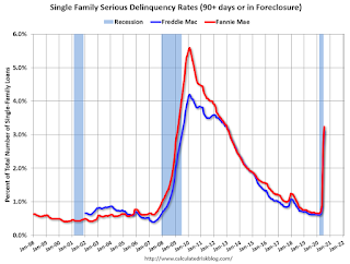
By vintage, for loans made in 2004 or earlier (2% of portfolio), 5.57% are seriously delinquent (up from 5.00% in May). For loans made in 2005 through 2008 (3% of portfolio), 9.36% are seriously delinquent (up from 8.37%), For recent loans, originated in 2009 through 2018 (95% of portfolio), 2.79% are seriously delinquent (up from 2.21%). So Fannie is still working through a few poor performing loans from the bubble years.
Mortgages in forbearance are counted as delinquent in this monthly report, but they will not be reported to the credit bureaus.
This is very different from the increase in delinquencies following the housing bubble. Lending standards have been fairly solid over the last decade, and most of these homeowners have equity in their homes - and they will be able to restructure their loans once they are employed.
Note: Freddie Mac reported earlier.
MBA Survey: "Share of Mortgage Loans in Forbearance Remains Flat at 7.20%"
by Calculated Risk on 8/31/2020 04:00:00 PM
Note: This is as of August 23rd.
From the MBA: Share of Mortgage Loans in Forbearance Remains Flat at 7.20%
The Mortgage Bankers Association’s (MBA) latest Forbearance and Call Volume Survey revealed that the total number of loans now in forbearance remained unchanged relative to the prior week at 7.20% as of August 23, 2020. According to MBA’s estimate, 3.6 million homeowners are in forbearance plans.
...
“The share of loans in forbearance was unchanged, as the decline in the share of GSE loans was offset by increases for Ginnie Mae, and portfolio and PLS loans. The pace of new forbearance requests has been relatively flat across investor types, but for those with GSE loans, the rate of exits from forbearance regularly exceeds the rate of new requests,” said Mike Fratantoni, MBA’s Senior Vice President and Chief Economist. “The exception in these trends are borrowers with Ginnie Mae loans. The loss of enhanced unemployment insurance benefits, coupled with a consistently high rate of layoffs and uncertainty about the job market, are having a disproportionate impact on FHA and VA borrowers.”
By stage, 36.71% of total loans in forbearance are in the initial forbearance plan stage, while 62.43% are in a forbearance extension. The remaining 0.86% are forbearance re-entries
emphasis added
 Click on graph for larger image.
This graph shows the percent of portfolio in forbearance by investor type over time. Most of the increase was in late March and early April, and has been trending down for the last ten weeks.
The MBA notes: "Total weekly forbearance requests as a percent of servicing portfolio volume (#) remained unchanged relative to the prior week at 0.10%."
There hasn't been a pickup in forbearance activity related to the end of the extra unemployment benefits.
Dallas Fed: "Recovery Continues in Texas Manufacturing" in August
by Calculated Risk on 8/31/2020 10:38:00 AM
From the Dallas Fed: Recovery Continues in Texas Manufacturing
Texas factory activity expanded in August for the third month in a row following a record contraction in the spring after the onset of the COVID-19 pandemic, according to business executives responding to the Texas Manufacturing Outlook Survey. The production index, a key measure of state manufacturing conditions, came in at 13.1, down slightly from July but still indicative of moderate growth.This was the last of the regional Fed surveys for August.
Other measures of manufacturing activity also point to expansion this month. The new orders index advanced three points to 9.8, and the growth rate of orders index surged more than 10 points to 11.8. The shipments index rose from 17.3 to 23.3, while the capacity utilization index inched down but remained positive at 10.9.
Perceptions of broader business conditions improved in August. The general business activity index turned positive after five months in negative territory, coming in at 8.0. The company outlook index registered a third consecutive positive reading, shooting up 11 points to 16.6, its highest reading in nearly two years. The index measuring uncertainty regarding companies’ outlooks remained positive but retreated to 8.2.
Labor market measures indicated solid growth in employment and workweek length. The employment index pushed up from 3.1 to 10.6, suggesting more robust hiring. Twenty-three percent of firms noted net hiring, while 13 percent noted net layoffs. The hours worked index pushed up five points to 10.5.
emphasis added
Here is a graph comparing the regional Fed surveys and the ISM manufacturing index:
 Click on graph for larger image.
The New York and Philly Fed surveys are averaged together (yellow, through August), and five Fed surveys are averaged (blue, through August) including New York, Philly, Richmond, Dallas and Kansas City. The Institute for Supply Management (ISM) PMI (red) is through July (right axis).
The ISM manufacturing index for August will be released on Tuesday, September 1st. The consensus is for the ISM to be at 54.5, up from 54.2 in July. Based on these regional surveys, the ISM manufacturing index will likely be at about the same level in August as in July.
Note that these are diffusion indexes, so returning to 0 (or 50 for ISM) means activity is not declining further (it does not mean that activity is back to pre-crisis levels).
Seven High Frequency Indicators for the Economy
by Calculated Risk on 8/31/2020 08:45:00 AM
These indicators are mostly for travel and entertainment - some of the sectors that will recover very slowly.
The TSA is providing daily travel numbers.
 Click on graph for larger image.
This data shows the seven day average of daily total traveler throughput from the TSA for 2019 (Blue) and 2020 (Red).
This data is as of August 30th.
The seven day average is down 70% from last year. There had been a slow steady increase from the bottom, but air travel has mostly moved sideways recently.
The second graph shows the 7 day average of the year-over-year change in diners as tabulated by OpenTable for the US and several selected cities.
 Thanks to OpenTable for providing this restaurant data:
This data is updated through Aug 29, 2020.
This data is "a sample of restaurants on the OpenTable network across all channels: online reservations, phone reservations, and walk-ins. For year-over-year comparisons by day, we compare to the same day of the week from the same week in the previous year."
Note that this data is for "only the restaurants that have chosen to reopen in a given market". Since some restaurants have not reopened, the actual year-over-year decline is worse than shown.
The 7 day average for New York is still off 64% YoY, and down 34% in Florida.
Dining is increasing again, probably mostly outdoor dining.
 This data shows domestic box office for each week (red) and the maximum and minimum for the previous four years. Data is from BoxOfficeMojo through August 27th.
Note that the data is usually noisy week-to-week and depends on when blockbusters are released.
Movie ticket sales have picked up over the last few weeks, and were over $7 million last week (compared to usually around $300 million per week).
Most movie theaters are still closed, but a few seem to be reopening (probably with limited seating at first).
 This graph shows the seasonal pattern for the hotel occupancy rate using the four week average.
 The red line is for 2020, dash light blue is 2019, blue is the median, and black is for 2009 (the worst year probably since the Great Depression for hotels).
This data is through August 22nd.
COVID-19 crushed hotel occupancy, however the occupancy rate has increased in 17 of the last 19 weeks, and is currently down 30.3% year-over-year.
Notes: Y-axis doesn't start at zero to better show the seasonal change.
The leisure travel season usually peaks at the beginning of August, and then the occupancy rate typically declines sharply in the Fall.
With so many schools closed, the leisure travel season might have lasted longer than usual this year, but it is unlikely business travel will pickup significantly in the Fall.
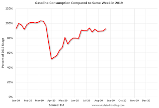 This graph, based on weekly data from the U.S. Energy Information Administration (EIA), shows gasoline consumption compared to the same week last year of .
At one point, gasoline consumption was off almost 50% YoY.
As of August 21st, gasoline consumption was only off about 8% YoY (about 92% of normal).
Note: I know several people that have driven to vacation spots - or to visit family - and they usually would have flown. So this might be boosting gasoline consumption over the summer.
This graph is from Apple mobility. From Apple: "This data is generated by counting the number of requests made to Apple Maps for directions in select countries/regions, sub-regions, and cities." This is just a general guide - people that regularly commute probably don't ask for directions.
There is also some great data on mobility from the Dallas Fed Mobility and Engagement Index. However the index is set "relative to its weekday-specific average over January–February", and is not seasonally adjusted, so we can't tell if an increase in mobility is due to recovery or just the normal increase in the Spring and Summer.
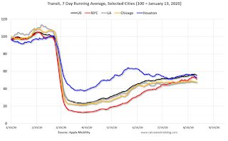 This data is through August 29th for the United States and several selected cities.
The graph is the running 7 day average to remove the impact of weekends.
IMPORTANT: All data is relative to January 13, 2020. This data is NOT Seasonally Adjusted. People walk and drive more when the weather is nice, so I'm just using the transit data.
According to the Apple data directions requests, public transit in the 7 day average for the US is still only about 56% of the January level. It is at 48% in Los Angeles, and 53% in Houston.
Here is some interesting data on New York subway usage (HT BR).
 This graph is from Todd W Schneider.
This data is through Friday, August 28th.
Schneider has graphs for each borough, and links to all the data sources.
He notes: "Data updates weekly from the MTA’s public turnstile data, usually on Saturday mornings"
Sunday, August 30, 2020
Sunday Night Futures
by Calculated Risk on 8/30/2020 06:43:00 PM
Weekend:
• Schedule for Week of August 30, 2020
Monday:
• At 10:30 AM ET, Dallas Fed Survey of Manufacturing Activity for August. This is the last of the regional Fed surveys for August.
From CNBC: Pre-Market Data and Bloomberg futures S&P 500 are up 8 and DOW futures are up 88 (fair value).
Oil prices were up over the last week with WTI futures at $43.01 per barrel and Brent at $45.90 barrel. A year ago, WTI was at $55, and Brent was at $61 - so WTI oil prices are down about 20% year-over-year.
Here is a graph from Gasbuddy.com for nationwide gasoline prices. Nationally prices are at $2.22 per gallon. A year ago prices were at $2.56 per gallon, so gasoline prices are down $0.34 per gallon year-over-year.
August 30 COVID-19 Test Results
by Calculated Risk on 8/30/2020 06:18:00 PM
The US is now mostly reporting over 700,000 tests per day (fewer recently). Based on the experience of other countries, the percent positive needs to be well under 5% to really push down new infections, so the US still needs to increase the number of tests per day significantly (or take actions to push down the number of new infections).
There were 737,701 test results reported over the last 24 hours.
There were 39,452 positive tests.
There have been approximately 30 thousand COVID reported deaths in the first 30 days of August. See the graph on US Daily Deaths here.

This data is from the COVID Tracking Project.
The percent positive over the last 24 hours was 5.3% (red line).
For the status of contact tracing by state, check out testandtrace.com.
And check out COVID Exit Strategy to see how each state is doing.

The dashed line is the June low.
Note that there were very few tests available in March and April, and many cases were missed (the percent positive was very high - see first graph).
By June, the percent positive had dropped below 5% (lower than today). If people stay vigilant, the number of cases might drop to the June low by the end of September (that would still be a large number of new cases, but progress).
August Employment Report: Comments on Temporary Decennial Census Hiring and Education
by Calculated Risk on 8/30/2020 11:46:00 AM
The employment report for August will be released on Friday, September 4th at 8:30 AM. The consensus is for 1.40 million jobs added in August, and for the unemployment rate to decrease to 9.8%.
There were 1.763 million jobs added in July, and the unemployment rate was at 10.2%.
There will be two distortions in the August employment report that are worth discussing.
The August employment report will show an increase of 237,800 in temporary Census hiring under Federal employment. Since these are temporary jobs, and only happen every ten years with the decennial Census, it makes sense to adjust the headline monthly Current Employment Statistics (CES) by Census hiring to determine the underlying employment trend.
The correct adjustment method is to take the headline number and subtract the change in the number of Census 2020 temporary and intermittent workers. For more, see: How to Report the Monthly Employment Number excluding Temporary Census Hiring

Here is a page from the 2020 Census Paid Temporary Workers report released last week.
The temporary employment for the July and August reference weeks are circled in red.
As of the July BLS employment report reference week, there were 50,404 decennial Census temporary workers. As of August reference week there were 288,204 temp workers.
This will boost August employment by 237,800 jobs.
Another distortion in the August employment report will be from education employment. There is a seasonal pattern to state and local education employment with a large number of educators usually hired in late Summer or early Fall - at the beginning of the school year - and then let go in June and July. Due to the pandemic, many of these educators were let go earlier than usual this year.
This led to a weird quirk in the seasonal adjustment for July. Although there were 960,000 state and local education jobs lost in July NSA (Not Seasonally Adjusted), this was reported as a gain of 245,000 jobs (SA). This was fewer jobs added (SA) than I expected, but it was difficult to tell how many year-round jobs had been lost.
As of February 2020, there were 10,979,000 state and local education employees. Approximately 2 million were seasonal (hired in the Fall, and then usually let go at the end of the school year), and the remaining almost 9 million are year round employees. As of July, all 2 million seasonal employees were let go, along with 635 thousand year round employees.
Usually we'd expect about 415,000 seasonal jobs hired in August (and then most of the remaining seasonal employees hired in September). However, since many school districts delayed the opening of the school year, my guess is few of these seasonal jobs were filled in August.
The BLS model will expect about 415,000 seasonal jobs added in August. If fewer jobs are added, the BLS will report that education jobs were lost Seasonally Adjusted. For example, if only 115,000 jobs are added in August, then the BLS will report around 300 thousand education jobs lost.
Of course some of the year round jobs that were lost earlier in the year could be hired back. However, since state and local governments are under financial pressure, it seems unlikely that many year round employees were hired back.
Saturday, August 29, 2020
August 29 COVID-19 Test Results
by Calculated Risk on 8/29/2020 06:27:00 PM
The US is now mostly reporting over 700,000 tests per day (fewer recently). Based on the experience of other countries, the percent positive needs to be well under 5% to really push down new infections, so the US still needs to increase the number of tests per day significantly (or take actions to push down the number of new infections).
There were 760,818 test results reported over the last 24 hours.
There were 44,328 positive tests.
There have been over 29,000 COVID reported deaths in the first 29 days of August. See the graph on US Daily Deaths here.
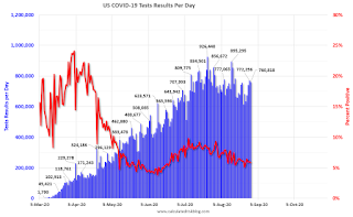
This data is from the COVID Tracking Project.
The percent positive over the last 24 hours was 5.8% (red line).
For the status of contact tracing by state, check out testandtrace.com.
And check out COVID Exit Strategy to see how each state is doing.
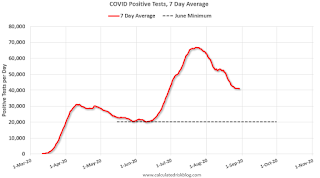
The dashed line is the June low.
Note that there were very few tests available in March and April, and many cases were missed (the percent positive was very high - see first graph).
By June, the percent positive had dropped below 5% (lower than today). If people stay vigilant, the number of cases might drop to the June low by the end of September (that would still be a large number of new cases, but progress).
August 2020: Unofficial Problem Bank list Increased to 66 Institutions
by Calculated Risk on 8/29/2020 01:17:00 PM
The FDIC's official problem bank list is comprised of banks with a CAMELS rating of 4 or 5, and the list is not made public (just the number of banks and assets every quarter). Note: Bank CAMELS ratings are also not made public.
CAMELS is the FDIC rating system, and stands for Capital adequacy, Asset quality, Management, Earnings, Liquidity and Sensitivity to market risk. The scale is from 1 to 5, with 1 being the strongest.
As a substitute for the CAMELS ratings, surferdude808 is using publicly announced formal enforcement actions, and also media reports and company announcements that suggest to us an enforcement action is likely, to compile a list of possible problem banks in the public interest.
DISCLAIMER: This is an unofficial list, the information is from public sources only, and while deemed to be reliable is not guaranteed. No warranty or representation, expressed or implied, is made as to the accuracy of the information contained herein and same is subject to errors and omissions. This is not intended as investment advice. Please contact CR with any errors.
Here is the unofficial problem bank list for August 2020.
Here are the monthly changes and a few comments from surferdude808:
Update on the Unofficial Problem Bank List for August 2020. During the month, the list increased by one to 66 banks after one addition. From last month, aggregate assets increased by a sizable $5.7 billion to $58.4 billion. $5.3 billion of the increase in assets came from updated asset figures from the FDIC for the second quarter of 2020. Further, the asset growth was attributable largely to a $3.7 billion increase at Deutsche Bank Trust Company Americas. A year ago, the list held 76 institutions with assets of $54.6 billion. Added this month was The First National Bank and Trust Company of Vinita, Vinita, OK ($347 million). This past Tuesday, the FDIC provided updated figures on the Official Problem Bank List. As of the second quarter of 2020, the FDIC said its list had 52 institutions with assets of $48.1 billion. Last quarter, the official list had 54 institutions with assets of $44.5 billion. Hence, there was a $3.6 billion increase in assets on the FDIC during the recent calendar quarter, which about matches that asset growth at Deutsche Bank.
Schedule for Week of August 30, 2020
by Calculated Risk on 8/29/2020 08:11:00 AM
The key report this week is the August employment report on Friday.
Other key indicators include the August ISM manufacturing and services indexes, August auto sales, and the July trade deficit.
For data nerds, the BLS will release their 10 year Labor Force Projections on Tuesday.
10:30 AM: Dallas Fed Survey of Manufacturing Activity for August. This is the last of the regional Fed surveys for August.
 10:00 AM: ISM Manufacturing Index for August. The consensus is for the ISM to be at 54.5, up from 54.2 in July.
Here is a long term graph of the ISM manufacturing index.
The PMI was at 54.2% in July, the employment index was at 44.3%, and the new orders index was at 61.5%.
10:00 AM: Construction Spending for July. The consensus is for a 1.0% increase in construction spending.
 All day: Light vehicle sales for August. The consensus is for light vehicle sales to be 15.2 million SAAR in August, up from 14.5 million in July (Seasonally Adjusted Annual Rate).
This graph shows light vehicle sales since the BEA started keeping data in 1967. The dashed line is the current sales rate.
10:00 AM: The BLS is scheduled to release Labor Force projections through 2029.
7:00 AM ET: The Mortgage Bankers Association (MBA) will release the results for the mortgage purchase applications index.
8:15 AM: The ADP Employment Report for August. This report is for private payrolls only (no government). The consensus is for 900,000 payroll jobs added in August, up from 167,000 added in July.
8:30 AM: The initial weekly unemployment claims report will be released. The early consensus is for a 950 thousand initial claims, down from 1.006 million the previous week.
 8:30 AM: Trade Balance report for July from the Census Bureau.
 This graph shows the U.S. trade deficit, with and without petroleum, through the most recent report. The blue line is the total deficit, and the black line is the petroleum deficit, and the red line is the trade deficit ex-petroleum products.
The consensus is for the U.S. trade deficit to be at $52.3 billion in July, from $50.7 billion in June.
10:00 AM: ISM Services Index for August.
 8:30 AM: Employment Report for August. The consensus is for 1.40 million jobs added, and for the unemployment rate to decrease to 9.8%.
There were 1.763 million jobs added in July, and the unemployment rate was at 10.2%.
This graph shows the job losses from the start of the employment recession, in percentage terms.
The current employment recession was by far the worst recession since WWII in percentage terms, and the worst in terms of the unemployment rate.


