by Calculated Risk on 7/21/2020 05:36:00 PM
Tuesday, July 21, 2020
July 21 COVID-19 Test Results
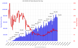
The US is now reporting over 700,000 tests per day. Based on the experience of other countries, the percent positive needs to be well under 5% to really push down new infections, so the US still needs to increase the number of tests per day significantly (or take actions to push down the number of new infections).
There were 754,858 test results reported over the last 24 hours.
There were 62,749 positive tests.
Sadly, over 1,000 deaths reported today.

This data is from the COVID Tracking Project.
The percent positive over the last 24 hours was 8.3% (red line).
For the status of contact tracing by state, check out testandtrace.com.
And check out COVID Exit Strategy to see how each state is doing.
New York City Subway Usage
by Calculated Risk on 7/21/2020 03:19:00 PM
Here is some interesting data on New York subway usage (HT BR).

This graph is from Todd W Schneider.
He has graphs for each borough, and links to all the data sources.
He notes: "Data updates weekly from the MTA’s public turnstile data, usually on Saturday mornings"
Thoughts on CARES II: Additional Disaster Relief
by Calculated Risk on 7/21/2020 10:10:00 AM
A month ago I outlined a few key items for additional disaster relief. Time is running short.
This morning, the WaPo had an article on some proposals: GOP coronavirus bill likely to include payroll tax cut and tie school money to reopening plans
The emerging GOP coronavirus relief bill appears likely to embrace some of President Trump’s key priorities, despite opposition from within his own party, including a payroll tax cut, very little aid to state and local governments, and measures tying school funding to the reopening of classrooms.The proposed payroll tax deferral is inane (using a "deferral" as opposed to a cut is an accounting gimmick). This proposal targets money for people with a low marginal propensity to consume (MPC).
Compare that to the current Federal Pandemic Unemployment Compensation (FPUC) that targets unemployed people with a high MPC, and helps them pay their bills (grocery, rent, mortgage, etc).
Other people's spending is our income, so during this crisis, we want to provide disaster relief to the people that are most impacted by the crisis (the unemployed), and those with a high MPC.
A few suggestions:
First, we need to address the health crisis.
This means additional money for hospitals, testing, trace-and-isolate programs, and personal protection equipment (PPE). Test results are taking far too long, and that isn't useful. We need to significantly improve our testing (and turnaround). Also, it appears PPE is running low again for our healthcare workers. This puts these frontline workers at risk.
Addressing the healthcare crisis remains the first priority.
Second, we need to provide additional disaster relief to the unemployed.
I discussed this last month, and this includes an extension of the Extension of Federal Pandemic Unemployment Compensation (FPUC), even if the amount is reduced. This is critical, or we will see a significant slump in spending in August, and a sharp increase in delinquencies (rents, mortgages, credit cards, etc).
We will also need to extend the term of the Paycheck Protection Program (PPP). This program has kept many small businesses alive, and millions of employees employed. There will have to be additional disaster relief for these companies, or millions of people will be let go soon.
Third, we need to provide State government relief.
It is time for a substantial state relief package. Without relief, the states and local governments will have to start laying off a significant number of employees.
These are some key areas, and it seems very likely there will be a "CARES II" act. But it has to be sized and structured appropriately.
Chicago Fed National Activity "Index Suggests Economic Growth Increased Further in June"
by Calculated Risk on 7/21/2020 08:37:00 AM
Note: This is a composite index of other data.
From the Chicago Fed: Index Suggests Economic Growth Increased Further in June
Led by improvements in production- and employment-related indicators, the Chicago Fed National Activity Index (CFNAI) increased to +4.11 in June from +3.50 in May. Three of the four broad categories of indicators used to construct the index made positive contributions in June, and two of the four categories increased from May. The index’s three-month moving average, CFNAI-MA3, moved up to –3.49 in June from –6.36 in May.This graph shows the Chicago Fed National Activity Index (three month moving average) since 1967.
emphasis added
 Click on graph for larger image.
According to the Chicago Fed:
The index is a weighted average of 85 indicators of growth in national economic activity drawn from four broad categories of data: 1) production and income; 2) employment, unemployment, and hours; 3) personal consumption and housing; and 4) sales, orders, and inventories.
...
A zero value for the monthly index has been associated with the national economy expanding at its historical trend (average) rate of growth; negative values with below-average growth (in standard deviation units); and positive values with above-average growth.
Monday, July 20, 2020
July 20 COVID-19 Test Results
by Calculated Risk on 7/20/2020 06:02:00 PM
The US is now reporting over 700,000 tests per day. Based on the experience of other countries, the percent positive needs to be well under 5% to really push down new infections, so the US still needs to increase the number of tests per day significantly (or take actions to push down the number of new infections).
There were 735,197 test results reported over the last 24 hours.
There were 57,948 positive tests.

This data is from the COVID Tracking Project.
The percent positive over the last 24 hours was 7.9% (red line).
For the status of contact tracing by state, check out testandtrace.com.
And check out COVID Exit Strategy to see how each state is doing.
MBA Survey: "Share of Mortgage Loans in Forbearance Decreases for Fifth Straight Week to 7.80%" of Portfolio Volume
by Calculated Risk on 7/20/2020 04:00:00 PM
Note: To put these numbers in perspective, the MBA notes "For the week of March 2, only 0.25% of all loans were in forbearance."
From the MBA: Share of Mortgage Loans in Forbearance Decreases for Fifth Straight Week to 7.80%
The Mortgage Bankers Association’s (MBA) latest Forbearance and Call Volume Survey revealed that the total number of loans now in forbearance decreased by 38 basis points from 8.18% of servicers’ portfolio volume in the prior week to 7.80% as of July 12, 2020. According to MBA’s estimate, 3.9 million homeowners are in forbearance plans.
...
“The share of loans in forbearance dropped to its lowest level in over two months, driven by an increase in the pace of exits as more homeowners have been able to get back to work,” said Mike Fratantoni, MBA’s Senior Vice President and Chief Economist. “The decline in the forbearance share was broad based, with decreases for GSE, Ginnie Mae, and portfolio/PLS loans.”
Added Fratantoni, “Almost half of borrowers remaining in forbearance are now in an extension of the original term, while the remainder are in their initial forbearance plan. The pace of new forbearance requests remains quite low compared to earlier in the crisis, but we are watching carefully for any increases due to either the pick-up in COVID-19 cases or the cessation of enhanced unemployment insurance benefits at the end of this month.”
emphasis added
 Click on graph for larger image.
This graph shows the percent of portfolio in forbearance by investor type over time. Most of the increase was in late March and early April, and has been trending down for the last five weeks.
The MBA notes: "Total weekly forbearance requests as a percent of servicing portfolio volume (#) remained flat relative to the prior week at 0.13%. "
Lawler: Serious Delinquency Rate on FHA-Insured SF Loans Surged in June
by Calculated Risk on 7/20/2020 03:24:00 PM
CR: Note that Lawler is discussing the sharp increase in serious delinquencies in June according to the Early Warning System. This means people have missed three payments (although many of these people are probably in forbearance programs.)
While the FHA’s “official” monthly loan performance report for June is not yet available on its website, data from the FHA’s Early Warning System indicates that FHA’s Early Warning System indicate that the serious delinquency rate on FHA-insured single-family loans surged in June.
Delinquency rates in the EWS do not match those in the official report, but the two delinquency rates tend to move together over time.
| Delinquency Rate, FHA-Insured SF Loans | ||||
|---|---|---|---|---|
| Official Report | ||||
| Total | 30-day | 60-day | SDQ | |
| 2/29/2020 | 10.85% | 5.16% | 1.65% | 4.04% |
| 3/31/2020 | 11.17% | 5.59% | 1.61% | 3.97% |
| 4/30/2020 | 15.52% | 9.20% | 2.28% | 4.04% |
| 5/31/2020 | 17.27% | 6.37% | 5.99% | 4.91% |
| Early Warning System, Active Servicers | ||||
| 2/29/2020 | 10.63% | 5.16% | 1.66% | 3.81% |
| 3/31/2020 | 10.74% | 5.36% | 1.62% | 3.76% |
| 4/30/2020 | 15.32% | 9.17% | 2.27% | 3.88% |
| 5/31/2020 | 17.15% | 6.37% | 5.99% | 4.80% |
| 6/30/2020 | 17.17% | 4.65% | 3.70% | 8.82% |
Sacramento Housing in June: Sales decline 1% YoY, Active Inventory down 37% YoY
by Calculated Risk on 7/20/2020 12:20:00 PM
Note that June sales are for contracts typically signed in April and May..
From SacRealtor.org: June 2020 Statistics – Sacramento Housing Market – Single Family Homes
June sales rebounded with 1,506 sales for the month, up 45.9% from the 1,032 sales in May. Compared to one year ago (1,527), the current figure is down 1.4%.1) Overall sales decreased to 1,506 in June, down 1.4% from 1,527 in June 2019. Sales were up 45.9% from May 2020 (previous month).
...
The Active Listing Inventory decreased 15.8% from May to June, from 1,775 units to 1,495 units. Compared with June 2019 (2,362), inventory is down 36.7%. The Months of Inventory decreased from 1.7 Months to 1 Months. This figure represents the amount of time (in months) it would take for the current rate of sales to deplete the total active listing inventory.
...
The Median DOM (days on market) increased from 9 to 10 and the Average DOM decreased from 19 to 23. “Days on market” represents the days between the initial listing of the home as “active” and the day it goes “pending.”
emphasis added
2) Active inventory was at 1,495 down from 2,362 in June 2019. That is down 36.7% year-over-year. This is the fourteenth consecutive month with a YoY decline in inventory.
Comments on BLS Reference Week
by Calculated Risk on 7/20/2020 10:05:00 AM
Just a few comments ...
Last week was the reference week for the monthly U.S. Bureau of Labor Statistics (BLS) employment report.
This means analysts will focus on the Department of Labor's initial weekly claims report to be released this coming Thursday (covering the BLS reference week) for clues about the July employment report.
The consensus is for a 1.3 million initial claims, unchanged from the previous week. Some analysts are expecting an increase in claims this week related to bar and indoor dining closings in some states - and possibly also due to the end of some Paycheck Protection Program (PPP) agreements. For example, Merrill Lynch economists are expecting an increase to 1.5 million initial claims in the report this week.
Another interesting data point will be released on Wednesday; the Census Bureau's experimental Household Pulse Survey.
Note: Initially the Pulse Survey was planned for 90 days starting April 23rd. Hopefully this program will be extended!
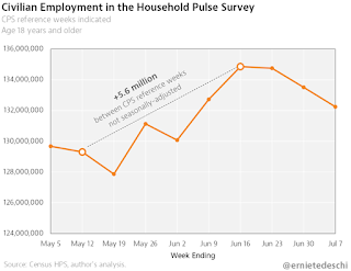
Ernie Tedeschi (former US Treasury economist) @ernietedeschi has pointed out that his survey was helpful in predicting the June employment report.

Employment in the @uscensusbureau Household Pulse Survey fell another -1.3 million last week alone. It's now fallen -2.6 million cumulatively over the past 3 weeks.The graph is from Ernie Tedeschi.
Seasonality & survey noise may be factors, but the HPS did an excellent job of anticipating the June jobs report.
The Pulse Survey doesn't align exactly with the reference week. The release on Wednesday will be for the period July 9th - July 14th, and the release the following week will be for the period July 16th - July 21th. The reference week is the 12th - 18th.
So we will need to look at two Pulse weekly surveys for hints about the July employment report.
Six High Frequency Indicators for the Economy
by Calculated Risk on 7/20/2020 08:34:00 AM
These indicators are mostly for travel and entertainment - some of the sectors that will recover very slowly.
The TSA is providing daily travel numbers.
 Click on graph for larger image.
This data shows the daily total traveler throughput from the TSA for 2019 (Blue) and 2020 (Red).
On July 19th there were 747,422 travelers compared to 2,727,355 a year ago.
That is a decline of 73%. There had been a slow steady increase from the bottom, but the increase in air travel has slowed.
The second graph shows the 7 day average of the year-over-year change in diners as tabulated by OpenTable for the US and several selected cities.
 Thanks to OpenTable for providing this restaurant data:
This data is updated through July 18, 2020.
This data is "a sample of restaurants on the OpenTable network across all channels: online reservations, phone reservations, and walk-ins. For year-over-year comparisons by day, we compare to the same day of the week from the same week in the previous year."
Note that this data is for "only the restaurants that have chosen to reopen in a given market".
The 7 day average for New York is still off 76%.
Florida is down 62% YoY. Note that dining seems to be declining in many areas over the last few weeks (certainly due to the recent surge in COVID cases).
 This data shows domestic box office for each week (red) and the maximum and minimum for the previous four years. Data is from BoxOfficeMojo through July 16th.
Note that the data is usually noisy week-to-week and depends on when blockbusters are released.
Movie ticket sales have picked up a slightly from the bottom, but are still under $1 million per week (compared to usually around $300 million per week), and ticket sales have essentially been at zero for seventeen weeks.
Most movie theaters are closed all across the country, and will probably reopen slowly (probably with limited seating at first).
The following graph shows the seasonal pattern for the hotel occupancy rate using the four week average.
 The red line is for 2020, dash light blue is 2019, blue is the median, and black is for 2009 (the worst year probably since the Great Depression for hotels).
2020 was off to a solid start, however, COVID-19 crushed hotel occupancy.
Notes: Y-axis doesn't start at zero to better show the seasonal change.
The occupancy rate for the last four weeks was 43.9%, 46.2%, 45.6% and 45.9%. Flattening out well below the median for this week of 75%.
Usually hotel occupancy starts to pick up seasonally in early June. So some of the recent pickup might be seasonal (summer travel). Note that summer occupancy usually peaks at the end of July or in early August.
 This graph, based on weekly data from the U.S. Energy Information Administration (EIA), shows the year-over-year change in gasoline consumption.
At one point, gasoline consumption was off almost 50% YoY.
As of July 10th, gasoline consumption was only off about 6% YoY (about 94% of normal).
Note: I know several people that have driven to vacation spots - or to visit family - and they usually would have flown. So this might be boosting gasoline consumption over the summer.
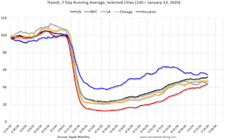
The final graph is from Apple mobility. From Apple: "This data is generated by counting the number of requests made to Apple Maps for directions in select countries/regions, sub-regions, and cities." This is just a general guide - people that regularly commute probably don't ask for directions.
There is also some great data on mobility from the Dallas Fed Mobility and Engagement Index. However the index is set "relative to its weekday-specific average over January–February", and is not seasonally adjusted, so we can't tell if an increase in mobility is due to recovery or just the normal increase in the Spring and Summer.
 This data is through July 18th for the United States and several selected cities.
The graph is the running 7 day average to remove the impact of weekends.
IMPORTANT: All data is relative to January 13, 2020. This data is NOT Seasonally Adjusted. People walk and drive more when the weather is nice, so I'm just using the transit data.
According to the Apple data directions requests, public transit in the 7 day average for the US is still only about 52% of the January level. It is at 45% in New York, and 54% in Houston (down over the last few of weeks).


