by Calculated Risk on 1/22/2016 08:36:00 AM
Friday, January 22, 2016
Chicago Fed: "Index shows economic growth below average in December"
The Chicago Fed released the national activity index (a composite index of other indicators): Index shows economic growth below average in December
The Chicago Fed National Activity Index (CFNAI) moved up to –0.22 in December from –0.36 in November. Two of the four broad categories of indicators that make up the index increased from November, but three of the four categories made negative contributions to the index in December.This graph shows the Chicago Fed National Activity Index (three month moving average) since 1967.
The index’s three-month moving average, CFNAI-MA3, decreased to –0.24 in December from –0.19 in November. December’s CFNAI-MA3 suggests that growth in national economic activity was somewhat below its historical trend. The economic growth reflected in this level of the CFNAI-MA3 suggests subdued inflationary pressure from economic activity over the coming year.
emphasis added
 Click on graph for larger image.
This suggests economic activity was somewhat below the historical trend in December (using the three-month average).
According to the Chicago Fed:
What is the National Activity Index? The index is a weighted average of 85 indicators of national economic activity drawn from four broad categories of data: 1) production and income; 2) employment, unemployment, and hours; 3) personal consumption and housing; and 4) sales, orders, and inventories.
A zero value for the index indicates that the national economy is expanding at its historical trend rate of growth; negative values indicate below-average growth; and positive values indicate above-average growth.
Thursday, January 21, 2016
Friday: Existing Home Sales
by Calculated Risk on 1/21/2016 05:27:00 PM
Housing economist Tom Lawler estimates the NAR will report December sales of 5.36 million on a seasonally adjusted annual rate (SAAR) basis, up from 4.76 million SAAR in November.
Based on Lawler's estimate, I'd take the "over" tomorrow. Note: Lawler is not always right on, but he is usually pretty close. See this post for a review of Lawler's track record.
Friday:
• At 8:30 AM, the Chicago Fed National Activity Index for December. This is a composite index of other data.
• At 10:00 AM, Existing Home Sales for December from the National Association of Realtors (NAR). The consensus is for 5.19 million SAAR, up from 4.76 million in November.
Private Investment and the Business Cycle
by Calculated Risk on 1/21/2016 03:20:00 PM
The following is an update to a few graphs and analysis that I started posting in 2005. In 2005 I was bearish on residential investment, and I used these graphs to argue that the then coming housing bust would lead the economy into a recession. Now this analysis is suggesting more growth ... (note: Some of this discussion is updated from previous posts).
Discussions of the business cycle frequently focus on consumer spending (PCE: Personal consumption expenditures), but the key is to watch private domestic investment, especially residential investment. Even though private investment usually only accounts for around 15% of GDP, the swings for private investment are significantly larger than for PCE during the business cycle, so private investment has an outsized impact on GDP at transitions in the business cycle.
The first graph shows the real annualized change in GDP and private investment since 1976 through Q3 2016 (this is a 3 quarter centered average to smooth the graph).
GDP has fairly small annualized changes compared to the huge swings in investment, especially during and just following a recession. This is why investment is one of the keys to the business cycle.

Note that during the recent recession, the largest decline for GDP was in Q4 2008 (a 8.2% annualized rate of decline). On a three quarter center averaged basis (as presented on graph), the largest decline was 5.2% annualized.
However the largest decline for private investment was a 39% annualized rate! On a three quarter average basis (on graph), private investment declined at a 31% annualized rate.
The second graph shows the contribution to GDP from the five categories of private investment: residential investment, equipment and software, nonresidential structures, intellectual property and "Change in private inventories". Note: this is a 3 quarter centered average of the contribution to GDP.
This is important to follow because residential investment tends to lead the economy, equipment and software is generally coincident, and nonresidential structure investment lags the business cycle. Red is residential, green is equipment and software, and blue is investment in non-residential structures. The usual pattern - both into and out of recessions is - red, green, and blue.

The key leading sector - residential investment - lagged the recent recovery because of the huge overhang of existing inventory. Usually residential investment is a strong contributor to GDP growth and employment in the early stages of a recovery, but not this time - and that weakness was a key reason why the recovery was sluggish.
Residential investment turned positive in 2011, and made a positive contribution to GDP through 2015.

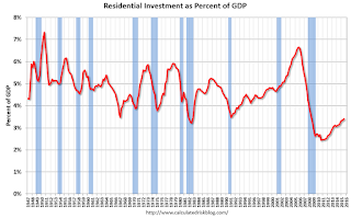
The third graph shows residential investment as a percent of GDP. Residential investment as a percent of GDP is still very low, and it seems likely that residential investment as a percent of GDP will increase further in 2016.
Nothing is perfect, but residential investment suggests further growth. Add in the improvement in household balance sheets, some contribution from Federal, state and local governments, and a further increase in non-residential structures in 2016 (ex-energy) - and the economy should continue to grow.
Philly Fed Manufacturing Survey showed "modest" contraction in January
by Calculated Risk on 1/21/2016 09:01:00 AM
From the Philly Fed: January 2016 Manufacturing Business Outlook Survey
Manufacturing conditions in the region contracted modestly this month, according to firms responding to the January Manufacturing Business Outlook Survey. The indicator for general activity remained negative this month; however, it rebounded from a lower reading in December.This was close to the consensus forecast of a reading of -4.0 for January.
...
The diffusion index for current activity increased from a revised reading of -10.2 in December to -3.5 and has now been negative for five consecutive months ...
The survey’s labor market indicators suggest weaker employment. The employment index decreased 4 points, from 2.2 to -1.9.
emphasis added
 Click on graph for larger image.
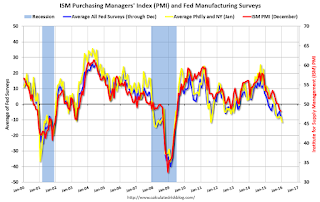
Here is a graph comparing the regional Fed surveys and the ISM manufacturing index. The yellow line is an average of the NY Fed (Empire State) and Philly Fed surveys through January. The ISM and total Fed surveys are through December.
The average of the Empire State and Philly Fed surveys decreased in January, and was solidly negative. This suggests another weak reading for the ISM survey.
Weekly Initial Unemployment Claims increase to 293,000
by Calculated Risk on 1/21/2016 08:34:00 AM
The DOL reported:
In the week ending January 16, the advance figure for seasonally adjusted initial claims was 293,000, an increase of 10,000 from the previous week's revised level. The previous week's level was revised down by 1,000 from 284,000 to 283,000. The 4-week moving average was 285,000, an increase of 6,500 from the previous week's revised average. The previous week's average was revised down by 250 from 278,750 to 278,500.The previous week was revised down to 283,000.
There were no special factors impacting this week's initial claims.
The following graph shows the 4-week moving average of weekly claims since 1971.
 Click on graph for larger image.
The dashed line on the graph is the current 4-week average. The four-week average of weekly unemployment claims increased to 285,000.
This was above the consensus forecast of 275,000. Although initial claims have increased recently, this is still a very low level and the 4-week average suggests few layoffs.
Wednesday, January 20, 2016
Thursday: Unemployment Claims, Philly Fed Mfg Survey
by Calculated Risk on 1/20/2016 06:58:00 PM
From Matthew Graham at Mortgage News Daily: Rates Head Back Toward Long Term Lows
Mortgage rates fell today, bringing them back in line with the lowest levels in more than 2 months and very near the best levels since late April 2015. ... The average lender is easily back into the "high 3's" when it comes to conventional 30yr fixed quotes for top tier scenarios. The only question is whether that means 3.75% or 3.875%. With today's improvements, quite a few lenders moved back down to to 3.75%. They don't necessarily represent a majority just yet, but it's getting to be a closer call.Thursday:
• At 8:30 AM, the initial weekly unemployment claims report will be released. The consensus is for 275 thousand initial claims, down from 284 thousand the previous week.
• At 8:30 AM, the Philly Fed manufacturing survey for January. The consensus is for a reading of -4.0, up from -5.9.
AIA: "Architecture Billings Index Ends Year on Positive Note"
by Calculated Risk on 1/20/2016 03:11:00 PM
Note: This index is a leading indicator primarily for new Commercial Real Estate (CRE) investment.
From the AIA: Architecture Billings Index Ends Year on Positive Note
There were a few occasions where demand for design services decreased from a month-to-month basis in 2015, but the Architecture Billings Index (ABI) concluded the year in positive terrain and was so in eight of the twelve months of the year. As a leading economic indicator of construction activity, the ABI reflects the approximate nine to twelve month lead time between architecture billings and construction spending. The American Institute of Architects (AIA) reported the December ABI score was 50.9, up from the mark of 49.3 in the previous month. This score reflects a slight increase in design services (any score above 50 indicates an increase in billings). The new projects inquiry index was 60.2, up from a reading of 58.6 the previous month.
“As has been the case for the past several years, there continues to be a mix of business conditions that architecture firms are experiencing,” said AIA Chief Economist Kermit Baker, Hon. AIA, PhD. “Overall, however, ABI scores for 2015 averaged just below the strong showing in 2014, which points to another healthy year for construction this year.”
...
• Regional averages: West (53.7), South (53.3), Northeast (46.7), Midwest (46.1)
• Sector index breakdown: multi-family residential (52.9), institutional (52.2), commercial / industrial (47.3), mixed practice (46.5)
emphasis added
 Click on graph for larger image.
This graph shows the Architecture Billings Index since 1996. The index was at 50.9 in December, down from 49.3 in November. Anything above 50 indicates expansion in demand for architects' services.
Note: This includes commercial and industrial facilities like hotels and office buildings, multi-family residential, as well as schools, hospitals and other institutions.
The multi-family residential market was negative for most of the year - suggesting a slowdown or less growth for apartments - but has been positive for the last three months.
According to the AIA, there is an "approximate nine to twelve month lag time between architecture billings and construction spending" on non-residential construction. This index was positive in 8 of the last 12 months, suggesting a further increase in CRE investment in 2016.
Key Measures Show Inflation close to 2% in December
by Calculated Risk on 1/20/2016 11:47:00 AM
The Cleveland Fed released the median CPI and the trimmed-mean CPI this morning:
According to the Federal Reserve Bank of Cleveland, the median Consumer Price Index rose 0.1% (1.8% annualized rate) in December. The 16% trimmed-mean Consumer Price Index also rose 0.1% (0.8% annualized rate) during the month. The median CPI and 16% trimmed-mean CPI are measures of core inflation calculated by the Federal Reserve Bank of Cleveland based on data released in the Bureau of Labor Statistics' (BLS) monthly CPI report.Note: The Cleveland Fed has the median CPI details for December here. Motor fuel was down 38% annualized in December.
Earlier today, the BLS reported that the seasonally adjusted CPI for all urban consumers fell 0.1% (-1.3% annualized rate) in December. The CPI less food and energy rose 0.1% (1.5% annualized rate) on a seasonally adjusted basis.
 Click on graph for larger image.
This graph shows the year-over-year change for these four key measures of inflation. On a year-over-year basis, the median CPI rose 2.4%, the trimmed-mean CPI rose 1.8%, and the CPI less food and energy also rose 2.1%. Core PCE is for November and increased 1.3% year-over-year.
On a monthly basis, median CPI was at 1.8% annualized, trimmed-mean CPI was at 0.8% annualized, and core CPI was at 1.5% annualized.
On a year-over-year basis, two of these measures suggest inflation remains below the Fed's target of 2%, and two measures, core CPI and median CPI, are above 2%.
Using these measures, inflation has been mostly moving up, and three of the measures are close to the Fed's target (Core PCE is still way below).
Comments on December Housing Starts
by Calculated Risk on 1/20/2016 10:11:00 AM
Earlier: Housing Starts declined to 1.149 Million Annual Rate in December
Total starts were up 10.8% in 2015 compared to 2014. My guess was for an increase of 8% to 12%.
Here is a table showing 1 unit and 5+ unit housing starts since the peak year in 2005. This also shows the year-over-year change for both categories. Single family starts were up 10.4% in 2015 compared to 2014. Starts for 5+ units were up 12.5% compared to 2014.
Note that the year-over-year change for 5+ units is smaller in 2015, and will probably be even smaller in 2016. Last year, after the June data was released, I pointed out that that might be the peak for the cycle (524 thousand SAAR in June 2015). I expect multi-family starts to move more sideways going forward.
| Starts and YOY % Change | ||||
|---|---|---|---|---|
| Year | 1 unit | % Change | 5+ units | % Change |
| 2005 | 1,715.8 | 6.5% | 311.4 | 2.8% |
| 2006 | 1,465.4 | -14.6% | 292.8 | -6.0% |
| 2007 | 1,046.0 | -28.6% | 277.3 | -5.3% |
| 2008 | 622.0 | -40.5% | 266.0 | -4.1% |
| 2009 | 445.1 | -28.4% | 97.3 | -63.4% |
| 2010 | 471.2 | 5.9% | 104.3 | 7.2% |
| 2011 | 430.6 | -8.6% | 167.3 | 60.4% |
| 2012 | 535.3 | 24.3% | 233.9 | 39.8% |
| 2013 | 617.6 | 15.4% | 293.7 | 25.6% |
| 2014 | 647.9 | 4.9% | 341.7 | 16.3% |
| 2015 | 715.3 | 10.4% | 384.4 | 12.5% |
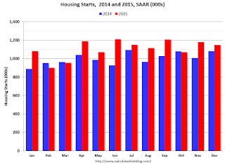
 This first graph shows the month to month comparison between 2014 (blue) and 2015 (red).
Starts were up year-over-year in 9 of 12 months in 2015. The year started slow - weather impacted starts in February and March - but overall growth was about as expected.
Below is an update to the graph comparing multi-family starts and completions. Since it usually takes over a year on average to complete a multi-family project, there is a lag between multi-family starts and completions. Completions are important because that is new supply added to the market, and starts are important because that is future new supply (units under construction is also important for employment).
These graphs use a 12 month rolling total for NSA starts and completions.
 The blue line is for multifamily starts and the red line is for multifamily completions.
 The rolling 12 month total for starts (blue line) increased steadily over the last few years, and completions (red line) have lagged behind - but completions have been catching up (more deliveries), and will continue to follow starts up (completions lag starts by about 12 months).
Multi-family completions are increasing sharply year-over-year.
I think most of the growth in multi-family starts is probably behind us - in fact multi-family starts might have peaked in June (at 524 thousand SAAR) - although I expect solid multi-family starts for a few more years (based on demographics).
 The second graph shows single family starts and completions. It usually only takes about 6 months between starting a single family home and completion - so the lines are much closer. The blue line is for single family starts and the red line is for single family completions.
Note the exceptionally low level of single family starts and completions. The "wide bottom" was what I was forecasting several years ago, and now I expect several years of increasing single family starts and completions.
The housing recovery continues, but I expect less growth from multi-family going forward.
Housing Starts declined to 1.149 Million Annual Rate in December
by Calculated Risk on 1/20/2016 08:30:00 AM
From the Census Bureau: Permits, Starts and Completions
Housing Starts:
Privately-owned housing starts in December were at a seasonally adjusted annual rate of 1,149,000. This is 2.5 percent below the revised November estimate of 1,179,000, but is 6.4 percent above the December 2014 rate of 1,080,000.
Single-family housing starts in December were at a rate of 768,000; this is 3.3 percent below the revised November figure of 794,000. The December rate for units in buildings with five units or more was 365,000.
An estimated 1,111,200 housing units were started in 2015. This is 10.8 percent above the 2014 figure of 1,003,300.
Building Permits:
Privately-owned housing units authorized by building permits in December were at a seasonally adjusted annual rate of 1,232,000. This is 3.9 percent below the revised November rate of 1,282,000, but is 14.4 percent above the December 2014 estimate of 1,077,000.
Single-family authorizations in December were at a rate of 740,000; this is 1.8 percent above the revised November figure of 727,000. Authorizations of units in buildings with five units or more were at a rate of 455,000 in December.
emphasis added
 Click on graph for larger image.
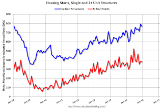
The first graph shows single and multi-family housing starts for the last several years.
Multi-family starts (red, 2+ units) decreased in December. Multi-family starts are up 6% year-over-year.
Single-family starts (blue) decreased in December and are up 7% year-over-year.
 The second graph shows total and single unit starts since 1968.
 The second graph shows the huge collapse following the housing bubble, and then - after moving sideways for a couple of years - housing is now recovering (but still historically low),
Total housing starts in December were below expectations, however starts for October and November were revised up. And starts were up 10.8% in 2015 compared to 2014. I'll have more later ...


