by Calculated Risk on 8/11/2015 07:19:00 PM
Tuesday, August 11, 2015
Wednesday: Job Openings
From the WSJ: U.S. Oil Falls to Six-Year Low
Light, sweet crude for September delivery fell $1.88, or 4.2%, to settle at $43.08 a barrel on the New York Mercantile Exchange. ... U.S. oil to its lowest settlement since March 11, 2009, when the U.S. economy was still reeling from the financial crisis.Here is a graph from Gasbuddy.com for nationwide gasoline prices. Nationally prices are at $2.58 per gallon, well above the 6 year low of $2.02 per gallon set in January.
Brent crude, the global benchmark, fell $1.23, or 2.4%, to $49.18 a barrel on ICE Futures Europe. It is within $3 of its six-year low set in January.
There are several reasons why gasoline prices are still so high, including: 1) it takes time for declines in oil prices to reach the pump, 2) there is a seasonal component (this is the driving season), and 3) supply issues in California. However, gasoline prices should follow oil prices down over the next several weeks.
Wednesday:
• At 7:00 AM ET, the Mortgage Bankers Association (MBA) will release the results for the mortgage purchase applications index.
• At 10:00 AM, Job Openings and Labor Turnover Survey for June from the BLS. Jobs openings increased in May to 5.363 million from 5.334 million in April. The number of job openings were up 16% year-over-year, and Quits were up 8% year-over-year.
• At 2:00 PM, the Monthly Treasury Budget Statement for July.
U.S. Population Distribution by Age, 1900 through 2060
by Calculated Risk on 8/11/2015 02:39:00 PM
By request, here is a repeat of animations of the U.S population by age and distribution, from 1900 through 2060. The population data and estimates are from the Census Bureau (actual through 2010 and projections through 2060).
Note: For distribution, here are the same graphs using a slider (the user can look at individual slides).
There are many interesting points - the Depression baby bust, the baby boom, the 2nd smaller baby bust following the baby boom, the "echo" boom" and more. What jumps out at me are the improvements in health care. And also that the largest cohorts will all soon be under 40. Heck, in the last frame (2060), any remaining Boomers will be in those small (but growing) 95 to 99, and 100+ cohorts.
The first graph is by distribution (updates every 2 seconds).
The second graph is by age. Population is in thousands (not labeled)! Prior to 1940, the oldest group in the Census data was "75+". From 1940 through 1985, the oldest group was "85+". Starting in 1990, the oldest group is 100+.
U.S. Births increased in 2014
by Calculated Risk on 8/11/2015 11:24:00 AM
This provisional data for 2014 was released in June and shows a possible impact of the great recession ... and recovery.
From the National Center for Health Statistics: Births: Preliminary Data for 2014. The NCHS reports:
The 2014 preliminary number of U.S. births was 3,985,924, an increase of 1% from 2013. ...Here is a long term graph of annual U.S. births through 2014 ...
The general fertility rate was 62.9 births per 1,000 women aged 15–44, up 1% from 2013, and the first increase in the fertility rate since 2007.
 Click on graph for larger image.
Births had declined for five consecutive years prior to increasing in 2013. Births are about 7.7% below the peak in 2007 (births in 2007 were at the all time high - even higher than during the "baby boom"). I suspect certain segments of the population were under stress before the recession started - like construction workers - and even more families were in distress in 2008 through 2012. And this led to fewer babies.
Notice that the number of births started declining a number of years before the Great Depression started. Many families in the 1920s were under severe stress long before the economy collapsed. By 1933 births were down by almost 23% from the early '20s levels.
Of course economic distress isn't the only reason births decline - look at the huge decline following the baby boom that was driven by demographics. But it is not surprising that the number of births slow or decline during tough economic times - but that is over now.
 The second graph is from the NCHS report and shows births per 1,000 women by teen age group. From the NCHS:
 The preliminary birth rate for teenagers in 2014 was 24.2 births per 1,000 women aged 15–19—yet another historic low for the nation. The rate was down 9% from 2013 (26.5) and has declined more than 7% annually since 2007. Since the most recent peak in 1991 (61.8), the rate has declined a total of 61%. In 2014, the preliminary number of births to women aged 15–19 was 249,067, down 9% from 2013 and 44% from 2007 (444,899)Far fewer teens births is great news (and is probably related to the much higher enrollment rates).
Another key trends ... women are waiting longer to have babies:
The preliminary birth rate for women aged 20–24 in 2014 was 79.0 births per 1,000 women, down 2% from the rate in 2013 (80.7), reaching yet another record low for the nation. The rate for women in this age group has declined steadily since 2007 at more than 4% a year. ... The rate for women aged 25–29 was 105.7 births per 1,000 women, essentially unchanged from 2013 (105.5).. Since 2008, the rate for women in this age group has declined more than 1% a year. The number of births to women in their late 20s increased 2% from 2013 to 2014.Waiting longer to have children makes sense (see: Demographics and Behavior) and we should expect a baby boom in a few years as the largest cohorts move into the 25 to 34 years old age groups.
The preliminary birth rate for women aged 30–34 in 2014 was 100.8 births per 1,000 women, up 3% from the rate in 2013 (98.0). The rate for this group has increased steadily since 2011. The number of births to women in their early 30s also increased in 2014, by 4%. The rate for women aged 35–39 was 50.9 births per 1,000 women, up 3% from 2013 (49.3). The rate for this group has increased steadily since 2010. The number of births to women in their late 30s increased 5% in 2014
P.S. I expect that as families have babies, they will tend to buy homes (as opposed to rent)! The demographics are favorable for renting now, but eventually the demographics will be more positive for home ownership.
NFIB: Small Business Optimism Index increased in July
by Calculated Risk on 8/11/2015 09:51:00 AM
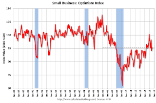
From the National Federation of Independent Business (NFIB): NFIB Small Business Optimism Index increased 1.3 points in July
The Small Business Optimism Index rose 1.3 points to 95.4. After giving up over 4 points in June, the Index clawed back 1.3 points in July, a familiar theme now, which has produced the most grudging gains in the Index’s history – and still not above the 42 year average of 98. ...
Job creation was flat in July. On balance, owners added a net 0.05 workers per firm in recent months, better than June’s -0.01 reading, but still close to the zero line.
emphasis added
 Click on graph for larger image.
This graph shows the small business optimism index since 1986.
The index increased to 95.4 in July from 94.1 in June.
Monday, August 10, 2015
Fannie and Freddie: REO inventory declined in Q2, Down 33% Year-over-year
by Calculated Risk on 8/10/2015 07:37:00 PM
Fannie and Freddie reported results last week. Here is some information on Real Estate Owned (REOs).
From Fannie Mae:
The continued decrease in the number of our seriously delinquent single-family loans has resulted in a reduction in the number of REO acquisitions in the first half of 2015 as compared with the first half of 2014.Fannie is unable to currently market about 40% of their inventory.
We continue to manage our REO inventory to appropriately manage costs and maximize sales proceeds. However, we are unable to market and sell a large portion of our inventory, primarily due to occupancy and state or local redemption or confirmation periods, which extends the amount of time it takes to bring our properties to a marketable state and eventually dispose of them. This results in higher foreclosed property expenses, which include costs related to maintaining the property and ensuring that the property is vacant. Additionally, before we market our foreclosed properties, we may choose to repair them in order to maximize the sales price and increase the likelihood that an owner occupant will purchase. The percent of properties we repair prior to marketing has increased as a result of market demand and our continued focus on stabilizing neighborhoods and increasing opportunities for owner occupants to purchase.
emphasis added
From Freddie Mac:
In recent periods, third-party sales at foreclosure auction have comprised an increasing portion of foreclosure transfers. Third-party sales at foreclosure auction avoid the REO property expenses that we would have otherwise incurred if we held the property in our REO inventory until disposition.Fannie and Freddie are still working through the backlog of loans made during the housing bubble, mostly in judicial foreclosure states.
 Click on graph for larger image.
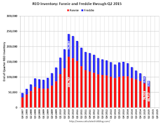
Here is a graph of Fannie and Freddie Real Estate Owned (REO).
REO inventory decreased in Q2 for both Fannie and Freddie, and combined inventory is down 33% year-over-year. For Freddie, this is the lowest level of REO since Q1 2008. For Fannie, this is the lowest level since Q2 2009.
Short term delinquencies are at normal levels, but there are still a fairly large number of properties in the foreclosure process with long time lines in judicial foreclosure states.
More Employment Graphs: Duration of Unemployment, Unemployment by Education, Construction Employment and Diffusion Indexes
by Calculated Risk on 8/10/2015 02:01:00 PM
By request, a few more employment graphs ...
Here are the previous posts on the employment report:
• July Employment Report: 215,000 Jobs, 5.3% Unemployment Rate
• Employment Report Comments and more Graphs
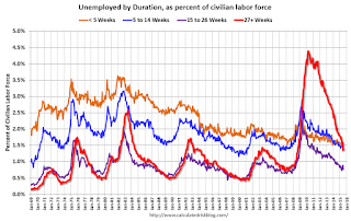
 This graph shows the duration of unemployment as a percent of the civilian labor force. The graph shows the number of unemployed in four categories: less than 5 week, 6 to 14 weeks, 15 to 26 weeks, and 27 weeks or more.
The general trend is down for all categories, and the "less than 5 weeks", "6 to 14 weeks" and "15 to 26 weeks" are all close to normal levels.
The long term unemployed is less than 1.4% of the labor force, however the number (and percent) of long term unemployed remains elevated.
 This graph shows the unemployment rate by four levels of education (all groups are 25 years and older).
Unfortunately this data only goes back to 1992 and only includes one previous recession (the stock / tech bust in 2001). Clearly education matters with regards to the unemployment rate - and it appears all four groups are generally trending down.
Although education matters for the unemployment rate, it doesn't appear to matter as far as finding new employment.
Note: This says nothing about the quality of jobs - as an example, a college graduate working at minimum wage would be considered "employed".
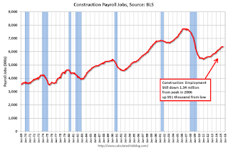
 This graph shows total construction employment as reported by the BLS (not just residential).
Since construction employment bottomed in January 2011, construction payrolls have increased by 951 thousand.
Construction employment is still far below the bubble peak - and below the level in the late '90s.
 The BLS diffusion index for total private employment was at 64.4 in July, up from 60.6 in June.
 For manufacturing, the diffusion index was at 57.5, up from 52.5 in June.
Think of this as a measure of how widespread job gains are across industries. The further from 50 (above or below), the more widespread the job losses or gains reported by the BLS. Above 60 is very good. From the BLS:
Figures are the percent of industries with employment increasing plus one-half of the industries with unchanged employment, where 50 percent indicates an equal balance between industries with increasing and decreasing employment.Overall private job growth was widespread in July. A positive indicator.
FNC: Residential Property Values increased 5.7% year-over-year in June
by Calculated Risk on 8/10/2015 10:18:00 AM
In addition to Case-Shiller, and CoreLogic, I'm also watching the FNC, Zillow and several other house price indexes.
FNC released their June 2015 index data today. FNC reported that their Residential Price Index™ (RPI) indicates that U.S. residential property values increased 1.2% from May to June (Composite 100 index, not seasonally adjusted).
The 10 city MSA increased 1.7% in June, the 20-MSA RPI increased 1.6%, and the 30-MSA RPI increased 1.4%. These indexes are not seasonally adjusted (NSA), and are for non-distressed home sales (excluding foreclosure auction sales, REO sales, and short sales).
Notes: In addition to the composite indexes, FNC presents price indexes for 30 MSAs. FNC also provides seasonally adjusted data.
The year-over-year (YoY) change was larger in June than in May, with the 100-MSA composite up 5.7% compared to June 2014.
The index is still down 15.2% from the peak in 2006 (not inflation adjusted).

This graph shows the year-over-year change based on the FNC index (four composites) through June 2015. The FNC indexes are hedonic price indexes using a blend of sold homes and real-time appraisals.
Most of the other indexes are also showing the year-over-year change around 5%, but increasing a little faster over the last several months.
Note: The June Case-Shiller index will be released on Tuesday, August 25th.
Las Vegas Real Estate in July: Sales Increased 15% YoY
by Calculated Risk on 8/10/2015 08:11:00 AM
This is a key distressed market to follow since Las Vegas has seen the largest price decline of any of the Case-Shiller composite 20 cities.
The Greater Las Vegas Association of Realtors reported GLVAR reports local home sales, prices continue to climb steadily from last year
According to GLVAR, the total number of existing local homes, condominiums and townhomes sold in July was 3,815, up from 3,314 one year ago. Compared to July 2014, 20.4 percent more homes, but 5.5 percent fewer condos and townhomes, sold this July.There are several key trends that we've been following:
...
For more than two years, GLVAR has been reporting fewer distressed sales and more traditional home sales, where lenders are not controlling the transaction. In July, 7.1 percent of all local sales were short sales – which occur when lenders allow borrowers to sell a home for less than what they owe on the mortgage. That’s down from 11.5 percent one year ago. Another 7.7 percent of July sales were bank-owned, down from 9.1 percent one year ago.
...
The total number of single-family homes listed for sale on GLVAR’s Multiple Listing Service in July was 13,616, down 0.7 percent from one year ago. GLVAR tracked a total of 3,465 condos, high-rise condos and townhomes listed for sale on its MLS in July, down 4.4 percent from one year ago.
By the end of July, GLVAR reported 7,636 single-family homes listed without any sort of offer. That’s up 5.1 percent from one year ago. For condos and townhomes, the 2,320 properties listed without offers in July represented a 0.4 percent decrease from one year ago.
emphasis added
1) Overall sales were up 15% year-over-year.
2) Conventional (equity, not distressed) sales were up 24% year-over-year. In July 2014, 79.4% of all sales were conventional equity. In July 2015, 85.2% were standard equity sales.
3) The percent of cash sales has declined year-over-year from 35.6% in July 2014 to 27.1% in July 2015. (investor buying appears to be declining).
4) Non-contingent inventory is up 5.1% year-over-year. The table below shows the year-over-year change for non-contingent inventory in Las Vegas. Inventory declined sharply through early 2013, and then inventory started increasing sharply year-over-year. It appears the inventory build is slowing - but still ongoing.
| Las Vegas: Year-over-year Change in Non-contingent Inventory | |
|---|---|
| Month | YoY |
| Jan-13 | -58.3% |
| Feb-13 | -53.4% |
| Mar-13 | -42.1% |
| Apr-13 | -24.1% |
| May-13 | -13.2% |
| Jun-13 | 3.7% |
| Jul-13 | 9.0% |
| Aug-13 | 41.1% |
| Sep-13 | 60.5% |
| Oct-13 | 73.4% |
| Nov-13 | 77.4% |
| Dec-13 | 78.6% |
| Jan-14 | 96.2% |
| Feb-14 | 107.3% |
| Mar-14 | 127.9% |
| Apr-14 | 103.1% |
| May-14 | 100.6% |
| Jun-14 | 86.2% |
| Jul-14 | 55.2% |
| Aug-14 | 38.8% |
| Sep-14 | 29.5% |
| Oct-14 | 25.6% |
| Nov-14 | 20.0% |
| Dec-14 | 18.0% |
| Jan-15 | 12.9% |
| Feb-15 | 15.8% |
| Mar-15 | 12.2% |
| Apr-15 | 7.6% |
| May-15 | 7.8% |
| Jun-15 | 4.3% |
| Jul-15 | 5.1% |
Sunday, August 09, 2015
Sunday Night Futures
by Calculated Risk on 8/09/2015 10:55:00 PM
From the WSJ: Oil Futures Signal Weak Prices Could Last Years
Benchmark U.S. oil futures for September delivery are nearing the six-year low hit in March. But contracts for delivery in later years have taken an even bigger hit, with prices for 2016 and 2017 already trading below their March lows.This would be good news for consumers (bad news for producers).
That indicates that investors, traders and oil companies see the global glut of crude oil persisting beyond this year.
Weekend:
• Schedule for Week of August 9, 2015
Monday:
• At 10:00 AM ET, The Fed will release the monthly Labor Market Conditions Index (LMCI).
From CNBC: Pre-Market Data and Bloomberg futures: currently S&P futures are up 4 and DOW futures are up 20 (fair value).
Oil prices were down over the last week with WTI futures at $43.65 per barrel and Brent at $48.34 per barrel. A year ago, WTI was at $97, and Brent was at $104 - so prices are down over 50% year-over-year.
Here is a graph from Gasbuddy.com for nationwide gasoline prices. Nationally prices are at $2.60 per gallon (down about $0.85 per gallon from a year ago). Gasoline prices should follow oil prices down.
Update: Framing Lumber Prices down Year-over-year
by Calculated Risk on 8/09/2015 10:36:00 AM
Here is another graph on framing lumber prices. Early in 2013 lumber prices came close to the housing bubble highs.
The price increases in early 2013 were due to a surge in demand (more housing starts) and supply constraints (framing lumber suppliers were working to bring more capacity online).
Prices didn't increase as much early in 2014 (more supply, smaller "surge" in demand).
In 2015, even with the pickup in U.S. housing starts, prices are down year-over-year. Note: Multifamily starts do not use as much lumber as single family starts, and there was a surge in multi-family starts.
Overall the decline in prices is probably due to more supply, and less demand from China.

This graph shows two measures of lumber prices: 1) Framing Lumber from Random Lengths through July 2015 (via NAHB), and 2) CME framing futures.
Right now Random Lengths prices are down about 14% from a year ago, and CME futures are down around 24% year-over-year.


