 RSS Feed
 by Calculated Risk on 5/13/2015 06:32:00 PM
Wednesday, May 13, 2015
Thursday: Unemployment Claims, PPI
File under "the beatings will continue until morale improves" ...
From Bloomberg: Greece’s Creditors Said to Seek 3 Billion-Euro Budget Cuts
Greece’s anti-austerity government needs to raise at least three billion euros ($3.4 billion) through additional fiscal measures by the end of this year to meet the minimum budget targets acceptable by creditors, an official with knowledge of the discussions said.Thursday:
The reductions would bring the primary budget surplus in 2015 to just over 1 percent of gross domestic product, a target Greek Interior Minister Nikos Voutsis said today is acceptable. Without any change in fiscal policy, Greece would end 2015 with a budget deficit of about 0.5 percent of GDP, the official said.
• At 8:30 AM ET, the initial weekly unemployment claims report will be released. The consensus is for claims to increase to 276 thousand from 265 thousand.
• Also at 8:30 AM, the Producer Price Index for April from the BLS. The consensus is for a 0.2% increase in prices, and a 0.1% increase in core PPI.
Public and Private Sector Payroll Jobs: Carter, Reagan, Bush, Clinton, Bush, Obama
by Calculated Risk on 5/13/2015 02:26:00 PM
By request, here is an update on an earlier post through the April employment report.
NOTE: Several readers have asked if I could add a lag to these graphs (obviously a new President has zero impact on employment for the month they are elected). But that would open a debate on the proper length of the lag, so I'll just stick to the beginning of each term.
Note: We frequently use Presidential terms as time markers - we could use Speaker of the House, or any other marker.
Important: There are many differences between these periods. Overall employment was smaller in the '80s, however the participation rate was increasing in the '80s (younger population and women joining the labor force), and the participation rate is generally declining now. But these graphs give an overview of employment changes.
First, here is a table for private sector jobs. The top two private sector terms were both under President Clinton. Reagan's 2nd term saw about the same job growth as during Carter's term. Note: There was a severe recession at the beginning of Reagan's first term (when Volcker raised rates to slow inflation) and a recession near the end of Carter's term (gas prices increased sharply and there was an oil embargo).
| Term | Private Sector Jobs Added (000s) |
|---|---|
| Carter | 9,041 |
| Reagan 1 | 5,360 |
| Reagan 2 | 9,357 |
| GHW Bush | 1,510 |
| Clinton 1 | 10,885 |
| Clinton 2 | 10,070 |
| GW Bush 1 | -844 |
| GW Bush 2 | 381 |
| Obama 1 | 2,018 |
| Obama 2 | 6,0441 |
| 127 months into 2nd term: 10,745 pace. | |
The first graph shows the change in private sector payroll jobs from when each president took office until the end of their term(s). President George H.W. Bush only served one term, and President Obama is in the second year of his second term.
Mr. G.W. Bush (red) took office following the bursting of the stock market bubble, and left during the bursting of the housing bubble. Mr. Obama (blue) took office during the financial crisis and great recession. There was also a significant recession in the early '80s right after Mr. Reagan (yellow) took office.
There was a recession towards the end of President G.H.W. Bush (purple) term, and Mr Clinton (light blue) served for eight years without a recession.
 Click on graph for larger image.
The first graph is for private employment only.
The employment recovery during Mr. G.W. Bush's (red) first term was sluggish, and private employment was down 844,000 jobs at the end of his first term. At the end of Mr. Bush's second term, private employment was collapsing, and there were net 463,000 private sector jobs lost during Mr. Bush's two terms.
Private sector employment increased slightly under President G.H.W. Bush (purple), with 1,510,000 private sector jobs added.
Private sector employment increased by 20,955,000 under President Clinton (light blue), by 14,717,000 under President Reagan (yellow), and 9,041,000 under President Carter (dashed green).
There were only 2,018,000 more private sector jobs at the end of Mr. Obama's first term. Twenty seven months into Mr. Obama's second term, there are now 8,062,000 more private sector jobs than when he initially took office.
 A big difference between the presidencies has been public sector employment. Note the bumps in public sector employment due to the decennial Census in 1980, 1990, 2000, and 2010.
 The public sector grew during Mr. Carter's term (up 1,304,000), during Mr. Reagan's terms (up 1,414,000), during Mr. G.H.W. Bush's term (up 1,127,000), during Mr. Clinton's terms (up 1,934,000), and during Mr. G.W. Bush's terms (up 1,744,000 jobs).
However the public sector has declined significantly since Mr. Obama took office (down 688,000 jobs). These job losses have mostly been at the state and local level, but more recently at the Federal level. This has been a significant drag on overall employment.
And a table for public sector jobs. Public sector jobs declined the most during Obama's first term, and increased the most during Reagan's 2nd term.
| Term | Public Sector Jobs Added (000s) |
|---|---|
| Carter | 1,304 |
| Reagan 1 | -24 |
| Reagan 2 | 1,438 |
| GHW Bush | 1,127 |
| Clinton 1 | 692 |
| Clinton 2 | 1,242 |
| GW Bush 1 | 900 |
| GW Bush 2 | 844 |
| Obama 1 | -702 |
| Obama 2 | 301 |
| 127 months into 2nd term, 53 pace | |
Looking forward, I expect the economy to continue to expand through 2016 (at least), so I don't expect a sharp decline in private employment as happened at the end of Mr. Bush's 2nd term (In 2005 and 2006 I was warning of a coming recession due to the bursting of the housing bubble).
For the public sector, the cutbacks are clearly over at the state and local levels, and it appears cutbacks at the Federal level have slowed. Right now I'm expecting some increase in public employment during Obama's 2nd term, but nothing like what happened during Reagan's second term.
Here is a table of the top three presidential terms for private job creation (they also happen to be the three best terms for total non-farm job creation).
Clinton's two terms were the best for both private and total non-farm job creation, followed by Reagan's 2nd term.
Currently Obama's 2nd term is on pace to be the 2nd best ever for private job creation. However, with very few public sector jobs added, Obama's 2nd term is only on pace to be the third best for total job creation.
Note: Only 30 thousand public sector jobs have been added during the first twenty six months of Obama's 2nd term (following a record loss of 702 thousand public sector jobs during Obama's 1st term). This is about 2% of the public sector jobs added during Reagan's 2nd term!
| Top Employment Gains per Presidential Terms (000s) | ||||
|---|---|---|---|---|
| Rank | Term | Private | Public | Total Non-Farm |
| 1 | Clinton 1 | 10,885 | 692 | 11,577 |
| 2 | Clinton 2 | 10,070 | 1,242 | 11,312 |
| 3 | Reagan 2 | 9,357 | 1,438 | 10,795 |
| Obama 21 | 6,044 | 30 | 6,074 | |
| Pace2 | 10,745 | 53 | 10,798 | |
| 127 Months into 2nd Term 2Current Pace for Obama's 2nd Term | ||||
The second table shows the jobs need per month for Obama's 2nd term to be in the top three presidential terms.
| Average Jobs needed per month (000s) for Obama's 2nd Term | ||||
|---|---|---|---|---|
| to Rank | Private | Total | ||
| #1 | 231 | 262 | ||
| #2 | 192 | 249 | ||
| #3 | 158 | 225 | ||
Las Vegas: Record Visitor Traffic in 2014, Same pace in 2015
by Calculated Risk on 5/13/2015 12:04:00 PM
Another update ... during the recession, I wrote about the troubles in Las Vegas and included a chart of visitor and convention attendance: Lost Vegas.
Since then Las Vegas visitor traffic recovered to a new record high in 2014.
We only have data through March, but visitor traffic is slightly below the 2014 pace so far.
However convention attendance is only returning slowly. Here is the data from the Las Vegas Convention and Visitors Authority.
 Click on graph for larger image.
The blue bars are annual visitor traffic (left scale), and the red line is convention attendance (right scale).
Through March, visitor traffic in 2015 is running 0.3% below 2014.
Convention traffic is up about 2% from last year, and is still way below the pre-recession peak. In general, the gamblers are back - and the conventions are slowly returning.
It seemed like there were many housing related conventions during the housing bubble, so it may be some time before convention attendance hits a new high.
Retail Sales unchanged in April
by Calculated Risk on 5/13/2015 08:41:00 AM
On a monthly basis, retail sales were unchanged from March to April (seasonally adjusted), and sales were up 0.9% from April 2014.
From the Census Bureau report:
The U.S. Census Bureau announced today that advance estimates of U.S. retail and food services sales for April, adjusted for seasonal variation and holiday and trading-day differences, but not for price changes, were $436.8 billion, virtually unchanged from the previous month, but 0.9 percent above April 2014. ... The February 2015 to March 2015 percent change was revised from +0.9 percent to +1.1 percent.
 Click on graph for larger image.
This graph shows retail sales since 1992. This is monthly retail sales and food service, seasonally adjusted (total and ex-gasoline).
Retail sales ex-gasoline were unchanged.
Retail sales ex-autos increased 0.1%.
The second graph shows the year-over-year change in retail sales and food service (ex-gasoline) since 1993.
 Retail and Food service sales ex-gasoline increased by 3.6% on a YoY basis (0.9% for all retail sales).
The increase in April was below consensus expectations of a 0.2% increase, however March was revised up.
MBA: Mortgage Applications Decrease in Latest Weekly Survey
by Calculated Risk on 5/13/2015 07:00:00 AM
From the MBA: As Rates Climb, Refinance Applications Continue to Drop
Mortgage applications decreased 3.5 percent from one week earlier, according to data from the Mortgage Bankers Association’s (MBA) Weekly Mortgage Applications Survey for the week ending May 8, 2015. ...
The Refinance Index decreased 6 percent from the previous week. The seasonally adjusted Purchase Index decreased 0.2 percent from one week earlier. The unadjusted Purchase Index increased 0.1 percent compared with the previous week and was 12 percent higher than the same week one year ago.
...
The average contract interest rate for 30-year fixed-rate mortgages with conforming loan balances ($417,000 or less) increased to 4.00 percent, its highest level since March 2015, from 3.93 percent, with points increasing to 0.36 from 0.35 (including the origination fee) for 80 percent loan-to-value ratio (LTV) loans.
emphasis added
 Click on graph for larger image.
The first graph shows the refinance index.
2014 was the lowest year for refinance activity since year 2000.
It would take much lower rates - below 3.5% - to see a significant refinance boom this year.
 The second graph shows the MBA mortgage purchase index.
 According to the MBA, the unadjusted purchase index is 12% higher than a year ago.
Tuesday, May 12, 2015
Wednesday: Retail Sales
by Calculated Risk on 5/12/2015 10:26:00 PM
From the WSJ: Don’t Expect Cheap Gasoline to Fuel Retail Sales
The slump in crude oil had, as of February, led to pump-price savings estimated at over $100 billion annually for American households. But tepid retail-sales data from December through February left forecasters scratching their heads about consumers’ failure to spend much of it.Wednesday:
Back in November, year-over-year growth in retail sales was running at 4.7%. It had slipped to 1.26% by March. Even stripping out gas-station sales, it had slowed to 4% from 5.8% over the same period.
There are two likely explanations: the weather and the fact spending is sticky.
• At 7:00 AM ET, the Mortgage Bankers Association (MBA) will release the results for the mortgage purchase applications index.
• At 8:30 AM, the Retail sales for April will be released. The consensus is for retail sales to increase 0.2% in April, and to increase 0.5% ex-autos.
• At 10:00 AM, Manufacturing and Trade: Inventories and Sales (business inventories) report for March. The consensus is for a 0.2% increase in inventories.
Mortgage News Daily: Mortgage Rates at 2015 Highs, Average Lender at 4%
by Calculated Risk on 5/12/2015 05:32:00 PM
From Matthew Graham at Mortgage News Daily: Mortgage Rates Keep Pushing 2015 Highs
Mortgage rates moved disconcertingly higher again today, despite the fact that underlying market levels actually improved during the day. Guaranteeing rates in such a volatile environment is expensive for lenders. The result is yet another high for 2015. The average lender is quoting conventional 30yr fixed rates of 4.0% on top tier scenarios. Just a few short weeks ago, the average rate was 3.625%. That makes this the most abrupt move higher in roughly 2 years, with the last notable example being the mid-2013 'taper tantrum.'Here is a table from Mortgage News Daily:
NY Fed: Household Debt increased slightly in Q1 2015
by Calculated Risk on 5/12/2015 01:11:00 PM
Here is the Q1 report: Household Debt and Credit Report.
From the NY Fed: Delinquencies, Foreclosures and Bankruptcies Improve as Household Debt Stays Flat
The Federal Reserve Bank of New York’s Household Debt and Credit Report revealed that aggregate household debt balances were largely flat in the first quarter of 2015. As of the end of March, total household indebtedness was $11.85 trillion, a $24 billion, or 0.2 percent, increase during the first quarter of this year. The report is based on data from the New York Fed’s Consumer Credit Panel, a nationally representative sample drawn from anonymized Equifax credit data.
The slowdown in growth can be attributed to a negligible uptick in mortgage balances, which are the largest component of household debt. Mortgage balances stood at $8.17 trillion in the first quarter. Additionally, balances on home equity lines of credit (HELOC), which were $510 billion at the end of fourth quarter, 2014, were unchanged in the first quarter of this year.
Non-housing debt balances increased by 0.7 percent from the end of last year, largely due to increases in student loans ($32 billion) and auto loans ($13 billion). These gains were partially offset by a $16 billion decline in credit card balances.
Measures on delinquencies, foreclosures and bankruptcies all improved in the first quarter. The percentage of outstanding debt in some stage of delinquency fell to 5.7 percent from 6.0 percent in the fourth quarter of 2014, with continuing improvements in mortgages. About 112,000 individuals had a new foreclosure notation added to their credit reports in the first quarter of this year, the lowest total since at least 1999. Four percent fewer consumers had a bankruptcy notation added to their credit reports, bringing the quarterly total to its lowest point since early 2006.
“Tight standards on mortgage lending are reflected in both sluggish growth in housing debt as well as substantial reductions in mortgage delinquency and defaults,“ said Andrew Haughwout, senior vice president and economist at the New York Fed.
emphasis added
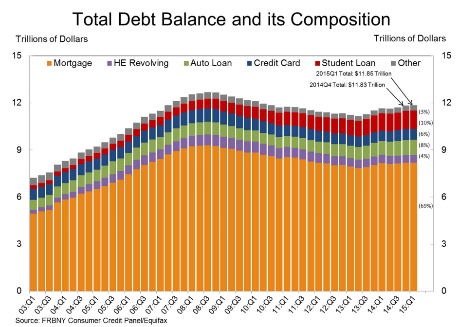 Click on graph for larger image.
Here are two graphs from the report:
The first graph shows aggregate consumer debt increased slightly in Q1. Household debt peaked in 2008, and bottomed in Q2 2013.
The recent increase in debt suggests households (in the aggregate) deleveraging is over.
 The second graph shows the percent of debt in delinquency. The percent of delinquent debt is generally declining, although there is still a large percent of debt 90+ days delinquent (Yellow, orange and red).
 The overall delinquency rate decreased to 5.7% in Q1, from 6.0% in Q4.
There are a number of credit graphs at the NY Fed site.
BLS: Jobs Openings at 5.0 million in March, Up 19% Year-over-year
by Calculated Risk on 5/12/2015 10:09:00 AM
From the BLS: Job Openings and Labor Turnover Summary
There were 5.0 million job openings on the last business day of March, little changed from 5.1 million in February, the U.S. Bureau of Labor Statistics reported today. Hires were little changed at 5.1 million in March and separations were little changed at 5.0 million....The following graph shows job openings (yellow line), hires (dark blue), Layoff, Discharges and other (red column), and Quits (light blue column) from the JOLTS.
...
Quits are generally voluntary separations initiated by the employee. Therefore, the quits rate can serve as a measure of workers’ willingness or ability to leave jobs. ... There were 2.8 million quits in March, little changed from February.
This series started in December 2000.
Note: The difference between JOLTS hires and separations is similar to the CES (payroll survey) net jobs headline numbers. This report is for March, the most recent employment report was for April.
 Click on graph for larger image.
Note that hires (dark blue) and total separations (red and light blue columns stacked) are pretty close each month. This is a measure of labor market turnover. When the blue line is above the two stacked columns, the economy is adding net jobs - when it is below the columns, the economy is losing jobs.
Jobs openings decreased in March to 4.994 million from 5.144 million in February.
The number of job openings (yellow) are up 19% year-over-year compared to March 2014.
Quits are up 14% year-over-year. These are voluntary separations. (see light blue columns at bottom of graph for trend for "quits").
This is another solid report. It is a good sign that job openings are around 5 million, and that quits are increasing solidly year-over-year.
NFIB: Small Business Optimism Index increased in April
by Calculated Risk on 5/12/2015 09:06:00 AM
From the National Federation of Independent Business (NFIB): Small Business Optimism Rises, But Future Sales Cloud Outlook
The Small Business Optimism Index increased 1.7 points from March to 96.9, this in spite of a quarter of virtually no economic growth. Unfortunately, the Index remained below the January reading. Nine of the 10 Index components gained, only real sales expectations were weaker. But this still leaves the Index below its historical average, oscillating between 95 and 98 but never breaking out except for December, when the Index just tipped past 100, only to fall again.More good news: Only 11 percent of companies reported "poor sales" as the most important problem, down from 16% a year ago, and a recession high of 34%.
...
Small businesses posted another decent month of job creation. Those that hired were more aggressive than those reducing employment, producing an average increase of 0.14 workers per firm, continuing a string of solid readings for 2015. ... Twenty-seven percent of all owners reported job openings they could not fill in the current period, up 3 points from March. A net 11 percent plan to create new jobs, up 1 point and a solid reading.
emphasis added
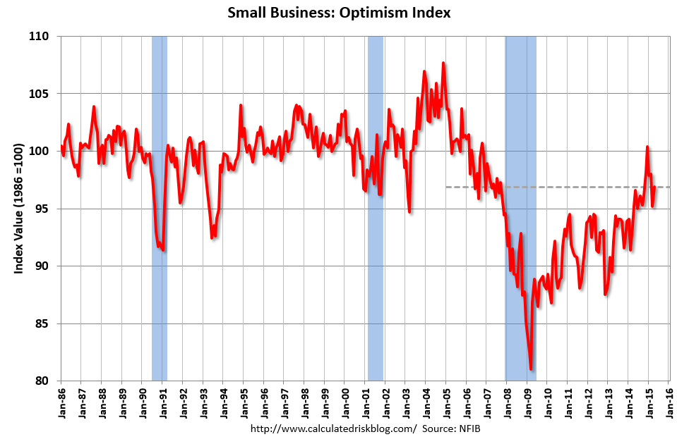 Click on graph for larger image.
This graph shows the small business optimism index since 1986.
The index increased to 96.9 in April from 95.2 in March.


