by Calculated Risk on 5/10/2015 08:28:00 PM
Sunday, May 10, 2015
Sunday Night Futures
On Greece from the NY Times: I.M.F. and Central Bank Loom Large Over Greece’s Debt Talks
Greece is expected to repay 750 million euros, or $840 million, to the monetary fund on Tuesday as scheduled. For the rest of the year, however, its debt repayments to the fund and the central bank total nearly €12 billion.Monday:
...
Discussions in the Greek government have included assessing the pros and cons of not paying the central bank and the monetary fund ... a few of the debt specialists ... contend that they have a strong intellectual case for defaulting on debt owed to the central bank and the monetary fund. For too long, they assert, Greece has been stuck in a cycle of having to borrow more money to pay off maturing debts. And each time it borrows more, it must accept economic austerity measures that deflate its economy.
A result, they argue, is that five years after Greece’s first bailout, the nation’s economy has contracted by a quarter, and its debt burden is approaching 200 percent of its gross domestic product.
• At 10:00 AM ET, the Fed will release the monthly Labor Market Conditions Index (LMCI).
Weekend:
• Schedule for Week of May 10, 2015
• Lawler: Analyzing/Projecting Household Formations: It’s Not Just “Demographics”
From CNBC: Pre-Market Data and Bloomberg futures: currently S&P futures and DOW futures are mostly unchanged (fair value).
Oil prices were mixeed over the last week with WTI futures at $59.30 per barrel and Brent at $65.41 per barrel. A year ago, WTI was at $100, and Brent was at $108 - so, even with the recent increases, prices are down 40%+ year-over-year.
Below is a graph from Gasbuddy.com for nationwide gasoline prices. Nationally prices are up to $2.67 per gallon (down about $1.00 per gallon from a year ago).
If you click on "show crude oil prices", the graph displays oil prices for WTI, not Brent; gasoline prices in most of the U.S. are impacted more by Brent prices.
| Orange County Historical Gas Price Charts Provided by GasBuddy.com |
The Projected Improvement in Life Expectancy
by Calculated Risk on 5/10/2015 10:07:00 AM
Note: This is an update to a post I wrote some time ago with more recent data and projections.
Here is something different, but it is important when looking at demographics ...
The following data is from the CDC United States Life Tables, 2010 by Elizabeth Arias.
The most frequently used life table statistic is life expectancy (ex), which is the average number of years of life remaining for persons who have attained a given age (x). ... Life expectancy at birth (e0) for 2010 for the total population was 78.7 years. ... Another way of assessing the longevity of the period life table cohort is by determining the proportion that survives to specified ages. ... To illustrate, 57,188 persons out of the original 2010 hypothetical life table cohort of 100,000 (or 57.2 %) were alive at exact age 80.Instead of look at life expectancy, here is a graph of survivors out of 100,000 born alive, by age for three groups: those born in 1900-1902, born in 1949-1951 (baby boomers), and born in 2010.
emphasis added
 Click on graph for larger image.
There was a dramatic change between those born in 1900 (blue) and those born mid-century (orange). The risk of infant and early childhood deaths dropped sharply, and the risk of death in the prime working years also declined significantly.
The CDC is projecting further improvement for childhood and prime working age for those born in 2010, but they are also projecting that people will live longer.
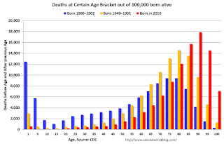 The second graph uses the same data but looks at the number of people who die before a certain age, but after the previous age. As an example, for those born in 1900 (blue), 12,448 of the 100,000 born alive died before age 1, and another 5,748 died between age 1 and age 5. That is 18.2% of those born in 1900 died before age 5.
In 1950, only 3.5% died before age 5. In 2010, it was 0.7%.
The peak age for deaths didn't change much for those born in 1900 and 1950 (between 76 and 80, but many more people born in 1950 will make it).
Now the CDC is projection the peak age for deaths - for those born in 2010 - will increase to 86 to 90!
Also the number of deaths for those younger than 20 will be very small (down to mostly accidents, guns, and drugs). Self-driving cars might reduce the accident components of young deaths.
In 1900, 25,2% died before age 20. And another 26.8% died before 55.
In 1950, 5.3% died before age 20. And another 18.7% died before 55. A dramatic decline in early deaths.
In 2010, 1.5% are projected to die before age 20. And only 9.7% before 55. A dramatic decline in prime working age deaths.
An amazing statistic: for those born in 1900, about 13 out of 100,000 made it to 100. For those born in 1950, 199 are projected to make to 100 - an significant increase. Now the CDC is projecting that 1,968 out of 100,000 born in 2010 will make it to 100. Stunning!
Some people look at this data and worry about supporting all the old people. To me, this is all great news - the vast majority of people can look forward to a long life - with fewer people dying in childhood or during their prime working years. Awesome!
Saturday, May 09, 2015
Lawler: Analyzing/Projecting Household Formations: It’s Not Just “Demographics”
by Calculated Risk on 5/09/2015 02:31:00 PM
From housing economist Tom Lawler: Analyzing/Projecting Household Formations: It’s Not Just “Demographics” (With a Special Focus on the 60’s and 70’s)
When talking about the outlook for housing, economists, analysts, and even home builders themselves often focus on “demographics.” Probably the most common discussion relates to recent trends in and future projections of the US population by age, with special emphasis on the age distribution of adults.
One of the simplest “models” used to analyze and project household growth is one that breaks out the actual and projected population by age buckets (or cohorts); looks at “recent” trends in “headship” rates, and then make what is often a “subjective” assumption of headship rates by age cohort based both on recent trends and historical “averages.”
There are, of course, several “challenges” related to this approach: first, of course, there are no timely reliable estimates of US households; rather, there are multiple and conflicting estimates based on different Census surveys. The only relatively reliable estimates come from the decennial Census, which is (1) seldom timely; and (2) provides analysts with only very infrequent “snapshots.”
The second challenge is that both headship and homeownership rates were decidedly unstable in the latter half of the last century, with many of the “swings” related not just to “economic” conditions but also to massive social and cultural changes.
Consider this simple example. Suppose that at the beginning of each decade one had perfect information on what the US population – both total and by age – would be a decade later, and suppose further that one assumed that “headship” rates (or the number of householders as a percent of the population) would be the same at the end of a decade as they were at the beginning of a decade for each age cohort. Here is what the resulting forecast for the increase in the number of households would have been compared to the “actual” increase in the number of households.
| Actual | Projected Assuming Previous Census Headship Rates | Difference | |
|---|---|---|---|
| 1960-1970 | 10,425,812 | 6,781,855 | 3,643,957 |
| 1970-1980 | 16,939,926 | 12,747,585 | 4,192,341 |
| 1980-1990 | 11,557,737 | 13,267,479 | -1,709,742 |
| 1990-2000 | 13,532,691 | 14,292,026 | -759,335 |
| 2000-2010 | 11,236,191 | 13,546,146 | -2,309,955 |
As the table indicates, a “constant for a decade headship-rate” model for household growth produced household projections that were massively to low during the 60’s and 70’s, but were significantly too high over the subsequent 30 years.
As I hope most folks know, the 60’s and 70’s were a time of huge social and cultural upheaval and change, and I won’t discuss these. One result, however, was a massive surge in the number of people living alone – from 1960 to 1980 the number of people living alone increased to 18.2 million from 7.1 million. The 158% jump in the number on one-person households from 1960 to 1980 obviously vastly exceeded the 26.3% increase in the overall population, and the share of people living alone increased for each “adult” age group – with especially large increases in “young” adults living alone. This “explosion” in the number of people living alone reflected substantial declines in marriage rates, sizable increases in the divorce rate (from 1970 to 1980 the number of divorced people living alone double), and significant increases in the number of widows living alone. It did not, interestingly, reflect a decline in the number of young adults living at home. Rather, it reflected a surge in the number of young adults who left home to live alone.
| Share of Population Living Alone by Age Group | |||
|---|---|---|---|
| Age | 1980 | 1970 | 1960 |
| 15-64 | 7.4% | 4.9% | 3.9% |
| 15-24 | 4.0% | 1.7% | |
| 25-34 | 9.0% | 3.8% | |
| 35-44 | 5.9% | 3.3% | |
| 45-64 | 10.3% | 9.3% | |
| 65+ | 27.7% | 24.6% | 17.5% |
The surge in the number of people living alone, which was driven as much by and probably more so by social and cultural changes as opposed to “economic” changes, produced sized increases in “headship” rates (and big declines in average household sizes), and as a result household growth massively outpaced population growth in a fashion not readily explainable by “demographics.”
Given the surge in the number of people living along, especially among “younger adults,” from 1970 to 1980, one might have expected the overall US homeownership rate to have declined over this period (the homeownership rate for one-person households has traditionally been way below that for married-couple families). In fact, however, the overall homeownership rate increased, mainly reflecting sizable increases in the homeownership rates for married-couple families in all age groups.
| Homeowership Rates | |||
|---|---|---|---|
| 1980 | 1970 | ||
| Total | 64.4% | 62.9% | |
| Married Couple Households | 77.8% | 70.7% | |
| 15-24 | 36.5% | 26.0% | |
| 25-34 | 66.9% | 56.9% | |
| 35-44 | 82.6% | 76.7% | |
| 45-64 | 87.1% | 80.8% | |
| 65+ | 83.0% | 78.4% | |
| Other 2+ Households | 43.8% | 49.5% | |
| One-Person Households | 43.5% | 42.4% | |
During most of the 1970’s the “typical” home buyer purchased a home that was much more modest than was the case in subsequent decades, both in terms of size, price relative to income, and housing expense relative to income, as during most of the decade buyers typically purchased a home mainly as a place to live rather than as an investment. In addition, manufactured housing was a much more important source of “affordable” housing back then – in 1980 16% of owner-occupied housing units built between 1970 and 1980 were manufactured homes/trailers.
As inflation accelerated during the decade, however, an increasing number of buyers, looking for a “hedge” against inflation, began to focus more on housing as an investment as well. That trend, which was temporarily halted by the surge in interest rates and the exceptionally severe recession of the early 1980’s, accelerated in the latter half of the 1980’s for a variety of reasons, and continued to accelerate (with a brief recession-related respite in the early 90’s) through much of last decade.
But that discussion will be in a subsequent edition.
Schedule for Week of May 10, 2015
by Calculated Risk on 5/09/2015 10:01:00 AM
The key economic report this week is April Retail sales on Wednesday.
For manufacturing, the April Industrial Production and Capacity Utilization report, and the May NY Fed (Empire State) survey will be released this week.
At 10:00 AM ET: The Fed will release the monthly Labor Market Conditions Index (LMCI).
9:00 AM: NFIB Small Business Optimism Index for April.
 10:00 AM: Job Openings and Labor Turnover Survey for March from the BLS.
 This graph shows job openings (yellow line), hires (purple), Layoff, Discharges and other (red column), and Quits (light blue column) from the JOLTS.
Jobs openings increased in February to 5.133 million from 4.965 million in January. This was the highest level for job openings since January 2001.
The number of job openings (yellow) were up 23% year-over-year, and Quits were up 10% year-over-year.
11:00 AM: The New York Fed will release their Q1 2015 Household Debt and Credit Report
7:00 AM: The Mortgage Bankers Association (MBA) will release the results for the mortgage purchase applications index.
 8:30 AM ET: Retail sales for April will be released.
This graph shows retail sales since 1992 through March 2015. This is monthly retail sales and food service, seasonally adjusted (total and ex-gasoline). On a monthly basis, retail sales increased 0.9% from February to March (seasonally adjusted), and sales were up 1.3% from March 2014.
The consensus is for retail sales to increase 0.2% in April, and to increase 0.5% ex-autos.
10:00 AM: Manufacturing and Trade: Inventories and Sales (business inventories) report for March. The consensus is for a 0.2% increase in inventories.
8:30 AM: The initial weekly unemployment claims report will be released. The consensus is for claims to increase to 276 thousand from 265 thousand.
8:30 AM ET: The Producer Price Index for April from the BLS. The consensus is for a 0.2% increase in prices, and a 0.1% increase in core PPI.
8:30 AM: NY Fed Empire State Manufacturing Survey for May. The consensus is for a reading of 5.0, up from -1.2 last month (above zero is expansion).
 9:15 AM: The Fed will release Industrial Production and Capacity Utilization for April.
This graph shows industrial production since 1967.
The consensus is for no change in Industrial Production, and for Capacity Utilization to be unchanged at 78.4%.
10:00 AM: University of Michigan's Consumer sentiment index (preliminary for May). The consensus is for a reading of 95.8, down from 95.9 in April.
Friday, May 08, 2015
Bank Failure Friday Returns: 5th Failure in 2015
by Calculated Risk on 5/08/2015 06:35:00 PM
From the FDIC: Republic Bank of Chicago, Oak Brook, Illinois, Assumes All of the Deposits of Edgebrook Bank, Chicago, Illinois
As of March 31, 2015, Edgebrook Bank had approximately $90.0 million in total assets and $90.0 million in total deposits. ... The FDIC estimates that the cost to the Deposit Insurance Fund (DIF) will be $16.8 million. Compared to other alternatives, ... Edgebrook Bank is the fifth FDIC-insured institution in the nation to fail this year, and the second in Illinois. The last FDIC-insured institution closed in the state was Highland Community Bank, Chicago, on January 23, 2015.This is the first bank closing since February, and it looks like failures might be in single digits this year (lowest since 2007 when 3 banks failed). Last year 18 banks were closed by regulators.
Lawler: More Builder Results (updated table)
by Calculated Risk on 5/08/2015 04:36:00 PM
Housing economist Tom Lawler sent me this updated table of builder results for Q1.
For these nine builders, net orders were up 20.3% year-over-year. Although cancellations are handled differently, this is about the same year-over-year increase for Q1 as for New Home sales as reported by the Census Bureau.
The average closing price is only up slightly this year following a sharp increase in 2014.
From Tom Lawler:
Below is a table with some summary statistics for nine large publicly-traded home builders for the first calendar quarter of 2015. While results varied across builders, the general themes were significantly higher unit sales, but lower home building margins, relative to the comparable quarter of 2014.
Net orders per community for these combined nine builders combined were up 13.2% YOY, and their combined order backlog at the end of March was up 14.8% from last March.
| Net Orders | Settlements | Average Closing Price | |||||||
|---|---|---|---|---|---|---|---|---|---|
| Qtr. Ended: | 3/15 | 3/14 | % Chg | 3/15 | 3/14 | % Chg | 3/15 | 3/14 | % Chg |
| D.R. Horton | 11,135 | 8,569 | 29.9% | 8,243 | 6,194 | 33.1% | $281,305 | 271,230 | 3.7% |
| PulteGroup | 5,139 | 4,863 | 5.7% | 3,365 | 3,436 | -2.1% | $323,000 | 317,000 | 1.9% |
| NVR | 3,926 | 3,325 | 18.1% | 2,534 | 2,211 | 14.6% | $371,000 | 361,400 | 2.7% |
| The Ryland Group | 2,389 | 2,186 | 9.3% | 1,463 | 1,470 | -0.5% | $343,000 | 327,000 | 4.9% |
| Beazer Homes | 1,698 | 1,390 | 22.2% | 936 | 977 | -4.2% | $305,800 | 272,400 | 12.3% |
| Standard Pacific | 1,571 | 1,311 | 19.8% | 972 | 995 | -2.3% | $528,000 | 483,000 | 9.3% |
| Meritage Homes | 1,979 | 1,525 | 29.8% | 1,335 | 1,109 | 20.4% | $387,000 | 366,000 | 5.7% |
| MDC Holdings | 1,593 | 1,236 | 28.9% | 909 | 873 | 4.1% | $414,800 | 364,900 | 13.7% |
| M/I Homes | 1,108 | 982 | 12.8% | 717 | 732 | -2.0% | $325,000 | 299,000 | 8.7% |
| Total | 30,538 | 25,387 | 20.3% | 20,474 | 17,997 | 13.8% | $330,848 | $318,886 | 3.8% |
Fannie and Freddie: REO inventory declined in Q1, Down 30% Year-over-year
by Calculated Risk on 5/08/2015 02:31:00 PM
Fannie and Freddie reported results this week. Here is some information on Real Estate Owned (REOs).
From Fannie Mae:
We continue to experience disproportionately higher credit losses and serious delinquency rates from single-family loans originated in 2005 through 2008 than from loans originated in other years. Single-family loans originated in 2005 through 2008 constituted 12% of our single-family book of business as of March 31, 2015 but constituted 59% of our seriously delinquent loans as of March 31, 2015 and drove 67% of our credit losses in the first quarter of 2015.From Freddie Mac:
emphasis added
Our single-family REO acquisitions in the first quarter of 2015 were highest in Florida, Illinois, Ohio, and Michigan, which collectively represented 38% of total single-family REO acquisitions during that period, based on the number of properties, and comprised 38% of our total single-family REO property inventory at March 31, 2015.Fannie and Freddie are still working through the backlog of loans made during the housing bubble, mostly in judicial foreclosure states.
Our REO acquisition activity is disproportionately high for certain types of loans, including loans with certain higher-risk characteristics. For example, the percentage of interest-only and Alt-A loans in our single-family credit guarantee portfolio, based on UPB, was approximately 2% and 3%, respectively, at March 31, 2015. The percentage of our REO acquisitions in the first quarter of 2015 that had been financed by either of these loan types represented approximately 20% of our total REO acquisitions, based on loan amount prior to acquisition. In addition, loans from our 2005-2008 Legacy single-family book comprised approximately 71% of our REO acquisition activity during the first quarter of 2015.
 Click on graph for larger image.
Here is a graph of Fannie and Freddie Real Estate Owned (REO).
REO inventory decreased in Q1 for both Fannie and Freddie, and combined inventory is down 30% year-over-year. For Freddie, this is the lowest level of REO since Q2 2008. For Fannie, this is the lowest level since Q3 2009.
Short term delinquencies are at normal levels, but there are still a fairly large number of properties in the foreclosure process with long time lines in judicial foreclosure states.
Employment Report Comments and Graphs
by Calculated Risk on 5/08/2015 11:52:00 AM
Earlier: April Employment Report: 223,000 Jobs, 5.4% Unemployment Rate
This was a decent employment report with 223,000 jobs added, but February and March were revised down by a combined 39,000 jobs.
However there is still limited wage growth, from the BLS: "In April, average hourly earnings for all employees on private nonfarm payrolls rose by 3 cents to $24.87. Over the past 12 months, average hourly earnings have increased by 2.2 percent." Weekly hours were unchanged.
A few more numbers: Total employment increased 223,000 from March to April and is now 3.0 million above the previous peak. Total employment is up 11.7 million from the employment recession low.
Private payroll employment increased 213,000 from March to April, and private employment is now 3.5 million above the previous peak. Private employment is up 12.3 million from the recession low.
In April, the year-over-year change was just under 3.0 million jobs.
Overall this is another positive month ... and moving in the right direction!
Employment-Population Ratio, 25 to 54 years old
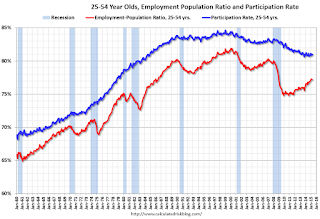
In the earlier period the participation rate for this group was trending up as women joined the labor force. Since the early '90s, the participation rate moved more sideways, with a downward drift starting around '00 - and with ups and downs related to the business cycle.
The 25 to 54 participation rate increased in April to 81.0%, and the 25 to 54 employment population ratio was unchanged at 77.2%. As the recovery continues, I expect the participation rate for this group to increase a little more (or at least stabilize for a couple of years) - although the participation rate has been trending down for this group since the late '90s.
Average Hourly Earnings
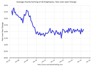
The blue line shows the nominal year-over-year change in "Average Hourly Earnings" for all private employees. Nominal wage growth increased slightly to 2.2%, however wages were revised down for February and March. Wages will probably pick up a little this year.
Note: CPI has been running under 2%, so there has been some real wage growth.
Part Time for Economic Reasons

The number of persons employed part time for economic reasons (sometimes referred to as involuntary part-time workers) was little changed at 6.6 million in April, but is down by 880,000 from a year earlier. These individuals, who would have preferred full-time employment, were working part time because their hours had been cut back or because they were unable to find a full-time job.The number of persons working part time for economic reasons decreased in April to 6.58 million from 6.70 million in March. This suggests slack still in the labor market. These workers are included in the alternate measure of labor underutilization (U-6) that decreased to 10.8% in April from 10.9% in March. This is the lowest level for U-6 since August 2008.
Unemployed over 26 Weeks
 This graph shows the number of workers unemployed for 27 weeks or more.
 According to the BLS, there are 2.525 million workers who have been unemployed for more than 26 weeks and still want a job. This was down from 2.563 million in March.
This is trending down - and is at the lowest level since November 2008 - but is still very high.
State and Local Government
 This graph shows total state and government payroll employment since January 2007. State and local governments had lost jobs for four straight years. (Note: Scale doesn't start at zero to better show the change.)
 In April 2015, state and local governments added 8,000 jobs (after losing 8,000 in March). State and local government employment is now up 132,000 from the bottom, but still 626,000 below the peak.
State and local employment is now generally increasing - slowly. And Federal government layoffs have slowed (Federal payrolls added 2,000 jobs in April, and Federal employment is unchanged year-to-date).
This was a decent employment report for April (not great, but not terrible). The year-over-year employment gains are still solid.
April Employment Report: 223,000 Jobs, 5.4% Unemployment Rate
by Calculated Risk on 5/08/2015 08:35:00 AM
From the BLS:
Total nonfarm payroll employment increased by 223,000 in April, and the unemployment rate was essentially unchanged at 5.4 percent, the U.S. Bureau of Labor Statistics reported today. Job gains occurred in professional and business services, health care, and construction. Mining employment continued to decline.
...
The change in total nonfarm payroll employment for February was revised from +264,000 to +266,000, and the change for March was revised from +126,000 to +85,000. With these revisions, employment gains in February and March combined were 39,000 lower than previously reported.
emphasis added
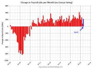 Click on graph for larger image.
The first graph shows the monthly change in payroll jobs, ex-Census (meaning the impact of the decennial Census temporary hires and layoffs is removed - mostly in 2010 - to show the underlying payroll changes).
Total payrolls increased by 223 thousand in April (private payrolls increased 213 thousand).
Payrolls for February and March were revised down by a combined 39 thousand.
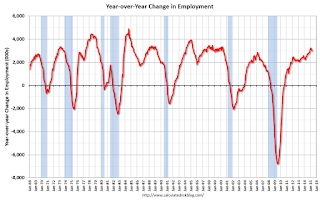 This graph shows the year-over-year change in total non-farm employment since 1968.
In April, the year-over-year change was just under 3.0 million jobs.
This is a solid year-over-year gain.
 The third graph shows the employment population ratio and the participation rate.
The Labor Force Participation Rate increased in April to 62.8%. This is the percentage of the working age population in the labor force. A large portion of the recent decline in the participation rate is due to demographics.
The Employment-Population ratio was unchanged at 59.3% (black line).
I'll post the 25 to 54 age group employment-population ratio graph later.
 The fourth graph shows the unemployment rate.
 The unemployment rate was declined in April to 5.4%.
This was at expectations of 220,000, however there March was revised down ... still a decent report.
I'll have much more later ...
Thursday, May 07, 2015
Friday: Jobs, Jobs, Jobs
by Calculated Risk on 5/07/2015 07:42:00 PM
Here is the employment preview I posted earlier: Preview: Employment Report for April
Goldman Sachs is forecasting 230,000 jobs added, and for the unemployment rate to decline to 5.4%.
Merrill Lynch is forecasting 235,000 jobs added in April, and the unemployment rate declining to 5.4%.
Nomura is forecasting 210,000 jobs, a 0.28% increase in wages month-to-month, and a 5.4% unemployment rate.
Friday:
• At 8:30 AM ET, the Employment Report for April. The consensus is for an increase of 220,000 non-farm payroll jobs added in April, up from the 126,000 non-farm payroll jobs added in March. The consensus is for the unemployment rate to decline to 5.4%.


