by Calculated Risk on 4/18/2015 10:56:00 AM
Saturday, April 18, 2015
Schedule for Week of April 19, 2015
The key economic reports this week are March new home sales on Thursday and existing home sales on Wednesday.
8:30 AM ET: Chicago Fed National Activity Index for March. This is a composite index of other data.
10:00 AM: Regional and State Employment and Unemployment (Monthly), March 2015
7:00 AM: The Mortgage Bankers Association (MBA) will release the results for the mortgage purchase applications index.
9:00 AM: FHFA House Price Index for February 2015. This was originally a GSE only repeat sales, however there is also an expanded index.
 10:00 AM: Existing Home Sales for March from the National Association of Realtors (NAR).
 The consensus is for sales of 5.03 million on seasonally adjusted annual rate (SAAR) basis. Sales in February were at a 4.88 million SAAR. Economist Tom Lawler estimates the NAR will report sales of 5.18 million SAAR.
A key will be the reported year-over-year increase in inventory of homes for sale.
During the day: The AIA's Architecture Billings Index for March (a leading indicator for commercial real estate).
8:30 AM: The initial weekly unemployment claims report will be released. The consensus is for claims to decrease to 290 thousand from 294 thousand.
 10:00 AM: New Home Sales for March from the Census Bureau.
 This graph shows New Home Sales since 1963. The dashed line is the February sales rate.
The consensus is for a decrease in sales to 510 thousand Seasonally Adjusted Annual Rate (SAAR) in March from 539 thousand in February.
8:30 AM: Durable Goods Orders for February from the Census Bureau. The consensus is for a 0.6% increase in durable goods orders.
Friday, April 17, 2015
Philly Fed: State Coincident Indexes increased in 46 states in February
by Calculated Risk on 4/17/2015 07:29:00 PM
From the Philly Fed:
The Federal Reserve Bank of Philadelphia has released the coincident indexes for the 50 states for February 2015. In the past month, the indexes increased in 46 states, decreased in one, and remained stable in three, for a one-month diffusion index of 90. Over the past three months, the indexes increased in 49 states and decreased in one (West Virginia), for a three-month diffusion index of 96.Note: These are coincident indexes constructed from state employment data. An explanation from the Philly Fed:
The coincident indexes combine four state-level indicators to summarize current economic conditions in a single statistic. The four state-level variables in each coincident index are nonfarm payroll employment, average hours worked in manufacturing, the unemployment rate, and wage and salary disbursements deflated by the consumer price index (U.S. city average). The trend for each state’s index is set to the trend of its gross domestic product (GDP), so long-term growth in the state’s index matches long-term growth in its GDP.
 Click on graph for larger image.
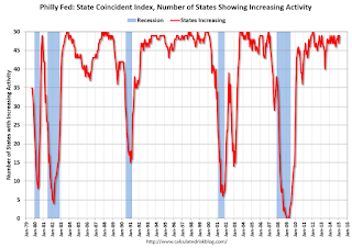
This is a graph is of the number of states with one month increasing activity according to the Philly Fed. This graph includes states with minor increases (the Philly Fed lists as unchanged).
In February, 49 states had increasing activity (including minor increases). This measure has been moving up and down, and is in the normal range for a recovery.
 Here is a map of the three month change in the Philly Fed state coincident indicators. This map was all red during the worst of the recession, and is almost all green again.
 It seems likely that several oil producing states will turn red sometime in 2015 - possibly Texas, North Dakota, Alaska or Oklahoma.
Key Measures Show Low Inflation in March
by Calculated Risk on 4/17/2015 04:17:00 PM
The Cleveland Fed released the median CPI and the trimmed-mean CPI this morning:
According to the Federal Reserve Bank of Cleveland, the median Consumer Price Index rose 0.2% (2.6% annualized rate) in March. The 16% trimmed-mean Consumer Price Index also rose 0.2% (2.2% annualized rate) during the month. The median CPI and 16% trimmed-mean CPI are measures of core inflation calculated by the Federal Reserve Bank of Cleveland based on data released in the Bureau of Labor Statistics’ (BLS) monthly CPI report.Note: The Cleveland Fed has the median CPI details for March here.
Earlier today, the BLS reported that the seasonally adjusted CPI for all urban consumers rose 0.2% (2.9% annualized rate) in March. The CPI less food and energy also rose 0.2% (2.8% annualized rate) on a seasonally adjusted basis.
 Click on graph for larger image.
This graph shows the year-over-year change for these four key measures of inflation. On a year-over-year basis, the median CPI rose 2.2%, the trimmed-mean CPI rose 1.8%, and the CPI less food and energy rose 1.8%. Core PCE is for February and increased 1.4% year-over-year.
On a monthly basis, median CPI was at 2.6% annualized, trimmed-mean CPI was at 2.2% annualized, and core CPI was at 2.8% annualized.
On a year-over-year basis these measures suggest inflation remains below the Fed's target of 2% (median CPI is slightly above 2%).
The key question for the Fed is if these key measures will move back towards 2%.
Goldman Sachs: "An Update on Student Loans: A Bigger Headwind but Still Not a Deal Breaker"
by Calculated Risk on 4/17/2015 03:06:00 PM
Some excerpts from interesting analysis by Goldman Sachs economists Alec Phillips and Hui Shan: An Update on Student Loans: A Bigger Headwind but Still Not a Deal Breaker
The upshot is that the student debt burden on young households has increased and it has become a bigger headwind to housing demand compared to a few years ago. That said, we still think the sheer size of the millennials who are currently in their 20s and whose housing consumption should increase sharply in the coming years will support aggregate housing demand.
However, we are skeptical that student loans would pose serious systemic risks even if default rates increased significantly from their already high levels. The main reason is simply that around two-thirds of the outstanding balance of student loans is held directly on the federal government's balance sheet, and most of the remainder is held in the form of asset backed securities that are guaranteed by the federal government, subject to a small first loss (up to 3% of the outstanding balance and accrued interest). ... The bottom line is that the non-guaranteed portion of federal student loan balances plus all non-federal student loans that have not yet been charged off by lenders is probably not much greater than $100 billion and could be as low as $20 billion.
Of slightly greater concern is the fact that student loan debt is in many ways senior to other forms of consumer debt. For example, student loans cannot generally be discharged in bankruptcy, and borrowers in default can face wage garnishments and reduced tax refunds, among other remedies. In theory, this makes it more likely that a borrower's limited income would be used to repay student loan debt rather than to service mortgage or other consumer debt. This could, in theory, increase the default rate on non-student debt during the next economic downturn.
That said, recent policy changes alleviate this concern somewhat. Income-based repayment programs, which limit required monthly payments to a manageable percentage of borrowers' income and, in some cases, allow remaining debt to be forgiven, should reduce the competition between debt service on student loans and other debt. The Obama Administration has recently expanded eligibility for these programs.
Overall, after updating our prior analysis on student loans we come away with the view that increased student debt levels, and particularly the concentration of higher levels of debt among some borrowers, could create some headwinds for consumers, but that the risk of an acute financial disruption caused by student loan defaults is low.
Lawler: Texas Employment Declines (Housing Impact)
by Calculated Risk on 4/17/2015 11:58:00 AM
From housing economist Tom Lawler: Texas: Non-Farm Payoll Employment Fell in March
The Texas Workforce Commission reported that non-farm payroll employment in the Lone Star State declined by 25,400 (or -0.22%) on a seasonally adjust basis in March, the first monthly decline since September 2009 and the largest monthly decline since August 2009. Declines were broad-based from an industry perspective, with mining and logging, construction, manufacturing, and the service-producing sectors all experiencing a monthly dip in employment.
From the end of 2013 to the end of 2014 non-farm payroll employment in Texas increased by 3.6%, easily outpacing the 2.3% growth for the US as a whole.
In 2014 single-family building permits in Texas were up 8.7% from 2013 compared to 1.5% for the US as a whole. In the first two months of 2015 single-family building permits in Texas were up 6.7% from the comparable period of 2014, compared to a YOY gain of 5.6% for the US as a whole.
CR note: As Lawler points out, single family building permits (and housing starts) have increased much faster in Texas than in the U.S. With the slowdown due to lower oil prices, employment is now falling, and building will probably slow.
Preliminary April Consumer Sentiment increases to 95.9
by Calculated Risk on 4/17/2015 10:03:00 AM
BLS: CPI increased 0.2% in March, Core CPI increased 0.2%
by Calculated Risk on 4/17/2015 08:32:00 AM
The Consumer Price Index for All Urban Consumers (CPI-U) increased 0.2 percent in March on a seasonally adjusted basis, the U.S. Bureau of Labor Statistics reported today. Over the last 12 months, the all items index declined 0.1 percent before seasonal adjustment.I'll post a graph later today after the Cleveland Fed releases the median and trimmed-mean CPI. This was lower than the consensus forecast of a 0.2% increase for CPI, and at the forecast of a 0.2% increase in core CPI.
The index for all items less food and energy rose 0.2 percent in March, the same increase as in January and February.
emphasis added
Thursday, April 16, 2015
Lawler: Updated Table of Distressed Sales and Cash buyers for Selected Cities in March
by Calculated Risk on 4/16/2015 08:59:00 PM
Friday:
• At 8:30 AM ET, the Consumer Price Index for March from the BLS. The consensus is for a 0.3% increase in prices, and a 0.2% increase in core CPI.
• At 10:00 AM, University of Michigan's Consumer sentiment index (preliminary for April). The consensus is for a reading of 93.7, up from 93.0 in March.
Economist Tom Lawler sent me the updated table below of short sales, foreclosures and cash buyers for a few selected cities in March.
On distressed: Total "distressed" share is down in most of these markets mostly due to a decline in short sales (Mid-Atlantic is up year-over-year because of an increase foreclosure as lenders work through the backlog).
Short sales are down in these areas.
The All Cash Share (last two columns) is declining year-over-year. As investors pull back, the share of all cash buyers will probably continue to decline.
| Short Sales Share | Foreclosure Sales Share | Total "Distressed" Share | All Cash Share | |||||
|---|---|---|---|---|---|---|---|---|
| Mar-15 | Mar-14 | Mar-15 | Mar-14 | Mar-15 | Mar-14 | Mar-15 | Mar-14 | |
| Las Vegas | 8.3% | 12.9% | 9.3% | 11.7% | 17.6% | 24.6% | 32.4% | 43.1% |
| Reno** | 5.0% | 14.0% | 8.0% | 7.0% | 13.0% | 21.0% | ||
| Phoenix | 3.2% | 5.1% | 4.2% | 6.9% | 7.4% | 11.9% | 27.5% | 33.1% |
| Sacramento | 5.4% | 8.2% | 6.9% | 7.9% | 12.3% | 16.1% | 19.3% | 22.5% |
| Minneapolis | 2.9% | 4.9% | 12.2% | 21.9% | 15.1% | 26.8% | ||
| Mid-Atlantic | 4.7% | 7.7% | 14.0% | 10.9% | 18.8% | 18.5% | 18.2% | 19.9% |
| Orlando | 4.2% | 7.9% | 26.9% | 23.7% | 31.1% | 31.6% | 38.2% | 44.6% |
| Chicago (city) | 21.9% | 28.8% | ||||||
| Hampton Roads | 22.7% | 24.5% | ||||||
| Northeast Florida | 31.0% | 39.1% | ||||||
| Richmond VA | 11.9% | 18.1% | 18.0% | 21.1% | ||||
| Tucson | 32.0% | 33.5% | ||||||
| Toledo | 32.7% | 40.7% | ||||||
| Des Moines | 16.3% | 20.8% | ||||||
| Omaha | 16.1% | 20.3% | ||||||
| Wichita | 23.2% | 32.0% | ||||||
| Pensacola | 33.4% | 35.7% | ||||||
| Memphis* | 15.5% | 18.5% | ||||||
| Springfield IL** | 11.8% | 14.4% | ||||||
| *share of existing home sales, based on property records **Single Family Only ***GAMLS | ||||||||
NMHC: Apartment Market Conditions Tighter in April Survey
by Calculated Risk on 4/16/2015 05:50:00 PM
From the National Multi Housing Council (NMHC): Apartment Markets Expand in April NMHC Quarterly Survey
All four indexes landed above the breakeven level of 50 in the April National Multifamily Housing Council (NMHC) Quarterly Survey of Apartment Market Conditions.
“The song remains the same—the apartment markets are not only strong but getting stronger,” said Mark Obrinsky, NMHC’s SVP of Research and Chief Economist. “Despite occasional predictions to the contrary, markets keep getting tighter. As new construction increases, so do absorptions, indicating the demand for apartments is not yet close to being sated.”
The Market Tightness Index increased by 7 points from last quarter (and by 2 points from a year earlier) to 58. Thirty-one percent of respondents reported tighter conditions than three months ago. This now marks the fifth consecutive quarter where the index indicates overall improving conditions.
emphasis added

Click on graph for larger image.
This graph shows the quarterly Apartment Tightness Index. Any reading above 50 indicates tighter conditions from the previous quarter. This indicates market conditions were tighter over the last quarter.
As I've mentioned before, this index helped me call the bottom for effective rents (and the top for the vacancy rate) early in 2010.
Comments on March Housing Starts
by Calculated Risk on 4/16/2015 02:54:00 PM
March was another disappointing month for housing start.
In February, it was easy to blame the weather, especially in the Northeast where starts plunged and then bounced back in March. However, in March, the weakness was more in the South and West (maybe related to oil prices in Texas and the drought in California).
Note: It is also possible that the West Coast port slowdown impacted starts a little in March. The labor situation was resolved in February, and any impact should disappear quickly.

This graph shows the month to month comparison between 2014 (blue) and 2015 (red).
Even with two weak months, starts are still running about 5% ahead of 2014 through March.
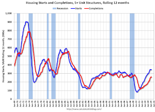
Below is an update to the graph comparing multi-family starts and completions. Since it usually takes over a year on average to complete a multi-family project, there is a lag between multi-family starts and completions. Completions are important because that is new supply added to the market, and starts are important because that is future new supply (units under construction is also important for employment).
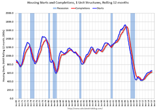
These graphs use a 12 month rolling total for NSA starts and completions.

The rolling 12 month total for starts (blue line) increased steadily over the last few years, and completions (red line) have lagged behind - but completions have been catching up (more deliveries), and will continue to follow starts up (completions lag starts by about 12 months).
Note that the blue line (multi-family starts) might be starting to move more sideways.
I think most of the growth in multi-family starts is probably behind us - although I expect solid multi-family starts for a few more years (based on demographics).

Note the exceptionally low level of single family starts and completions. The "wide bottom" was what I was forecasting several years ago, and now I expect several years of increasing single family starts and completions.


