by Calculated Risk on 8/20/2014 08:30:00 PM
Wednesday, August 20, 2014
Thursday: Existing Home Sales, Philly Fed Mfg Survey, Unemployment Claims
From Andrew Ross at the San Francisco Chronicle: Household income hasn't shared in recovery
As of June, median annual household income was 4.8 percent below December 2007, when the recession began, dropping from $56,000 to $54,000. Going back to the good old days, it's down 5.9 percent from January 2000, according to the Sentier Research Group, which compiled the numbers from the latest Current Population Survey by the U.S. Census Bureau.I think this is real household income (adjusted for inflation). Hopefully, as the unemployment rate continues to decline, the median real household income will start to increase.
Thursday:
• At 8:30 AM ET, the initial weekly unemployment claims report will be released. The consensus is for claims to decrease to 305 thousand from 311 thousand.
• At 10:00 AM, Existing Home Sales for July from the National Association of Realtors (NAR). The consensus is for sales of 5.00 million on seasonally adjusted annual rate (SAAR) basis. Sales in June were at a 5.04 million SAAR. Economist Tom Lawler estimates the NAR will report sales of 5.09 million SAAR. A key will be the reported year-over-year increase in inventory of homes for sale.
• Also at 10:00 AM, the Philly Fed manufacturing survey for August. The consensus is for a reading of 18.5, down from 23.9 last month (above zero indicates expansion).
Lawler: Updated Table of Distressed Sales and Cash buyers for Selected Cities in July
by Calculated Risk on 8/20/2014 04:34:00 PM
Economist Tom Lawler sent me the updated table below of short sales, foreclosures and cash buyers for several selected cities in July.
Comments from CR: Tom Lawler has been sending me this table every month for several years. I think it is very useful for looking at the trend for distressed sales and cash buyers in these areas. I sincerely appreciate Tom sharing this data with us!
On distressed: Total "distressed" share is down in all of these markets, mostly because of a sharp decline in short sales.
Short sales are down in all of these areas.
Foreclosures are down in most of these areas too, although foreclosures are up a little in few areas like Nevada, Sacramento, Orlando, Miami and the Mid-Atlantic (areas with foreclosure delays related to a judicial foreclosure process or state law changes).
The All Cash Share (last two columns) is mostly declining year-over-year. As investors pull back, the share of all cash buyers will probably continue to decline.
| Short Sales Share | Foreclosure Sales Share | Total "Distressed" Share | All Cash Share | |||||
|---|---|---|---|---|---|---|---|---|
| July-14 | July-13 | July-14 | July-13 | July-14 | July-13 | July-14 | July-13 | |
| Las Vegas | 11.5% | 28.0% | 10.1% | 8.0% | 21.6% | 36.0% | 35.6% | 54.5% |
| Reno** | 8.0% | 21.0% | 4.0% | 7.0% | 12.0% | 28.0% | ||
| Phoenix | 3.7% | 11.5% | 5.9% | 9.4% | 9.6% | 20.8% | 24.8% | 35.8% |
| Sacramento | 5.7% | 17.9% | 6.3% | 5.1% | 12.0% | 23.0% | 20.9% | 25.5% |
| Minneapolis | 3.0% | 5.7% | 9.5% | 15.0% | 12.5% | 20.7% | ||
| Mid-Atlantic | 4.3% | 6.6% | 7.7% | 6.6% | 12.1% | 13.2% | 17.1% | 16.1% |
| Orlando | 8.3% | 17.9% | 24.4% | 17.5% | 32.7% | 35.4% | 39.6% | 47.8% |
| California * | 6.6% | 12.7% | 5.6% | 8.3% | 12.2% | 21.0% | ||
| Bay Area CA* | 4.2% | 8.5% | 2.7% | 4.6% | 6.9% | 13.1% | 20.2% | 23.5% |
| So. California* | 5.9% | 12.7% | 5.2% | 7.7% | 11.1% | 20.4% | 24.5% | 30.0% |
| Miami MSA SF | 8.5% | 17.8% | 17.4% | 12.9% | 25.9% | 30.7% | 38.6% | 43.2% |
| Miami MSA C/TH | 5.1% | 12.6% | 21.7% | 17.1% | 26.8% | 29.7% | 68.1% | 75.0% |
| Georgia*** | 24.1% | N/A | ||||||
| Toledo | 32.9% | 35.0% | ||||||
| Wichita | 28.0% | 24.1% | ||||||
| Des Moines | 15.1% | 15.1% | ||||||
| Peoria | 18.4% | 18.6% | ||||||
| Tucson | 26.2% | 29.1% | ||||||
| Omaha | 17.0% | 15.9% | ||||||
| Pensacola | 32.9% | 30.0% | ||||||
| Memphis* | 13.4% | 16.9% | ||||||
| *share of existing home sales, based on property records **Single Family Only ***GAMLS | ||||||||
FOMC Minutes: Most Participants will wait for more data
by Calculated Risk on 8/20/2014 02:11:00 PM
Note: Most participants want to see more data - and several are still concerned that inflation is too low.
From the Fed: Minutes of the Federal Open Market Committee, July 29-30, 2014. Excerpts:
With respect to monetary policy over the medium run, participants generally agreed that labor market conditions and inflation had moved closer to the Committee's longer-run objectives in recent months, and most anticipated that progress toward those goals would continue. Moreover, many participants noted that if convergence toward the Committee's objectives occurred more quickly than expected, it might become appropriate to begin removing monetary policy accommodation sooner than they currently anticipated. Indeed, some participants viewed the actual and expected progress toward the Committee's goals as sufficient to call for a relatively prompt move toward reducing policy accommodation to avoid overshooting the Committee's unemployment and inflation objectives over the medium term. These participants were increasingly uncomfortable with the Committee's forward guidance. In their view, the guidance suggested a later initial increase in the target federal funds rate as well as lower future levels of the funds rate than they judged likely to be appropriate. They suggested that the guidance should more clearly communicate how policy-setting would respond to the evolution of economic data. However, most participants indicated that any change in their expectations for the appropriate timing of the first increase in the federal funds rate would depend on further information on the trajectories of economic activity, the labor market, and inflation. In particular, although participants generally saw the drop in real GDP in the first quarter as transitory, some noted that it increased uncertainty about the outlook, and they were looking to additional data on production, spending, and labor market developments to shed light on the underlying pace of economic growth. Moreover, despite recent inflation developments, several participants continued to believe that inflation was likely to move back to the Committee's objective very slowly, thereby warranting a continuation of highly accommodative policy as long as projected inflation remained below 2 percent and longer-term inflation expectations were well anchored.
...
Members discussed their assessments of progress--both realized and expected--toward the Committee's objectives of maximum employment and 2 percent inflation and considered enhancements to the statement language that would more clearly communicate the Committee's view on such progress. Regarding the labor market, many members concluded that a range of indicators of labor market conditions--including the unemployment rate as well as a number of other measures of labor utilization--had improved more in recent months than they anticipated earlier. They judged it appropriate to replace the description of recent labor market conditions that mentioned solely the unemployment rate with a description of their assessment of the remaining underutilization of labor resources based on their evaluation of a range of labor market indicators. In their discussion, some members expressed reservations about describing the extent of underutilization in labor resources more broadly. In particular, they worried that the degree of labor market slack was difficult to characterize succinctly and that the statement language might prove difficult to adjust as labor market conditions continued to improve. Moreover, they were concerned that, despite the improvement in labor market conditions, the new language might be misinterpreted as indicating increased concern about underutilization of labor resources. At the conclusion of the discussion, the Committee agreed to state that labor market conditions had improved, with the unemployment rate declining further, while also stating that a range of labor market indicators suggested that there remained significant underutilization of labor resources. Many members noted, however, that the characterization of labor market underutilization might have to change before long, particularly if progress in the labor market continued to be faster than anticipated. Regarding inflation, members agreed to update the language in the statement to acknowledge that inflation had recently moved somewhat closer to the Committee's longer-run objective and to convey their judgment that the likelihood of inflation running persistently below 2 percent had diminished somewhat.
emphasis added
AIA: Architecture Billings Index increased in July, "Highest Mark Since 2007"
by Calculated Risk on 8/20/2014 09:59:00 AM
Note: This index is a leading indicator primarily for new Commercial Real Estate (CRE) investment.
From AIA: Architecture Billings Index Reaches Highest Mark Since 2007
The last three months have shown steadily increasing demand for design services and the Architecture Billings Index (ABI) is now at its highest level since 2007. As a leading economic indicator of construction activity, the ABI reflects the approximate nine to twelve month lead time between architecture billings and construction spending. The American Institute of Architects (AIA) reported the July ABI score was 55.8, up noticeably from a mark of 53.5 in June. This score reflects an increase in design activity (any score above 50 indicates an increase in billings). The new projects inquiry index was 66.0, following a very strong mark of 66.4 the previous month.
The AIA has added a new indicator measuring the trends in new design contracts at architecture firms that can provide a strong signal of the direction of future architecture billings. The score for design contracts in July was 54.9.
“Business conditions for the design and construction marketplace, and those industries associated with it, appear to be well-positioned for continued growth in the coming months,” said AIA Chief Economist Kermit Baker, Hon. AIA, PhD. “The key to a more widespread boost in design activity continues to be the institutional sector which is starting to exhibit signs of life after languishing for the better part of the last five-plus years.”
• Regional averages: Northeast (55.5), South (55.1), Midwest (54.1), West (53.5) [three month average]
emphasis added
 Click on graph for larger image.
This graph shows the Architecture Billings Index since 1996. The index was at 55.8 in July, up from 53.5 in June. Anything above 50 indicates expansion in demand for architects' services.
Note: This includes commercial and industrial facilities like hotels and office buildings, multi-family residential, as well as schools, hospitals and other institutions.
According to the AIA, there is an "approximate nine to twelve month lag time between architecture billings and construction spending" on non-residential construction. So the readings over the last year suggest an increase in CRE investment this year and in 2015.
MBA: Mortgage Applications Increase in Latest MBA Weekly Survey
by Calculated Risk on 8/20/2014 07:01:00 AM
From the MBA: Mortgage Applications Increase in Latest MBA Weekly Survey
Mortgage applications increased 1.4 percent from one week earlier, according to data from the Mortgage Bankers Association’s (MBA) Weekly Mortgage Applications Survey for the week ending August 15, 2014. ...
The Refinance Index increased 3 percent from the previous week. The seasonally adjusted Purchase Index decreased 0.4 percent from one week earlier. ...
...
The average contract interest rate for 30-year fixed-rate mortgages with conforming loan balances ($417,000 or less) decreased to 4.29 percent from 4.35 percent, with points increasing to 0.26 from 0.22 (including the origination fee) for 80 percent loan-to-value ratio (LTV) loans.
emphasis added
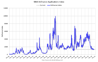 Click on graph for larger image.
The first graph shows the refinance index.
The refinance index is down 74% from the levels in May 2013.
As expected, refinance activity is very low this year.
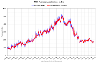 The second graph shows the MBA mortgage purchase index.
 According to the MBA, the unadjusted purchase index is down about 11% from a year ago.
Tuesday, August 19, 2014
Wednesday: FOMC Minutes
by Calculated Risk on 8/19/2014 09:32:00 PM
Wednesday:
• At 8:30 AM ET, the Mortgage Bankers Association (MBA) will release the results for the mortgage purchase applications index.
• During the day, the AIA's Architecture Billings Index for July (a leading indicator for commercial real estate).
• 2:00 PM, FOMC Minutes for the Meeting of July 29-3
In addition to housing starts for July, the Census Bureau also released the Q2 "Started and Completed by Purpose of Construction" report today.
It is important to remember that we can't directly compare single family housing starts to new home sales. For starts of single family structures, the Census Bureau includes owner built units and units built for rent that are not included in the new home sales report. For an explanation, see from the Census Bureau: Comparing New Home Sales and New Residential Construction
We are often asked why the numbers of new single-family housing units started and completed each month are larger than the number of new homes sold. This is because all new single-family houses are measured as part of the New Residential Construction series (starts and completions), but only those that are built for sale are included in the New Residential Sales series.However it is possible to compare "Single Family Starts, Built for Sale" to New Home sales on a quarterly basis.
The quarterly report released today showed there were 130,000 single family starts, built for sale, in Q2 2014, and that was above the 118,000 new homes sold for the same quarter, so inventory increased in Q2 (Using Not Seasonally Adjusted data for both starts and sales).
The first graph shows quarterly single family starts, built for sale and new home sales (NSA).
 Click on graph for larger image.
In 2005, and most of 2006, starts were higher than sales, and inventories of new homes increased. The difference on this graph is pretty small, but the builders were starting about 30,000 more homes per quarter than they were selling (speculative building), and the inventory of new homes soared to record levels. Inventory of under construction and completed new home sales peaked at 477,000 in Q3 2006.
In 2008 and 2009, the home builders started far fewer homes than they sold as they worked off the excess inventory that they had built up in 2005 and 2006.
Now it looks like builders are generally starting about the same number of homes that they are selling, and the inventory of under construction and completed new home sales is still very low.
Note: new home sales are reported when contracts are signed, so it is appropriate to compare sales to starts (as opposed to completions). This is not perfect because of the handling of cancellations, but it does suggest the builders are keeping inventories under control.
The second graph shows the NSA quarterly intent for four start categories since 1975: single family built for sale, owner built (includes contractor built for owner), starts built for rent, and condos built for sale.
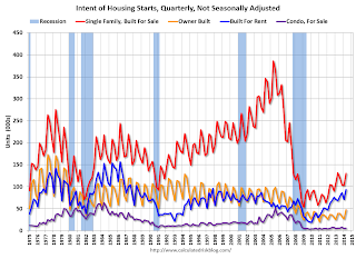 Single family starts built for sale were mostly unchanged compared to Q2 2013.
 Owner built starts were up 23% year-over-year. And condos built for sale are just above the record low.
The 'units built for rent' has increased significantly year-over-year.
Early Look at 2015 Cost-Of-Living Adjustments and Maximum Contribution Base
by Calculated Risk on 8/19/2014 03:16:00 PM
The BLS reported this morning:
The Consumer Price Index for Urban Wage Earners and Clerical Workers (CPI-W) increased 1.9 percent over the last 12 months to an index level of 234.525 (1982-84=100). For the month, the index fell 0.1 percent prior to seasonal adjustment.CPI-W is the index that is used to calculate the Cost-Of-Living Adjustments (COLA). The calculation dates have changed over time (see Cost-of-Living Adjustments), but the current calculation uses the average CPI-W for the three months in Q3 (July, August, September) and compares to the average for the highest previous average of Q3 months. Note: this is not the headline CPI-U, and is not seasonally adjusted (NSA).
Since the highest Q3 average was last year (Q3 2013), at 230.327, we only have to compare to last year.
 Click on graph for larger image.
This graph shows CPI-W since January 2000. The red lines are the Q3 average of CPI-W for each year.
Note: The year labeled for the calculation, and the adjustment is effective for December of that year (received by beneficiaries in January of the following year).
CPI-W was up 1.9% year-over-year in July, and although this is early - we need the data for August and September - my current guess is COLA will be higher than the previous two years, and will probably be close to 2% this year.
If gasoline prices continue to decline, COLA could be below 2%, but probably still higher than the previous two years (1.7% and 1.5% in 2013 and 2014).
Contribution and Benefit Base
The contribution base will be adjusted using the National Average Wage Index. This is based on a one year lag. The National Average Wage Index is not available for 2013 yet, but wages probably increased again in 2013. If wages increased the same as last year, then the contribution base next year will be increased to around $120,500 from the current $117,000.
Remember - this is an early look. What matters is average CPI-W for all three months in Q3 (July, August and September).
Key Measures Show Low Inflation in July
by Calculated Risk on 8/19/2014 12:14:00 PM
The Cleveland Fed released the median CPI and the trimmed-mean CPI this morning:
According to the Federal Reserve Bank of Cleveland, the median Consumer Price Index rose 0.1% (1.5% annualized rate) in July. The 16% trimmed-mean Consumer Price Index also increased 0.1% (1.6% annualized rate) during the month. The median CPI and 16% trimmed-mean CPI are measures of core inflation calculated by the Federal Reserve Bank of Cleveland based on data released in the Bureau of Labor Statistics' (BLS) monthly CPI report.Note: The Cleveland Fed has the median CPI details for July here.
Earlier today, the BLS reported that the seasonally adjusted CPI for all urban consumers rose 0.1% (1.1% annualized rate) in July. The CPI less food and energy increased 0.1% (1.2% annualized rate) on a seasonally adjusted basis.
 Click on graph for larger image.
This graph shows the year-over-year change for these four key measures of inflation. On a year-over-year basis, the median CPI rose 2.2%, the trimmed-mean CPI rose 1.9%, and the CPI less food and energy rose 1.9%. Core PCE is for June and increased just 1.5% year-over-year.
On a monthly basis, median CPI was at 1.5% annualized, trimmed-mean CPI was at 1.6% annualized, and core CPI increased 1.2% annualized.
On a year-over-year basis these measures suggest inflation remains at or below the Fed's target of 2%.
A few comments on July Housing Starts
by Calculated Risk on 8/19/2014 10:14:00 AM
This was a solid report for housing starts in July.
There were 585 thousand total housing starts during the first seven months of 2014 (not seasonally adjusted, NSA), up 9.1% from the 563 thousand during the same period of 2013. Single family starts are up 3%, and multi-family starts up 24%. The key weakness has been in single family starts.
Starts were up 21.7% year-over-year in July.
This solid year-over-year increase was due to a combination of more starts in July (highest this year), and an easier comparison to last year. There was a huge surge in housing starts early in 2013, and then a lull - and finally more starts at the end of the year.

This graph shows the month to month comparison between 2013 (blue) and 2014 (red).
Starts in Q1 averaged 925 thousand SAAR, and starts in Q2 averaged 997 thousand SAAR (up 8% from Q1). Q3 is off to a solid start.
This year, I expect starts to mostly increase throughout the year (Q1 will probably be the weakest quarter, and Q2 the second weakest). The comparisons will be easy for the next few months, and starts should finish the year up double digits from 2013.
Below is an update to the graph comparing multi-family starts and completions. Since it usually takes over a year on average to complete a multi-family project, there is a lag between multi-family starts and completions. Completions are important because that is new supply added to the market, and starts are important because that is future new supply (units under construction is also important for employment).
These graphs use a 12 month rolling total for NSA starts and completions.

The rolling 12 month total for starts (blue line) has been increasing steadily, and completions (red line) are lagging behind - but completions will continue to follow starts up (completions lag starts by about 12 months).
This means there will be an increase in multi-family completions later this year and in 2015.
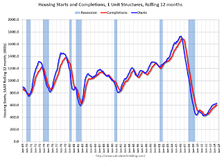
Single family starts had been moving up, but recently starts have been moving sideways on a rolling 12 months basis.
Note the exceptionally low level of single family starts and completions. The "wide bottom" was what I was forecasting several years ago, and now I expect several years of increasing single family starts and completions.
Housing Starts increase to 1.093 million Annual Rate in July
by Calculated Risk on 8/19/2014 08:30:00 AM
From the Census Bureau: Permits, Starts and Completions
Housing Starts:
Privately-owned housing starts in July were at a seasonally adjusted annual rate of 1,093,000. This is 15.7 percent above the revised June estimate of 945,000 and is 21.7 percent above the July 2013 rate of 898,000.
Single-family housing starts in July were at a rate of 656,000; this is 8.3 percent above the revised June figure of 606,000. The July rate for units in buildings with five units or more was 423,000.
emphasis added
Building Permits:
Privately-owned housing units authorized by building permits in July were at a seasonally adjusted annual rate of 1,052,000. This is 8.1 percent above the revised June rate of 973,000 and is 7.7 percent above the July 2013 estimate of 977,000.
Single-family authorizations in July were at a rate of 640,000; this is 0.9 percent above the revised June figure of 634,000. Authorizations of units in buildings with five units or more were at a rate of 382,000 in July.
 Click on graph for larger image.
The first graph shows single and multi-family housing starts for the last several years.
Multi-family starts (red, 2+ units) increased in July (Multi-family is volatile month-to-month).
Single-family starts (blue) also increased in July.
The second graph shows total and single unit starts since 1968.
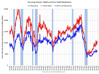 The second graph shows the huge collapse following the housing bubble, and that housing starts have been increasing after moving sideways for about two years and a half years.
 This was well above expectations of 963 thousand starts in July. Note: Starts for June were revised higher too.
This was a solid report with starts up 21.7% year-over-year in July.


