by Calculated Risk on 4/17/2014 05:59:00 PM
Thursday, April 17, 2014
LA area Port Traffic: Up year-over-year in March, Exports at New High
Container traffic gives us an idea about the volume of goods being exported and imported - and possibly some hints about the trade report for March since LA area ports handle about 40% of the nation's container port traffic.
The following graphs are for inbound and outbound traffic at the ports of Los Angeles and Long Beach in TEUs (TEUs: 20-foot equivalent units or 20-foot-long cargo container).
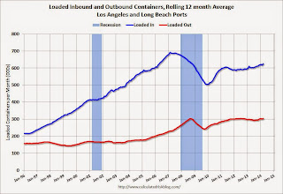
To remove the strong seasonal component for inbound traffic, the first graph shows the rolling 12 month average.
 Click on graph for larger image.
On a rolling 12 month basis, inbound traffic was up 1.3% compared to the rolling 12 months ending in February. Outbound traffic was up 0.9% compared to 12 months ending in February.
Inbound traffic has generally been increasing, and outbound traffic has been moving up a little after moving sideways.
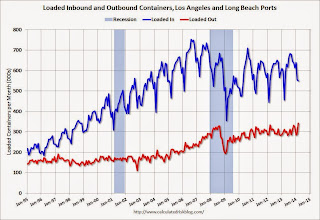
The 2nd graph is the monthly data (with a strong seasonal pattern for imports).
 Usually imports peak in the July to October period as retailers import goods for the Christmas holiday, and then decline sharply and bottom in February or March (depending on the timing of the Chinese New Year).
This suggests an increase in trade with Asia in March.
Hotels: Strongest Year since 2000
by Calculated Risk on 4/17/2014 01:12:00 PM
From HotelNewsNow.com: US hotels report strong weekly RevPAR
The U.S. hotel industry posted positive results in the three key performance measurements during the week of 6-12 April 2014, according to data from STR.Note: ADR: Average Daily Rate, RevPAR: Revenue per Available Room. These metrics are now at new highs.
In year-over-year measurements, the industry’s revenue per available room jumped 12.8% to $80.09. Occupancy for the week increased 7.1% to 68.5%. Average daily rate rose 5.3% to finish the week at $116.85.
emphasis added
The 4-week average of the occupancy rate is solidly above the median for 2000-2007, and is at the highest level since 2000.
The following graph shows the seasonal pattern for the hotel occupancy rate using the four week average.
 Click on graph for larger image.
The red line is for 2014 and black is for 2009 - the worst year since the Great Depression for hotels.
Through April 12th, the 4-week average of the occupancy rate is tracking higher than pre-recession levels.
It looks like 2014 should be a good year for hotels.
Data Source: Smith Travel Research, Courtesy of HotelNewsNow.com
Philly Fed Manufacturing Survey indicated Faster Expansion in April
by Calculated Risk on 4/17/2014 10:29:00 AM
From the Philly Fed: April Manufacturing Survey
Manufacturing activity in the region increased in April, according to firms responding to this month’s Business Outlook Survey. The survey’s broadest indicators for general activity, new orders, shipments, and employment all remained positive and increased from their readings in March. Price pressures remain modest. The surveyʹs indicators of future activity reflected optimism about continued expansion over the next six months, although the indicators have fallen from higher readings in recent months.This was above the consensus forecast of a reading of 9.1 for April.
The survey’s broadest measure of manufacturing conditions, the diffusion index of current activity, increased from a reading of 9.0 in March to 16.6 this month, its highest reading since last September.
The employment index remained positive for the 10th consecutive month and increased 5 points, suggesting overall improvement.
emphasis added
Weekly Initial Unemployment Claims at 304,000; 4-Week average lowest since 2007
by Calculated Risk on 4/17/2014 08:37:00 AM
The DOL reports:
In the week ending April 12, the advance figure for seasonally adjusted initial claims was 304,000, an increase of 2,000 from the previous week's revised level. The previous week's level was revised up by 2,000 from 300,000 to 302,000. The 4-week moving average was 312,000, a decrease of 4,750 from the previous week's revised average. This is the lowest level for this average since October 6, 2007 when it was 302,000.The previous week was revised up from 300,000.
The following graph shows the 4-week moving average of weekly claims since January 2000.
 Click on graph for larger image.
The dashed line on the graph is the current 4-week average. The four-week average of weekly unemployment claims decreased to 312,000.
This was lower than the consensus forecast of 320,000. The 4-week average is at normal levels for an expansion.
Wednesday, April 16, 2014
Thursday: Unemployment Claims, Philly Fed Mfg Survey
by Calculated Risk on 4/16/2014 08:55:00 PM
Some more data from DataQuick: California March Home Sales
An estimated 32,923 new and resale houses and condos sold statewide in March. That was up 28.2 percent from 25,680 in February, and down 12.8 percent from 37,764 sales in March 2013, according to San Diego-based DataQuick.A common theme now: As distress sales decline, overall sales decline too.
Last month’s sales were the lowest for a March since 2008, when 24,565 homes sold – a record low for the month of March. California’s high for March sales was 68,848 in 2005. Last month's sales were 23.9 percent below the average of 43,251 sales for all months of March since 1988, when DataQuick's statistics begin. California sales haven’t been above average for any particular month in more than eight years.
...
Of the existing homes sold last month, 7.4 percent were properties that had been foreclosed on during the past year. That was down from a revised 8.0 percent in February and down from 15.0 percent a year earlier. California’s foreclosure resales peaked at 58.8 percent in February 2009.
Short sales - transactions where the sale price fell short of what was owed on the property - made up an estimated 7.4 percent of the homes that resold last month. That was down from an estimated 9.3 percent the month before and 18.7 percent a year earlier.
Thursday:
• At 8:30 AM ET, the initial weekly unemployment claims report will be released. The consensus is for claims to increase to 320 thousand from 300 thousand.
• At 10:00 AM, the Philly Fed manufacturing survey for April. The consensus is for a reading of 9.1, up from 9.0 last month (above zero indicates expansion).
Lawler: Preliminary Table of Distressed Sales and Cash buyers for Selected Cities in March
by Calculated Risk on 4/16/2014 05:11:00 PM
Economist Tom Lawler sent me the preliminary table below of short sales, foreclosures and cash buyers for several selected cities in March.
From CR: Total "distressed" share is down in all of these markets, mostly because of a sharp decline in short sales.
Foreclosures are down in most of these areas too, although foreclosures are up in the mid-Atlantic area and Orlando - and a little in Las Vegas (there was a state law change that slowed foreclosures dramatically in Nevada at the end of 2011 - so it isn't a surprise that foreclosures are up a little year-over-year).
The All Cash Share (last two columns) is mostly declining year-over-year. As investors pull back, the share of all cash buyers will probably decline. Toledo's cash share is up.
In general it appears the housing market is slowly moving back to normal.
| Short Sales Share | Foreclosure Sales Share | Total "Distressed" Share | All Cash Share | |||||
|---|---|---|---|---|---|---|---|---|
| Mar-14 | Mar-13 | Mar-14 | Mar-13 | Mar-14 | Mar-13 | Mar-14 | Mar-13 | |
| Las Vegas | 12.9% | 33.3% | 11.7% | 11.2% | 24.6% | 44.5% | 43.1% | 57.5% |
| Reno** | 14.0% | 32.0% | 7.0% | 9.0% | 21.0% | 41.0% | ||
| Phoenix | 5.1% | 15.1% | 6.9% | 11.6% | 11.9% | 26.8% | 33.1% | 41.5% |
| Sacramento | 8.2% | 27.0% | 7.9% | 10.5% | 16.1% | 37.5% | 22.5% | 36.5% |
| Minneapolis | 4.7% | 9.3% | 21.9% | 28.3% | 26.6% | 37.6% | ||
| Mid-Atlantic | 6.4% | 11.4% | 10.9% | 10.7% | 17.3% | 22.1% | 19.9% | 20.6% |
| Orlando | 7.9% | 21.7% | 23.7% | 21.4% | 31.6% | 43.0% | 44.6% | 55.6% |
| So. California* | 7.7% | 18.7% | 6.4% | 13.8% | 14.1% | 32.5% | 29.1% | 35.1% |
| Hampton Roads | 24.5% | 28.4% | ||||||
| Northeast Florida | 39.1% | 40.2% | ||||||
| Toledo | 40.7% | 38.9% | ||||||
| Des Moines | 20.8% | 19.1% | ||||||
| Tucson | 33.5% | 35.0% | ||||||
| Georgia*** | 33.8% | NA | ||||||
| Houston | 6.8% | 12.3% | ||||||
| Memphis* | 18.5% | 26.7% | ||||||
| Springfield IL** | 14.0% | 26.1% | ||||||
| *share of existing home sales, based on property records **Single Family Only ***GAMLS | ||||||||
Fed's Beige Book: "Economic activity increased in most regions"
by Calculated Risk on 4/16/2014 02:07:00 PM
Fed's Beige Book "Prepared at the Federal Reserve Bank of Richmond and based on information collected before April 7, 2014."
Reports from the twelve Federal Reserve Districts suggest economic activity increased in most regions of the country since the previous report. The expansion was characterized as modest or moderate by the Boston, Philadelphia, Richmond, Atlanta, Minneapolis, Kansas City, Dallas, and San Francisco Districts. Chicago reported that economic growth had picked up, and New York and Philadelphia indicated that business activity had rebounded from weather-related slowdowns earlier in the year. The Cleveland and St. Louis Districts both reported a decline in economic activity.And on real estate:
Reports on residential housing markets varied. However, across most Districts, home prices rose modestly and inventory levels remained low. Residential construction increased in several Districts; only Cleveland, St. Louis, and Minneapolis reported a decrease. ...Some positive comments on commercial real estate. This is similar to the previous beige book, but it appears there is some weather related rebound in some areas.
Commercial construction activity strengthened since the previous survey period for the Kansas City and Dallas Districts. The Richmond, Atlanta, Chicago, St. Louis, Minneapolis, and San Francisco Districts reported modest to moderate expansion in commercial construction. Philadelphia noted mild growth, while Cleveland reported a slight decline in commercial construction.
emphasis added
Yellen: Three Big Questions for the FOMC
by Calculated Risk on 4/16/2014 12:20:00 PM
From Fed Chair Janet Yellen: Monetary Policy and the Economic Recovery. Excerpts:
Is there still significant slack in the labor market?Currently Yellen sees substantial slack in the labor market, and is more concerned about low inflation than high inflation. This suggests rate will be low for a long time.
...
I will refer to the shortfall in employment relative to its mandate-consistent level as labor market slack, and there are a number of different indicators of this slack. Probably the best single indicator is the unemployment rate. At 6.7 percent, it is now slightly more than 1 percentage point above the 5.2 to 5.6 percent central tendency of the Committee's projections for the longer-run normal unemployment rate. This shortfall remains significant, and in our baseline outlook, it will take more than two years to close.
Other data suggest that there may be more slack in labor markets than indicated by the unemployment rate. For example, the share of the workforce that is working part time but would prefer to work full time remains quite high by historical standards. Similarly, while the share of workers in the labor force who are unemployed and have been looking for work for more than six months has fallen from its peak in 2010, it remains as high as any time prior to the Great Recession. ...
The low level of labor force participation may also signal additional slack that is not reflected in the headline unemployment rate. Participation would be expected to fall because of the aging of the population, but the decline steepened in the recovery. Although economists differ over what share of those currently outside the labor market might join or rejoin the labor force in a stronger economy, my own view is that some portion of the decline in participation likely represents labor market slack.
Lastly, economists also look to wage pressures to signal a tightening labor market. At present, wage gains continue to proceed at a historically slow pace in this recovery, with few signs of a broad-based acceleration.
Is inflation moving back toward 2 percent?
...
I will mention two considerations that will be important in assessing whether inflation is likely to move back to 2 percent as the economy recovers. First, we anticipate that, as labor market slack diminishes, it will exert less of a drag on inflation. However, during the recovery, very high levels of slack have seemingly not generated strong downward pressure on inflation. We must therefore watch carefully to see whether diminishing slack is helping return inflation to our objective.10 Second, our baseline projection rests on the view that inflation expectations will remain well anchored near 2 percent and provide a natural pull back to that level. But the strength of that pull in the unprecedented conditions we continue to face is something we must continue to assess.
Finally, the FOMC is well aware that inflation could also threaten to rise substantially above 2 percent. At present, I rate the chances of this happening as significantly below the chances of inflation persisting below 2 percent, but we must always be prepared to respond to such unexpected outcomes, which leads us to my third question.
What factors may push the recovery off track?
Myriad factors continuously buffet the economy, so the Committee must always be asking, "What factors may be pushing the recovery off track?" For example, over the nearly 5 years of the recovery, the economy has been affected by greater-than-expected fiscal drag in the United States and by spillovers from the sovereign debt and banking problems of some euro-area countries. Further, our baseline outlook has changed as we have learned about the degree of structural damage to the economy wrought by the crisis and the subsequent pace of healing.
A comment on Housing Starts
by Calculated Risk on 4/16/2014 11:27:00 AM
There were 203 thousand total housing starts in Q1 this year (not seasonally adjusted, NSA), down 2% from the 208 thousand during Q1 of 2013. Note: Permits were up 6% in Q1 2014 compared to Q1 2013 - still weak growth, but positive.
The weak start to 2014 was due to several factors: severe weather, higher mortgage rates, higher prices and probably supply constraints in some areas.
It is also important to note that Q1 was a difficult year-over-year comparison for housing starts. There was a huge surge for housing starts in Q1 2013 (up 34% over Q1 2012). Then starts softened a little over the next 7 months until November.
 Click on graph for larger image.
This year, I expect starts to be stronger over the next couple of quarters - and more starts combined with an easier comparison means starts will be up solidly year-over-year.
In 2013, the year-over-year comparisons ranged from a high of 42% to a low of just 2% - so there is quite a bit of variability. Overall starts finished up a solid 18.5% last year compared to 2012, and I still expect solid growth this year.
Here is an update to the graph comparing multi-family starts and completions. Since it usually takes over a year on average to complete a multi-family project, there is a lag between multi-family starts and completions. Completions are important because that is new supply added to the market, and starts are important because that is future new supply (units under construction is also important for employment).
These graphs use a 12 month rolling total for NSA starts and completions.
 The blue line is for multifamily starts and the red line is for multifamily completions.
The rolling 12 month total for starts (blue line) has been increasing steadily, and completions (red line) are lagging behind - but completions will continue to follow starts up (completions lag starts by about 12 months).
This means there will be an increase in multi-family completions in 2014, but probably still below the 1997 through 2007 level of multi-family completions. Multi-family starts will probably move more sideways in 2014.
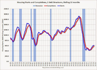
 The second graph shows single family starts and completions. It usually only takes about 6 months between starting a single family home and completion - so the lines are much closer. The blue line is for single family starts and the red line is for single family completions.
Starts have been moving up, and completions have followed.
Note the exceptionally low level of single family starts and completions. The "wide bottom" was what I was forecasting several years ago, and now I expect several years of increasing single family starts and completions.
Fed: Industrial Production increased 0.7% in March
by Calculated Risk on 4/16/2014 09:15:00 AM
From the Fed: Industrial production and Capacity Utilization
Industrial production increased 0.7 percent in March after having advanced 1.2 percent in February. The rise in February was higher than previously reported primarily because of stronger gains for durable goods manufacturing and for mining. For the first quarter as a whole, industrial production moved up at an annual rate of 4.4 percent, just slightly slower than in the fourth quarter of 2013. In March, the output of manufacturing rose 0.5 percent, the output of utilities increased 1.0 percent, and the output of mines gained 1.5 percent. At 103.2 percent of its 2007 average, total industrial production in March was 3.8 percent above its level of a year earlier. Capacity utilization for total industry increased in March to 79.2 percent, a rate that is 0.9 percentage point below its long-run (1972–2013) average but 1.2 percentage points higher than a year prior.
emphasis added
 Click on graph for larger image.
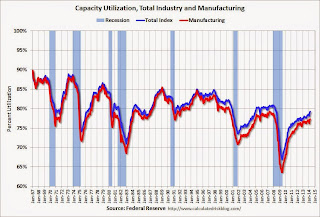
This graph shows Capacity Utilization. This series is up 12.3 percentage points from the record low set in June 2009 (the series starts in 1967).
Capacity utilization at 79.2% is still 0.9 percentage points below its average from 1972 to 2012 and below the pre-recession level of 80.8% in December 2007.
Note: y-axis doesn't start at zero to better show the change.
 The second graph shows industrial production since 1967.
Industrial production increased 0.7% in March to 103.2. This is 23% above the recession low, and 2.5% above the pre-recession peak.
The monthly change for both Industrial Production and Capacity Utilization were above expectations.


