by Calculated Risk on 8/11/2011 03:07:00 PM
Thursday, August 11, 2011
U.S. Births Decline in 2010
This provisional data for 2010 was released in June and shows a possible impact of the serious recession ...
From the National Center for Health Statistics: Recent Trends in Births and Fertility Rates Through 2010. The NCHS reports (provisional):
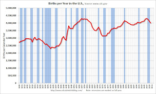
The provisional count of births in the United States for 2010 (12-month period ending December 2010) was 4,007,000. This count was 3 percent less than the number of births in 2009 (4,131,019) and 7 percent less than the all-time high of 4,316,233 births in 2007.Here is a long term graph of annual U.S. births through 2010 ...
The provisional fertility rate for 2010 was 64.7 births per 1,000 women aged 15–44. This was 3 percent less than the 2009 preliminary rate of 66.7 and 7 percent less than the 17-year high of 69.5 in 2007.
 Click on graph for larger image in new window.
Births have declined for three consecutive years, and are now 7% below the peak in 2007. I suspect certain segments of the population were under stress before the recession started - like construction workers - and even more families were in distress in 2008 through 2011. Of course it takes 9 months to have a baby, so families in distress in 2010 probably put off having babies in 2011 too.
Notice that the number of births started declining a number of years before the Great Depression started. Many families in the 1920s were under severe stress long before the economy collapsed. By 1933 births were down by almost 23% from the early '20s levels.
Of course economic distress isn't the only reason births decline - look at the huge decline following the baby boom that was driven by demographics. But it is not surprising that the number of births slow or decline during tough economic times - and that appears to be happening now.
I don't think the percentage decline in births will be anything like what happened during the Depression, but a 7% decline is pretty significant.
Hotels: Occupancy Rate increased 1.4 Percent compared to same week in 2010
by Calculated Risk on 8/11/2011 12:08:00 PM
Note: This is one of the industry specific measures that I follow. I only post this once a month or so. Looking back at this data during the recession, hotel occupancy first declined in Dec 2007, and then declined sharply in the fall of 2008. Right now I don't see any special weakness in the occupancy rate that would suggest another recession.
From HotelNewsNow.com: STR: Midscale lags in weekly hotel results
Overall, the U.S. hotel industry’s occupancy rose 1.4% to 71.2%, ADR increased 3.3% to US$102.52, and RevPAR finished the week up 4.8% to US$72.99.Note: ADR: Average Daily Rate, RevPAR: Revenue per Available Room.
The following graph shows the seasonal pattern for the hotel occupancy rate using a four week average for the occupancy rate.
 Click on graph for larger image in graph gallery.
The summer leisure travel season has peaked, and the 4-week average of the occupancy rate will now start to decrease. Right now the occupancy rate is tracking just above 2008 - and well above 2009 - but still below the "normal" level.
Data Source: Smith Travel Research, Courtesy of HotelNewsNow.com
Trade Deficit increased in June
by Calculated Risk on 8/11/2011 09:15:00 AM
The Department of Commerce reports:
[T]otal June exports of $170.9 billion and imports of $223.9 billion resulted in a goods and services deficit of $53.1 billion, up from $50.8 billion in May, revised. June exports were $4.1 billion less than May exports of $175.0 billion. June imports were $1.9 billion less than May imports of $225.8 billion.The trade deficit was well above the consensus forecast of $48 billion.
The first graph shows the monthly U.S. exports and imports in dollars through June 2011.
 Click on graph for larger image.
Both exports and imports decreased in June (seasonally adjusted). Exports are well above the pre-recession peak and up 13% compared to June 2010; imports are almost back to the pre-recession peak, and up about 13% compared to June 2010.
The second graph shows the U.S. trade deficit, with and without petroleum, through June.
 The blue line is the total deficit, and the black line is the petroleum deficit, and the red line is the trade deficit ex-petroleum products.
Oil averaged $106.00 per barrel in June, down from $108.70 per barrel in May. There is a bit of a lag with prices, and import prices will fall further in July.
The trade deficit with China increased to $26.7 billion; trade with China remains a significant issue.
Weekly Initial Unemployment Claims decline to 395,000
by Calculated Risk on 8/11/2011 08:30:00 AM
The DOL reports:
In the week ending August 6, the advance figure for seasonally adjusted initial claims was 395,000, a decrease of 7,000 from the previous week's revised figure of 402,000. The 4-week moving average was 405,000, a decrease of 3,250 from the previous week's revised average of 408,250.The following graph shows the 4-week moving average of weekly claims since January 2000 (longer term graph in graph gallery).
 Click on graph for larger image in graph gallery.
The dashed line on the graph is the current 4-week average. The four-week average of weekly unemployment claims decreased this week to 405,000.
The 4-week average is still elevated, but has been moving down since mid-May. This is the lowest level for the 4-week average since early April and the first week under 400,000 since April 2nd.
Wednesday, August 10, 2011
Misc: France, Futures and More
by Calculated Risk on 8/10/2011 11:22:00 PM
• From Nelson Schwartz at the NY Times: Financial Turmoil Evokes Comparison to 2008 Crisis
Many Americans are wondering whether they are in for a repeat of the financial crisis of 2008.The European financial crisis remains a big unknown now, but I think investors are mostly concerned with lower U.S. and global growth prospects.
The answer is a matter of fierce debate ...
• And on Europe, here is a resource for Sovereign Credit-Default Swaps (ht Steve).
• The concern today was that France might lose its AAA rating and that would impact the European bailout fund, the EFSF. From the WSJ: France Considers Further Austerity
French government pledged Wednesday to consider fresh tax rises, spending cuts and other budget measures ... French bank shares were hammered Wednesday also, with some traders citing the triple-A jitters. Shares in Société Générale were down over 18% in afternoon Paris trading and BNP Paribas shares slid over 10%.• Here is a graph of the 10 year spread (Italy to Germany) from Bloomberg (currently 290). And for Spain to Germany (284).
• The Asian markets are mixed tonight with the Nikkei down 1.3%. The Shanghai is up 1%.
• U.S. Futures from CNBC: Pre-Market Data and Bloomberg futures: the S&P 500 is up about 17 points, and Dow futures are up about 150 points.
• Oil: WTI futures are up to $82 per barrel and Brent is up to $106.
FHFA, Treasury, HUD Seek Input on Disposition of REOs
by Calculated Risk on 8/10/2011 07:53:00 PM
From FHFA: FHFA, Treasury, HUD Seek Input on Disposition of Real Estate Owned Properties
The Federal Housing Finance Agency (FHFA), in consultation with the U.S. Department of the Treasury and Department of Housing and Urban Development (HUD), has announced a Request For Information (RFI), seeking input on new options for selling single-family real estate owned (REO) properties held by Fannie Mae and Freddie Mac (the Enterprises), and the Federal Housing Administration (FHA).Let me repeat the graphs I posted on Monday:
The RFI’s objective is to help address current and future REO inventory. It will explore alternatives for maximizing value to taxpayers and increasing private investment in the housing market, including approaches that support rental and affordable housing needs.
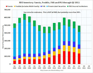
The combined REO (Real Estate Owned) inventory for Fannie, Freddie and the FHA decreased to 250,982 at the end of Q2 from a record 288,341 units at the end of Q1. The "F's" REO inventory increased 6% compared to Q2 2010 (year-over-year comparison).
 Click on graph for larger image in new window.
This graph shows the REO inventory for Fannie, Freddie and FHA through Q2 2011.
The REO inventory for the "Fs" increased sharply in 2010, but may have peaked in Q4 2010. However there may be a new peak when the foreclosure dam breaks.
The second graph shows REO inventory for Fannie, Freddie, FHA, Private Label Securities (PLS), and FDIC insured institutions. (economist Tom Lawler has provided some of this data).
 Total REO decreased to 495,000 in Q2 from almost 550,000 in Q1.
As Tom Lawler noted: "This is NOT an estimate of total residential REO, as it excludes non-FHA government REO (VA, USDA, etc.), credit unions, finance companies, non-FDIC-insured banks and thrifts, and a few other lender categories." However this is the bulk of the REO - probably 90% or more. Rounding up the estimate (using 90%) suggests total REO is around 550,000 in Q2.
But this is only the current REO, there are also a large number of properties in the "90 days delinquent" and "in foreclosure" buckets. Here is a graph I posted on Sunday:
 This graph shows the delinquent and REO buckets over time. The delinquency data is from LPS, and the REO estimates are based on work by Tom Lawler and my own calculations.
The dashed lines are "normal" historical levels for each bucket. The 30 day bucket is only slightly elevated (as of June), and the 60 day buckets is somewhat elevated. But the glaring problems are in the 90 day and in-foreclosure buckets.
There are 4.1 million seriously delinquent loans (90 day and in-foreclosure). This is about 3 million more properties than normal.
Nick Timiraos at the WSJ noted:
Together with the Federal Housing Administration, the entities owned about 250,000 homes at the end of June, or around half of all unsold, repossessed properties. Another 830,000 homes backed by the entities are in some stage of foreclosure, according to Barclays Capital.Of those 2.1 million in the foreclosure process, less than half are related to the F's.
I'll try to add some proposal ideas soon.
Dow Down 500+, S&P 500 down 4.4%
by Calculated Risk on 8/10/2011 04:14:00 PM
This was the third big down day this month ...
From the WSJ: Stocks Slide 4.6%, Erasing Tuesday Gains
The Dow Jones Industrial Average fell 520.29 points, or 4.6%, to 10719.48, while the Standard & Poor's 500-stock index slid 51.83 points, or 4.4%, to 1120.70 and the Nasdaq Composite lost 101.47 points, or 4.1%, to 2381.05.The table below shows the largest down days on the S&P 500 since 1950.
... In a reflection of investor concern, the CBOE Market Volatility Index, the "fear gauge" known as the VIX, surged 18%
| Largest S&P 500 One Day Percentage Declines since 1950 | ||||||
|---|---|---|---|---|---|---|
| Date | Percent Decline | Close | Previous Close | Six Months Later | ||
| 1 | 10/19/1987 | -20.5% | 224.84 | 282.7 | 15.3% | |
| 2 | 10/15/2008 | -9.0% | 907.84 | 998.01 | -4.7% | |
| 3 | 12/1/2008 | -8.9% | 816.21 | 896.24 | 15.7% | |
| 4 | 9/29/2008 | -8.8% | 1106.42 | 1213.27 | -28.8% | |
| 5 | 10/26/1987 | -8.3% | 227.67 | 248.22 | 15.3% | |
| 6 | 10/9/2008 | -7.6% | 909.92 | 984.94 | -5.9% | |
| 7 | 10/27/1997 | -6.9% | 876.99 | 941.64 | 23.7% | |
| 8 | 8/31/1998 | -6.8% | 957.28 | 1027.14 | 28.0% | |
| 9 | 1/8/1988 | -6.8% | 243.4 | 261.07 | 11.7% | |
| 10 | 11/20/2008 | -6.7% | 752.44 | 806.58 | 17.9% | |
| 11 | 5/28/1962 | -6.7% | 55.5 | 59.47 | 10.6% | |
| 12 | 8/8/2011 | -6.7% | 1,119.47 | 1199.38 | --- | |
| 13 | 9/26/1955 | -6.6% | 42.61 | 45.63 | 14.1% | |
| 14 | 10/13/1989 | -6.1% | 333.65 | 355.39 | 3.2% | |
| 15 | 11/19/2008 | -6.1% | 806.58 | 859.12 | 10.1% | |
| 16 | 10/22/2008 | -6.1% | 896.78 | 955.05 | -5.0% | |
| 17 | 4/14/2000 | -5.8% | 1356.56 | 1440.51 | -2.0% | |
| 18 | 10/7/2008 | -5.7% | 996.23 | 1056.89 | -18.1% | |
| 19 | 6/26/1950 | -5.4% | 18.11 | 19.14 | 10.0% | |
| 20 | 1/20/2009 | -5.3% | 805.22 | 850.12 | 18.1% | |
| 21 | 11/5/2008 | -5.3% | 952.77 | 1005.75 | -4.8% | |
| 22 | 11/12/2008 | -5.2% | 852.3 | 898.95 | 4.8% | |
| 23 | 10/16/1987 | -5.2% | 282.7 | 298.08 | -8.1% | |
| 24 | 11/6/2008 | -5.0% | 904.88 | 952.77 | 2.7% | |
| 25 | 9/17/2001 | -4.9% | 1038.77 | 1092.54 | 12.2% | |
| 26 | 2/10/2009 | -4.9% | 827.16 | 869.89 | 21.8% | |
| 27 | 9/11/1986 | -4.8% | 235.18 | 247.06 | 23.4% | |
| 28 | 8/4/2011 | -4.8% | 1200.07 | 1260.34 | --- | |
| 29 | 9/17/2008 | -4.7% | 1156.39 | 1213.6 | -31.3% | |
| 30 | 9/15/2008 | -4.7% | 1192.7 | 1251.7 | -36.8% | |
| 31 | 3/2/2009 | -4.7% | 700.82 | 735.09 | 47.1% | |
| 32 | 2/17/2009 | -4.6% | 789.17 | 826.84 | 27.2% | |
| 33 | 8/10/2011 | -4.4% | 1,120.75 | 1172.53 | --- | |
| 34 | 4/14/1988 | -4.4% | 259.75 | 271.58 | 7.0% | |
| 35 | 3/12/2001 | -4.3% | 1180.16 | 1233.42 | -8.0% | |
| 36 | 4/20/2009 | -4.3% | 832.39 | 869.6 | 31.7% | |
| 37 | 3/5/2009 | -4.3% | 682.55 | 712.87 | 46.2% | |
| 38 | 11/30/1987 | -4.2% | 230.3 | 240.34 | 10.0% | |
| 39 | 11/14/2008 | -4.2% | 873.29 | 911.29 | 4.2% | |
| 40 | 9/3/2002 | -4.2% | 878.02 | 916.07 | -6.4% | |
| 41 | 10/2/2008 | -4.0% | 1114.28 | 1161.06 | -25.1% | |
| 42 | 10/25/1982 | -4.0% | 133.32 | 138.83 | 20.3% | |
HousingTracker: Homes For Sale inventory down 13.3% Year-over-year in mid-August
by Calculated Risk on 8/10/2011 03:39:00 PM
Back in June, Tom Lawler posted on how the NAR estimates existing home inventory. The NAR does NOT aggregate data from the local boards (see Tom's post for how the NAR estimates inventory). Sometime this fall, the NAR is expected to revise down their estimates of inventory and sales for the last few years.
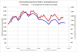
While we wait for the NAR revisions, I think the HousingTracker data that Tom mentioned might be a better estimate of changes in inventory (and always more timely). Ben at HousingTracker.net is tracking the aggregate monthly inventory for 54 metro areas.
 Click on graph for larger image in graph gallery.
This graph shows the NAR estimate of existing home inventory through June (left axis) and the HousingTracker data for the 54 metro areas through mid-August. The HousingTracker data shows a steeper decline (as mentioned above, the NAR will probably revise down their inventory estimates this summer).
 The second graph shows the year-over-year change in inventory for both the NAR and HousingTracker.
HousingTracker reported that the mid-August listings - for the 54 metro areas - declined 13.3% from last year.
Of course there is a large percentage of distressed inventory, many seriously delinquent loans and various categories of "shadow inventory" too. But the decline in listed inventory is something to watch carefully.
The QE3 Watch
by Calculated Risk on 8/10/2011 01:01:00 PM
It was obvious the Fed would not announce QE3 yesterday. Instead they announced an extended "extended period". But they also hinted at QE3 in the last couple of sentences of the statement:
The Committee discussed the range of policy tools available to promote a stronger economic recovery in a context of price stability. It will continue to assess the economic outlook in light of incoming information and is prepared to employ these tools as appropriate.That led Goldman Sachs chief economist Jan Hatzius to write last night: "QE3 Now Our Base Case"
We now see a greater-than-even chance that the FOMC will resume quantitative easing later this year or in early 2012.Last year, Fed Chairman Ben Bernanke paved the way for QE2 at the Jackson Hole economic symposium. Here is his speech from last August.
This year Bernanke will speak on August 26th at the Kansas City Economic Symposium in Jackson Hole, Wymong.
More from Hatzius:
Although QE3 is now our base case, it is not a certainty. We see three main ways in which our revised call could turn out to be incorrect. First, of course, the economy may turn out to be stronger than our forecast. ... Second, inflation might pose a higher hurdle to additional easing than we have allowed. ... Third, the anti-Fed backlash late last year might argue against further QE.Earlier Bernanke made it clear that further accommodation would require both a weaker economy and a renewed threat of deflation. Although the economy is weaker than the Fed expected, I think the Fed will wait for more evidence of a threat of deflation.
BLS: Job Openings "essentially unchanged" in June
by Calculated Risk on 8/10/2011 10:15:00 AM
From the BLS: Job Openings and Labor Turnover Summary
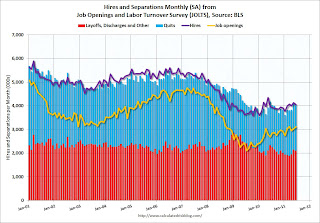
The number of job openings in June was 3.1 million, essentially unchanged from May. Although the number of job openings in June was 997,000 higher than in July 2009 (the series trough), it has been relatively flat since February 2011 and remains well below the 4.4 million openings when the recession began in December 2007.The following graph shows job openings (yellow line), hires (purple), Layoff, Discharges and other (red column), and Quits (light blue column) from the JOLTS.
Unfortunately this is a new series and only started in December 2000.
Note: The difference between JOLTS hires and separations is similar to the CES (payroll survey) net jobs headline numbers. This report is for June, the most recent employment report was for July.
 Click on graph for larger image in graph gallery.
Notice that hires (purple) and total separations (red and blue columns stacked) are pretty close each month. When the purple line is above the two stacked columns, the economy is adding net jobs - when it is below the columns, the economy is losing jobs.
In general job openings (yellow) has been trending up - and job openings increased slightly again in June - and are up about 16% year-over-year compared to June 2010.
Overall turnover is increasing too, but remains low. Quits decreased slightly in June, but have been trending up - and quits are now up about 4% year-over-year.


