by Calculated Risk on 8/06/2011 05:15:00 PM
Saturday, August 06, 2011
Schedule for Week of August 7th
Earlier: A long Summary for Week ending August 5th
The key reports this week are July Retail Sales on Friday, and the June Trade Balance report on Thursday.
The FOMC statement on Tuesday will be closely scrutinized for possible hints of QE3.
10:00 AM ET: NY Fed Q2 Report on Household Debt and Credit (note: moved to Aug 15th)
 7:30 AM: NFIB Small Business Optimism Index for July.
 Click on graph for larger image in graph gallery.
This graph shows the small business optimism index since 1986. The index decreased to 90.8 in June from 90.9 in May.
This index is still very low - and had been trending up - but optimism has declined for four consecutive months now, and July will probably make five.
2:15 PM: FOMC Meeting Announcement. There will no press briefing after this meeting (the next press conference is scheduled for Nov 2nd). Although no change is expected to interest rates, the FOMC statement will probably be changed to reflect the recent weakness in the economy.
7:00 AM: The Mortgage Bankers Association (MBA) will release the mortgage purchase applications index. This index has been very weak over the last several months.
9:00 AM: Ceridian-UCLA Pulse of Commerce Index™ This is the diesel fuel index for July (a measure of transportation).
10:00 AM: Monthly Wholesale Trade: Sales and Inventories for June. The consensus is for a 1.0% increase.
10:00 AM: Job Openings and Labor Turnover Survey for June from the BLS. In general job openings have been trending up, however overall labor turnover remains low.
8:30 AM: The initial weekly unemployment claims report will be released. The consensus is for an increase to 405,000 from 400,000 last week.
 8:30 AM: Trade Balance report for June from the Census Bureau.
 This graph shows the monthly U.S. exports and imports in dollars through May 2011.
The consensus is for the U.S. trade deficit to be around $48 billion, down from $50.2 billion in May.
 8:30 AM: Retail Sales for July.
 This graph shows retail sales since 1992. This is monthly retail sales, seasonally adjusted (total and ex-gasoline). Retail sales growth has stalled recently.
The consensus is for retail sales to increase 0.6% in July, and for a 0.3% increase ex-auto.
9:55 AM: Reuters/University of Mich Consumer Sentiment preliminary for August. The consensus is for a slight decrease to 63.0 from 63.7 in July.
10:00 AM: Manufacturing and Trade: Inventories and Sales for June. The consensus is for a 0.6% increase in inventories.
Summary for Week ending August 5th
by Calculated Risk on 8/06/2011 11:09:00 AM
This was a crazy week that people will long remember. On the political front, the U.S. government finally agreed to raise the debt ceiling. Unfortunately there were clear indications that the process negatively impacted the economy over the last couple of weeks.
In Europe, the financial crisis continued to spread. The President of the European Commission, José Manuel Barroso, finally acknowledged that containment has been lost and that the crisis has spread beyond Greece, Ireland and Portugal: “[I]t is clear that we are no longer managing a crisis just in the euro-area periphery.”
And on Friday, Standard & Poor’s downgraded U.S. debt to AA+. This will lead to related downgrades on Monday. However the regulatory agencies have already said there would be no change for risk-based capital purposes for financial institutions
There was plenty of economic data released too. Let’s start with employment:
The BLS reported that payroll employment increased 117,000 in July and that the unemployment rate decreased to 9.1%. So far the economy has added 1,148,000 private sector jobs this year, or 164,000 per month. There have been 930,000 total non-farm jobs added this year or 133,000 per month.
The pace of job growth has slowed over the last three months, and the overall pace is barely enough to keep up with the growth in the labor force. The unemployment rate has only declined from 9.4% in December 2010 to 9.1% in July. Mostly moving sideways ...
This was another weak employment report and reminds us that unemployment and underemployment are critical problems in the U.S. There are 6.8 million fewer payroll jobs now than before the recession started in 2007 with 13.9 million Americans currently unemployed. Another 8.4 million are working part time for economic reasons, and about 4 million more workers have left the labor force. Of those unemployed, 6.2 million have been unemployed for six months or more. Clearly the overall employment situation remains grim.
Other data was mostly weak too. The ISM manufacturing index declined to the lowest level since July 2009, and the ISM non-manufacturing index fell to the lowest level since early 2010. Auto sales were above expectations, although still below the pre-tsunami levels.
CoreLogic reported home prices increased in June, although the increase was mostly seasonal. And private construction spending increased slightly in June, although public spending is falling sharply.
On Friday, Goldman Sachs lowered their outlook through 2012: “We have lowered our growth forecast further and now expect real GDP to increase just 2%-2½% (annualized) through the end of 2012. Since this pace is slightly below the US economy’s potential, we now expect the unemployment rate to be at 9¼% by the end of 2012, slightly above the current level. We now see a one-in-three risk of renewed recession ...”
It was another very difficult week.
Here is a summary in graphs:
• July Employment Report: 117,000 Jobs, 9.1% Unemployment Rate
The BLS reported: "Total nonfarm payroll employment rose by 117,000 in July, and the unemployment rate was little changed at 9.1 percent ... The change in total nonfarm payroll employment for May was revised from +25,000 to +53,000, and the change for June was revised from +18,000 to +46,000."
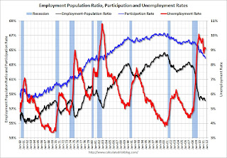
The following graph shows the employment population ratio, the participation rate, and the unemployment rate.
 Click on graph for larger image in graph gallery.
The unemployment rate decreased to 9.1% (red line).
The Labor Force Participation Rate declined to 63.9% in July (blue line). This is the percentage of the working age population in the labor force. This is a new cycle low - and the lowest participation rate since the early '80s.
The Employment-Population ratio declined to 58.1% in July (black line). This is also at a new cycle low and the lowest since the early '80s.
 This graph shows the job losses from the start of the employment recession, in percentage terms aligned at the start of the recession. The dotted line is ex-Census hiring.
This was a weak report, but better than expectations for payroll jobs, and the unemployment rate.
Here is the Employment graph gallery
• ISM Manufacturing index declines in July
 From the Institute for Supply Management: July 2011 Manufacturing ISM Report On Business®
PMI was at 50.9% in July, down from 55.3% in June. The employment index was at 53.5%, down from 59.9% and new orders decreased to 49.2%, down from 51.6%.
Here is a long term graph of the ISM manufacturing index.
This was below expectations of 54.3%, but in line with the weak regional surveys.
• ISM Non-Manufacturing Index indicates slower expansion in July
 From the Institute for Supply Management: July 2011 Non-Manufacturing ISM Report On Business®
The July ISM Non-manufacturing index was at 52.7%, down from 53.3% in June. The employment index decreased in July to 52.5%, down from 54.1% in June. Note: Above 50 indicates expansion, below 50 contraction.
This graph shows the ISM non-manufacturing index (started in January 2008) and the ISM non-manufacturing employment diffusion index.
This was below the consensus forecast of 54.0%.
• U.S. Light Vehicle Sales 12.23 million Annual Rate in July
 Based on an estimate from Autodata Corp, light vehicle sales were at a 12.23 million SAAR in July. That is up 6.1% from July 2010, and up 6.2% from the sales rate last month (June 2011).
This graph shows light vehicle sales since the BEA started keeping data in 1967.
Although still below the sales rate earlier this year - before the tragedy in Japan - this was above the consensus forecast of 11.9 million SAAR.
• Recession Measures
By request, here are four key indicators used by the NBER for business cycle dating: GDP, Employment, Industrial production and real personal income less transfer payments.
 Note: The following graphs are all constructed as a percent of the peak in each indicator. This shows when the indicator has bottomed - and when the indicator has returned to the level of the previous peak. If the indicator is at a new peak, the value is 100%.
These graphs show that no major indicator has returned to the pre-recession levels - and most are still way below the pre-recession peaks.
This graph is for real GDP through Q2 2011 and shows real GDP is still 0.4% below the previous pre-recession peak.
At the worst point, real GDP was off 5.1% from the 2007 peak.
 And real GDP has performed better than other indicators ...
This graph shows real personal income less transfer payments as a percent of the previous peak.
With the revisions, this measure was off almost 11% at the trough - a significant downward revision and shows the recession was much worse than originally thought.
Real personal income less transfer payments is still 5.1% below the previous peak.
 This graph is for industrial production through June.
Industrial production had been one of the stronger performing sectors because of inventory restocking and some growth in exports.
However industrial production is still 7.6% below the pre-recession peak, and it will probably be some time before industrial production returns to pre-recession levels.
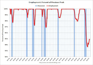 The final graph is for employment. This is similar to the graph I post every month comparing percent payroll jobs lost in several recessions.
On the timing of the trough of the recession, GDP and industrial production would suggest the end of Q2 2009 (and June 2009). The other two indicators would suggest later troughs.
And of course the recovery in all indicators has been very sluggish compared to recent recessions.
• CoreLogic: Home Price Index increased 0.7% in June
 From CoreLogic: CoreLogic® Home Price Index Shows Third Consecutive Month-Over-Month Increase
This graph shows the national CoreLogic HPI data since 1976. January 2000 = 100.
The index was up 0.7% in June, and is down 6.8% over the last year, and off 31.7% from the peak.
Some of this increase is seasonal (the CoreLogic index is NSA) and the index is still off 6.8% from last June. This is also the eleventh consecutive month showing a year-over-year decline.
• Construction Spending increased in June
 The Census Bureau reported that overall construction spending increased slightly in June.
This graph shows private residential and nonresidential construction spending, and public spending, since 1993. Note: nominal dollars, not inflation adjusted.
Private residential spending is 65% below the peak in early 2006, and non-residential spending is 38% below the peak in January 2008.
Private construction spending is mostly moving sideways, and public spending is now falling sharply as the stimulus spending ends.
• Personal Income increased 0.1% in June, PCE decreased 0.2%
 The BEA released the Personal Income and Outlays report for June.
This graph shows real Personal Consumption Expenditures (PCE) through June (2005 dollars).
PCE decreased 0.2 in June, and real PCE decreased less than 0.1% as the price index for PCE decreased 0.2 percent in June. On a quarterly basis, PCE barely increased in Q2 from Q1 (this was in the GDP report Friday).
Real PCE has declined for three straight months - this was expected based on the weak GDP report, but this is very weak.
• Other Economic Stories ...
• ADP: Private Employment increased 114,000 in July
• European Commission President: Crisis no longer contained to periphery
• NMHC Quarterly Apartment Survey: Market Conditions Tighten
• States cutting Unemployment Insurance benefits
• FHA sells record number of REO in June
• LPS: Foreclosure Starts Increased in June
• Q2 2011 Details: Investment in Office, Mall, and Lodging, Residential Components
Have a great weekend!
Unofficial Problem Bank list declines to 988 Institutions
by Calculated Risk on 8/06/2011 08:14:00 AM
Note: this is an unofficial list of Problem Banks compiled only from public sources.
Here is the unofficial problem bank list for Aug 5, 2011.
Changes and comments from surferdude808:
Busy week for removals with the two failures this Friday night and after the FDIC updated its structure database to reflect some recent unassisted mergers. The removals plus one addition leave the Unofficial Problem Bank List at 988 institutions with assets of $411.6 billion, down from 995 institutions with assets of $415.4 billion last week.Employment posts yesterday (with graphs):
The removals from failure include Bank of Whitman, Colfax, WA ($608 million) and Bank of Shorewood, Shorewood, IL ($120 million). Consistent with an American Banker article published in the past month that said regulators are pushing troubled banks to find merger partners, there were six removals because of unassisted mergers including Wilmington Trust FSB, Baltimore, MD ($2.3 billion); Sunrise Bank, San Diego, CA ($232 million); Jefferson Bank, Dallas, TX ($205 million); Bank of the Northwest, Bellevue, WA ($146 million); Cornerstone Bank & Trust, National Association, Carrollton, IL ($144 million); and Heritage Bank, National Association, Holstein, IA ($137 million).
The flow of new additions will become lumpier with the shuttering of the OTS as the OCC and FDIC only release actions on a monthly basis instead of when they are issued like the Federal Reserve and OTS.
• July Employment Report: 117,000 Jobs, 9.1% Unemployment Rate
• Employment Summary, Part Time Workers, and Unemployed over 26 Weeks
• More Employment (Duration, Education, Diffusion Index)
• Employment graph gallery
Friday, August 05, 2011
AAR: Rail Traffic soft in July
by Calculated Risk on 8/05/2011 10:26:00 PM
Note: S&P downgraded U.S. debt to AA+. The regulatory agencies responded saying there would be no change for risk-based capital purposes for financial institutions.
Here are the earlier employment posts (with graphs):
• July Employment Report: 117,000 Jobs, 9.1% Unemployment Rate
• Employment Summary, Part Time Workers, and Unemployed over 26 Weeks
• More Employment (Duration, Education, Diffusion Index)
• Employment graph gallery
The Association of American Railroads (AAR) reports carload traffic in July 2011 decreased 1.0 percent compared with the same month last year, and intermodal traffic (using intermodal or shipping containers) increased 1.3 percent compared with July 2010. On a seasonally adjusted basis, carloads in July 2011 were up 0.7% from June 2011; intermodal in July 2011 was down 0.8% from June 2011.
On a non-seasonally adjusted basis, U.S. freight railroads averaged 277,921 carloads per week in July 2011, down 1.0% from July 2010’s 280,680 carloads per week and up 3.1% over July 2009’s 269,479 carloads per week. July 2011 was the fourth straight month in which carload traffic closely tracked year-earlier levels.
... July ... saw the biggest year-over-year monthly decline (and the second decline of any kind) in U.S. rail carload traffic in 16 months.
 Click on graph for larger image in graph gallery.
This graph shows U.S. average weekly rail carloads (NSA) excluding coal.
Rail carload traffic collapsed in November 2008, and now, 2 years into the recovery, carload traffic ex-coal is about half way back.
"Excluding coal, U.S. rail carloads in July 2011 were up 4.3% over July 2010."
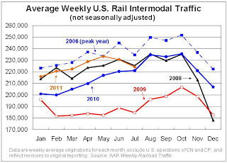 The second graph is for intermodal traffic (using intermodal or shipping containers):
U.S. railroads originated 895,649 intermodal trailers and containers in July 2011, an average of 223,912 units and up 1.3% (11,724 units) over July 2010. That’s the lowest year-over-year increase since January 2010.Another soft month for rail traffic.
excerpts with permission
Bank Failure #63: Bank of Whitman, Colfax, Washington
by Calculated Risk on 8/05/2011 09:14:00 PM
Bankers yodel past graveyard
Siren song of doom
by Soylent Green is People
From the FDIC: Columbia State Bank, Tacoma, Washington, Assumes All of the Deposits of Bank of Whitman, Colfax, Washington
As of June 30, 2011, Bank of Whitman had approximately $548.6 million in total assets and $515.7 million in total deposits. ... The FDIC estimates that the cost to the Deposit Insurance Fund (DIF) will be $134.8 million. ... Bank of Whitman is the 63rd FDIC-insured institution to fail in the nation this year, and the third in Washington.Two today!
Bank Failure #62: Illinois
by Calculated Risk on 8/05/2011 08:30:00 PM
We Shorewood like more money
Heartland, Fed say no.
by Soylent Green is People
From the FDIC: Heartland Bank and Trust Company, Bloomington, Illinois, Assumes All of the Deposits of Bank of Shorewood, Shorewood, Illinois
As of June 30, 2011, Bank of Shorewood had approximately $110.7 million in total assets and $104.0 million in total deposits. ... The FDIC estimates that the cost to the Deposit Insurance Fund (DIF) will be $25.6 million. ... Bank of Shorewood is the 62nd FDIC-insured institution to fail in the nation this year, and the sixth in Illinois.
Misc: S&P Plans U.S. Downgrade, makes math error, ECB to Buy Italian Bonds
by Calculated Risk on 8/05/2011 07:41:00 PM
A few stories ...
• From CNN: S&P rethinking planned downgrade of U.S. after White House objects
• From CNBC: ECB Agrees to Start Buying Italian Bonds on Monday: Italian Minister
• From Reuters: Italy brings forward budget plans as crisis mounts
Q2 2011 Details: Investment in Office, Mall, and Lodging, Residential Components
by Calculated Risk on 8/05/2011 04:05:00 PM
Here are the earlier employment posts (with graphs):
• July Employment Report: 117,000 Jobs, 9.1% Unemployment Rate
• Employment Summary, Part Time Workers, and Unemployed over 26 Weeks
• More Employment (Duration, Education, Diffusion Index)
• Employment graph gallery
The BEA released the underlying detail data today for the Q2 Advance GDP report. Here is a look at office, mall and lodging investment:
 Click on graph for larger image in new graph gallery.
This graph shows investment in offices, malls and lodging as a percent of GDP. Office investment as a percent of GDP peaked at 0.46% in Q1 2008 and has declined sharply to a new series low as a percent of GDP (data series starts in 1959).
Investment in multimerchandise shopping structures (malls) peaked in 2007 and has fallen by 66% (note that investment includes remodels, so this will not fall to zero). Mall investment increased slightly in Q2 (probably remodels).
The bubble boom in lodging investment was stunning. Lodging investment peaked at 0.32% of GDP in Q2 2008 and has fallen by 80%.
Notice that investment for all three categories typically falls for a year or two after the end of a recession, and then usually recovers very slowly (flat as a percent of GDP for 2 or 3 years). Something similar will probably happen again, and there will not be a recovery in these categories until the vacancy rates fall significantly.
The second graph is for Residential investment (RI) components. According to the Bureau of Economic Analysis, RI includes new single family structures, multifamily structures, home improvement, broker's commissions, and a few minor categories (dormitories, manufactured homes).
 This graph shows the various components of RI as a percent of GDP for the last 50 years. Usually the most important components are investment in single family structures followed by home improvement.
Investment in single family structures was just above the record low set in Q2 2009.
Investment in home improvement was at a $153.1 billion Seasonally Adjusted Annual Rate (SAAR) in Q2 (about 1.0% of GDP), significantly above the level of investment in single family structures of $105.8 billion (SAAR) (or 0.7% of GDP).
Brokers' commissions increased slightly in Q2, and are near the lowest level (as a percent of GDP) since the early '80s.
And investment in multifamily structures has been bouncing along at a series low for the last few quarters, although this is expected to increase this year as starts increase.
These graphs show there is currently very little investment in offices, malls and lodging - and also very little investment in most components of residential investment. For Residential Investment, I expect RI to make a positive contribution to GDP this year for the first time since 2005 - mostly because of increases in multifamily investment and home improvement.
More Employment
by Calculated Risk on 8/05/2011 01:15:00 PM
Here are the earlier employment posts (with graphs):
• July Employment Report: 117,000 Jobs, 9.1% Unemployment Rate
• Employment Summary, Part Time Workers, and Unemployed over 26 Weeks
• Employment graph gallery
And a few more graphs based on the employment report ...
 This graph shows the duration of unemployment as a percent of the civilian labor force. The graph shows the number of unemployed in four categories: less than 5 week, 6 to 14 weeks, 15 to 26 weeks, and 27 weeks or more.
Two key categories moved down in a little in July. The 27 weeks and more (the long term unemployed) declined slightly to 6.2 million workers, or 4.0% of the labor force.
Also the less than 5 weeks category declined in July after increasing in June.
 This graph shows the unemployment rate by four levels of education (all groups are 25 years and older).
Unfortunately this data only goes back to 1992 and only includes one previous recession (the stock / tech bust in 2001). Clearly education matters with regards to the unemployment rate - and it appears all four groups are generally trending down.
Although education matters for the unemployment rate, it doesn't appear to matter as far as finding new employment (all four categories are only gradually declining).
Note: This says nothing about the quality of job - many college graduates are underemployed.
 This is a little more technical. The BLS diffusion index for total private employment was at 58.6 in July, up from 56.6 in June, and for manufacturing, the diffusion index increased slightly to 53.1.
 Think of this as a measure of how widespread job gains are across industries. The further from 50 (above or below), the more widespread the job losses or gains reported by the BLS. From the BLS:
Figures are the percent of industries with employment increasing plus one-half of the industries with unchanged employment, where 50 percent indicates an equal balance between industries with increasing and decreasing employment.
Employment Summary, Part Time Workers, and Unemployed over 26 Weeks
by Calculated Risk on 8/05/2011 10:22:00 AM
This was an improvement over May and June, but still a weak report. As I noted yesterday, the BLS survey reference week includes the 12th of the month (the 2nd full week of July), and that was before the economy froze up due to the D.C. debate, and also before the European crisis really flared up again. That might be why this report was a little better than expected.
There were more jobs added in July (117,000 total and 154,000 private sector). The unemployment rate decreased from 9.2% to 9.1%, and the participation rate declined to 63.9%. This is the lowest participation rate since the early ‘80s. Note: This is the percentage of the working age population in the labor force.
The employment population ratio fell to 58.1%, also a new cycle low.
U-6, an alternate measure of labor underutilization that includes part time workers and marginally attached workers, decreased to 16.1%; barely off the high for the year.
The BLS revised up the May and June payrolls, showing a gain of 56,000 more jobs were created than previously reported.
The average workweek was unchanged at 34.3 hours, and average hourly earnings increased. "In July, average hourly earnings for all employees on private nonfarm payrolls increased by 10 cents, or 0.4 percent, to $23.13. Over the past 12 months, average hourly earnings have increased by 2.3 percent."
Through the first seven months of 2011, the economy has added 930,000 total non-farm jobs or just 133 thousand per month. This is a better pace of payroll job creation than last year, but the economy still has 6.8 million fewer payroll jobs than at the beginning of the 2007 recession.
There are a total of 13.9 million Americans unemployed and 6.2 million have been unemployed for more than 6 months. Very grim numbers.
Even though this was an improvement over May and June, overall this was a weak report and reminds us that unemployment and underemployment are critical problems in the U.S.
The following graph shows the employment population ratio, the participation rate, and the unemployment rate.
 Click on graph for larger image in graph gallery.
The unemployment rate decreased to 9.1% (red line).
The Labor Force Participation Rate declined to 63.9% in July (blue line). This is the percentage of the working age population in the labor force. This is a new cycle low - and the lowest participation rate since the early '80s.
The Employment-Population ratio declined to 58.1% in July (black line). This is also at a new cycle low and the lowest since the early '80s.
Percent Job Losses During Recessions
 This graph shows the job losses from the start of the employment recession, in percentage terms - this time aligned at maximum job losses.
In the previous post, the graph showed the job losses aligned at the start of the employment recession.
In terms of lost payroll jobs, the 2007 recession was by far the worst since WWII.
Part Time for Economic Reasons
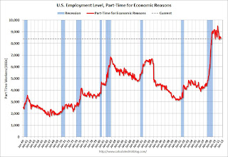 From the BLS report:
The number of persons employed part time for economic reasons (sometimes referred to as involuntary part-time workers) was about unchanged in July at 8.4 million. These individuals were working part time because their hours had been cut back or because they were unable to find a full-time job.The number of workers only able to find part time jobs (or have had their hours cut for economic reasons) decreased to 8.396 million in July from 8.552 million in June.
These workers are included in the alternate measure of labor underutilization (U-6) that decreased to 16.1% in July from 16.2% in June.
Unemployed over 26 Weeks
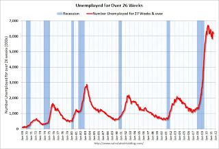 This graph shows the number of workers unemployed for 27 weeks or more.
 According to the BLS, there are 6.185 million workers who have been unemployed for more than 26 weeks and still want a job. This was down from 6.3 million in June. This is very high, and long term unemployment is one of the defining features of this employment recession.
• Earlier Employment post: July Employment Report: 117,000 Jobs, 9.1% Unemployment Rate


