by Calculated Risk on 12/05/2012 01:52:00 PM
Wednesday, December 05, 2012
Lawler: On the upward trend in Real House Prices
CR NOTE: This is a very long piece from economist Tom Lawler on long term house prices. I've written about this before, The upward slope of Real House Prices, and Tom digs much deeper into the data!
From Tom Lawler:
One of the most widely abused home price series used by folks is the long-term “real” home price chart constructed by Robert Shiller in his “Irrational Exuberance” book. While he and others have sometimes characterized his “time series” of “real” home prices back to 1890 as being a good representation of “constant quality” home prices, in fact that is not even remotely the case. There are especially serious issues with the “older” home price series used by Dr. Shiller, with the “most troubling” being that used for the 1890-1934 period. Indeed, the authors of the book from which the home price index used by Dr. Shiller came from actually argued that this index did NOT reflect the behavior of “constant-quality” home price (with evidence to support that argument), and suggested using a materially different home price index. More on this point later.
When Dr. Shiller decided to explore home prices, and especially what appeared to be a housing “bubble,” he was “most surprised” that there were no “good” data going back prior to 1987 – with “good” defined as the Case-Shiller HPI.. But he wanted to “show” last decade’s house price runup in a long-term historical context. So he decided to take various home price sources, and attempt to construct a “long run” home price index by “concatenating” time series based on these sources.
Not surprisingly, from 1987 to the present Shiller used the “national” S&P/Case-Shiller home price index, which is a market-value weighted (using values from the various decennial Censuses, which unfortunately are not available for 2010. This “national” index is estimated to cover just over 70% of the US housing market.
From 1975 to 1987 Shiller used the “national” FHFA (formerly OFHEO) home price index, which is a unit-weighted index (using annually-updated estimates of states’ share of the housing stock) based on repeat sales transactions AND appraisal information on refinances of homes backing mortgages owned or guaranteed by Fannie Mae or Freddie Mac. Aside from the obvious “dataset” limitations (GSE only) and use of appraisals, the “unit-weighting” can result in materially different behavior than “value-weighting” over time.
From 1953 to 1975 Shiller used the home price index from the BLS’ Consumer Price Index, which was based on a sample of new home purchases financed with FHA-insured loans. It probably is not the case, however, that new home prices financed with FHA-insured loans, which often represent a very small sample of total home purchases, reflected trends in “overall” home prices. Indeed, the BLS characterized the data base used as representing “a small and specialized segment of the housing market and presents BLS with increasingly serious estimation problems . Here is an excerpt from a BLS paper discussing the 1983 change in the treatment of shelter costs for homeowners in the CPI.
“In the current (now ‘old’) CPI, the data are for house sales on which financing is insured by the Federal Housing Administration. These data fall far short of the ideal. Processing delays often mean that several months elapse between the time a house sale occurs and the time it is used in the CPI. For some geographic areas, especially those in the Northeast, the number of FHA transactions is very small. In addition, the FHA mortgage ceiling virtually eliminates higher priced homes from consideration. The impact of the ceiling- and especially changes in the ceiling - may be quite substantial, possibly resulting in a downward bias in the house price indexes used in the CPl.”
From 1934 to 1953 Shiller couldn’t find a good published source, but his grad students found median asking prices advertised in newspapers in five cities -- Chicago, Los Angeles, New Orleans, New York, and Washington, D.C. – and his home price index from 1934 to 1953 is a simple average of these median home asking prices.
From 1890 to 1934, Shiller used a home price index for 22 cities by Grebler, Blank, and Winnick (in their seminal book, “Capital Formation in Residential Real Estate: Trends and Prospects,” 1956) derived using data from the “Financial Survey of Housing” by the Department of Commerce in 1937. Here is a description of the question asked of home owners.
“One set of questions asked each owner of a residential structure related to: (1) value of the property in 1934, (2) year of acquisition by the then-present owner, and (3) original cost to owner at time of acquisition. This information was summarized for each city and a table presented for each of the 22 cities, listing the number of properties included in the 1934 sample which were acquired in each year from 1890 to 1933, the total acquisition cost of properties acquired in each such year, and the value of each group of such properties in 1934.” GBW used data for single-family owner-occupied homes.
To construct their home price index, “A relative for each year was calculated for each city, based on the ratio of the total acquisition cost of the single-family owner-occupied houses acquired in each given year in a given city to their value in 1934. The median relative for each year was then determined.”
Shiller’s decision to use this home price index was a major departure in that the index was not based on any transactions, but instead (1) owners’ assessment of the current value of their home, and (2) owners’ recollection of when the acquired the property AND what they paid for the property. More important, Shiller’s decision to use this HPI was one that GBW would have strongly disagreed with.
GBW note the following about the resulting home price index.
“The assumptions underlying the final index warrant clarification before any comparisons are drawn. It is assumed, first, that the acquisition cost estimates are reasonably accurate. In all likelihood, the estimates of acquisition cost for properties acquired in the early years of the period studied have some margin of error. It is also assumed that the year of acquisition has been accurately reported; here again, there undoubtedly are significant error margins for the early years, with a tendency for respondents to report acquisitions in years which are multiples of five. Finally, it is assumed that the movement between median relatives of two successive years approximates the movement in prices of a single sample between the two years; it will be remembered that each relative, before conversion to a 1929 base, actually represents the movement in prices of a separate sample between the given year and 1934.”
Aside from these obvious “issues” (e.g., surveys of home owners in the middle of a depression regarding the likely value of their home could be WAY off) with such a home price index, it is important to note that GBW did NOT conclude that the resulting home price index was an accurate representation of the behavior of “typical” (or “constant quality”) home prices; in fact, they concluded otherwise, based (1) on the behavior of residential construction cost indexes over this period; and (2) a comparison of the survey-derived home price index and separately-derived indexes of new home prices of specific types of owner-occupied new single-family homes derived by Garfield and Hoad from special tabulations of unpublished data from the Financial Survey of Housing. While the purchase price indexes are not “constant quality” indices, the index is based only on purchases of six-room frame houses in each city, which is probably as cloe as one can get to “constant quality.”
Here is a comparison of the “survey based” HPI and the “new home purchase price” HPI for Cleveland (from GBW) from 1907 to 1930 (the “new home price index” is a three-year moving average).
 Click on graph for larger image.
As is readily apparent, the “survey-based” HPI increased by a massively lower amount than did the price of similar new homes over the above period.
Here is a comparable graph for Seattle from 1909 to 1930
 Clearly, the “survey-based” HPI significantly understated the trend in hew home prices.
In discussing factors affecting the survey-based HPI, GBW note that any long-term HPI is influenced by two potentially “offsetting” biases: value losses due to depreciation and obsolescence, value gains associated with structural additions and alterations. Here is an excerpt from GBW:
“The index in its present form is subject to two major offsetting biases, viz, value losses due to depreciation and obsolescence and value increments in the form of structural additions and alterations. The price relative for 1904, for example, before conversion to a 1929 base, measures the change in price of a given set of properties between 1904 and 1934; this change is affected by the thirty years of depreciation operating on these properties and is somewhat smaller than the change in price that would be measured if this group of properties in 1934 had the same age structure as they had in 1904. Conversely, any structural additions or alterations to the properties between time of acquisition and 1934 would tend to make the actual price rise larger between these two periods than the theoretically correct price movement.
“Empirical evidence cited there supports the generally accepted view that value losses due to depreciation and obsolescence typically outweigh value gains (over the 1890-1934 period) due to additions and alterations. Therefore, the present index must be biased downward as the net result of these two kinds of value change.”
GBW argue that “(f)urther corroboration for this view is found in a comparison of two sets of house price indexes for Cleveland and Seattle” discussed here earlier.
GBW then go on to construct survey-based HPI estimates adjusted for depreciation, and compare than index to an index of residential construction costs. Here is a comparison of the unadjusted survey-based HPI, the adjusted survey-based HPI, and an index of residential construction costs.
 Obviously, the “unadjusted” survey-based HPI doesn’t even remotely track residential construction costs, while the “depreciation-adjusted” HPI over “long” periods of time does “track” the construction cost index. As such, GBW conclude that “for long-term analysis the margin of error in using the cost index as an approximation of a (home) price index cannot be great.”
While GBW did not say so in so many words, their analysis suggests that the “depreciation-adjusted” survey-based HPI is almost certainly a better measure of “constant-quality” home prices than the unadjusted survey-based HPI – which Dr. Shiller used for his long-term chart.
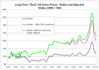
If Shiller had used the “GBW-recommended” adjusted HPI for 1890 to 1934, here is what his long-term “real” home price index would have looked. (Note: in the spreadsheet for Shiller’s chart, for some reason the “annual” CPI for 1913 though 1952 use the January HPI as opposed to the yearly-average CPI. The chart shown here using the yearly-average CPI.
 Wow! Maybe there WAS a long-term upward trend in “real” US home prices in the century ending in 1990!
But wait ... There’s more!
In adjusted home prices for “inflation,” Dr. Shiller used the “official” Consumer Price Index for Urban Consumers (CPI-U). However, the CPI-U is NOT a consistently-constructed time series. The BLS has made numerous significant methodological changes to the Consumer Price Index, but the BLS has NOT revised historical CPI-U data to reflect those changes. The BLS DID, however, go back to 1977 and estimate what the historical CPI would have looked like if the current methodology had been in place all the way back to 1977. When Census reports on “inflation-adjusted” incomes, home prices, etc., it uses the CPI-U-RS, and in the 2012 “Poverty” report it shows annual average CPI-U-RS values back to 1947. From December 1977 to December 2011 the CPI-U increased by 263.4% (CAGR of 3.28%) compare to a 231.4% increase (CAGR of 2.84%) in the CPI-U-RS
Here is what the Shiller long-term real home price chart would look like (1) using “better” 1890-1934 home prices, and (2) with a “more accurate” adjustment for consumer price inflation.
 Annualized Growth, “Real” US Home Prices
Shiller “Current” Chart 0.186%
w/1890-1934 Correction 0.726%
+ Better Inflation Adjustment 0.831%
To some these growth rate differences might seem small. But compounded over a 100 years, they translate into really big differences.
“Real” HPI, 1890 = 100
Shiller “Current” Chart 120.3989
w/1890-1934 Correction 206.0653
+ Better Inflation Adjustment 228.7397
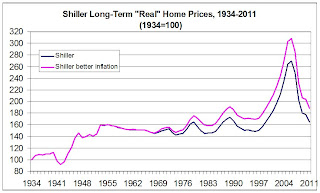
Of course, an alternative to “adjusting” Shiller’s home prices from 1890 to 1934 would be simply to ignore that time period. Here’s what the Shiller long-term trend would then look like.
 While we’re at it, the 1934-1952 data, based on an average of asking prices for five cities, probably is “questionable” as a “constant-quality” HPI for the US as a whole. And the BLS itself questions the FHA-based home price index from the “old” consumer price index, and notes that it is biased downward, so one should probably not use the 1953-1974 data. So ...
 CAGR, 1975-1985: Shiller 0.1955%
Better inflation Adjustment 0.6379%
limits changed over the period; and research suggests that this HPI understated home price gains during the 70’s.
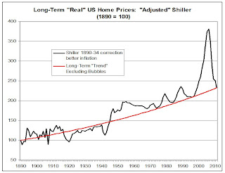
But hey, folks really like long-term charts, so let’s just again look at the Shiller chart adjusted for 1890-34 data and for changes in the CPI over time.
 Oh my – it looks as if home price in 2011 had fallen back down to the “long-term” trend (and since home prices at the end of 2011 were below the average for the year, and the above chart shows yearly averages). Gosh, then the Shiller “long-term” chart suggests that home price may have bottomed last year, and that home prices at the end of 2012 will probably be higher than at the end of 2011!
Of course, long-term charts where the quality of the data deteriorate significantly as you go back in time don’t really give anything more than broad trends rather than precise measurements of whether “home prices” are “too high” or “too low.”
However, “real” home prices in 2011 were not out of line with extremely long-term US real home prices trends, “rightly” defined!


