The first graph is from Doug Short of dshort.com (financial planner): "Four Bad Bears".
The S&P 500 is up 34% from the bottom, and still off 42% from the peak.
Note that the Great Depression crash is based on the DOW; the three others are for the S&P 500.
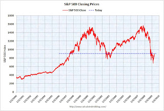
 The second graph shows the S&P 500 since 1990.
 The dashed line is the closing price today.
This puts the recent rally into perspective.