 RSS Feed
 by Calculated Risk on 4/11/2023 09:25:00 AM
Tuesday, April 11, 2023
More Employment Graphs: Duration of Unemployment, Unemployment by Education, Diffusion Indexes
A few more employment graphs ...
 Click on graph for larger image.
This graph shows the duration of unemployment as a percent of the civilian labor force. The graph shows the number of unemployed in four categories: less than 5 week, 6 to 14 weeks, 15 to 26 weeks, and 27 weeks or more.
The short-term categories peaked at over 9% of the labor force at the onset of the pandemic.
The duration of unemployment was much shorter during the pandemic than during the housing bust / financial crisis. In general, all categories are close to normal levels.
Unemployment by Education
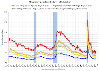 This graph shows the unemployment rate by four levels of education (all groups are 25 years and older).
Unfortunately, this data only goes back to 1992 and includes only three recessions (the stock / tech bust in 2001, and the housing bust/financial crisis, and the 2020 pandemic). Clearly education matters with regards to the unemployment rate, with the lowest rate for college graduates at 2.0% in March, and highest for those without a high school degree at 4.8% in March.
All four groups were generally trending down prior to the pandemic. And all are close to pre-pandemic levels now.
Note: This says nothing about the quality of jobs - as an example, a college graduate working at minimum wage would be considered "employed".
Diffusion Indexes
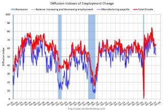 The BLS diffusion index for total private employment was at 60.2 in March, up from 57.4 in February. A solid reading.
For manufacturing, the diffusion index was at 56.3, up from 47.9 in February.
Think of this as a measure of how widespread job gains are across industries. The further from 50 (above or below), the more widespread the job losses or gains reported by the BLS. Above 60 is very good. From the BLS:
 This graph shows the unemployment rate by four levels of education (all groups are 25 years and older).
Unfortunately, this data only goes back to 1992 and includes only three recessions (the stock / tech bust in 2001, and the housing bust/financial crisis, and the 2020 pandemic). Clearly education matters with regards to the unemployment rate, with the lowest rate for college graduates at 2.0% in March, and highest for those without a high school degree at 4.8% in March.
All four groups were generally trending down prior to the pandemic. And all are close to pre-pandemic levels now.
Note: This says nothing about the quality of jobs - as an example, a college graduate working at minimum wage would be considered "employed".
 The BLS diffusion index for total private employment was at 60.2 in March, up from 57.4 in February. A solid reading.
For manufacturing, the diffusion index was at 56.3, up from 47.9 in February.
Think of this as a measure of how widespread job gains are across industries. The further from 50 (above or below), the more widespread the job losses or gains reported by the BLS. Above 60 is very good. From the BLS:
Figures are the percent of industries with employment increasing plus one-half of the industries with unchanged employment, where 50 percent indicates an equal balance between industries with increasing and decreasing employment.Overall private job growth was widespread in March.


