by Calculated Risk on 7/24/2013 11:28:00 AM
Wednesday, July 24, 2013
A Few Comments on New Home Sales
As I noted over the weekend, the key number in the existing home sales report is not sales, but inventory. It is mostly visible inventory that impacts prices. When we look at sales for existing homes, the focus should be on the composition between conventional and distressed, not total sales. So, for those who follow housing closely, the existing home sales report on Monday was solid even though sales were down.
However, for the new home sales report, the key number IS sales! An increase in sales adds to both GDP and employment (completed inventory is at record lows, so any increase in sales will translate to more single family starts). So sales in June at 497 thousand SAAR were very solid (the highest sales rate since May 2008). The housing recovery is ongoing.
Earlier: New Home Sales at 497,000 Annual Rate in June
Looking at the first half of 2013, there has been a significant increase in sales this year. The Census Bureau reported that there were 244 new homes sold in the first half of 2013, up 28.4% from the 190 thousand sold during the same period in 2012. This was the highest sales for the first half of the year since 2008.
And even though there has been a large increase in the sales rate, sales are just above the lows for previous recessions. This suggests significant upside over the next few years. Based on estimates of household formation and demographics, I expect sales to increase to 750 to 800 thousand over the next several years - substantially higher than the current sales rate.
And an important point worth repeating every month: Housing is historically the best leading indicator for the economy, and this is one of the reasons I think The future's so bright, I gotta wear shades.
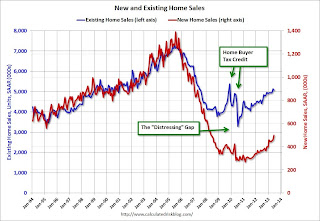
And here is another update to the "distressing gap" graph that I first started posting over four years ago to show the emerging gap caused by distressed sales. Now I'm looking for the gap to close over the next few years.
 Click on graph for larger image.
The "distressing gap" graph shows existing home sales (left axis) and new home sales (right axis) through June 2013. This graph starts in 1994, but the relationship has been fairly steady back to the '60s.
Following the housing bubble and bust, the "distressing gap" appeared mostly because of distressed sales. The flood of distressed sales kept existing home sales elevated, and depressed new home sales since builders weren't able to compete with the low prices of all the foreclosed properties.
I don't expect much of an increase in existing home sales (distressed sales will slowly decline and be offset by more conventional sales). But I do expect this gap to continue to close - mostly from an increase in new home sales.
 Another way to look at this is a ratio of existing to new home sales.
This ratio was fairly stable from 1994 through 2006, and then the flood of distressed sales kept the number of existing home sales elevated and depressed new home sales. (Note: This ratio was fairly stable back to the early '70s, but I only have annual data for the earlier years).
In general the ratio has been trending down - and is currently at the lowest level since November 2008. I expect this ratio to continue to trend down over the next several years as the number of distressed sales declines and new home sales increase.
Note: Existing home sales are counted when transactions are closed, and new home sales are counted when contracts are signed. So the timing of sales is different.


