by Calculated Risk on 2/01/2013 12:25:00 PM
Friday, February 01, 2013
Employment Report Comments and more Graphs
First, here is a table of the change in payroll employment on an annual basis including the benchmark revision released today. For private employment, 2011 was the best year this decade (2012 was the 3rd best year), but public payrolls have seen a four year decline:
| Annual Change Payroll Employment (000s) | |||
|---|---|---|---|
| Private | Public | Total | |
| 2001 | -2,308 | 551 | -1,757 |
| 2002 | -765 | 233 | -532 |
| 2003 | 104 | -42 | 62 |
| 2004 | 1,872 | 147 | 2,019 |
| 2005 | 2,298 | 186 | 2,484 |
| 2006 | 1,862 | 209 | 2,071 |
| 2007 | 827 | 288 | 1,115 |
| 2008 | -3,797 | 180 | -3,617 |
| 2009 | -4,976 | -76 | -5,052 |
| 2010 | 1,235 | -213 | 1,022 |
| 2011 | 2,420 | -317 | 2,103 |
| 2012 | 2,247 | -77 | 2,170 |
The headline number for January (157 thousand jobs added) was below expectations, and the unemployment rate was higher than expected. However the revisions (benchmark and new seasonal factors) were positive. The unemployment rate is from the household survey, and the household survey was weak - but that survey is very volatile.
Hopefully employment growth will pick up some in 2013, although austerity probably means another year of sluggish growth. Below are a several more graphs ... The first graph below shows the employment-population ratio for the 25 to 54 age group. This has been moving sideways lately, and that shows the labor market is still weak.
Employment-Population Ratio, 25 to 54 years old
 Click on graph for larger image.
Since the participation rate has declined recently due to cyclical (recession) and demographic (aging population) reasons, an important graph is the employment-population ratio for the key working age group: 25 to 54 years old.
In the earlier period the employment-population ratio for this group was trending up as women joined the labor force. The ratio has been mostly moving sideways since the early '90s, with ups and downs related to the business cycle.
This ratio should probably move close to 80% as the economy recovers. The ratio decreased in January to 75.7% from 75.7% in December. This has generally been trending up - although the improvement stalled in 2012 - and the ratio is still very low.
Percent Job Losses During Recessions

This graph shows the job losses from the start of the employment recession, in percentage terms - this time aligned at maximum job losses.
In the earlier post, the graph showed the job losses aligned at the start of the employment recession.
This financial crisis recession was much deeper than other post WWII recessions, and the recovery has been slower (the recovery from the 2001 recession was slow too). However, if we compare to other financial crisis recoveries, this recovery has actually been better than most.
Part Time for Economic Reasons
 From the BLS report:
The number of persons employed part time for economic reasons, at 8.0 million, changed little in January. These individuals were working part time because their hours had been cut back or because they were unable to find a full-time job.The number of part time workers increased in January to 7.97 million from 7.92 million in December.
These workers are included in the alternate measure of labor underutilization (U-6) that was unchanged at 14.4% in December.
Unemployed over 26 Weeks
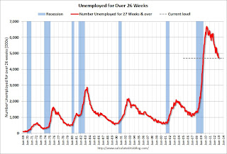
 This graph shows the number of workers unemployed for 27 weeks or more.
 According to the BLS, there are 4.71 million workers who have been unemployed for more than 26 weeks and still want a job. This was down slightly from 4.77 million in December, and is at the lowest level since June 2009. This is generally trending down, but is still very high. Long term unemployment remains one of the key labor problems in the US.
State and Local Government
 This graph shows total state and government payroll employment since January 2007. State and local governments lost 129,000 jobs in 2009, 262,000 in 2010, and 239,000 in 2011. In 2012, state and local government employment declined by 32,000 jobs.
In January 2013, state and local governments lost another 4,000 jobs.
It appears most of the state and local government layoffs are over, however state and local government employment is still trending down slightly.
Of course the Federal government layoffs are ongoing with another 5,000 jobs lost in January.
Overall this report suggests sluggish employment growth in the private sector.


