by Calculated Risk on 5/22/2012 12:08:00 PM
Tuesday, May 22, 2012
Existing Home Sales: Inventory and NSA Sales Graph
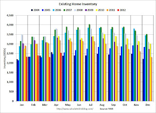
The NAR reported inventory increased to 2.54 million units in April, up 9.5% from the downwardly revised 2.32 million in March (revised down from 2.40 million). This is down 20.6% from April 2011, and up 2.7% from the inventory level in April 2005 (mid-2005 was when inventory started increasing sharply). Inventory was down slightly compared to April 2004 (see first graph below). This decline in inventory remains a significant story.
There is a seasonal pattern for inventory - usually inventory is the lowest in the winter months, and inventory usually peaks mid-summer. However most of the seasonal increase typically happens by April - so we could be close to the peak for this year.
Earlier this year, there were several analysts projecting that inventory would increase to 3 million by mid-summer. I thought that was too high, and it now looks like inventory will peak in the 2.6+ million range. That would be well below the inventory peak in 2005 of 2.9 million units.
At the current sales rate, 2.6 million units of inventory this would push the months-of-supply measure up to 6.7 to 6.8 months from the current 6.6 months. Note: Months-of-supply uses the seasonally adjusted sales rate, and the not seasonally adjusted inventory (even though there is a seasonal pattern for inventory). That would be the lowest seasonal peak for months-of-supply since 2005.
Important: The NAR reports active listings, and although there is some variability across the country in what is considered active, most "contingent short sales" are not included. "Contingent short sales" are strange listings since the listings were frequently NEVER on the market (they were listed as contingent), and they hang around for a long time - they are probably more closely related to shadow inventory than active inventory. However when we comparing inventory to 2005, we need to remember there were no "short sale contingent" listings in 2005. However, in the areas I track, the number of "short sale contingent" listings is also down sharply year-over-year.
The following graph shows inventory by month since 2004. In 2005 (dark blue columns), inventory kept rising all year - and that was a clear sign that the housing bubble was ending.
 Click on graph for larger image.
This year (dark red for 2012) inventory is at the lowest level for the month of April since 2005, and inventory is slightly below the level in April 2004 (not counting contingent sales). Sometime this summer, I expect inventory to be below the same month in 2005. However inventory is still elevated - especially with the much lower sales rate.
The following graph shows existing home sales Not Seasonally Adjusted (NSA).
 Sales NSA (red column) are above the sales for the 2008, 2009 and 2011 (2010 was higher because of the tax credit). Sales are well below the bubble years of 2005 and 2006.
Also it appears distressed sales were down in April. From the NAR:
Distressed homes – foreclosures and short sales sold at deep discounts – accounted for 28 percent of April sales (17 percent were foreclosures and 11 percent were short sales), down from 29 percent in March and 37 percent in April 2011.The increase in existing home sales, combined with fewer distressed sales, is a positive sign for the housing market.
Earlier:
• Existing Home Sales in April: 4.62 million SAAR, 6.6 months of supply
• Existing Home Sales graphs


