 RSS Feed
 by Calculated Risk on 11/29/2021 04:42:00 PM
Monday, November 29, 2021
Fed Chair Powell: "Factors pushing inflation upward will linger well into next year"
From Fed Chair Powell's prepared testimony: Coronavirus and CARES Act, Excerpt on inflation:
Most forecasters, including at the Fed, continue to expect that inflation will move down significantly over the next year as supply and demand imbalances abate. It is difficult to predict the persistence and effects of supply constraints, but it now appears that factors pushing inflation upward will linger well into next year. In addition, with the rapid improvement in the labor market, slack is diminishing, and wages are rising at a brisk pace.And on the new COVID variant:
emphasis added
The recent rise in COVID-19 cases and the emergence of the Omicron variant pose downside risks to employment and economic activity and increased uncertainty for inflation. Greater concerns about the virus could reduce people's willingness to work in person, which would slow progress in the labor market and intensify supply-chain disruptions.Powell will provide his testimony tomorrow at 10AM ET: Coronavirus and CARES Act, Before the U.S. Senate Committee on Banking, Housing, and Urban Affairs
Black Knight: Number of Mortgages in Forbearance Increased Slightly
by Calculated Risk on 11/29/2021 01:10:00 PM
This data is as of November 23rd.
From Andy Walden at Black Knight: November Forbearance Exits Steady Heading Into Thanksgiving
Active forbearance plan numbers remained relatively steady heading into the Thanksgiving holiday, holding true to the established mid-month pattern.
According to our McDash Flash daily forbearance tracking dataset, the number of active forbearance plans increased by 1,000 this week. A decline among FHA/VA loans (-4,000) was offset by another 5,000 rise in plan volumes among portfolio and PLS mortgages as GSE plans held steady. Both plan extensions and renewals remained steady, but low, in keeping with the typical mid-month lull.br />
As of November 23, 1.01 million mortgage holders (1.9%) of mortgage holders, remain in COVID-19 related forbearance plans, including 1.2% of GSE, 3.0% of FHA/VA and 2.5% of portfolio held and privately securitized loans.
Click on graph for larger image.
Overall, the number of forbearance plans is still down by 214,000 (-17%) from the same time last month, with the potential for additional improvements as we enter December. New plan starts, which have been relatively flat since the end of March, jumped almost 8,000 week over week, a number that will bear closer scrutiny in coming weeks to determine whether this is an anomaly or an inflection point.
emphasis added

Housing Inventory Nov 29th Update: Inventory Down 2.6% Week-over-week
by Calculated Risk on 11/29/2021 11:09:00 AM
Tracking existing home inventory is very important this year and in 2022.
 Click on graph for larger image in graph gallery.
This inventory graph is courtesy of Altos Research.
As of November 26th, inventory was at 375 thousand (7-day average), compared to 499 thousand for the same week a year ago. That is a decline of 24.9%. Inventory is down 2.6% from last week.
Compared to the same week in 2019, inventory is down 56.3% from 859 thousand. A week ago, inventory was at 385 thousand, and was down 25.2% YoY.
Seasonally, inventory bottomed in April (usually inventory bottoms in January or February). Inventory was about 22% above the record low in early April.
Inventory peaked for the year in early September. Twelve weeks ago, inventory was at 437 thousand (the peak for the year), so inventory is currently off about 14.3% from the peak for the year.
Mike Simonsen discusses this data regularly on Youtube.
Altos Research has also seen a significant pickup in price decreases - now well above the level of a year ago - but still below a normal rate for November.
NAR: Pending Home Sales Increased 7.5% in October
by Calculated Risk on 11/29/2021 10:04:00 AM
From the NAR: Pending Home Sales Jump 7.5% in October
Pending home sales increased in October, rebounding after a decline the month prior, according to the National Association of Realtors®. Contract activity rose month-over-month in each of the four major U.S. regions. On a year-over-year basis, however, transactions were split, as two regions reported drops and two others posted gains.This was well above expectations of a 1.0% increase for this index. Note: Contract signings usually lead sales by about 45 to 60 days, so this would usually be for closed sales in November and December.
The Pending Home Sales Index (PHSI), a forward-looking indicator of home sales based on contract signings, rose 7.5% to 125.2 in October. Year-over-year, signings fell 1.4%. An index of 100 is equal to the level of contract activity in 2001.
...
Compared to the previous month, contract signings rose at the strongest pace in the Midwest and South regions. Month-over-month, the Northeast PHSI increased 6.9% to 99.5 in October, a 10% drop from a year ago. In the Midwest, the index climbed 11.8% to 124.6 last month, up 5.1% from October 2020.
Pending home sales transactions in the South rose 8.0% to an index of 149.7 in October, up 0.6% from October 2020. The index in the West grew 2.1% in October to 107.5, down 6.2% from a year prior.
emphasis added
Seven High Frequency Indicators for the Economy
by Calculated Risk on 11/29/2021 08:16:00 AM
These indicators are mostly for travel and entertainment. It is interesting to watch these sectors recover as the pandemic subsides.
The TSA is providing daily travel numbers.
This data is as of November 28th.
 Click on graph for larger image.
This data shows the 7-day average of daily total traveler throughput from the TSA for 2019 (Light Blue), 2020 (Blue) and 2021 (Red).
The dashed line is the percent of 2019 for the seven-day average.
The 7-day average is down 12.1% from the same day in 2019 (87.9% of 2019). (Dashed line)
Air travel had been off about 20% relative to 2019 for the last four months (with some ups and downs) - but picked up recently, especially over the Thanksgiving holiday week.
The second graph shows the 7-day average of the year-over-year change in diners as tabulated by OpenTable for the US and several selected cities.
IMPORTANT: OpenTable notes: "we’ve updated the data including downloadable dataset from January 1, 2021 onward to compare seated diners from 2021 to 2019, as opposed to year over year." Thanks!
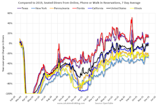 Thanks to OpenTable for providing this restaurant data:
This data is updated through November 27, 2021.
This data is "a sample of restaurants on the OpenTable network across all channels: online reservations, phone reservations, and walk-ins. For year-over-year comparisons by day, we compare to the same day of the week from the same week in the previous year."
Note that this data is for "only the restaurants that have chosen to reopen in a given market". Since some restaurants have not reopened, the actual year-over-year decline is worse than shown.
Dining picked up for the Labor Day weekend, but declined after the holiday - and is mostly moving sideways. The 7-day average for the US is down 4% compared to 2019.
 This data shows domestic box office for each week and the median for the years 2016 through 2019 (dashed light blue).
 Blue is 2020 and Red is 2021.
The data is from BoxOfficeMojo through November 25th.
Note that the data is usually noisy week-to-week and depends on when blockbusters are released.
Movie ticket sales were at $127 million last week, down about 53% from the median for the week.
Note that the data is usually noisy week-to-week and depends on when blockbusters are released.
Movie ticket sales were at $127 million last week, down about 53% from the median for the week.
 This graph shows the seasonal pattern for the hotel occupancy rate using the four week average.
 The red line is for 2021, black is 2020, blue is the median, dashed purple is 2019, and dashed light blue is for 2009 (the worst year on record for hotels prior to 2020).
This data is through November 13th. The occupancy rate was down 4.0% compared to the same week in 2019.
Notes: Y-axis doesn't start at zero to better show the seasonal change.
The occupancy rate will now decline seasonally into the new year.
 This graph, based on weekly data from the U.S. Energy Information Administration (EIA), shows gasoline supplied compared to the same week of 2019.
Blue is for 2020. Red is for 2021.
As of November 19th, gasoline supplied was up 1.4% compared to the same week in 2019.
There was the tenth week this year that gasoline supplied was up compared to the same week in 2019 - so consumption is running close to 2019 levels now.
This graph is from Apple mobility. From Apple: "This data is generated by counting the number of requests made to Apple Maps for directions in select countries/regions, sub-regions, and cities." This is just a general guide - people that regularly commute probably don't ask for directions.
There is also some great data on mobility from the Dallas Fed Mobility and Engagement Index. However the index is set "relative to its weekday-specific average over January–February", and is not seasonally adjusted, so we can't tell if an increase in mobility is due to recovery or just the normal increase in the Spring and Summer.
 This data is through November 24th
 for the United States and several selected cities.
The graph is the running 7-day average to remove the impact of weekends.
IMPORTANT: All data is relative to January 13, 2020. This data is NOT Seasonally Adjusted. People walk and drive more when the weather is nice, so I'm just using the transit data.
According to the Apple data directions requests, public transit in the 7-day average for the US is at 114% of the January 2020 level.
New York City is doing well by this metric, but subway usage in NYC is down sharply (next graph).
----- New York City Subway Usage -----
Here is some interesting data on New York subway usage (HT BR).
 This graph is from Todd W Schneider.
Here is some interesting data on New York subway usage (HT BR).
 This graph is from Todd W Schneider.
 This graph shows how much MTA traffic has recovered in each borough (Graph starts at first week in January 2020 and 100 = 2019 average).
Manhattan is at about 35% of normal.
This data is through Friday, November 26th.
He notes: "Data updates weekly from the MTA’s public turnstile data, usually on Saturday mornings".
Sunday, November 28, 2021
Monday: Pending Home Sales
by Calculated Risk on 11/28/2021 06:41:00 PM
Weekend:
• Schedule for Week of November 28, 2021
Monday:
• At 10:00 AM ET, Pending Home Sales Index for October. The consensus is for a 1.0% increase in the index.
• At 10:30 AM, Dallas Fed Survey of Manufacturing Activity for November. This is the last of the regional Fed manufacturing surveys for November.
From CNBC: Pre-Market Data and Bloomberg futures S&P 500 futures are up 31 and DOW futures are up 180 (fair value).
Oil prices were down over the last week with WTI futures at $70.30 per barrel and Brent at $74.67 per barrel. A year ago, WTI was at $46, and Brent was at $47 - so WTI oil prices are up 50% year-over-year.
Here is a graph from Gasbuddy.com for nationwide gasoline prices. Nationally prices are at $3.38 per gallon. A year ago prices were at $2.11 per gallon, so gasoline prices are up $1.27 per gallon year-over-year.
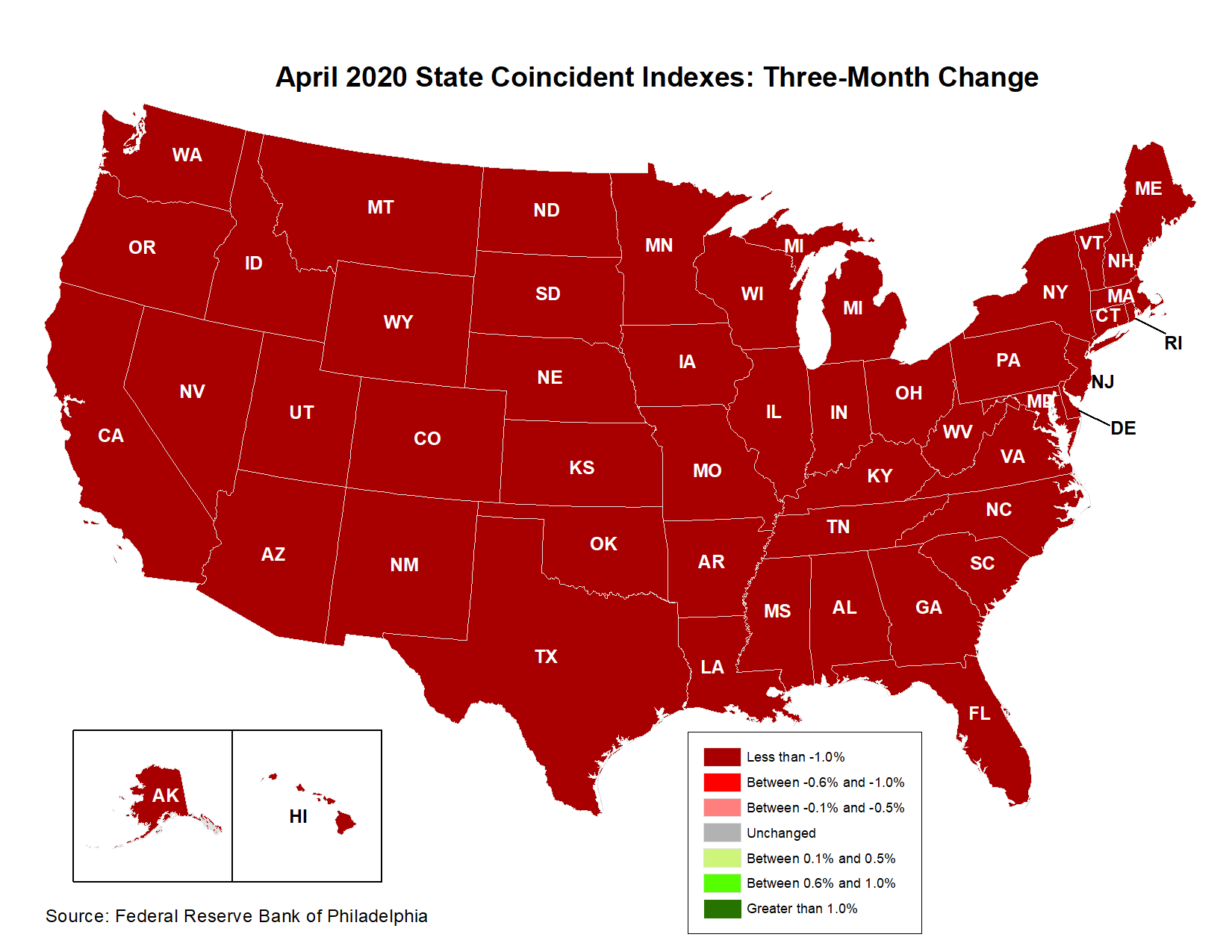
Philly Fed: State Coincident Indexes Increased in 48 States in October
by Calculated Risk on 11/28/2021 12:01:00 PM
From the Philly Fed:
The Federal Reserve Bank of Philadelphia has released the coincident indexes for the 50 states for October 2021. Over the past three months, the indexes increased in 49 states and decreased in one state, for a three-month diffusion index of 96. Additionally, in the past month, the indexes increased in 48 states and decreased in two states, for a one-month diffusion index of 92. For comparison purposes, the Philadelphia Fed has also developed a similar coincident index for the entire United States. The Philadelphia Fed’s U.S. index increased 1.4 percent over the past three months and 0.4 percent in October.Note: These are coincident indexes constructed from state employment data. An explanation from the Philly Fed:
emphasis added
The coincident indexes combine four state-level indicators to summarize current economic conditions in a single statistic. The four state-level variables in each coincident index are nonfarm payroll employment, average hours worked in manufacturing by production workers, the unemployment rate, and wage and salary disbursements deflated by the consumer price index (U.S. city average). The trend for each state’s index is set to the trend of its gross domestic product (GDP), so long-term growth in the state’s index matches long-term growth in its GDP.
 Click on map for larger image.
Here is a map of the three month change in the Philly Fed state coincident indicators. This map was all red during the worst of the Pandemic and also at the worst of the Great Recession.
The map is almost all positive on a three-month basis.
Source: Philly Fed.
 And here is a graph is of the number of states with one month increasing activity according to the Philly Fed.
 This graph includes states with minor increases (the Philly Fed lists as unchanged).
In October, 48 states had increasing activity including minor increases.
In October, 48 states had increasing activity including minor increases.
Saturday, November 27, 2021
Real Estate Newsletter Articles this Week
by Calculated Risk on 11/27/2021 02:11:00 PM
At the Calculated Risk Real Estate Newsletter this week:
• Four House Price Topics Case-Shiller and the FHFA Indexes will be released on Tuesday
• New Home Sales: Record 109 thousand homes have not been started Prices Are Up Sharply Year-over-year
• Final Look: Local Housing Markets in October No Sign of a Slowing Market
• Existing-Home Sales Increased to 6.34 million in October
This is usually published several times a week, and provides more in-depth analysis of the housing market.
The blog will continue as always!
You can subscribe at https://calculatedrisk.substack.com/ Currently all content is available for free - and some will always be free - but please subscribe!.
You can subscribe at https://calculatedrisk.substack.com/ Currently all content is available for free - and some will always be free - but please subscribe!.
Schedule for Week of November 28, 2021
by Calculated Risk on 11/27/2021 08:11:00 AM
The key report this week is the November employment report on Friday.
Other key indicators include the September Case-Shiller house price index, the November ISM manufacturing and services indexes, and November vehicle sales.
10:00 AM: Pending Home Sales Index for October. The consensus is for a 1.0% increase in the index.
10:30 AM: Dallas Fed Survey of Manufacturing Activity for November. This is the last of the regional Fed manufacturing surveys for November.
9:00 AM: FHFA House Price Index for September. This was originally a GSE only repeat sales, however there is also an expanded index. The 2022 Conforming loan limits will also be announced.
 9:00 AM ET: S&P/Case-Shiller House Price Index for September.
This graph shows graph shows the Year over year change in the seasonally adjusted National Index, Composite 10 and Composite 20 indexes through the most recent report (the Composite 20 was started in January 2000).
The consensus is for a 19.3% year-over-year increase in the Composite 20 index for September.
9:45 AM: Chicago Purchasing Managers Index for November.
10:00 AM: Testimony, Fed Chair Jerome Powell, Coronavirus and CARES Act, Before the U.S. Senate Committee on Banking, Housing, and Urban Affairs
10:30 AM: FDIC Quarterly Banking Profile, Third quarter.
7:00 AM ET: The Mortgage Bankers Association (MBA) will release the results for the mortgage purchase applications index.
8:15 AM: The ADP Employment Report for November. This report is for private payrolls only (no government). The consensus is for 525,000 jobs added, down from 571,000 in October.
10:00 AM: ISM Manufacturing Index for November. The consensus is for 61.0%, up from 60.8%.
10:00 AM: Construction Spending for October. The consensus is for 0.4% increase in spending.
2:00 PM: the Federal Reserve Beige Book, an informal review by the Federal Reserve Banks of current economic conditions in their Districts.
 All day: Light vehicle sales for November.
The consensus is for 13.2 million SAAR in November, up from the BEA estimate of 13.0 million SAAR in October (Seasonally Adjusted Annual Rate).
This graph shows light vehicle sales since the BEA started keeping data in 1967. The dashed line is the current sales rate.
8:30 AM: The initial weekly unemployment claims report will be released. The consensus is for 250 thousand initial claims, up from 199 thousand last week.
 8:30 AM: Employment Report for November. The consensus is for 563 thousand jobs added, and for the unemployment rate to decrease to 4.5%.
There were 531 thousand jobs added in October, and the unemployment rate was at 4.6%.
This graph shows the job losses from the start of the employment recession, in percentage terms.
The current employment recession was by far the worst recession since WWII in percentage terms, but currently is not as severe as the "Great Recession".
10:00 AM: the ISM Services Index for November.
Friday, November 26, 2021
Energy expenditures as a percentage of PCE
by Calculated Risk on 11/26/2021 02:11:00 PM
Note: Back in early 2016, I noted that energy expenditures as a percentage of PCE had hit an all-time low. Here is an update through the recently released October PCE report.
Below is a graph of expenditures on energy goods and services as a percent of total personal consumption expenditures through October 2021.
This is one of the measures that Professor Hamilton at Econbrowser looks at to evaluate any drag on GDP from energy prices.
Click on graph for larger image.
Data source: BEA.
The huge spikes in energy prices during the oil crisis of 1973 and 1979 are obvious. As is the increase in energy prices during the 2001 through 2008 period.
In general, energy expenditures as a percent of PCE have been trending down for years.
At the beginning of the pandemic, energy expenditures as a percentage of PCE, fell to a record low of 3.3% in May 2020.
In October 2021, energy expenditures as a percentage of PCE had rebounded and were at 4.1% of PCE. This is slightly above the pre-pandemic level in early 2020.


