 RSS Feed
 by Calculated Risk on 7/20/2021 10:20:00 AM
Tuesday, July 20, 2021
Comments on June Housing Starts
Earlier: Housing Starts increased to 1.643 Million Annual Rate in June
Total housing starts in June were above expectations, however starts in April and May were revised down.
Single family starts increased in June, and were up 28% year-over-year. Starts declined at the beginning of the pandemic, and then increased due to strong demand.
The volatile multi-family sector is up 31% year-over-year.
The housing starts report showed total starts were up 6.3% in June compared to the previous month, and total starts were up 29.1% year-over-year compared to June 2020.
The housing starts report showed total starts were up 6.3% in June compared to the previous month, and total starts were up 29.1% year-over-year compared to June 2020.
Low mortgage rates, limited existing home inventory, and favorable demographics have given a boost to single family housing starts.
The first graph shows the month to month comparison for total starts between 2020 (blue) and 2021 (red).
 Click on graph for larger image.
Starts were up 29.1% in June compared to June 2020. The year-over-year comparison will be more difficult starting in July.
In 2020, starts were off to a strong start before the pandemic, and with low interest rates, and little competing existing home inventory, starts finished 2020 strong.
Starts were solid in the first half of 2021.
Below is an update to the graph comparing multi-family starts and completions. Since it usually takes over a year on average to complete a multi-family project, there is a lag between multi-family starts and completions. Completions are important because that is new supply added to the market, and starts are important because that is future new supply (units under construction is also important for employment).
These graphs use a 12 month rolling total for NSA starts and completions.
 The blue line is for multifamily starts and the red line is for multifamily completions.
The rolling 12 month total for starts (blue line) increased steadily for several years following the great recession - then mostly moved sideways.
These graphs use a 12 month rolling total for NSA starts and completions.
 The blue line is for multifamily starts and the red line is for multifamily completions.
 The rolling 12 month total for starts (blue line) increased steadily for several years following the great recession - then mostly moved sideways.
Completions (red line) had lagged behind starts, but have caught up again.
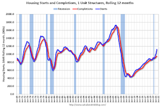 The last graph shows single family starts and completions. It usually only takes about 6 months between starting a single family home and completion - so the lines are much closer. The blue line is for single family starts and the red line is for single family completions.
Single family starts are getting back to more normal levels, but I still expect some further increases in single family starts and completions on a rolling 12 month basis - especially given the low level of existing home inventory.
Housing Starts increased to 1.643 Million Annual Rate in June
by Calculated Risk on 7/20/2021 08:37:00 AM
From the Census Bureau: Permits, Starts and Completions
Housing Starts:
Privately‐owned housing starts in June were at a seasonally adjusted annual rate of 1,643,000. This is 6.3 percent above the revised May estimate of 1,546,000 and is 29.1 percent above the June 2020 rate of 1,273,000. Single‐family housing starts in June were at a rate of 1,160,000; this is 6.3 percent above the revised May figure of 1,091,000. The June rate for units in buildings with five units or more was 474,000.
Building Permits:
Privately‐owned housing units authorized by building permits in June were at a seasonally adjusted annual rate of 1,598,000. This is 5.1 percent below the revised May rate of 1,683,000, but is 23.3 percent above the June 2020 rate of 1,296,000. Single‐family authorizations in June were at a rate of 1,063,000; this is 6.3 percent below the revised May figure of 1,134,000. Authorizations of units in buildings with five units or more were at a rate of 483,000 in June.
emphasis added
 Click on graph for larger image.
The first graph shows single and multi-family housing starts for the last several years.
Multi-family starts (red, 2+ units) increased in June compared to May. Multi-family starts were up 31% year-over-year in June.
Single-family starts (blue) increased in June, and were up 28% year-over-year (starts slumped at the beginning of the pandemic).
 The second graph shows total and single unit starts since 1968.
 The second graph shows the huge collapse following the housing bubble, and then the eventual recovery (but still not historically high).
Total housing starts in June were above expectations, however starts in April and May were revised down.
I'll have more later …
Monday, July 19, 2021
Tuesday: Housing Starts
by Calculated Risk on 7/19/2021 09:00:00 PM
From Matthew Graham at Mortgage News Daily: MBS RECAP: Big Bond Rally Just Got Bigger
U.S. traders fired up the screens this morning to see a substantial bond rally and stock sell-off that happened almost exclusively during European hours. Rather than push back against the move, the domestic session took things a step farther. ... the core is the fact that covid case counts are rising at their fastest pace since January. The pace of the stock sell-off added an additional source of motivation for bonds. [30 year fixed 2.89%]Tuesday:
emphasis added
• At 8:30 AM ET, Housing Starts for June. The consensus is for 1.592 million SAAR, up from 1.572 million SAAR in May.
Phoenix Real Estate in June: Sales Up 2% YoY, Active Inventory Down 33% YoY
by Calculated Risk on 7/19/2021 06:18:00 PM
Note: I'm tracking data for many local markets around the U.S. I think it is especially important to watch inventory this year.
The Arizona Regional Multiple Listing Service (ARMLS) reports ("Stats Report"):
1) Overall sales were at 9,661 in June, up 1.6% from 9,508 in June 2020.
2) Active inventory was at 5,866, down 33.3% from 8,792 in June 2020.
3) Months of supply decreased to 1.05 in June from 1.51 in June 2020. This is very low.
Inventory in June was up 12.4% from last month, and up 42% from the record low in February 2021.
MBA Survey: "Share of Mortgage Loans in Forbearance Decreases to 3.50%"
by Calculated Risk on 7/19/2021 04:00:00 PM
Note: This is as of July 11th.
From the MBA: Share of Mortgage Loans in Forbearance Decreases to 3.50%
The Mortgage Bankers Association’s (MBA) latest Forbearance and Call Volume Survey revealed that the total number of loans now in forbearance decreased by 26 basis points from 3.76% of servicers’ portfolio volume in the prior week to 3.50% as of July 11, 2021. According to MBA’s estimate, 1.75 million homeowners are in forbearance plans.
The share of Fannie Mae and Freddie Mac loans in forbearance decreased 8 basis points to 1.83%. Ginnie Mae loans in forbearance decreased 42 basis points to 4.36%, while the forbearance share for portfolio loans and private-label securities (PLS) decreased 61 basis points to 7.33%. The percentage of loans in forbearance for independent mortgage bank (IMB) servicers decreased 19 basis points to 3.68%, and the percentage of loans in forbearance for depository servicers decreased 36 basis points to 3.62%.
“Forbearance exits edged up again last week and new forbearance requests dropped to their lowest level since last March, leading to the largest weekly drop in the forbearance share since last October and the 20th consecutive week of declines,” said Mike Fratantoni, MBA’s Senior Vice President and Chief Economist. “The forbearance share decreased for every investor and servicer category.”
Added Fratantoni, “The latest economic data regarding the job market and consumer spending continue to show a robust pace of economic recovery, which is supporting further improvements in the forbearance numbers as more homeowners are able to resume their payments.”
emphasis added
 Click on graph for larger image.
This graph shows the percent of portfolio in forbearance by investor type over time. Most of the increase was in late March and early April 2020, and has trended down since then.
The MBA notes: "Total weekly forbearance requests as a percent of servicing portfolio volume (#) decreased relative to the prior week: from 0.04% to 0.03% – the lowest level reported since the week ending March 15, 2020."
July 19th COVID-19, New Cases, Hospitalizations, Vaccinations
by Calculated Risk on 7/19/2021 03:55:00 PM
Note: Cases and deaths reported on Monday are always low - and almost always revised up significantly when additional data is received.
This data is from the CDC.
According to the CDC, on Vaccinations.
Total doses administered: 338,247,434, as of a week ago 334,600,770. Average doses last week: 0.52 million per day.
KUDOS to the residents of the 20 states and D.C. that have already achieved the 70% goal (percent over 18 with at least one dose): Vermont, Hawaii, Massachusetts and Connecticut are at 80%+, and Maine, New Mexico, New Jersey, Rhode Island, Pennsylvania, California, Maryland, Washington, New Hampshire, New York, Illinois, Virginia, Delaware, Minnesota, Oregon, Colorado and D.C. are all over 70%.
According to the CDC, on Vaccinations.
Total doses administered: 338,247,434, as of a week ago 334,600,770. Average doses last week: 0.52 million per day.
| COVID Metrics | ||||
|---|---|---|---|---|
| Today | Yesterday | Week Ago | Goal | |
| Percent over 18, One Dose | 68.3% | 68.2% | 67.7% | ≥70.0%1,2 |
| Fully Vaccinated✅ (millions) | 161.5 | 161.2 | 159.5 | ≥1601 |
| New Cases per Day3🚩 | 26,011 | 27,776 | 20,849 | ≤5,0002 |
| Hospitalized3🚩 | 16,974 | 17,168 | 12,831 | ≤3,0002 |
| Deaths per Day3🚩 | 218 | 226 | 159 | ≤502 |
| 1 America's Short Term Goals, 2my goals to stop daily posts, 37 day average for Cases, Hospitalized, and Deaths 🚩 Increasing 7 day average week-over-week for Cases, Hospitalized, and Deaths ✅ Goal met (even if late). | ||||
KUDOS to the residents of the 20 states and D.C. that have already achieved the 70% goal (percent over 18 with at least one dose): Vermont, Hawaii, Massachusetts and Connecticut are at 80%+, and Maine, New Mexico, New Jersey, Rhode Island, Pennsylvania, California, Maryland, Washington, New Hampshire, New York, Illinois, Virginia, Delaware, Minnesota, Oregon, Colorado and D.C. are all over 70%.
Next up are Florida at 66.6%, Utah at 66.5%, Wisconsin at 66.4%, Nebraska at 66.3%, South Dakota at 65.1%, and Iowa at 64.7%.
 Click on graph for larger image.
This graph shows the daily (columns) and 7 day average (line) of positive tests reported.
This data is from the CDC.
NBER: Recession Trough in April 2020
by Calculated Risk on 7/19/2021 01:45:00 PM
From NBER: Business Cycle Dating Committee Announcement July 19, 2021
Cambridge, July 19, 2021 - The Business Cycle Dating Committee of the National Bureau of Economic Research maintains a chronology of the peaks and troughs of US business cycles. The committee has determined that a trough in monthly economic activity occurred in the US economy in April 2020. The previous peak in economic activity occurred in February 2020. The recession lasted two months, which makes it the shortest US recession on record.
The NBER chronology does not identify the precise moment that the economy entered a recession or expansion. In the NBER’s convention for measuring the duration of a recession, the first month of the recession is the month following the peak and the last month is the month of the trough. Because the most recent trough was in April 2020, the last month of the recession was April 2020, and May 2020 was the first month of the subsequent expansion.
In determining that a trough occurred in April 2020, the committee did not conclude that the economy has returned to operating at normal capacity. An expansion is a period of rising economic activity spread across the economy, normally visible in real GDP, real income, employment, industrial production, and wholesale-retail sales. Economic activity is typically below normal in the early stages of an expansion, and it sometimes remains so well into the expansion.
The committee decided that any future downturn of the economy would be a new recession and not a continuation of the recession associated with the February 2020 peak. The basis for this decision was the length and strength of the recovery to date.
emphasis added
Housing Inventory July 19th Update: Inventory Increased 5% Week-over-week, Up 27% from Low in early April
by Calculated Risk on 7/19/2021 11:11:00 AM
Tracking existing home inventory will be very important this year.
 Click on graph for larger image in graph gallery.
This inventory graph is courtesy of Altos Research.
As of July 16th, inventory was at 391 thousand (7 day average), compared to 647 thousand the same week a year ago. That is a decline of 39.6%.
A week ago, inventory was at 373 thousand, and was down 43.0% YoY.
Seasonally, inventory has bottomed. Inventory was about 27.4% above the record low in early April.
Mike Simonsen discusses this data regularly on Youtube. Altos Research has also seen a significant pickup in price decreases, although still well below a normal rate for July.
NAHB: Builder Confidence Declined to 80 in July
by Calculated Risk on 7/19/2021 10:06:00 AM
The National Association of Home Builders (NAHB) reported the housing market index (HMI) was at 80, down from 81 in June. Any number above 50 indicates that more builders view sales conditions as good than poor.
From the NAHB: Builder Confidence Edges Lower as Material Challenges Persist
Atrong buyer demand helped to offset supply-side challenges relating to building materials, regulation and labor as builder confidence in the market for newly built single-family homes inched down one point to 80 in July, according to the NAHB/Wells Fargo Housing Market Index (HMI) released today.
“Builders continue to grapple with elevated building material prices and supply shortages, particularly the price of oriented strand board, which has skyrocketed more than 500 percent above its January 2020 level,” said NAHB Chairman Chuck Fowke. “We are grateful that the White House heeded our urgent plea to hold a building materials meeting with interested stakeholders on July 16 to seek solutions to end production bottlenecks that have harmed housing affordability.”
“Builders are contending with shortages of building materials, buildable lots and skilled labor as well as a challenging regulatory environment. This is putting upward pressure on home prices and sidelining many prospective home buyers even as demand remains strong in a low-inventory environment,” said NAHB Chief Economist Robert Dietz.
...
The three major HMI indices were mixed in June. The HMI index gauging current sales conditions fell one point to 86, the component measuring traffic of prospective buyers dropped six points to 65 and the gauge charting sales expectations in the next six months posted a two-point gain to 81.
Looking at the three-month moving averages for regional HMI scores, the Northeast fell four points to 75, the Midwest moved one-point lower to 71 and the West posted a two-point decline to 87. The South held steady at 85.
 Click on graph for larger image.
This graph show the NAHB index since Jan 1985.
This was below the consensus forecast, but still a very strong reading - and lumber prices have continued to decline.
Seven High Frequency Indicators for the Economy
by Calculated Risk on 7/19/2021 08:10:00 AM
These indicators are mostly for travel and entertainment. It will interesting to watch these sectors recover as the pandemic subsides.
The TSA is providing daily travel numbers.
This data is as of July 18th.
 Click on graph for larger image.
This data shows the 7-day average of daily total traveler throughput from the TSA for 2019 (Light Blue), 2020 (Blue) and 2021 (Red).
The dashed line is the percent of 2019 for the seven day average.
The 7-day average is down 21.0% from the same day in 2019 (79.0% of 2019). (Dashed line)
There was a slow increase from the bottom - and TSA data has picked up in 2021.
The second graph shows the 7-day average of the year-over-year change in diners as tabulated by OpenTable for the US and several selected cities.
IMPORTANT: OpenTable notes: "we’ve updated the data including downloadable dataset from January 1, 2021 onward to compare seated diners from 2021 to 2019, as opposed to year over year." Thanks!
 Thanks to OpenTable for providing this restaurant data:
This data is updated through July 17th, 2021.
This data is "a sample of restaurants on the OpenTable network across all channels: online reservations, phone reservations, and walk-ins. For year-over-year comparisons by day, we compare to the same day of the week from the same week in the previous year."
Note that this data is for "only the restaurants that have chosen to reopen in a given market". Since some restaurants have not reopened, the actual year-over-year decline is worse than shown.
Dining picked up during the holidays, then slumped with the huge winter surge in cases. Dining is generally picking up, but was down 6% in the US (7-day average compared to 2019). Florida and Texas are above 2019 levels.
----- Movie Tickets: Box Office Mojo -----
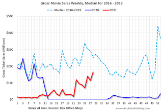 This data shows domestic box office for each week and the median for the years 2016 through 2019 (dashed light blue).
 Thanks to OpenTable for providing this restaurant data:
This data is updated through July 17th, 2021.
This data is "a sample of restaurants on the OpenTable network across all channels: online reservations, phone reservations, and walk-ins. For year-over-year comparisons by day, we compare to the same day of the week from the same week in the previous year."
Note that this data is for "only the restaurants that have chosen to reopen in a given market". Since some restaurants have not reopened, the actual year-over-year decline is worse than shown.
Dining picked up during the holidays, then slumped with the huge winter surge in cases. Dining is generally picking up, but was down 6% in the US (7-day average compared to 2019). Florida and Texas are above 2019 levels.
 This data shows domestic box office for each week and the median for the years 2016 through 2019 (dashed light blue).
 Blue is 2020 and Red is 2021.
The data is from BoxOfficeMojo through July 15th.
Note that the data is usually noisy week-to-week and depends on when blockbusters are released.
Movie ticket sales were at $165 million last week, down about 34% from the median for the week.
Note that the data is usually noisy week-to-week and depends on when blockbusters are released.
Movie ticket sales were at $165 million last week, down about 34% from the median for the week.
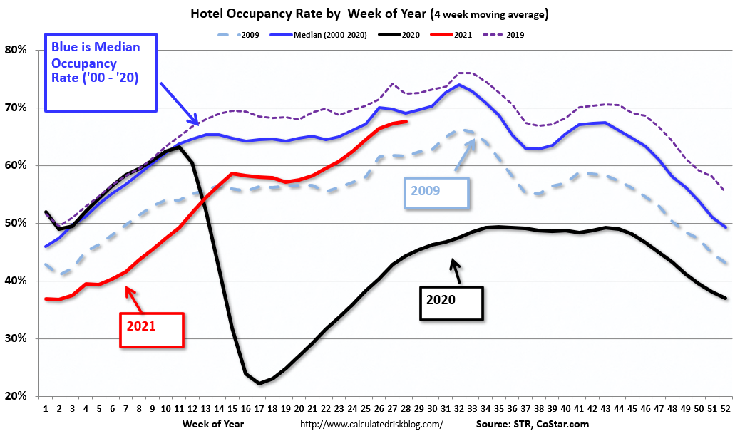 This graph shows the seasonal pattern for the hotel occupancy rate using the four week average.
 The red line is for 2021, black is 2020, blue is the median, dashed purple is 2019, and dashed light blue is for 2009 (the worst year on record for hotels prior to 2020).
Occupancy is now above the horrible 2009 levels and weekend occupancy (leisure) has been solid.
This data is through July 10th. The occupancy rate is down 9.3% compared to the same week in 2019.. Note: Occupancy was up year-over-year, since occupancy declined sharply at the onset of the pandemic. However, the 4-week average occupancy is still down from normal levels.
Notes: Y-axis doesn't start at zero to better show the seasonal change.
 This graph, based on weekly data from the U.S. Energy Information Administration (EIA), shows gasoline supplied compared to the same week of 2019.
Blue is for 2020. Red is for 2021.
As of July 9th, gasoline supplied was up 0.7% compared to the same week in 2019.
This is the third week this year when gasoline supplied was up compared to the same week in 2019.
This graph is from Apple mobility. From Apple: "This data is generated by counting the number of requests made to Apple Maps for directions in select countries/regions, sub-regions, and cities." This is just a general guide - people that regularly commute probably don't ask for directions.
There is also some great data on mobility from the Dallas Fed Mobility and Engagement Index. However the index is set "relative to its weekday-specific average over January–February", and is not seasonally adjusted, so we can't tell if an increase in mobility is due to recovery or just the normal increase in the Spring and Summer.
 This data is through July 17th for the United States and several selected cities.
The graph is the running 7-day average to remove the impact of weekends.
IMPORTANT: All data is relative to January 13, 2020. This data is NOT Seasonally Adjusted. People walk and drive more when the weather is nice, so I'm just using the transit data.
According to the Apple data directions requests, public transit in the 7 day average for the US is at 100% of the January 2020 level.
Here is some interesting data on New York subway usage (HT BR).
 This graph is from Todd W Schneider. This is weekly data since 2015.
 Most weeks are between 30 and 35 million entries, and currently there are over 12 million subway turnstile entries per week - and generally increasing.
This data is through Friday, July 16th.
Schneider has graphs for each borough, and links to all the data sources.
He notes: "Data updates weekly from the MTA’s public turnstile data, usually on Saturday mornings".
This data is through Friday, July 16th.
Schneider has graphs for each borough, and links to all the data sources.
He notes: "Data updates weekly from the MTA’s public turnstile data, usually on Saturday mornings".


